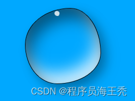
这个水滴动画在视觉效果上看着是动态图,有需要的小伙伴直接可以参考代码
<!DOCTYPE html>
<html lang="en">
  <head>
    <meta charset="UTF-8" />
    <meta http-equiv="X-UA-Compatible" content="IE=edge" />
    <meta name="viewport" content="width=device-width, initial-scale=1.0" />
    <title>水滴效果</title>
  </head>
  <body>
    <div class="box"></div>
  </body>
</html>
<style>
  body {
    width: 100vw;
    height: 100vh;
    display: flex;
    background-color: #00a8ff;
  }
  .box {
    width: 150px;
    height: 150px;
    border: 1px solid #000;
    margin: 80px auto;
    border-radius: 61% 39% 57% 43% / 46% 67% 33% 54%;
    box-shadow: inset 10px 20px 30px rgba(0, 0, 0, 0.5),
      10px 10px 20px rgba(0, 0, 0, 0.3), 15px 15px 30px rgba(0, 0, 0, 0.05),
      inset -10px -20px 30px rgba(255, 255, 255, 0.8);
  }
  .box:before {
    content: "";
    width: 10px;
    height: 10px;
    position: absolute;
    top: 94px;
    left: 50%;
    background-color: rgba(255, 255, 255, 0.8);
    border-radius: 46% 54% 36% 64% / 46% 43% 57% 54%;
  }
  @keyframes a {
    25% {
      border-radius: 58% 42% 59% 41% / 52% 46% 54% 48%;
    }
    50% {
      border-radius: 46% 54% 40% 60% / 52% 33% 67% 48%;
    }
    75% {
      border-radius: 65% 35% 71% 29% / 31% 60% 40% 69%;
    }
    100% {
      border-radius: 60% 40% 43% 57% / 45% 51% 49% 55%;
    }
  }
  .box {
    animation: a 4s linear infinite alternate;
  }
</style>