CSS 3.0实现水滴单选框

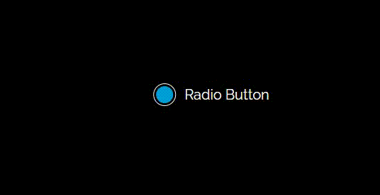
给大家分享一个用CSS 3.0实现水滴单选框动画,效果如下:

以下是代码实现,欢迎大家复制、粘贴和收藏。

<!DOCTYPE html>
<html lang="en">

    <head>
        <meta charset="UTF-8">
        <title>CSS 3.0实现水滴单选框</title>
        <style>
            @import url(https://fonts.googleapis.com/css?family=Raleway:400);
            @keyframes checkIn {
                0% {
                    top: -1%;
                    height: 10px;
                    width: 24px;
                    margin-left: -12px;
                }

                7% {
                    top: -4%;
                    height: 12.5px;
                    width: 22px;
                    margin-left: -11px;
                }

                17% {
                    top: -2%;
                    height: 15px;
                    width: 12px;
                    margin-left: -6px;
                }

                25% {
                    top: 20%;
                    height: 15px;
                    width: 10px;
                    margin-left: -5px;
                }

                30% {
                    top: 102%;
                    height: 10px;
                    width: 28px;
                    margin-left: -14px;
                }

                45% {
                    top: 50%;
                    height: 15px;
                    width: 6px;
                    margin-left: -3px;
                    margin-top: -10px;
                }

                60% {
                    top: 50%;
                    height: 20px;
                    width: 10px;
                    margin-left: -5px;
                }

                70% {
                    top: 50%;
                    height: 40px;
                    width: 40px;
                    margin-left: -20px;
                    margin-top: -20px;
                }

                80% {
                    top: 50%;
                    height: 32px;
                    width: 32px;
                    margin-left: -16px;
                    margin-top: -16px;
                }

                90% {
                    top: 50%;
                    height: 24px;
                    width: 24px;
                    margin-left: -12px;
                    margin-top: -12px;
                }

                100% {
                    top: 50%;
                    height: 24px;
                    width: 24px;
                    margin-left: -12px;
                    margin-top: -12px;
                }
            }

            @keyframes checkOut {
                0% {
                    overflow: visible;
                    top: 50%;
                    width: 30px;
                    height: 30px;
                    margin-top: -17px;
                    margin-left: -17px;
                    border: 2px solid #009fd6;
                    opacity: 1;
                }

                100% {
                    width: 46px;
                    top: 50%;
                    height: 46px;
                    margin-top: -25px;
                    margin-left: -25px;
                    border: 2px solid #009fd6;
                    opacity: 0;
                }
            }

            html,
            body {
                background: #000;
                height: 100%;
                width: 100%;
                padding: 0;
                margin: 0;
            }

            #container {
                position: relative;
                left: 50%;
                top: 50%;
                display: inline-block;
                transform: translateX(-50%) translateY(-50%);
            }

            input#circle-input {
                display: none;
            }

            input#circle-input:checked+label#circle-cont {
                overflow: hidden;
            }

            input#circle-input:checked+label#circle-cont #circle {
                background: #009fd6;
                animation: checkIn 1s forwards linear 0s 1;
            }

            label#circle-cont {
                border-radius: 50%;
                width: 30px;
                height: 30px;
                border: 1px solid #FFF;
                display: block;
                position: relative;
                float: left;
                overflow: visible;
            }

            label#circle-cont #circle {
                background: rgba(0, 0, 0, 0);
                position: absolute;
                left: 50%;
                border-radius: 50%;
                top: -100%;
                animation: checkOut 0.25s forwards linear 0s 1;
            }

            label#label-name {
                color: #FFF;
                font-family: "Raleway", sans-serif;
                position: relative;
                float: left;
                font-size: 1.25em;
                margin: 4px 12px;
            }
        </style>
    </head>

    <body>
        <div id="container">
            <input type="checkbox" id="circle-input" />
            <label for="circle-input" id="circle-cont">
                <div id="circle"></div>
            </label>
            <label for="circle-input" id="label-name">Radio Button</label>
        </div>
    </body>

</html>

猜你喜欢

转载自blog.csdn.net/weixin_40629244/article/details/124670724