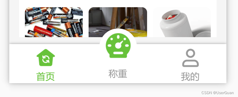
效果图
在 pages.json 中设置隐藏自带的 tabbar 导航栏
"custom": true, // 开启自定义tabBar(不填每次原来的tabbar在重新加载时都回闪现)
新建一个 custom-tabbar.vue 自定义组件页面
custom-tabbar.vue<!-- 自定义底部导航栏 -->
<template>
<view class="container">
<view
class="tabbar-item"
:class="[item.centerItem ? ' center-item' : '']"
:style="'width: calc(100% /' + tabbarList.length + ')'"
@click="changeItem(item)"
v-for="(item, i) in tabbarList"
:key="i"
>
<view class="item-top"><image :src="curItem === item.id ? item.selectedIconPath : item.iconPath" /></view>
<view class="item-bottom" :class="[curItem === item.id ? 'item-active' : '']">{
{ item.text }}</view>
</view>
</view>
</template>
<script>
export default {
props: {
/* 当前导航栏 */
currPage: {
type: Number,
default: 0
}
},
data() {
return {
curItem: 0, // 当前所选导航栏
tabbarList: [
{
id: 0,
pagePath: "/pages/public/index",
iconPath: "/static/tab-bar/home.png",
selectedIconPath: "/static/tab-bar/home-active.png",
text: "首页",
centerItem: false
},
{
id: 1,
pagePath: "",
iconPath: "/static/tab-bar/bulge-active.png",
selectedIconPath: "/static/tab-bar/bulge-active.png",
text: "称重",
centerItem: true
},
{
id: 2,
pagePath: "/pages/weight/my",
iconPath: "/static/tab-bar/my.png",
selectedIconPath: "/static/tab-bar/my-active.png",
text: "我的",
centerItem: false
}
] // 导航栏列表
};
},
mounted() {
this.curItem = this.currPage; // 当前所选导航栏
// #ifdef H5
uni.hideTabBar(); // 隐藏 tabBar 导航栏
// #endif
},
methods: {
/* 导航栏切换 */
changeItem(e) {
// 中间凸起按钮
if (e.id === 1) {
// todo
return;
}
uni.switchTab({ url: e.pagePath }); // 跳转到其他 tab 页面
}
}
};
</script>
<style lang="scss" scoped>
$textDefaultColor: #999; // 文字默认颜色
$bottomBg: #fff; // 底部背景
$textSelectedColor: #67c23a; // 文字选中颜色
$centerItemBg: #fff; // 中间凸起按钮背景
.container {
position: fixed;
bottom: 0;
left: 0;
display: flex;
align-items: center;
width: 100%;
height: 110rpx;
color: $textDefaultColor;
padding: 5rpx 0;
background-color: $bottomBg;
box-shadow: 0 0 10rpx #999;
}
.tabbar-item {
display: flex;
flex-direction: column;
justify-content: center;
align-items: center;
text-align: center;
height: 100rpx;
.item-top {
flex-shrink: 0;
width: 65rpx;
height: 65rpx;
padding: 4rpx;
image {
width: 100%;
height: 100%;
}
}
.item-bottom {
width: 100%;
font-size: 28rpx;
}
.item-active {
color: $textSelectedColor;
}
}
.center-item {
position: relative;
.item-top {
position: absolute;
top: -55rpx;
left: 50%;
transform: translateX(-50%);
width: 105rpx;
height: 105rpx;
background-color: $centerItemBg;
border-radius: 50%;
}
.item-bottom {
position: absolute;
bottom: 5rpx;
}
}
</style>
底部安全区域的适配问题可查看:uni-app 苹果手机底部安全区域的适配问题
在 main.js 中引用组件
// 注册全局组件
import customTabbar from "components/custom-tabbar.vue"
Vue.component('custom-tabbar', customTabbar)
在要用到的页面中直接调用
<!-- 自定义 tabbar 底部导航栏 -->
<custom-tabbar :curr-page="0" />