uni-app中原生tabbar配置和小程序差不多,具体配置查看这篇文章
https://uniapp.dcloud.io/collocation/pages?id=tabbar
"tabBar": {
    "color": "#7A7E83",
    "selectedColor": "#3cc51f",
    "borderStyle": "black",
    "backgroundColor": "#ffffff",
    "list": [{
        "pagePath": "pages/component/index",
        "iconPath": "static/image/icon_component.png",
        "selectedIconPath": "static/image/icon_component_HL.png",
        "text": "组件"
    }, {
        "pagePath": "pages/API/index",
        "iconPath": "static/image/icon_API.png",
        "selectedIconPath": "static/image/icon_API_HL.png",
        "text": "接口"
    }]
}
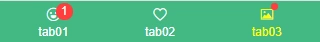
在pages.json中如果没有配置tabBar参数,uni-app中就不会显示底部tabbar,可以通过自定义组件形式来实现想要的自定义tabbar效果。
如下图:在H5端、小程序、App端 下显示的自定义tabbar效果

新建tabbar.vue组件,并在main.js里面引入全局组件
<block v-for="(item,index) in tabList" :key="index">
    <view class="navigator" :class="currentTabIndex == index ? 'on' : ''" @tap="switchTab(index)">
        <view class="icon">
            <text class="iconfont" :class="item.icon" :style="[currentTabIndex == index ? {'color': tintColor} : {'color': color}]"></text>
            <text v-if="item.badge" class="uni_badge">{{item.badge}}</text>
            <text v-if="item.badgeDot" class="uni_badge uni_badge_dot"></text>
            </view>
        <view class="text" :style="[currentTabIndex == index ? {'color': tintColor} : {'color': color}]">{{item.text}}</view>
    </view>
</block>
<script>
    export default {
        data() {
            return {
                tabList: [
                    {
                        icon: 'icon-emotion',
                        text: 'tab01',
                        badge: 1
                    },
                    {
                        icon: 'icon-qianbao',
                        text: 'tab02',
                    },
                    {
                        icon: 'icon-choose01',
                        text: 'tab03',
                        badgeDot: true
                    }
                ],
                currentTabIndex: this.current
            }
        },
        props: {
            current: { type: [Number, String], default: 0 },
            backgroundColor: { type: String, default: '#fbfbfb' },
            color: { type: String, default: '#999' },
            tintColor: { type: String, default: '#42b983' }
        },
        methods: {
            switchTab(index){
                this.currentTabIndex = index
                this.$emit('click', index)
            }
        },
    }
</script>
import tabBar from './components/tabbar.vue'
Vue.component('tab-bar', tabBar)
在页面中引入tabbar,并自定义tabbar属性参数

<tab-bar :current="currentTabIndex" backgroundColor="#fbfbfb" color="#999" tintColor="#42b983" @click="tabClick"></tab-bar>
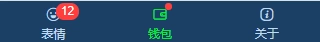
<tab-bar :current="2" backgroundColor="#1a4065" color="#c3daf1" tintColor="#02f32b" @click="tabClick"></tab-bar>
data() {
    return {
        ...
        currentTabIndex: 1
    }
},
methods: {
    tabClick(index){
        console.log('返回tabBar索引:' + index)
        this.currentTabIndex = index
    },
},
上图实例中uni-app自定义顶部导航栏