环境信息:
create-react-app v5
“react”: “^18.2.0”
“postcss-plugin-px2rem”: “^0.8.1”
配置步骤:
我这个方式是 npm run eject 暴露 webpack配置的方法
1.安装 postcss-plugin-px2rem 和 lib-flexible
cnpm install postcss-plugin-px2rem lib-flexible --save
2.配置config/webpack.config.js
加上这段代码:
//px2rem的配置
const px2rem = require("postcss-plugin-px2rem");
const px2remOpts = {


	rootValue: 37.5, //这个值定义了1rem应该等于多少像素。在这里,1rem等于37.5
	exclude: /(node_module)/, //这是一个正则表达式,用于指定哪些文件应该被排除在转换之外。在这里,所有在'node_module'目录下的文件都将被排除。
	// mediaQuery: false, //这个选项表示是否应该在媒体查询中转换px单位。在这里,它被设置为false,意味着媒体查询中的px单位将不会被转换
	// minPixelValue: 3, //这个选项表示应该转换的最小px值。在这里,只有px值大于或等于3的才会被转换
};
然后在 getStyleLoaders 里加上配置(搜索 getStyleLoaders),
在 postcss-loader 下的postcssOptions 里加上
[
  px2rem(px2remOpts)
],
postcss-preset-env 同级别的。
也就是 这个地方看截图:
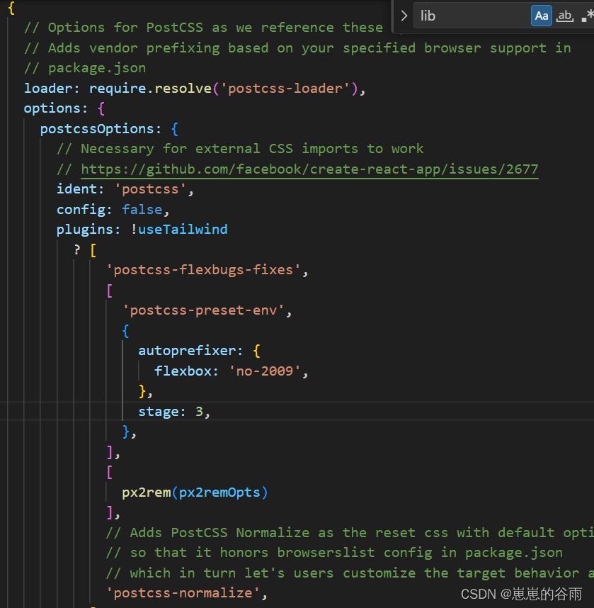
这一段完整的代码:
      {


        // Options for PostCSS as we reference these options twice
        // Adds vendor prefixing based on your specified browser support in
        // package.json
        loader: require.resolve('postcss-loader'),
        options: {


          postcssOptions: {


            // Necessary for external CSS imports to work
            // https://github.com/facebook/create-react-app/issues/2677
            ident: 'postcss',
            config: false,
            plugins: !useTailwind
              ? [
                  'postcss-flexbugs-fixes',
                  [
                    'postcss-preset-env',
                    {


                      autoprefixer: {


                        flexbox: 'no-2009',
                      },
                      stage: 3,
                    },
                  ],
                  [
                    px2rem(px2remOpts)
                  ],
                  // Adds PostCSS Normalize as the reset css with default options,
                  // so that it honors browserslist config in package.json
                  // which in turn let's users customize the target behavior as per their needs.
                  'postcss-normalize',
                ]
              : [
                  'tailwindcss',
                  'postcss-flexbugs-fixes',
                  [
                    'postcss-preset-env',
                    {


                      autoprefixer: {


                        flexbox: 'no-2009',
                      },
                      stage: 3,
                    },
                  ],
                ],
          },
          sourceMap: isEnvProduction ? shouldUseSourceMap : isEnvDevelopment,
        }
      }
3.在 src/index.js(入口文件引入 import ‘lib-flexible’; )

4.public/index.html 里 注释调 meta 和加上 一段兼容ipad和ipad pro 的兼容代码。
注释掉(注释的原因是 lib-flexible 会自动创建 meta):
<meta name="viewport" content="width=device-width, initial-scale=1" />
在 head里加上(ipad和ipad pro ):
<!-- 淘宝弹性布局方案lib-flexible不兼容ipad和ipad pro的解决方法 -->
    <script>
    /(iPhone|iPad|iPhone OS|Phone|iPod|iOS)/i.test(navigator.userAgent)&&(head=document.getElementsByTagName('head'),viewport=document.createElement('meta'),viewport.name='viewport',viewport.content='target-densitydpi=device-dpi, width=480px, user-scalable=no',head.length>0&&head[head.length-1].appendChild(viewport));
    </script>
这段代码用于检测用户是否正在使用iPhone、iPad、iPod或iOS等苹果设备。如果是,它将创建一个新的视口元标签,并添加到HTML文档的头部。视口元标签的内容设置为 ‘target-densitydpi=device-dpi, width=480px, user-scalable=no’,这意味着它会尝试让页面在各种设备上看起来相似,页面的宽度被设置为480px,并且用户不能手动缩放页面。
我的 index.html 代码如下:
<!DOCTYPE html>
<html lang="en">
  <head>
    <meta charset="utf-8" />
    <link rel="icon" href="%PUBLIC_URL%/favicon.ico" />
    <!-- <meta name="viewport" content="width=device-width, initial-scale=1" /> -->
    <meta name="theme-color" content="#000000" />
    <meta
      name="description"
      content="Web site created using create-react-app"
    />
    <link rel="apple-touch-icon" href="%PUBLIC_URL%/logo192.png" />
    <!--
      manifest.json provides metadata used when your web app is installed on a
      user's mobile device or desktop. See https://developers.google.com/web/fundamentals/web-app-manifest/
    -->
    <link rel="manifest" href="%PUBLIC_URL%/manifest.json" />
    <!--
      Notice the use of %PUBLIC_URL% in the tags above.
      It will be replaced with the URL of the `public` folder during the build.
      Only files inside the `public` folder can be referenced from the HTML.

      Unlike "/favicon.ico" or "favicon.ico", "%PUBLIC_URL%/favicon.ico" will
      work correctly both with client-side routing and a non-root public URL.
      Learn how to configure a non-root public URL by running `npm run build`.
    -->
    <title>React App</title>
    <!-- 淘宝弹性布局方案lib-flexible不兼容ipad和ipad pro的解决方法 -->
    <script>
    /(iPhone|iPad|iPhone OS|Phone|iPod|iOS)/i.test(navigator.userAgent)&&(head=document.getElementsByTagName('head'),viewport=document.createElement('meta'),viewport.name='viewport',viewport.content='target-densitydpi=device-dpi, width=480px, user-scalable=no',head.length>0&&head[head.length-1].appendChild(viewport));
    </script>
  </head>
  <body>
    <noscript>You need to enable JavaScript to run this app.</noscript>
    <div id="root"></div>
    <!--
      This HTML file is a template.
      If you open it directly in the browser, you will see an empty page.

      You can add webfonts, meta tags, or analytics to this file.
      The build step will place the bundled scripts into the <body> tag.

      To begin the development, run `npm start` or `yarn start`.
      To create a production bundle, use `npm run build` or `yarn build`.
    -->
  </body>

</html>
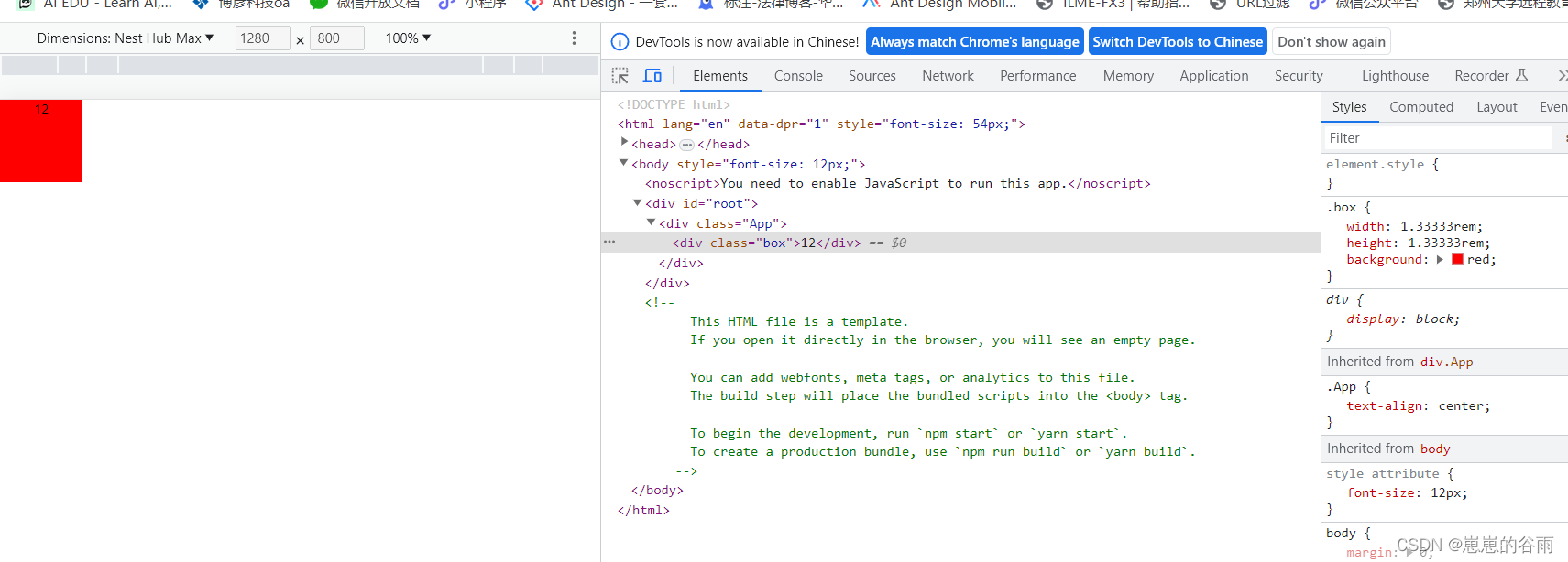
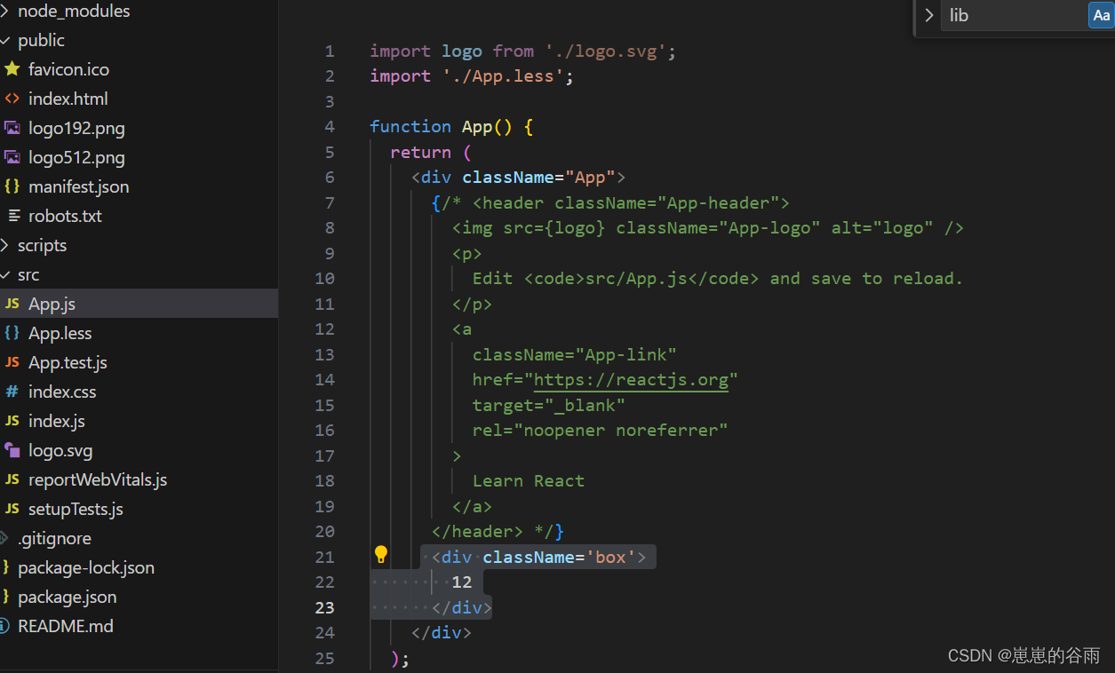
5.重新运行 npm start 审查元素 看看 px 是不是被转换成了rem。如果转换成功说明,配置成功了。
可以在 App.js 里加上一个div然后在 App.css 里写上一个width,height然后 用到 div上。
.box{


  width: 100px;
  height: 100px;
  background: red;
}
运行之后的效果截图:
从100px转换成了1.333rem ,当切换时,他也跟着变大变小。