const box = document.querySelector('.box');
const e = echarts.init(box);
const arr1 = [300, 1280, 250, 260, 270, 300, 1050, 500, 120, 390, 380, 390, 400];
const arr2 = [12, 20, 30, 40, 50, 10, 4, 10, 5, 10, 20, 40, 10, 11, 20, 10, 12];
const option = {
  title: {
    text: '一天用电量分布',
    subtext: '纯属虚构'
  },
  tooltip: {
    trigger: 'axis',
    axisPointer: {
      type: 'cross'
    }
  },
  legend: {
    data: ['用电量', '用电率']
  },
  xAxis: {
    type: 'category',
    boundaryGap: false,
    data: ['07:30', '08:45', '10:00', '11:15', '12:30', '13:45', '15:00', '16:15', '17:30', '18:45', '20:00', '21:15', '22:30']
  },
  yAxis: [
    {
      type: 'value',
      axisLabel: {
        formatter: '{value} W'
      },
      splitLine: {
        show: true
      },
      axisPointer: {
        snap: true
      }
    },
    {
      type: 'value',
      axisLabel: {
        formatter: '{value} %'
      },
      splitLine: {
        show: false
      },
      axisPointer: {
        snap: true
      }
    }
  ],

  series: [
    {
      name: '用电量',
      type: 'line',
      smooth: true,
      smoothMonotone: "x",
      animation: true,
      showSymbol: false,
      symbol: "circle",
      symbolSize: 10,
      data: arr1,
      markArea: {
        data: [
          [
            {
              name: '早高峰',
              xAxis: '08:45'
            },
            {
              xAxis: '10:00'
            }
          ],
          [
            {
              name: '晚高峰',
              xAxis: '17:30'
            },
            {
              xAxis: '18:45'
            }
          ]
        ]
      }
    },
    {
      name: '用电率',
      type: 'line',
      yAxisIndex: 1,
      smooth: true,
      smoothMonotone: "x",
      showSymbol: false,
      symbol: "circle",
      symbolSize: 10,
      data: arr2
    }
  ]
};
e.setOption(option);
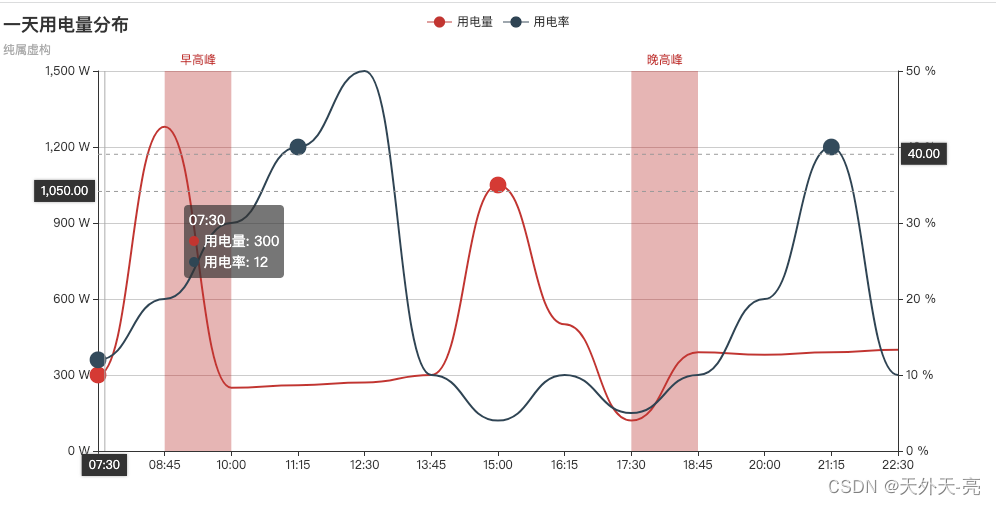
在x轴上做一些特殊标注,以更好的让用户看到某些特殊时间段的数据,比如日期中的节假日、时间中的早晚高峰一类。代码直接可用,Echarts 4.0、5.0都可用。