图片宽高不固定 ,一样实现自适应,拉伸裁剪不变形,适应各大兼容性。
下面咱们在网上找两张宽高不一样的照片:
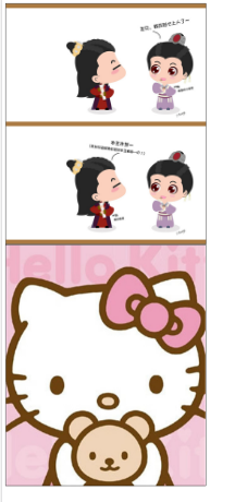
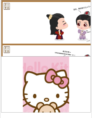
No.1 No.2


从上图看一个宽的一个宅的,很难做到自适应,无奈可恶的产品经理,只能自己想办法了
请看下面图片,经在各大浏览器和手机端测试,是好用的
咱们先来个对比:
好用 不好用
下面是代码:直接放个div就OK啦。
<div style="
  width:500px;
  height:600px;
  border: 1px solid #000000;
  background: url(http://img.zcool.cn/community/01b34f58eee017a8012049efcfaf50.jpg@1280w_1l_2o_100sh.jpg) no-repeat;
  background-size:cover;
  background-position: center center;
">
</div>
<div style="
  width:500px;
  height:600px;
  border: 1px solid #000000;
  background: url(http://img17.3lian.com/d/file/201703/07/4ceeb6fc3d7956ac7731290a603e0a84.jpg) no-repeat;
  background-size:cover;
  background-position: center center;
">
</div>