background: url(../img/share_bg.png) no-repeat center / cover;不借势深多学习几个background技巧吗?
一、background是下面七个css属性的合称
- background-color:属性设置元素的背景颜色;
- background-position:属性设置背景图像的起始位置;
- background-size:属性规定背景图像的尺寸;
- background-repeat:是否平铺(默认平铺);
- background-origin:属性规定 background-position 属性相对于什么位置来定位;
- background-clip:属性规定背景的绘制区域;
- background-attachment:属性设置背景图像是否固定或者随着页面的其余部分滚动;
- background-image:属性为元素设置背景图像。
二、background属性连写
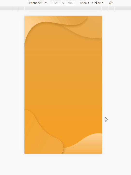
例如上图的背景,显然纯佣css是难于实现的,直接切成全图片肯定也不靠谱,一是不兼容,二是加载缓慢。不难看出,它仅仅是在橙色渐变背景上又给顶部,跟底部定位了两张图片而已。
<html>
	<head>
		<meta charset="UTF-8">
		<title>主页</title>
		<meta name="viewport" content="width=device-width,initial-scale=1,minimum-scale=1,maximum-scale=1,user-scalable=no" />
		<link rel="stylesheet" type="text/css" href="asset/css/framework.css" />
        <style type="text/css">
			.ui-content{
				background: url(../img/share_bg_top.png) no-repeat left -.3rem,
							url(../img/share_bottom_bg.png) left bottom no-repeat,
							linear-gradient(to bottom,#e4a243,#f7a022);
				background-size: 100% auto,100% auto;
			}
		</style>
	</head>
	<body>
		<div class="ui-pane">
			<div class="ui-content">
			</div>
		</div>
	</body>
</html>
background连写须知:
1.background: url(../img/share_bg_top.png) no-repeat left -.3rem;这样就是一个背景单位,除了定位两个值是前水平方向,后垂直方向之外,顺序并不会影响最终结果;
2.1中介绍了一个单位,当需要多个图片结合,当然也不局限背景图片,我们可以用逗号隔开;
3.background-size也是分单位的,当然background-size也可写在连写内,比如:
.ui-content{
	background: url(../img/share_bg_top.png) no-repeat left -.3rem / 100% auto,
	url(../img/share_bottom_bg.png) left bottom no-repeat / 100% auto,
	linear-gradient(to bottom,#e4a243,#f7a022);
}
三、做一个动态背景
<!DOCTYPE html>
<html>
<head>
<meta charset="utf-8">
<title></title>
<style type="text/css">
body{
width: 100%;
height: 100vh;
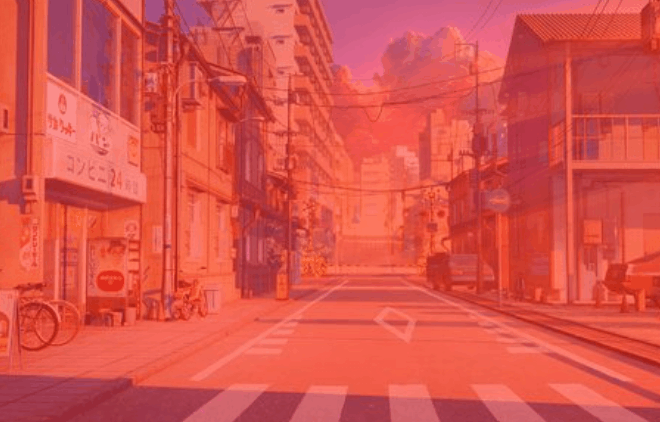
background: url(../jsbase/瀑布流/picture/7.jpg) no-repeat center / cover;
animation: bgMove 5s infinite;
}
@keyframes bgMove{
0%{
background: url(../jsbase/瀑布流/picture/7.jpg) no-repeat center / cover;
}
25%{
background: linear-gradient(to left,rgba(255,0,0,.4),rgba(255,0,0,.4)),url(../jsbase/瀑布流/picture/7.jpg) no-repeat center / cover;
}
50%{
background: linear-gradient(to left,rgba(0,0,0,.4),rgba(0,0,0,.4)),url(../jsbase/瀑布流/picture/7.jpg) no-repeat center / cover;
}
75%{
background: linear-gradient(to left,rgba(255,0,0,.4),rgba(0,255,0,.4)),url(../jsbase/瀑布流/picture/7.jpg) no-repeat center / cover;
}
}
</style>
</head>
<body>
</body>
</html>四、文字渐变
{
	background-image: linear-gradient(to right,#ff0000,#00ff00);
	display: inline-block;
	-webkit-background-clip: text;
	color: transparent;
	animation: bg_move 1s infinite;
}
五、clip-path使用
下图是经常遇到的元素缺角问题,可以使用clip-path实现。
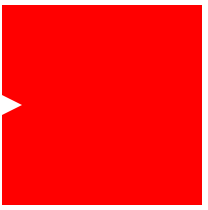
{
	width: 200px;
	height: 200px;
	background: red;
	clip-path: polygon(100% 0,0 0,0 calc(50% - 10px),20px 50%,0 calc(50% + 10px),0 100%,100% 100%);
}
好了,先写到这吧。