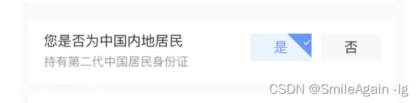
效果:
一、组件封装
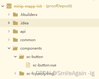
1、在项目根目录下创建components文件夹,自定义组件名称,我定义的是xc-button
2、封装组件代码
<template>
	<view class="handle-btn">
		<view :class="handleIdCode == '1' ? 'select' : 'unSelect'" @click="agreeBtn">
			{

    {

    agreeLabel}}
		</view>
		<view :class="handleIdCode == '0' ? 'select' : 'unSelect'" @click="unAgreeBtn">
			{

    {

    unAgreeLabel}}
		</view>
	</view>
</template>

<script>
	export default {


		name:"xc-button",
		props:{


			handleId:{


				type: String,
				default:"",
			},
			//lable值
			agreeLabel: {


				type: String,
				default:"",
			},
			//lable值
			unAgreeLabel: {


				type: String,
				default:"",
			}
		},
		data() {


			return {


				handleIdCode:''
			};
		},
		methods:{


			agreeBtn(){


				this.handleIdCode = '1',
				this.$emit('agreeBtn')
			},
			unAgreeBtn(){


				this.handleIdCode = '0',
				this.$emit('unAgreeBtn')
			},
		},
		onLoad() {


			this.handleIdCode = this.handleId
		}
	}
</script>

<style lang="scss">
// 按钮样式
.handle-btn{


	display: flex;
}
.select {


	position: relative;
	box-sizing: border-box;
	display: flex;
	flex-direction: column;
	justify-content: center;
	align-items: center;
	padding: 16rpx 32rpx;
	width: 120rpx;
	height: 56rpx;
	border-radius: 2px;
	margin: 0 10rpx;
    background-color: #E8F3FF;
    color: #5999fc;
}
.select:before {


	    content: '';
	    position: absolute;
	    right: 0;
	    top: 0;
	    border: 24rpx solid #5999fc;
	    border-top-color: transparent;
	    border-left-color: transparent;
		transform: rotate(-90deg);
	}
	.select:after {


	    content: '';
	    width: 2px;
	    height: 5px;
	    position: absolute;
	    right: 3px;
	    top: 5px;
	    border: 1px solid #fff;
	    border-top-color: transparent;
	    border-left-color: transparent;
	    transform: rotate(45deg);
	}
.unSelect{


			box-sizing: border-box;
			display: flex;
			flex-direction: column;
			justify-content: center;
			align-items: center;
			padding: 16rpx 32rpx;
			width: 120rpx;
			height: 56rpx;
			background: #F8F8F8;
			border: 0.5px solid #F8F8F8;
			border-radius: 2px;
			margin: 0 10rpx;
		}
</style>
二、在页面中使用组件
<template>
	<view>
			<xc-button agreeLabel="是"  unAgreeLabel="否" handleId="1" @agreeBtn="agreeBtn" @unAgreeBtn="unAgreeBtn">
			</xc-button>
		</view>
</template>

<script>
	export default {


		data() {


			return {


			};
		},
		methods: {


			agreeBtn() {


				console.log('是被触发了')
			},
			unAgreeBtn() {


				console.log('否被触发了')
			},
		}
	}
</script>

<style lang="scss">

</style>