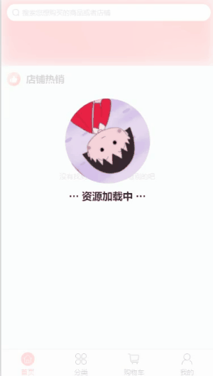
预览效果:
思路:
1、首页loading要全屏并且模糊地覆盖底部的页面
所以背景设置透明度0.8,固定定位fixed,层级999,宽高是页面宽度和高度
2、然后把图片和文本居中显示,我们知道,页面元素都是以左上角为基点的,所以单纯的设置top和left不能居中,加上transform: translate(-50%, -50%);,就可使元素自身偏移,形成居中。
3、图片加旋转动画,这个随便百度百度就有啦
4、设置成组件,就要给他传什么时候出现、什么时候消失的参数 value
<template>
	<view>
		<view v-if="value" class="refresh swapping-squares-spinner">
			<view class="refresh-box">
				<image class="image" src="https://gimg2.baidu.com/image_search/src=http%3A%2F%2Fc-ssl.duitang.com%2Fuploads%2Fitem%2F202003%2F04%2F20200304223820_pvkty.thumb.1000_0.jpeg&refer=http%3A%2F%2Fc-ssl.duitang.com&app=2002&size=f9999,10000&q=a80&n=0&g=0n&fmt=auto?sec=1668048636&t=66dca68cdd32398a3d1712be4efe3e8d"></image>
				<view class="text">··· 资源加载中 ···</view>
			</view>
		</view>
	</view>
</template>

<script>
export default {
	name: 'Loading',
	props: {
		value: {
			type: Boolean,
			default: false
		}
	}
};
</script>

<style scoped>
.refresh {
	background-color: rgba(255, 255, 255, 0.8);
	position: fixed;
	z-index: 999;
	width: 100%;
	height: 100%;
	top: 0;
	left: 0;
	right: 0;
	bottom: 0;
}
.refresh-box {
	position: absolute;
	top: 40%;
	left: 50%;
	transform: translate(-50%, -50%);
	display: flex;
	flex-direction: column;
}
.image {
	width: 300rpx;
	height: 300rpx;
	border-radius: 150rpx;
	animation-iteration-count: infinite;
	animation-name: loading;
	animation-duration: 2000ms;
	animation-delay: 200ms;
	animation-timing-function: ease-in-out;
}
.text {
	font-size: 36rpx;
	font-weight: bold;
	text-align: center;
	margin-top: 20rpx;
}
@keyframes loading {
	0% {
		transform: rotate(0deg);
	}
	100% {
		transform: rotate(360deg);
	}
}
</style>