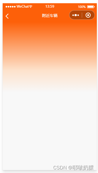
案例样式
自定义组件pageBox.vue
<template>
	<view>
		<view class="bgColor" :style="{ height: bgHeight + 'rpx' }"></view>
		<view class="main">
			<!-- 主要内容放这里 -->
			<slot></slot>
		</view>
	</view>
</template>

<script>
	export default {


		props: {


			bgHeight:{


				type:Number,
				default:584
			}
		}
	}
</script>
<style lang="scss">
	.bgColor {


		background: linear-gradient(360deg, #f8f8f8 4%, #FDE2CB 34%, #FD6009 100%);
	}
	.main{


		width: 100%;
		position: absolute;
		left: 0;
		top: 30rpx;
		z-index: 10;
	}
</style>
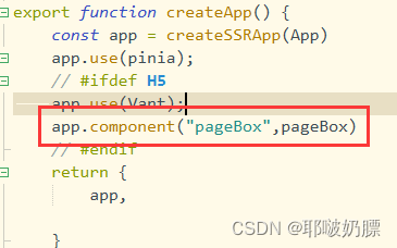
把该组件注册为全局组件,找到main.js文件,进行引入和注册。
import pageBox from "@/components/pageBox/pageBox.vue"


app.component("pageBox",pageBox)
使用组件
<template>
	<view>
		<pageBox>
			在这里直接写页面内容即可,这里地方就是插槽默认的地方
		</pageBox>
	</view>
</template>

<script setup>
	import {


		onLoad,
		onReachBottom
	} from '@dcloudio/uni-app'
	import api from '@/request/api.js'
	import {


		nextTick,
		ref,
		shallowRef
	} from "vue";
</script>


<style lang="scss" scoped>

</style>