sunui-cell 用于点击效果复用(组件仅1kb)
v1.0.0 于 2020.01.09更新
参数介绍:
1. hover:是否显示点击效果/默认false
2. time:点击显示时间/默认170ms
3. styles:组件样式,可按照行内样式编写(无需父组件传值子组件那样死板) - 见示例
扫描二维码关注公众号,回复: 8474097 查看本文章
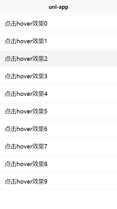
示例代码:
<template>
	<view class="index-page">
		<view v-for="(item,index) in 10" :key='index'>
			<sunui-cell :hover="true" styles="margin-top: 10rpx;border-top:1px solid #eee;border-bottom:1px solid #eee;">
				<view style="padding: 12px 15px;">
					点击hover效果{{index}}
				</view>
			</sunui-cell>
		</view>
	</view>
</template>

<script>
	import sunUiCell from '@/components/sunui-cell/sunui-cell.vue';
	export default {
		data() {
			return {}
		},
		components: {
			'sunui-cell': sunUiCell
		},
		onShow() {

		},
		onLoad() {},
		methods: {}
	}
</script>

<style>

</style>
点击下载示例:sunui-cell