基本要求:plotly_express绘图
参照https://blog.csdn.net/qq_44108455/article/details/111702898绘制共5个图:
(1)3.3中第二个或第三个图
(2)3.4中任意一个图
自选其它任意三个图
3.3中第二个或第三个图
# 3.3散点图
# 散点图的制作调用scatter方法:
1
fig=px.scatter(
    gapminder  # 绘图DataFrame数据集
    , x="gdpPercap"  # 横坐标
    , y="lifeExp"  # 纵坐标
    , color="continent"  # 区分颜色
    , size="pop"  # 区分圆的大小
    , size_max=60  # 散点大小
)
fig.show()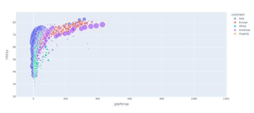
fig = px.scatter(
    gapminder  # 绘图使用的数据
    , x="gdpPercap"  # 横纵坐标使用的数据
    , y="lifeExp"  # 纵坐标数据
    , color="continent"  # 区分颜色的属性
    , size="pop"  # 区分圆的大小
    , size_max=60  # 圆的最大值
    , hover_name="country"  # 图中可视化最上面的名字
    , animation_frame="year"  # 横轴滚动栏的属性year
    , animation_group="country"  # 标注的分组
    , facet_col="continent"  # 按照国家country属性进行分格显示
    , log_x=True  # 横坐标表取对数
    , range_x=[100, 100000]  # 横轴取值范围
    , range_y=[25, 90]  # 纵轴范围
    , labels=dict(pop="Populations",  # 属性名字的变化,更直观
                  gdpPercap="GDP per Capital",
                  lifeExp="Life Expectancy")
)
fig.show()
3.4中任意一个图
fig = px.scatter(
    gapminder  # 绘图使用的数据
    , x="gdpPercap"  # 横纵坐标使用的数据
    , y="lifeExp"  # 纵坐标数据
    , color="continent"  # 区分颜色的属性
    , size="pop"  # 区分圆的大小
    , size_max=60  # 圆的最大值
    , hover_name="country"  # 图中可视化最上面的名字
    , animation_frame="year"  # 横轴滚动栏的属性year
    , animation_group="country"  # 标注的分组
    , facet_col="continent"  # 按照国家country属性进行分格显示
    , log_x=True  # 横坐标表取对数
    , range_x=[100, 100000]  # 横轴取值范围
    , range_y=[25, 90]  # 纵轴范围
    , labels=dict(pop="Populations",  # 属性名字的变化,更直观
                  gdpPercap="GDP per Capital",
                  lifeExp="Life Expectancy")
)
fig.show()
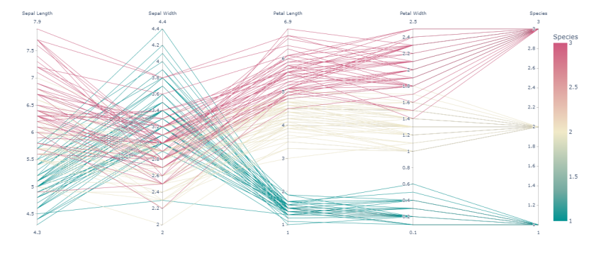
自选其它任意三个图
# 3.7小提琴图
fig=px.scatter(
  iris,  # 数据集
  x="sepal_width",  # 横坐标
  y="sepal_length",  # 纵坐标
  color="species",  # 颜色
  marginal_y="violin",  # 纵坐标小提琴图
  marginal_x="box",  # 横坐标箱型图
  trendline="ols"  # 趋势线
)
# 3.9平行坐标图
fig=px.parallel_coordinates(
  iris,   # 数据集
  color="species_id",  # 颜色
  labels={"species_id":"Species",  # 各种标签值
          "sepal_width":"Sepal Width",
          "sepal_length":"Sepal Length",
          "petal_length":"Petal Length",
          "petal_width":"Petal Width"},
  color_continuous_scale=px.colors.diverging.Tealrose,
  color_continuous_midpoint=2)
fig.show()
# 3.14柱状图
tips=px.data.tips()
fig = px.bar(
  tips,  # 数据集
  x="sex",  # 横轴
  y="total_bill",  # 纵轴
  color="smoker",  # 颜色参数取值
  barmode="group",  # 柱状图模式取值
  facet_row="time",  # 行取值
  facet_col="day",  # 列元素取值
  category_orders={
    "day": ["Thur","Fri","Sat","Sun"],  # 分类顺序
    "time":["Lunch", "Dinner"]})
fig.show()