Mtaplotlib常用技巧
1、导入matplotlib
import matplotlib as mpl
import matplotlib.pyplot as plt
2、设置绘图样式
plt.style.use('classic')3、一个python会话只能出现一次plt.show()
在IPython Notebook中画图:
%matplotlib notebook会在Notebook中启动交互式图形
%matplotlib inline会在Notebook中启动静态图形
4、将图片保存为文件
fig.savefig('my_figure.png')简易线性图
plt.style.use('seaborn-whitegrid')
#创建一个图形fig
fig=plt.figure()
#创建一个坐标轴
ax=plt.axes()
x=np.linspace(0,10,1000)
ax.plot(x,np.sin(x))
plt.plot(x,np.cos(x))
#设置颜色
ax.plot(x,np.sin(x-1),color='yellow')
#调整线条格式,可以使用简写模式如(‘-’,‘--’,‘-.’,‘:’)
ax.plot(x,np.sin(x-2),linestyle='dotted')
#可以将linestyle和color编码组合
ax.plot(x,np.sin(x-1),'--c')

#调整坐标轴的上下线
plt.xlim(-1,11)
plt.ylim(-1.5,1.5)

#设置图形标题、坐标轴标题
plt.title("A sine curve")
plt.xlabel('X')
plt.ylabel('Y')

#设置图例
plt.plot(x,np.tan(x),'-g',label='tan')
plt.plot(x,np.tanh(x),'-g',label='tanh')
plt.legend()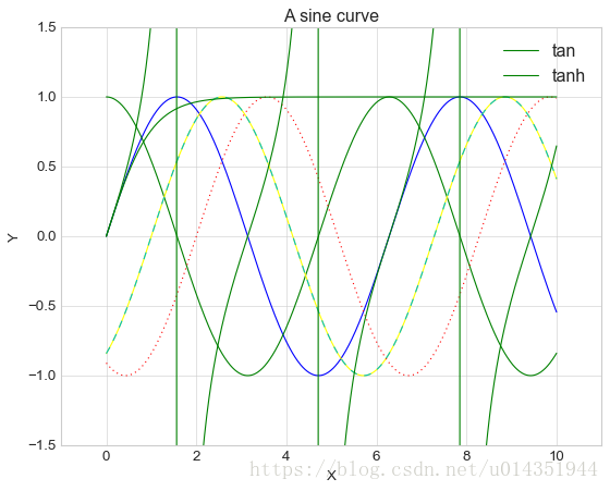
注:(1)plt.axis()通过传入[xmin,xmax.ymin,ymax]对应的值,可以通过一行代码设置x和y的限值,还可以传入字符串参数,如plt.axis(‘tight’)按照图形的内容自动收紧坐标轴。
(2)ax.set()可以一次性设置所有的属性
简易散点图
使用plt.plot()画散点图,具体使用参考https://matplotlib.org/users/pyplot_tutorial.html
x=np.linspace(0,10,30)
y=np.sin(x)
plt.plot(x,y,'o',color='black')
plt.plot(x,np.sin(x-1),'-ok')
plt.plot(x,np.sin(x-2),'-p',color='gray',markersize=15,linewidth=4,markerfacecolor='white',markeredgecolor='gray',markeredgewidth=2)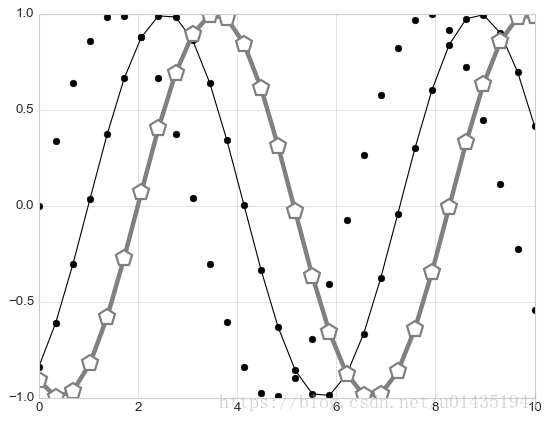
使用plt.scatter画散点图
plt.scatter的简易使用与plt.plot类似,主要的差别在于可以单独控制每个散点与数据匹配,也可以让每个散点具有不同的属性(大小、表面颜色、边框颜色等),alpha参数调剂透明度,cmap设置colormap,参考https://matplotlib.org/examples/color/colormaps_reference.html
rng=np.random.RandomState(0)
x=rng.randn(100)
y=rng.randn(100)
colors=rng.rand(100)
sizes=1000*rng.rand(100)
plt.scatter(x,y,c=colors,s=sizes,alpha=0.3,cmap='viridis')
plt.colorbar()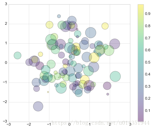
注:在面对大型数据集的时候,plt.plot方法比plt.scatter更好,因为plt.scatter会对每个散点进行单独的大小和颜色渲染,因此渲染器会消耗更多的资源,而在plt.plot,散点基本都彼此复制,因此整个数据集中所有的点的颜色、尺寸只需要配置一次。
可视化异常处理
1、基本误差线
fmt控制线条和点的外观,语法与plt.plot的缩写代码相同,ecolor和elinesgray控制误差线的颜色和宽度,capsize控制误差线两端的宽度
x=np.linspace(0,10,50)
dy=0.8
y=np.sin(x)+dy*np.random.randn(50)
plt.errorbar(x,y,yerr=dy,fmt='.k',ecolor='lightgray',elinewidth=3,capsize=10)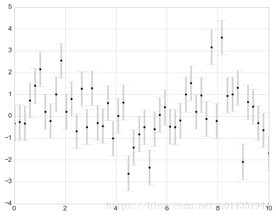
2、连续误差
连续误差可以通过plt.plot和plt.fill_between来解决,fill_betweem函数首先传入x轴坐标,然后传入y轴下边界以及y轴上边界,这样整个却与就被误差线填充了
from sklearn.gaussian_process import GaussianProcess
#定义模型和要画的数据
model=lambda x: x*np.sin(x)
xdata=np.array([1,3,5,6,8])
ydata=model(xdata)
#计算高斯过程拟合结果
gp=GaussianProcess(corr='cubic',theta0=1e-2,thetaL=1e-4,thetaU=1E-1,random_start=100)
gp.fit(xdata[:,np.newaxis],ydata)
xfit=np.linspace(0,10,1000)
yfit,MSE=gp.predict(xfit[:,np.newaxis],eval_MSE=True)
dyfit=2*np.sqrt(MSE)

#将结果可视化
plt.plot(xdata,ydata,'or')
plt.plot(xfit,yfit,'-',color='gray')
plt.fill_between(xfit,yfit-dyfit,yfit+dyfit,color='gray',alpha=0.2)
plt.xlim(0,10);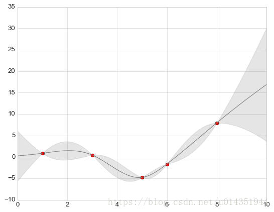
密度图和等高线图
默认虚线表示负数,实线表示正数,可以使用cmap参数设置一个线条配色方案来自定义颜色,colors参数和cmap参数只能设置一个,另外一个为空
def f(x,y):
    return np.sin(x)**10+np.cos(1-+y*x)*np.cos(x)
x=np.linspace(0,5,50)
y=np.linspace(0,5,40)
X,Y=np.meshgrid(x,y)
Z=f(X,Y)
plt.contour(X,Y,Z,colors='black');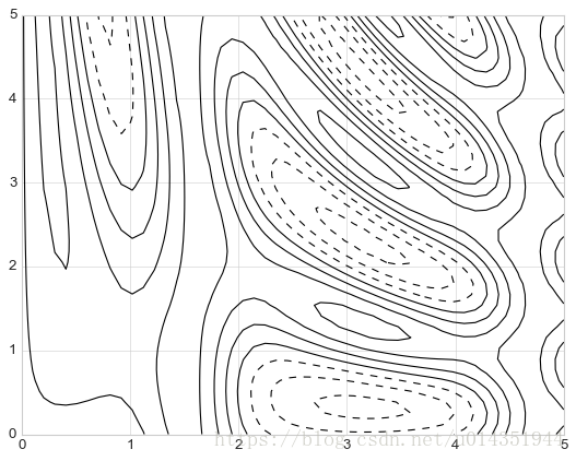
plt.contour(X,Y,Z,cmap=plt.cm.RdGy);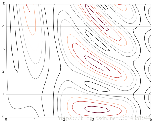
#20表示将数据范围等分为20份
plt.contourf(X,Y,Z,20,cmap=plt.cm.RdGy)
plt.colorbar();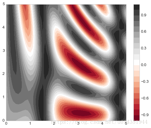
由于颜色的变化是一个离散的而非连续的,所以上图不是很满意,这个可以通过plt.imshow()函数来处理,它可以将二位数组渲染成渐变图,但有一些注意事项:
- plt.imshow()不支持用x轴和y轴数据设置网格,而是必须通过extend参数设置图形的坐标范围[xmin,xmax,ymin,ymax]。
- plt.imshow()默认使用标准的图形数组定义,就是原点位于左上角,而不是绝大多数等高线图中使用的左下角。
- plt.imshow()会自动调整坐标轴的精度以适应数据显示,可以通过plt.axis(aspect=’image’)来设置x轴和y轴的单位
plt.imshow(Z,extent=[0,5,0,5],origin='lower',cmap='RdGy')
plt.colorbar()
plt.axis(aspect='image');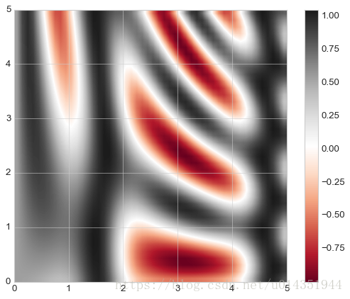
等高线图和彩色图组合,通过alpha参数设置透明度,和另一幅坐标轴、带数据标签的等高线图叠放在一起(plt.clabel()函数实现)
contours=plt.contour(X,Y,Z,3,colors='black')
plt.clabel(contours,inline=True,fontsize=8)
plt.imshow(Z,extent=[0,5,0,5],origin='lower',cmap='RdGy',alpha=0.5)
plt.colorbar();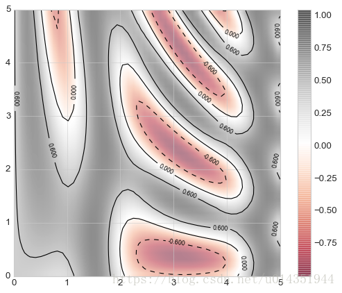
频次直方图、数据区间划分和分布密度
频次直方图
plt.hist()常用参数
data: 需要计算直方图的一维数组
bins: 直方图的柱数,可选项,默认为10
density: 是否将得到的直方图向量归一化。默认为False
color: 直方图颜色
edgecolor: 直方图边框颜色
alpha: 透明度
histtype: 直方图类型,‘bar’, ‘barstacked’, ‘step’, ‘stepfilled’
data = np.random.randn(1000)
plt.hist(data, bins=30, density=True, alpha=0.5,
         histtype='stepfilled', color='steelblue',
         edgecolor='none');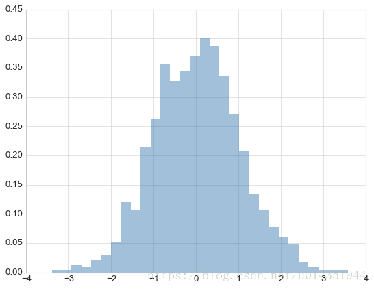
如果只需要每段区间的样本数,不需要画图,可以使用np.histogram()
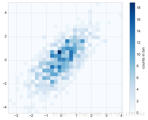
二维频次直方图与数据区间划分
plt.hist2d:
mean=[0,0]
cov=[[1,1],[1,2]]
x,y=np.random.multivariate_normal(mean,cov,1000).T
plt.hist2d(x,y,bins=30,cmap='Blues')
cb=plt.colorbar()
cb.set_label('counts in bin')
np.histogram2d也可以不画图只计算结果
plt.hexbin:
plt.hexbin(x,y,gridsize=30,cmap='Blues')
plt.colorbar(label='count in bin');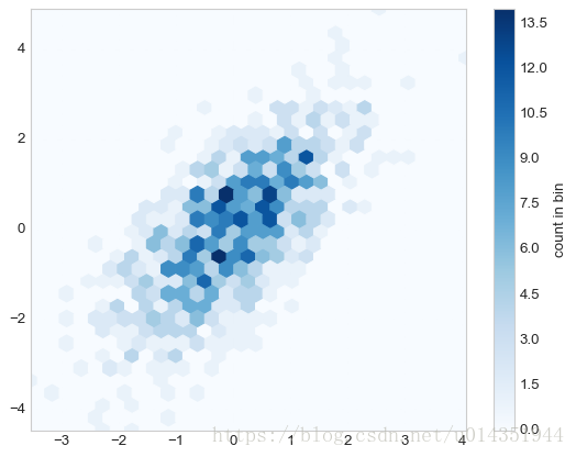
核密度估计:
kde方法:抹掉空间中离散的数据点,从而拟合出一个平滑的函数
from scipy.stats import gaussian_kde
#拟合数组维度[ndim,nsamples]
data=np.vstack([x,y])
kde=gaussian_kde(data)
#用一堆规则的网格数据进行拟合
xgrid=np.linspace(-3.5,3.5,40)
ygrid=np.linspace(-6,6,40)
Xgrid,Ygrid=np.meshgrid(xgrid,ygrid)
Z=kde.evaluate(np.vstack([Xgrid.ravel(),Ygrid.ravel()]))
plt.imshow(Z.reshape(Xgrid.shape),origin='lower',aspect='auto',extent=[-3.5,3.5,-6,6],cmap='Blues')
cb=plt.colorbar()
cb.set_label('density')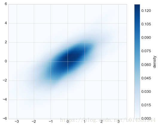
配置图例
plt.legend()创建图例主要参数
| 参数 | 功能 |
|---|---|
| loc | 设置图例的位置 |
| frameon | 设置外边框是否显示 |
| ncol | 设置图例的标签列数 |
| fancybox | 定义圆角边框 |
| framealpha | 改变外框透明度 |
| shadow | 增加边框阴影 |
| borderpad | 改变文字间距 |
当需要多个图例的时候的时候可以使用ax。add_artist()添加图例对象
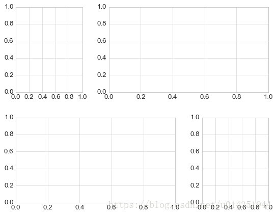
多子图
plt.axes(),可选参数[底坐标,左坐标,宽度,高度]
ax1=plt.axes()
ax2=plt.axes([0.65,0.65,0.2,0.2])
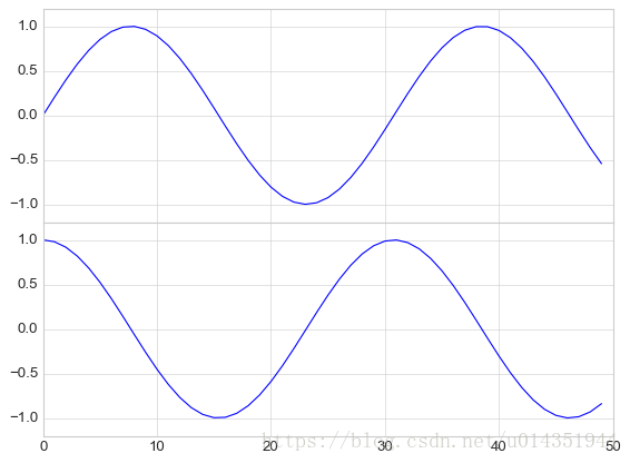
面向对象接口
fig=plt.figure()
ax1=fig.add_axes([0.1,0.5,0.8,0.4],xticklabels=[],ylim=(-1.2,1.2))
ax2=fig.add_axes([0.1,0.1,0.8,0.4],ylim=(-1.2,1.2))
x=np.linspace(0,10)
ax1.plot(np.sin(x))
ax2.plot(np.cos(x))
上制图起点为y坐标为0.5的位置且与下子图x周刻度对应
plt.subplot()
for i in range(1,7):
    plt.subplot(2,3,i)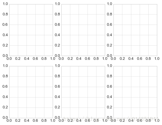
带有边距调节功能,fig.add_subplot()是plt.subplot的面向对象接口
fig=plt.figure()
fig.subplots_adjust(hspace=0.4,wspace=0.4)
for i in range(1,7):
    ax=fig.add_subplot(2,3,i)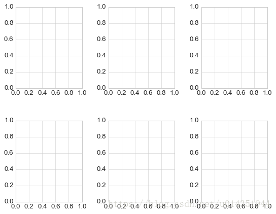
plt.subplots()
fig,ax=plt.subplots(2,3,sharex='col',sharey='row')共享x轴和y轴
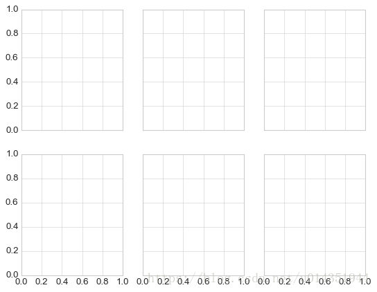
plt.GridSpec:实现更复杂的排列方式
grid=plt.GridSpec(2,3,wspace=0.4,hspace=0.3)
plt.subplot(grid[0,0])
plt.subplot(grid[0,1:])
plt.subplot(grid[1,:2])
plt.subplot(grid[1,2])
使用类似切片的语法设置制图的位置和扩展尺寸
文字和注释
- 添加文字
ax.text()方法需要一个x轴坐标,一个y轴坐标,一个字符串和一些可选参数,如文字的颜色、字号、风格、对齐方式以及其他文字属性 - 坐标转换:
ax.transData 以数据为基准的坐标转换
ax.transAxes 以坐标轴为基准的坐标转换
fig.transFigure 以图形为基准的坐标变换 - 箭头和注释
plt.annotate()既可以创建文字也可以创建箭头
fig,ax=plt.subplots()
x=np.linspace(0,20,1000)
ax.plot(x,np.cos(x))
ax.axis('equal')
ax.annotate('local maximum',xy=(6.28,1),xytext=(10,4),arrowprops=dict(facecolor='black',shrink=0.05))
ax.annotate('local minimum',xy=(5*np.pi,-1),xytext=(2,-6),arrowprops=dict(arrowstyle="->",connectionstyle="angle3,angleA=0,angleB=-90"))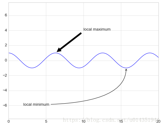
自定义坐标轴刻度
每个坐标轴都有主要刻度线和次要刻度线,主要刻度线显示为较大的刻度线和标签,而次要刻度都显示为一个较小的刻度线不显示标签,可以通过设置每个坐标轴的formatter与locator对象,自定义这些刻度属性。
ax=plt.axes()
ax.plot(np.random.rand(50))

ax.yaxis.set_major_locator(plt.NullLocator())
ax.xaxis.set_major_formatter(plt.NullFormatter())
隐藏图形的x轴标签(保留了刻度线和网格线)和y轴刻度
| 定位器类 | 描述 |
|---|---|
| NullLocator | 无刻度 |
| FixedLocator | 刻度位置固定 |
| IndexLocator | 用索引作为定位器 |
| LinearLocator | 从min到max均匀分布刻度 |
| LogLocator | 从min到max按对数分布刻度 |
| MultipleLocator | 刻度和范围都是基数的倍数 |
| MaxNLocator | 为最大刻度找到最优位置 |
| AutoLocator | 以MaxNlocator进行简单配置 |
| AutoMinorLocator | 次要刻度的定位器 |
| 格式生成器类 | 描述 |
|---|---|
| NullFormatter | 刻度上无标签 |
| IndexFormatter | 将一组标签设置为字符串 |
| FixedFromatter | 手动为刻度设置标签 |
| FuncFormatter | 用自定义函数设置标签 |
| FromatStrFormatter | 为每个刻度值设置字符串格式 |
| ScalarFormatter | 为标量值设置标签 |
| LogFormatter | 对数坐标轴的默认格式生成器 |
画三维图
1、三维数据点和向
fig = plt.figure()
ax=plt.axes(projection='3d')

#三维线的数据
zline=np.linspace(0,15,1000)
xline=np.sin(zline)
yline=np.cos(zline)
ax.plot3D(xline,yline,zline,'gray')

#三维散点的数据
zdata=15*np.random.random(100)
xdata=np.sin(zdata)+0.1*np.random.randn(100)
ydata=np.cos(zdata)+0.1*np.random.randn(100)
ax.scatter3D(xdata,ydata,zdata,c=zdata,cmap='Greens')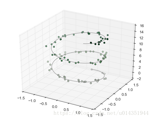
2、三维等高线图
def f(x,y):
     return np.sin(np.sqrt(x**2+y**2))
x=np.linspace(-6,6,30)
y=np.linspace(-6,6,30)
X,Y=np.meshgrid(x,y)
Z=f(X,Y)
fig=plt.figure()
ax=plt.axes(projection='3d')
ax.contour3D(X,Y,Z,50,cmap='binary')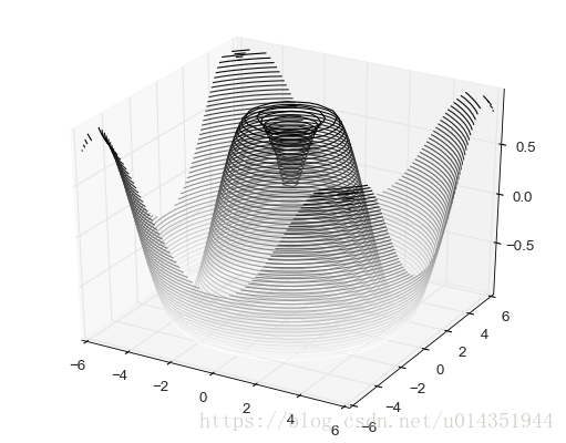
ax.view_init()可以调整观察角度和方位角
3、线框图和曲面图
fig=plt.figure()
ax=plt.axes(projection='3d')
ax.plot_wireframe(X,Y,Z,color='black')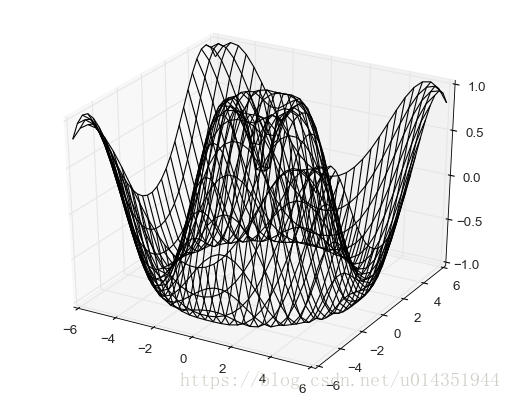
ax=plt.axes(projection='3d')
ax.plot_surface(X,Y,Z,rstride=1,cstride=1,cmap='viridis',edgecolor='none')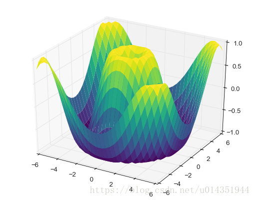
画曲面图可以使用极坐标
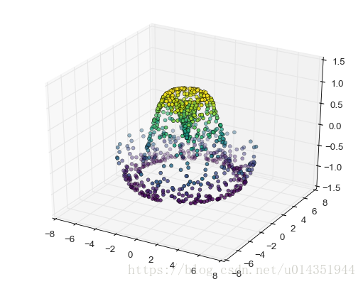
4、曲面三角剖分
theta=2*np.pi*np.random.random(1000)
r=6*np.random.random(1000)
x=np.ravel(r*np.sin(theta))
y=np.ravel(r*np.cos(theta))
z=f(x,y)
ax=plt.axes(projection='3d')
ax.scatter3D(x,y,z,c=z,cmap='viridis',linewidth=0.5)
三维采样的曲面图,可以使用ax.plot_trisurf进行修补
ax=plt.axes(projection='3d')
ax.plot_trisurf(x,y,z,cmap='viridis',edgecolor='none')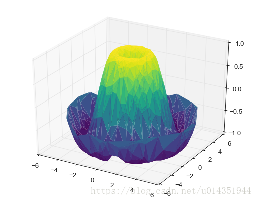
Basemap
from mpl_toolkits.basemap import Basemap
plt.figure(figsize=(8,8))
m=Basemap(projection='ortho',resolution=None,lat_0=50,lon_0=-100)
m.bluemarble(scale=0.5)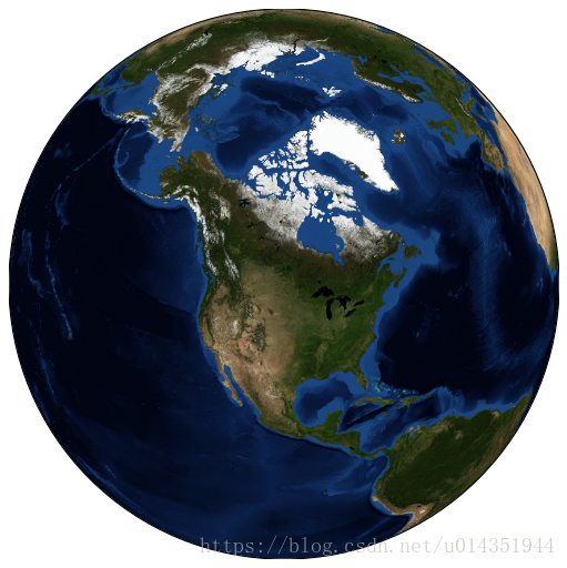
fig=plt.figure(figsize=(8,8))
m=Basemap(projection='lcc',resolution=None,width=8e6,height=8e6,lat_0=45,lon_0=-100,)
m.etopo(scale=0.5,alpha=0.5)

x,y=m(-122.3,47.6)
plt.plot(x,y,'ok',markersize=5)
plt.text(x,y,'Seattle',fontsize=12)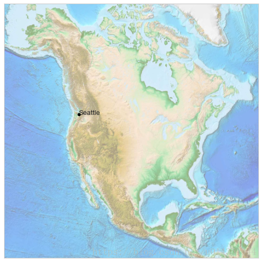
| Keyword | Description |
|---|---|
| projection | 映射规则 |
| llcrnrlon | 所需地图域左下角的经度(度)。 |
| llcrnrlat | 所需地图域左下角的纬度(度)。 |
| urcrnrlon | 所需地图域右上角的经度(度)。 |
| urcrnrlat | 所需地图域右上角的纬度(度)。 |
| width | 在投影坐标(米)中期望的地图域的宽度。 |
| height | 投影坐标(米)中期望的地图域的高度。 |
| lon_0 | center of desired map domain (in degrees). |
| lat_0 | center of desired map domain (in degrees). |
地图投影规则
- 圆柱投影
纬度线与经度线分别映射成水平线与竖直线,采用这种投影,赤道区域的显示效果非常好,但是南北极附近的区域会严重变形。圆柱投影类型有圆柱投影(‘cyl’),墨卡托(‘merc’),投影和圆柱等积(‘cea’),需要设置llcrnrlon、llcrnrlat、urcrnrlon、urcrnrlat。
from itertools import chain

def draw_map(m, scale=0.2):
    # draw a shaded-relief image
    m.shadedrelief(scale=scale)

    # lats and longs are returned as a dictionary
    lats = m.drawparallels(np.linspace(-90, 90, 13))
    lons = m.drawmeridians(np.linspace(-180, 180, 13))

    # keys contain the plt.Line2D instances
    lat_lines = chain(*(tup[1][0] for tup in lats.items()))
    lon_lines = chain(*(tup[1][0] for tup in lons.items()))
    all_lines = chain(lat_lines, lon_lines)

    # cycle through these lines and set the desired style
    for line in all_lines:
        line.set(linestyle='-', alpha=0.3, color='w')

fig = plt.figure(figsize=(8, 6), edgecolor='w')
m = Basemap(projection='cyl', resolution=None,
            llcrnrlat=-90, urcrnrlat=90,
            llcrnrlon=-180, urcrnrlon=180, )
draw_map(m)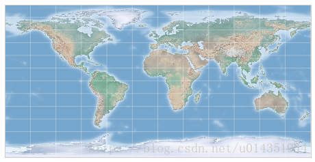
- 伪圆柱投影
伪圆柱投影的经线不在必须是竖直的,这样可以使附近的区域更加真实,这类投影主要有摩尔威德(‘moll’),正弦(’sinu),罗宾森(‘robin’),该类型投影,有两个额外参数地图中心的纬度(lat_0)和经度(lon_0)
fig=plt.figure(figsize=(8,6),edgecolor='w')
m=Basemap(projection='moll',resolution=None,lat_0=0,lon_0=0)
draw_map(m)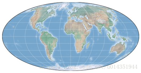
- 透视投影
从某一个透视点对地球进行透视获得的投影,典型的是正射(‘ortho’),还有球心投影(‘gnom’)和球极平面投影(‘stere’),这些投影通常用于显示地球较小面积区域
fig=plt.figure(figsize=(8,8),edgecolor='w')
m=Basemap(projection='ortho',resolution=None,lat_0=50,lon_0=0)
draw_map(m)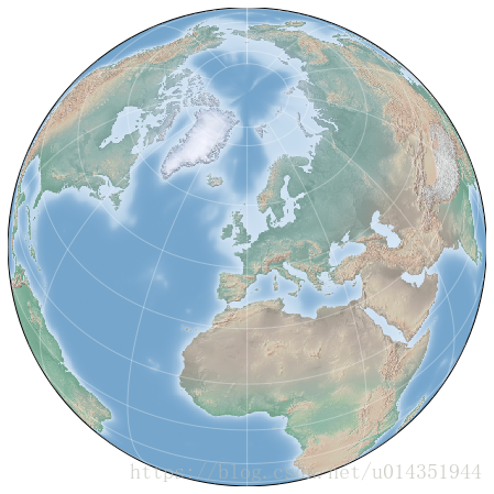
- 圆锥投影
先将地图投影成一个圆锥体,然后再将其展开,典型事例是兰勃特投影(‘lcc’),还有等距圆锥(‘eqdc’)和阿尔博斯等积圆锥(‘aea’)
fig=plt.figure(figsize=(8,8),edgecolor='w')
m=Basemap(projection='lcc',resolution=None,lat_0=50,lon_0=0,lat_1=45,lat_2=55,width=1.6e7,height=1.2e7)
draw_map(m)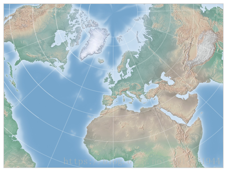
绘制地图背景
| 函数 | 功能 |
|---|---|
| drawcoastlines | 绘制大陆海岸线 |
| drawlsmask | 为陆地与海洋设置填充色,从而可以再陆地或海洋投影其它图像 |
| drawmapboundary | 绘制地图边界,包括为海洋填充颜色 |
| drawrivers | 绘制河流 |
| fillcontinents | 用一种颜色填充大陆,用另一种颜色填充胡泊 |
| drawcountries | 绘制国界线 |
| drawstates | 绘制州界线 |
| drawcounties | 绘制县界线 |
| drawgreatcircle | 在两点之间绘制一个大圆 |
| drawparallels | 绘制纬线 |
| drawmeridians | 绘制经线 |
| drawmapscale | 在地图上绘制一个线性比例尺 |
| bluemarble | 绘制NASA蓝色弹珠地球投影 |
| shadedrelief | 在地图上绘制地貌晕渲图 |
| etopo | 在地图上绘制地形眩晕图 |
| warpimage | 将用户提供的图像投影到地图上 |
在地图上画数据
| 函数 | 功能 |
|---|---|
| contour/contourf | 绘制等高线/填充等高线 |
| imshow | 绘制一个图像 |
| pcolor/pcolormesh | 绘制带规则/不规则网格的伪彩图 |
| plot | 绘制线条、标签 |
| scatter | 绘制带标签的点 |
| quiver | 绘制箭头 |
| barbs | 绘制风羽 |
| drawgreatcircle | 绘制大圆圈 |
Seaborn
1、频次直方图、KDE和密度图
使用KDE获取变量分布的平滑估计,并让频次直方图和KDE结合
import seaborn as sns
data=np.random.multivariate_normal([0,0],[[5,2],[2,2]],size=2000)
data=pd.DataFrame(data,columns=['x','y'])
for col in 'xy':
    sns.kdeplot(data[col],shade=True)
sns.distplot(data['x'])
sns.distplot(data['y'])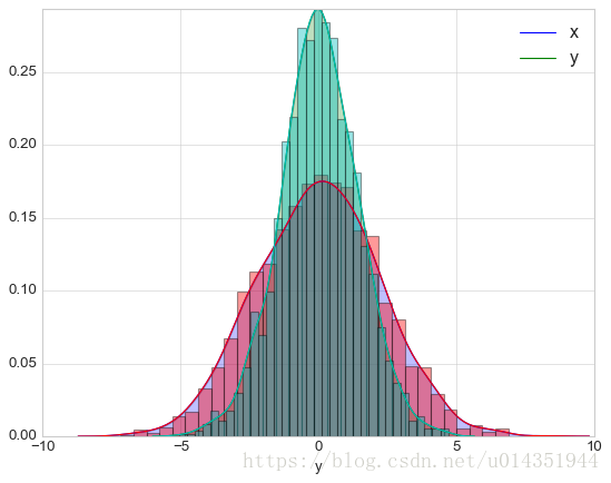
如果输入的是二位数据集,那么就获得一个二位数据可视化图
sns.kdeplot(data)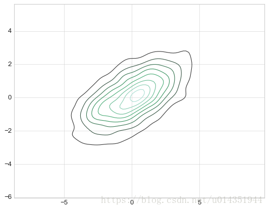
用sns.jointplot可以同时看到两个变量的联合分布与单变量的独立分布
with sns.axes_style('white'):
    sns.jointplot('x','y',data=data,kind='kde')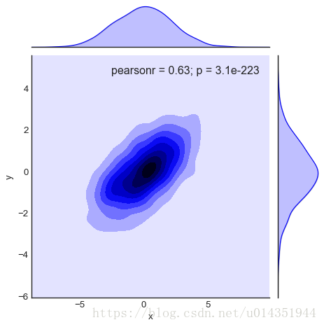
2、矩阵图
#载入鸢尾花数据集
iris=sns.load_dataset('iris')
iris.head()
输出:
sepal_length    sepal_width     petal_length    petal_width     species
0   5.1     3.5     1.4     0.2     setosa
1   4.9     3.0     1.4     0.2     setosa
2   4.7     3.2     1.3     0.2     setosa
3   4.6     3.1     1.5     0.2     setosa
4 5.0 3.6 1.4 0.2 setosasns.pairplot(iris,hue='species',size=2.5)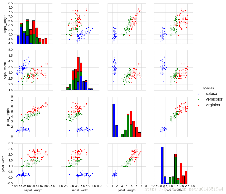
3、分面频次直方图
tips=sns.load_dataset('tips')
tips['tip_pict']=100*tips['tip']/tips['total_bill']
grid=sns.FacetGrid(tips,row='sex',col='time',margin_titles=True)
grid.map(plt.hist,'tip_pict',bins=np.linspace(0,40,15));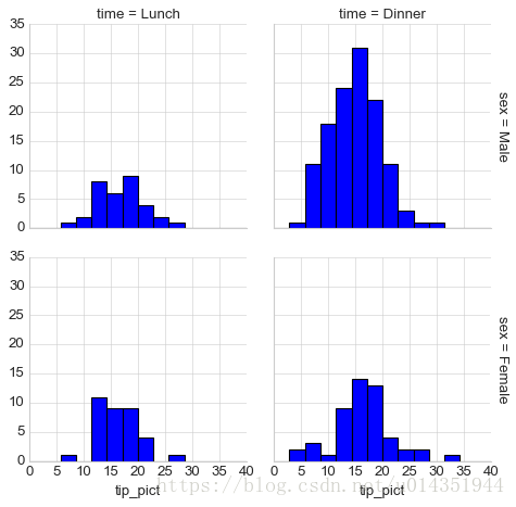
4、因子图
with sns.axes_style(style='ticks'):
    g=sns.factorplot('day','total_bill','sex',data=tips,kind='box')
    g.set_axis_labels('day','toatal bill')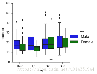
5、联合分布
with sns.axes_style(style='white'):
    sns.jointplot('total_bill','tip',data=tips,kind='hex')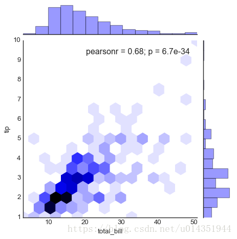
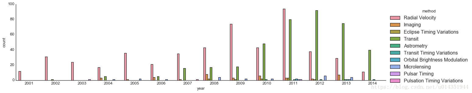
6、条形图
planets=sns.load_dataset('planets')
with sns.axes_style('white'):
    g=sns.factorplot('year',data=planets,aspect=4.0,kind='count',hue='method',order=range(2001,2015))