代码网址
GitHub
https://github.com/jinhao94/Heatmap_practice
这是作者使用ComplexHeatmap绘制热图的一个练习,教程已经讲述的很详细。ComplexHeatmap包也是热图绘制中常使用的包,功能很强大。
感兴趣的可以在本教程中进行在优化,此教程总体算是比较繁琐,在平时使用过程中可以进行优化。

绘图代码
##'@ComplexHwatmap绘制热图
##'
##'@数据来源:https://github.com/jinhao94/Heatmap_practice

setwd("E:\\小杜的生信筆記\\2023\\20230713-ComplexHeatmap绘制热图\\heatmap_demo")

##'@导入相关的包
#BiocManager::install("printr")
library(printr)
library(ComplexHeatmap)
library(ggplotify)
library(circlize)
library(ggpubr)
导入数据
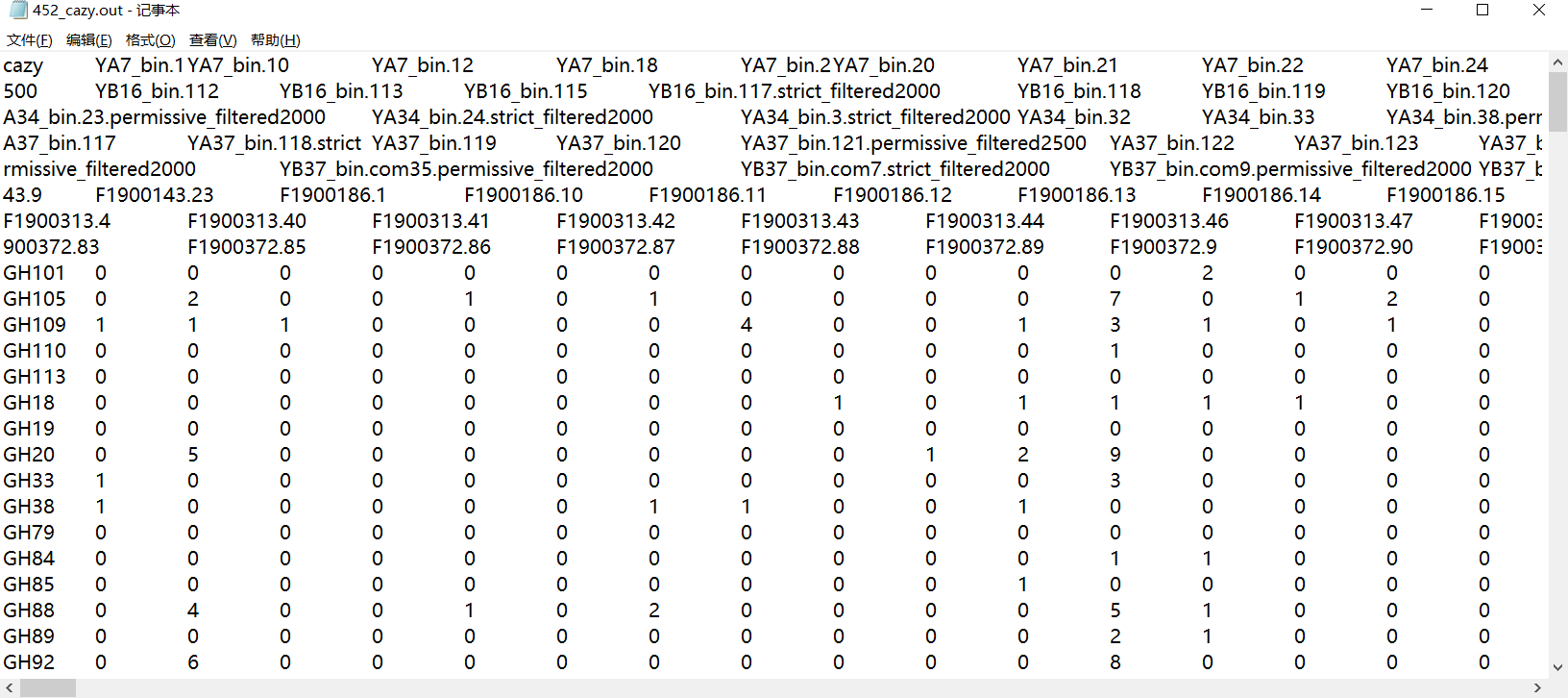
df<-read.table("452_cazy.out",sep = "\t",header = T,row.names=1)
df<-data.frame(t(df))
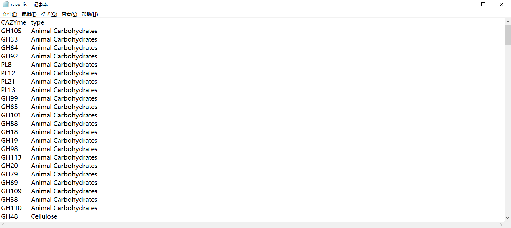
ko<-read.table("cazy_list.txt",sep="\t") #ko_others
bin_info<-read.table("all_452_mag_info.txt",sep="\t",header = T)
sub_ko_df<-df[,colnames(df) %in% ko[,1]]
sub_ko_df_ant<-data.frame(Bin=row.names(sub_ko_df),rawrank=c(1:nrow(sub_ko_df)))
sub_ko_df_plot<-sub_ko_df
sub_ko_df_ant_info<-merge(sub_ko_df_ant,bin_info,by="Bin")

数据mapping
#order mapping
sub_ko_df_ant_info_ordered<-sub_ko_df_ant_info[order(sub_ko_df_ant_info$rawrank),]
#order raw data
sub_ko_df_ant_info_ordered<-sub_ko_df_ant_info[order(sub_ko_df_ant_info$rawrank),]
颜色设置
c1<-c("#76c5ad","#e89f67") #Cultured uncultured
c2<-c("#6a92a7","#c0e9f2") #High abundance Low abundance
c3<-rev(c("#4B78A5","#A8514B","#8BA156","#6A6599FF","#4697AB","#CE8844","#5A8CBF","#A20056B2","#008B45B2","#BB0021B2","#54B0C5","#D5928F","#90ACD2","#F39B7FB2","#BBCE95","#AC9CC0","#84D7E1FF","#FBB98B","#C3CFE3","#E4C4C2","#D6E1C5"))
sub_ko_df_ant_info_ordered$Phylum<-factor(sub_ko_df_ant_info_ordered$Phylum,
                                          levels=c("p_Firmicutes","p_Proteobacteria","p_Bacteroidetes","p_Actinobacteria","p_Fusobacteria","p_Verrucomicrobia","p_Euryarchaeota"))

#用于第二轮颜色对齐
a=character()
cc=c("#d6ffc5","#E4C4C2","#c3cfe3","#fbb98b","#84d7e1","#ac9cc0","#bbce95")
cha_grp<-c("p_Firmicutes","p_Proteobacteria","p_Bacteroidetes","p_Actinobacteria","p_Fusobacteria","p_Verrucomicrobia","p_Euryarchaeota")
for (i in 1:length(cha_grp)){
  a[cha_grp[i]]=cc[i]
}
phylum_col<-a
Cultured_uncultured<-c("Y"="#e89f67","N"="#76c5ad")
Abundance_col<-c("Low"="#c0e9f2","High"="#6a92a7")

colant<-data.frame(ko=colnames(sub_ko_df_plot))
colant$rank<-1:nrow(colant)
colant<-merge(colant,ko,by.x="ko",by.y="V1")
colant<-colant[order(colant$rank),]
排序
#列名排序,很重要
colant$V2<-factor(colant$V2, levels = c("Animal Carbohydrates","Plant Cell Wall Carbohydrates",
                                        "Mucin","pectin","Sucrose/Fructans","Starch","xylan","Cellulose","Other"))

sub_ko_df_ant_info_ordered$Phylum<-factor(sub_ko_df_ant_info_ordered$Phylum, levels=c("p_Firmicutes",
                                                                                      "p_Proteobacteria",
                                                                                      "p_Bacteroidetes",
                                                                                      "p_Actinobacteria",
                                                                                      "p_Fusobacteria",
                                                                                      "p_Verrucomicrobia",
                                                                                      "p_Euryarchaeota"))
ha_row2 = rowAnnotation(df = data.frame(Phylum =sub_ko_df_ant_info_ordered$Phylum,
                                        Cultured_uncultured = sub_ko_df_ant_info_ordered$Culture_or_Unculture,
                                        Abundance=sub_ko_df_ant_info_ordered$Abundance_v3),
                        col = list(Phylum = phylum_col, Cultured_uncultured=Cultured_uncultured,
                                   Abundance=Abundance_col), width = unit(0.5, "cm"))
绘图
h2=Heatmap(sub_ko_df_plot, name = "Gene number",
           col = colorRamp2(c(0,1,10,100),
                            c( "white","orange","#d73027","#762a83")),
           cluster_rows = T,show_column_names=T,cluster_columns=F,
           rect_gp = gpar(col = "gray",lwd = 0.01,alpha=0.2),
           row_names_gp = gpar(fontsize = 1) ,
           column_names_gp = gpar(fontsize = 2),
           column_names_side = "top",
           top_annotation = HeatmapAnnotation(Pathway = colant$V2),
           column_split =colant$V2 ,show_row_names=T,
           row_split=sub_ko_df_ant_info_ordered$Sample,
           right_annotation=ha_row2)
输出图形
h2_out<-as.ggplot(h2)
ggsave(h2_out, file="KEGG_scfa_plot.pdf", height = 10,width = 18)
教程代码:
途径一:到GitHub中获得

途径二:本教程打赏1元即可。
往期文章:
1. 最全WGCNA教程(替换数据即可出全部结果与图形)
2. 精美图形绘制教程
小杜的生信筆記,主要发表或收录生物信息学的教程,以及基于R的分析和可视化(包括数据分析,图形绘制等);分享感兴趣的文献和学习资料!!