1.贷款数据集介绍
导入所使用的的库
Plotly中的graph_objs是Plotly下的子模块,用于导入Plotly中所有图像对象,在导入相应的图形对象之后,便可以根据需要呈现的数据和自定义的图形规格参数来定义一个graph对象,再输入plotly.offline.iplot()中进行最终的呈现。
import pandas as pd
import numpy as np
import matplotlib
import matplotlib.pyplot as plt # for plotting
import seaborn as sns # for making plots with seaborn
color = sns.color_palette() # 调色板
import plotly.offline as py
py.init_notebook_mode(connected=True)
import plotly.graph_objs as go
import plotly.offline as offline
offline.init_notebook_mode()
import plotly.tools as tls
import squarify
from mpl_toolkits.basemap import Basemap
from numpy import array
from matplotlib import cm

# Supress unnecessary warnings so that presentation looks clean
import warnings
warnings.filterwarnings("ignore")

# Print all rows and columns
pd.set_option('display.max_columns', None)
pd.set_option('display.max_rows', None)

%matplotlib inline
数据集的情况:
kiva_loans_data = pd.read_csv("kiva_loans.csv") # 贷款数据集
kiva_mpi_locations_data = pd.read_csv("kiva_mpi_region_locations.csv") # 贷款人地理信息
loan_theme_ids_data = pd.read_csv("loan_theme_ids.csv")  # 贷款主要用途
loan_themes_by_region_data = pd.read_csv("loan_themes_by_region.csv")  # 地理信息与贷款用途

#loans_data = pd.read_csv("loans.csv")
lenders_data = pd.read_csv("lenders.csv") # 贷款方数据
loans_lenders_data = pd.read_csv("loans_lenders.csv") # 贷款借款方
country_stats_data = pd.read_csv("country_stats.csv") # 国家统计数据

mpi_national_data = pd.read_csv("MPI_national.csv") #国家多维贫困指数
mpi_subnational_data = pd.read_csv("MPI_subnational.csv") #贫困指数低的国家或地区
数据集的数据量:
print("Size of kiva_loans_data",kiva_loans_data.shape)
print("Size of kiva_mpi_locations_data",kiva_mpi_locations_data.shape)
print("Size of loan_theme_ids_data",loan_theme_ids_data.shape)
print("Size of loan_themes_by_region_data",loan_themes_by_region_data.shape)

print("***** Additional kiva snapshot******")
#print("Size of loans_data",loans_data.shape)
print("Size of lenders_data",lenders_data.shape)
print("Size of loans_lenders_data",loans_lenders_data.shape)
print("Size of country_stats_data",country_stats_data.shape)

print("*****Multidimensional Poverty Measures Data set******")
print("Size of mpi_national_data",mpi_national_data.shape)
print("Size of mpi_subnational_data",mpi_subnational_data.shape)
数据集概况:

include=["0"]将所有的指标都展示出来
 检查缺失值,算出所有缺失值的个数,进行排序,并计算出缺失值比例
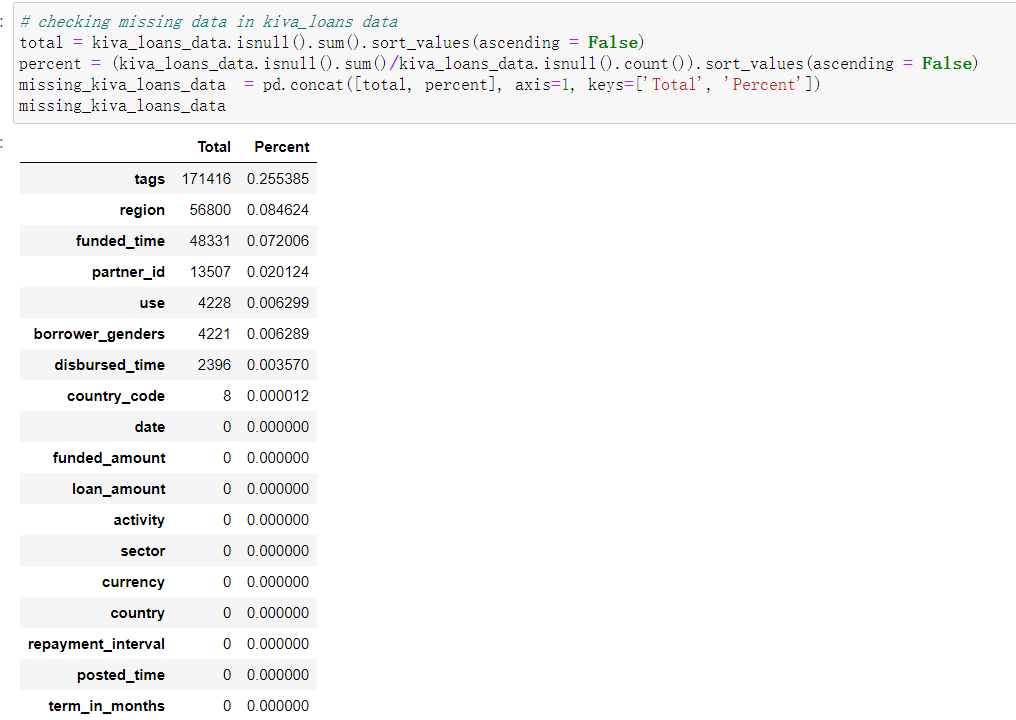
可以看出,处理tags以外,其他数值的缺失值较少

地区与贫困指数数据缺失值较多

贷款数据集缺失值较少
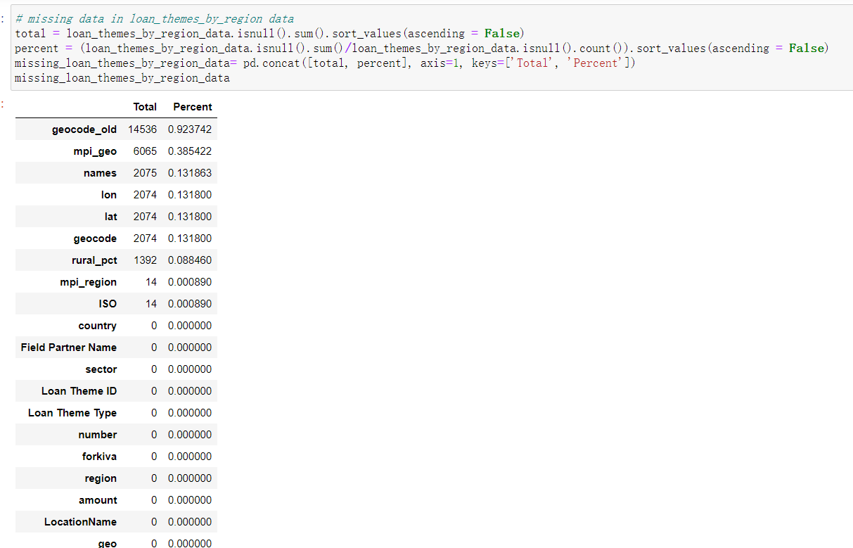
贷款用途与地区的数据中,geocode_old数据与mpi_geo缺失值较多,其他缺失值较少
2、数据可视化
1.贷款主要用途
plt.figure(figsize=(15,8))
sector_name = kiva_loans_data['sector'].value_counts()
sns.barplot(sector_name.values, sector_name.index)
for i, v in enumerate(sector_name.values):
    plt.text(0.8,i,v,color='k',fontsize=19)
plt.xticks(rotation='vertical')
plt.xlabel('Number of loans were given')
plt.ylabel('Sector Name')
plt.title("Top sectors in which more loans were given")
plt.show()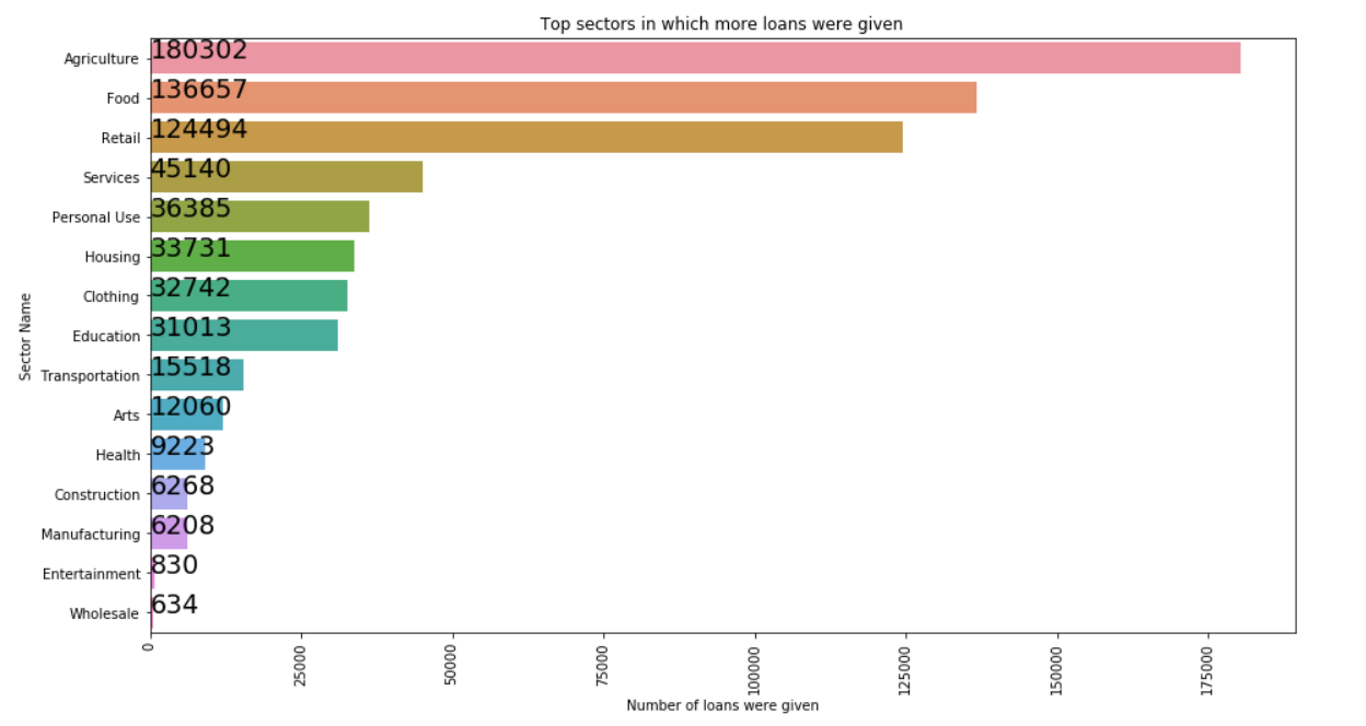
排名最前的是农业、食物、零售、服务、房子、衣服、教育等生活必需品
更加直观的图像:
plt.figure(figsize=(15,8))
count = kiva_loans_data['sector'].value_counts()
squarify.plot(sizes=count.values,label=count.index, value=count.values)
plt.title('Distribution of sectors')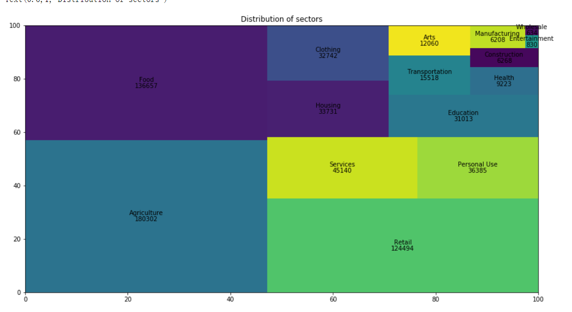
明细的用途:
plt.figure(figsize=(15,8))
count = kiva_loans_data['use'].value_counts().head(10)
sns.barplot(count.values, count.index, )
for i, v in enumerate(count.values):
    plt.text(0.8,i,v,color='k',fontsize=19)
plt.xlabel('Count', fontsize=12)
plt.ylabel('uses of loans', fontsize=12)
plt.title("Most popular uses of loans", fontsize=16)
水源、食物、药品最多
2.还款的情况
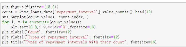

有钱就还以及月付最多
4.那些国家借款最多

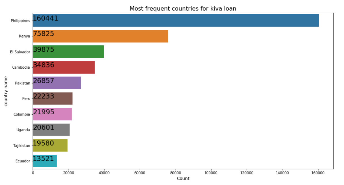
菲律宾,肯尼亚等贫穷落后的国家对贷款的需求最多
5.贷款的多少
plt.figure(figsize = (12, 8))
plt.scatter(range(kiva_loans_data.shape[0]), np.sort(kiva_loans_data.funded_amount.values))
plt.xlabel('index', fontsize=12)
plt.ylabel('loan_amount', fontsize=12)
plt.title("Loan Amount Distribution")
plt.show()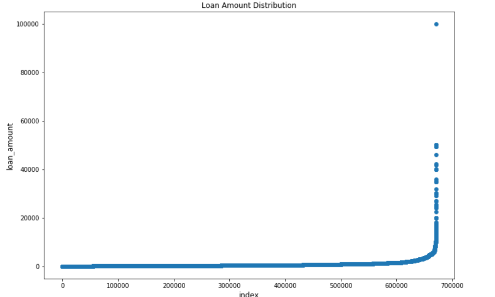
绝大多数人贷款额度比较小,贷款额度在20000以下,极小的点贷款额度较高
6.各个地区的需求情况
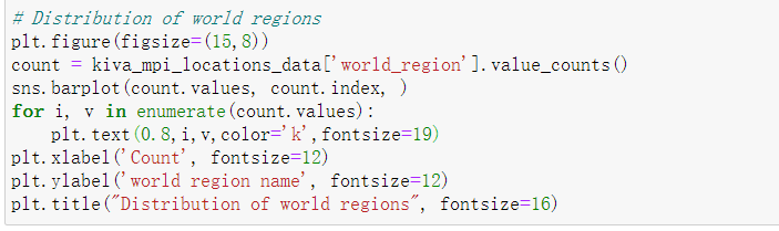

撒哈拉以南非洲地区需求比较大,欧洲和中亚地区基本没什么需求
7.贷款人的数量分布

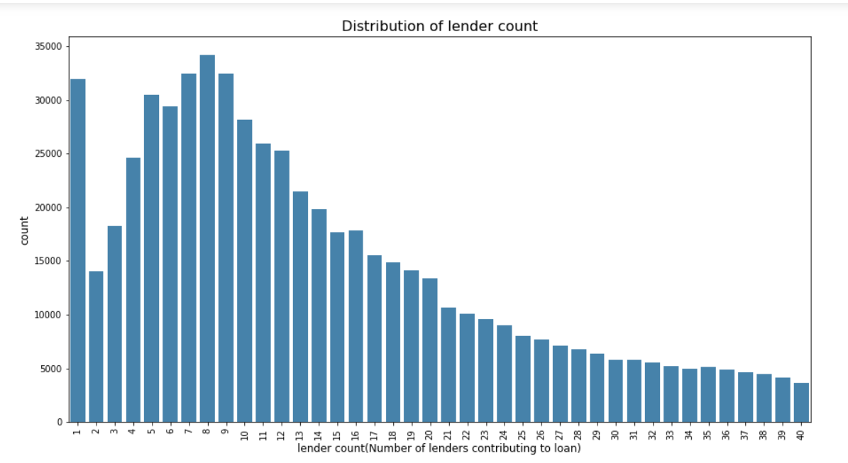
放款的人1个人,5-10人比较多
8.贷款的明细目的


一般的商店和农业贷款比较多
9.多久能还款
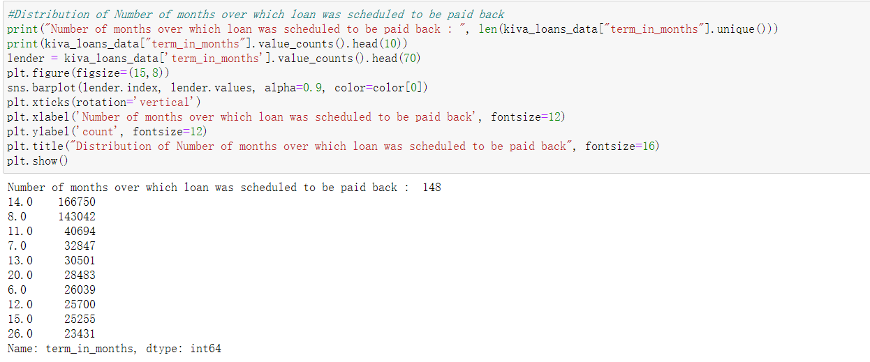

8个月,14个月还款的比较多。
9.性别比例
gender_list = []
for gender in kiva_loans_data["borrower_genders"].values:
    if str(gender) != "nan":
        gender_list.extend( [lst.strip() for lst in gender.split(",")] )
temp_data = pd.Series(gender_list).value_counts()

labels = (np.array(temp_data.index))
sizes = (np.array((temp_data / temp_data.sum())*100))
plt.figure(figsize=(15,8))

trace = go.Pie(labels=labels, values=sizes)
layout = go.Layout(title='Borrower Gender')
data = [trace]
fig = go.Figure(data=data, layout=layout)
py.iplot(fig, filename="BorrowerGender")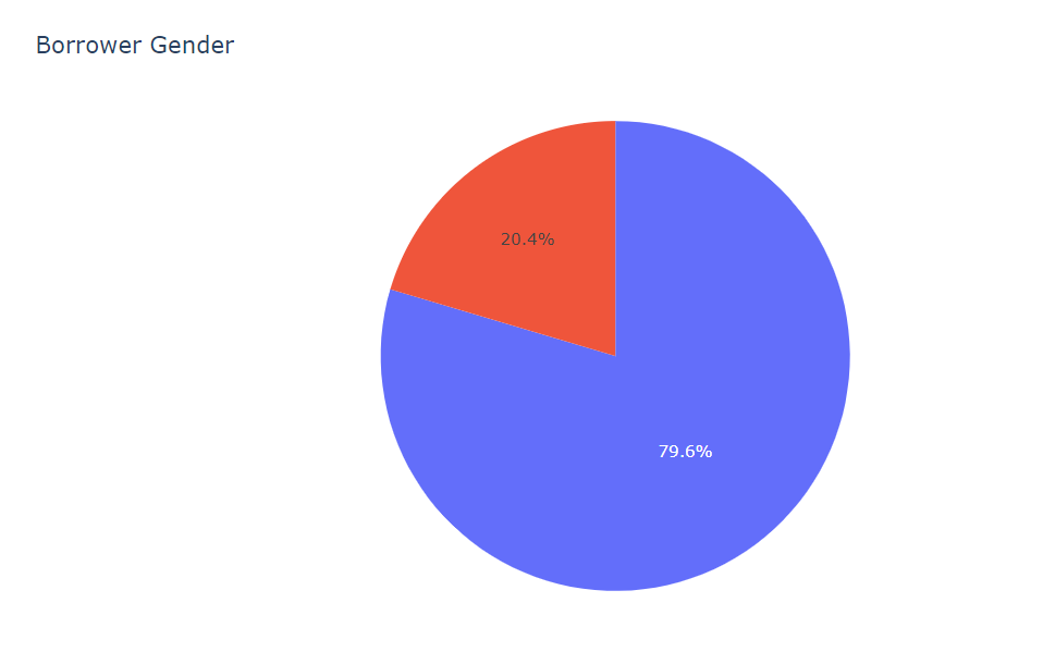
贷款女性居多
11.平均的额度
kiva_loans_data.borrower_genders = kiva_loans_data.borrower_genders.astype(str)
gender_data = pd.DataFrame(kiva_loans_data.borrower_genders.str.split(',').tolist())
kiva_loans_data['sex_borrowers'] = gender_data[0]
kiva_loans_data.loc[kiva_loans_data.sex_borrowers == 'nan', 'sex_borrowers'] = np.nan
sex_mean = pd.DataFrame(kiva_loans_data.groupby(['sex_borrowers'])['funded_amount'].mean().sort_values(ascending=False)).reset_index()
print(sex_mean)
g1 = sns.barplot(x='sex_borrowers', y='funded_amount', data=sex_mean)
g1.set_title("Mean funded Amount by Gender ", fontsize=15)
g1.set_xlabel("Gender")
g1.set_ylabel("Average funded Amount(US)", fontsize=12)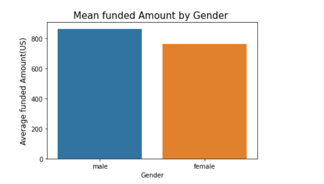
男性的平均额度较多
f, ax = plt.subplots(figsize=(15, 5))
print("Genders count with repayment interval monthly\n",kiva_loans_data['sex_borrowers'][kiva_loans_data['repayment_interval'] == 'monthly'].value_counts())
print("Genders count with repayment interval weekly\n",kiva_loans_data['sex_borrowers'][kiva_loans_data['repayment_interval'] == 'weekly'].value_counts())
print("Genders count with repayment interval bullet\n",kiva_loans_data['sex_borrowers'][kiva_loans_data['repayment_interval'] == 'bullet'].value_counts())
print("Genders count with repayment interval irregular\n",kiva_loans_data['sex_borrowers'][kiva_loans_data['repayment_interval'] == 'irregular'].value_counts())

sns.countplot(x="sex_borrowers", hue='repayment_interval', data=kiva_loans_data).set_title('sex borrowers with repayment_intervals');
男性一次性还款的居多
12.不同国家的贷款情况
countries_funded_amount = kiva_loans_data.groupby('country').mean()['funded_amount'].sort_values(ascending = False)
print("Top Countries with funded_amount(Dollar value of loan funded on Kiva.org)(Mean values)\n",countries_funded_amount.head(10))
data = [dict(
        type='choropleth',
        locations= countries_funded_amount.index,
        locationmode='country names',
        z=countries_funded_amount.values,
        text=countries_funded_amount.index,
        colorscale='Red',
        marker=dict(line=dict(width=0.7)),
        colorbar=dict(autotick=False, tickprefix='', title='Top Countries with funded_amount(Mean value)'),
)]
layout = dict(title = 'Top Countries with funded_amount(Dollar value of loan funded on Kiva.org)',
             geo = dict(
            showframe = False,
            #showcoastlines = False,
            projection = dict(
                type = 'Mercatorodes'
            )
        ),)
fig = dict(data=data, layout=layout)
py.iplot(fig, validate=False) 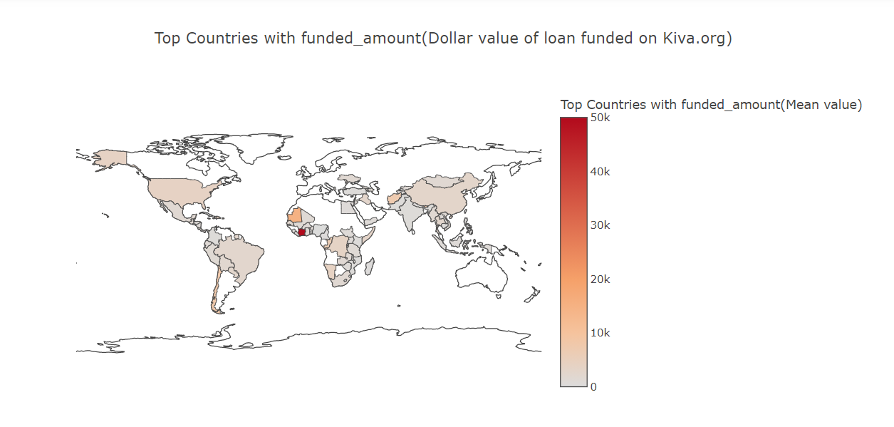
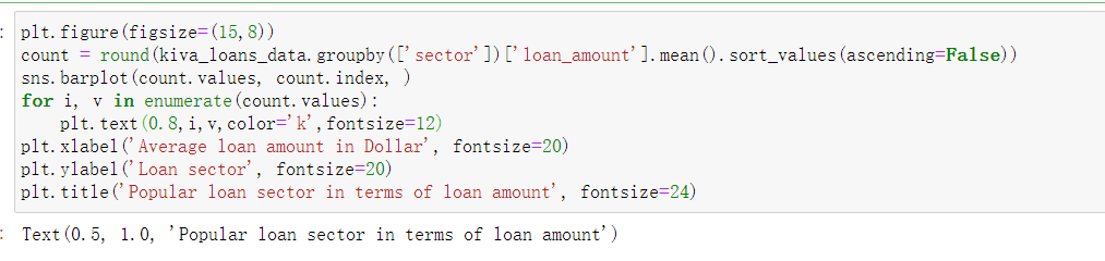
13.各种情况下平均贷款情况

14.哪些国家在数据集中比较抢眼呢
from wordcloud import WordCloud

names = kiva_loans_data["country"][~pd.isnull(kiva_loans_data["country"])]
#print(names)
wordcloud = WordCloud(max_font_size=50, width=600, height=300).generate(' '.join(names))
plt.figure(figsize=(15,8))
plt.imshow(wordcloud)
plt.title("Wordcloud for country Names", fontsize=35)
plt.axis("off")
plt.show() 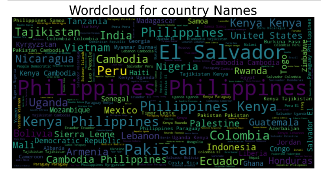
15.还款方式随时间的变动
kiva_loans_data['date'] = pd.to_datetime(kiva_loans_data['date'])
kiva_loans_data['date_month_year'] = kiva_loans_data['date'].dt.to_period("M")
plt.figure(figsize=(8,10))
g1 = sns.pointplot(x='date_month_year', y='loan_amount',
                   data=kiva_loans_data, hue='repayment_interval')
g1.set_xticklabels(g1.get_xticklabels(),rotation=90)
g1.set_title("Mean Loan by Month Year", fontsize=15)
g1.set_xlabel("")
g1.set_ylabel("Loan Amount", fontsize=12)
plt.show()
一次性偿还的方式比较多
14.不同国家贷款情况随时间的变化
kiva_loans_data['Century'] = kiva_loans_data.date.dt.year
loan = kiva_loans_data.groupby(['country', 'Century'])['loan_amount'].mean().unstack()
loan = loan.sort_values([2017], ascending=False)
f, ax = plt.subplots(figsize=(15, 20))
loan = loan.fillna(0)
temp = sns.heatmap(loan, cmap='Reds')
plt.show()
有些国家借款随着年份有着比较大的差异,可能是由于战乱、自然灾害等因素引起的
15.不同种类的还款方式对比
sector_repayment = ['sector', 'repayment_interval']
cm = sns.light_palette("red", as_cmap=True)
pd.crosstab(kiva_loans_data[sector_repayment[0]], kiva_loans_data[sector_repayment[1]]).style.background_gradient(cmap = cm) # 混淆矩阵
16.贷款金额与批下的金额的差异性
kiva_loans_data.index = pd.to_datetime(kiva_loans_data['posted_time'])
plt.figure(figsize = (12, 8))
ax = kiva_loans_data['loan_amount'].resample('w').sum().plot()
ax = kiva_loans_data['funded_amount'].resample('w').sum().plot()
ax.set_ylabel('Amount ($)')
ax.set_xlabel('month-year')
ax.set_xlim((pd.to_datetime(kiva_loans_data['posted_time'].min()),
             pd.to_datetime(kiva_loans_data['posted_time'].max())))
ax.legend(["loan amount", "funded amount"])
plt.title('Trend of loan amount V.S. funded amount')

plt.show()
17.针对个别地区
loan_use_in_india = kiva_loans_data['use'][kiva_loans_data['country'] == 'India']
percentages = round(loan_use_in_india.value_counts() / len(loan_use_in_india) * 100, 2)[:13]
trace = go.Pie(labels=percentages.keys(), values=percentages.values, hoverinfo='label+percent',
                textfont=dict(size=18, color='#000000'))
data = [trace]
layout = go.Layout(width=800, height=800, title='Top 13 loan uses in India',titlefont= dict(size=20),
                   legend=dict(x=0.1,y=-0.7))

fig = go.Figure(data=data, layout=layout)
offline.iplot(fig, show_link=False) 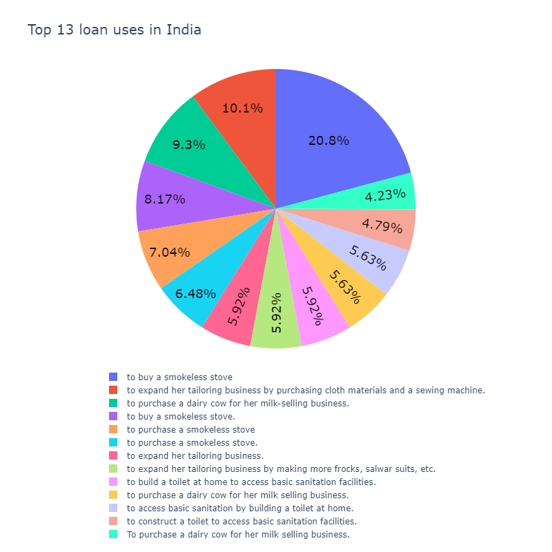
在印度最大的贷款用途是购买无烟炉,然后通过购买布料和缝纫机来扩大她的剪裁业务。
18.贷款最多的7个地区
# Plotting these Top 7 funded regions on India map. Circles are sized according to the
# regions of the india

plt.subplots(figsize=(20, 15))
map = Basemap(width=4500000,height=900000,projection='lcc',resolution='l',
                    llcrnrlon=67,llcrnrlat=5,urcrnrlon=99,urcrnrlat=37,lat_0=28,lon_0=77)

map.drawmapboundary ()
map.drawcountries ()
map.drawcoastlines ()

lg=array(top7_cities['lon'])
lt=array(top7_cities['lat'])
pt=array(top7_cities['amount'])
nc=array(top7_cities['region'])

x, y = map(lg, lt)
population_sizes = top7_cities["amount"].apply(lambda x: int(x / 3000))
plt.scatter(x, y, s=population_sizes, marker="o", c=population_sizes, alpha=0.9)


for ncs, xpt, ypt in zip(nc, x, y):
    plt.text(xpt+60000, ypt+30000, ncs, fontsize=20, fontweight='bold')

plt.title('Top 7 funded regions in India',fontsize=30)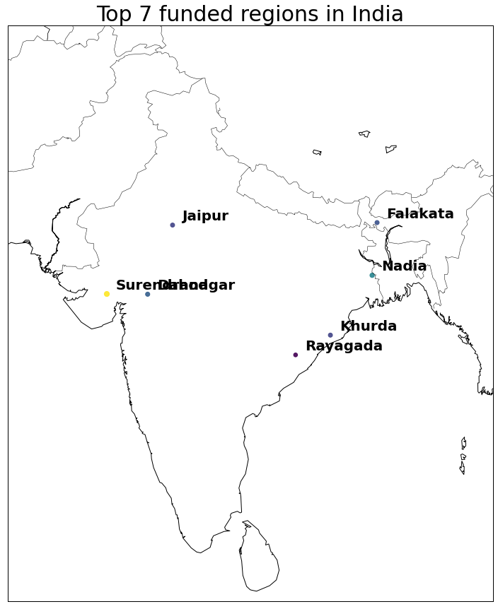
19.贫苦指数
data = [ dict(
        type = 'scattergeo',
        lat = kiva_mpi_locations_data['lat'],
        lon = kiva_mpi_locations_data['lon'],
        text = kiva_mpi_locations_data['LocationName'],
        marker = dict(
             size = 10,
             line = dict(
                width=1,
                color='rgba(102, 102, 102)'
            ),
            cmin = 0,
            color = kiva_mpi_locations_data['MPI'],
            cmax = kiva_mpi_locations_data['MPI'].max(),
            colorbar=dict(
                title="Multi-dimenstional Poverty Index"
            )
        ))]
layout = dict(title = 'Multi-dimensional Poverty Index for different regions')
fig = dict( data=data, layout=layout )
py.iplot(fig)
19.人类发展指数
data = [dict(
type='choropleth',
locations= country_stats_data['country_name'],
locationmode='country names',
z=country_stats_data['hdi'],
text=country_stats_data['country_name'],
colorscale='Red',
marker=dict(line=dict(width=0.7)),
colorbar=dict(autotick=False, tickprefix='', title='Human Development Index(HDI)'),
)]
layout = dict(title = 'Human Development Index(HDI) for different countries',)
fig = dict(data=data, layout=layout)
py.iplot(fig, validate=False)
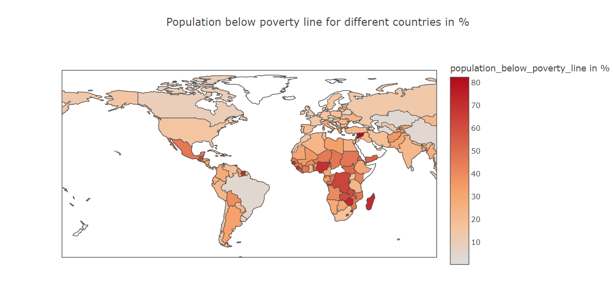
20.不同国家贫穷对比

data = [dict(
        type='choropleth',
        locations= country_stats_data['country_name'],
        locationmode='country names',
        z=country_stats_data['population_below_poverty_line'],
        text=country_stats_data['country_name'],
        colorscale='Red',
        marker=dict(line=dict(width=0.7)),
        colorbar=dict(autotick=False, tickprefix='', title='population_below_poverty_line in %'),
)]
layout = dict(title = 'Population below poverty line for different countries in % ',)
fig = dict(data=data, layout=layout)
py.iplot(fig, validate=False)