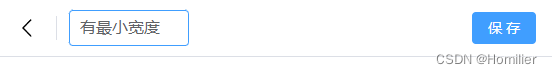
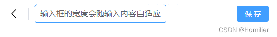
效果:
思路:
1.input用绝对定位,使其宽度与父容器保持一致
2.利用一个隐藏的div对齐input的内容,以此来撑开父容器宽度
(对齐内容除了输入文本外,还需包含padding,border、margin、font-size、font-family等所有会影响元素宽度的样式)
实现:
template代码:会使用到下面两个事件,不懂的朋友可以去看看文档。
compositionupdate - Web API 接口参考 | MDN
compositionend - Web API 接口参考 | MDN
<template>
  <div>
    <div class="nav-bar flex-row flex-center">
      <div class="nav-back">
        <el-icon :size="24"><arrow-left /></el-icon>
      </div>
      <div class="nav-title-wrap">
        <!-- 采用绝对定位的input -->
        <div class="nav-title">
          <el-input v-model="title" placeholder="" @compositionupdate="titleCompositionUpdate" @compositionend="titleCompositionEnd"></el-input>
        </div>
        <!-- 一个对齐input内容的不可见div -->
        <div class="nav-title-hidden">{

   { title }}{

   { titleUpdate }}</div>
      </div>
      <div class="flex-1"></div>
      <el-button type="primary">保 存</el-button>
    </div>
  </div>
</template>
script代码:主要处理输入法在中文模式下,输入拼音时会回显到输入框中,会影响到input宽度,所以需要捕获其输入备选状态下的内容
(用的Typescript语言,不懂的前端朋友只要看核心逻辑就好了)
<script setup lang="ts">
import { ArrowLeft, ArrowDown } from '@element-plus/icons-vue'
import { reactive, ref } from 'vue'
const title = ref('') // 已输入的标题内容
const titleUpdate = ref('') // 输入法中文模式下正在输入的拼音内容

function titleCompositionUpdate(e: any) {
  console.log(e)
  titleUpdate.value = e.data
}

function titleCompositionEnd(e: any) {
  titleUpdate.value = ''
}
</script>
<style lang="less" scoped>
.flex-row {
  position: relative;
  display: flex;
  flex-direction: row;
}
.flex-1 {
  position: relative;
  flex: 1;
  min-width: 0;
}
.flex-center {
  align-items: center;
}
.nav-bar {
  position: fixed;
  top: 0;
  left: 0;
  right: 0;
  height: 56px;
  background-color: #fff;
  z-index: 99;
  box-shadow: 0 0 0 1px var(--el-input-border-color,var(--el-border-color));
  padding-right: 16px;
  .nav-back {
    width: 56px;
    min-width: 56px;
    border-right: 1px solid var(--el-border-color);
    text-align: center;
    height: 24px;
  }
  .nav-title-wrap {
    width: auto;
    min-width: 120px;
    margin: 0 12px;
    position: relative;
    height: 36px;

    .nav-title {
      position: absolute;
      top: 0;
      left: 0;
      width: 100%;
      height: 100%;
      z-index: 1;
      /deep/ .el-input {
        font-size: 16px;
      }
    }

    .nav-title-hidden {
      height: 0;
      overflow: hidden;
      white-space: nowrap;
      // 对齐input所有会影响宽度的样式
      padding: 0 11px;
      font-size: 16px;
      font-family: var(--el-font-family);
    }
  }

}
</style>