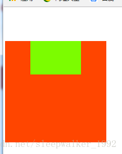
方法一:儿子绝对定位或相对定位,这样儿子脱离标准流,父亲有固定宽高,用儿子的margin去挤父亲
<!DOCTYPE html>
<html lang="en">
<head>
    <meta charset="UTF-8">
    <title>Title</title>
    <style>
        .father{
            width: 600px;
            height: 600px;
            background-color: orangered;
        }
        .son{
            width: 300px;
            height: 200px;
            background-color: lawngreen;
            position: absolute;
            margin: 200px 150px;
        }
    </style>
</head>
<body>
<div class="father">
    <div class="son"></div>
</div>
</body>
</html>
注意:如果儿子没有绝对定位或相对定位,且
父亲没有
border
,那么儿子的
margin
实际上踹的是“流”,踹的是这“行”。如果用margin-top,父亲整体也掉下来了。如下:
方法二、如果给父亲加一个border,就可以父亲,儿子都不定位,用儿子的margin去挤父亲,实现儿子居中。
<!DOCTYPE html>
<html lang="en">
<head>
    <meta charset="UTF-8">
    <title>Title</title>
    <style>
        .father{
            width: 600px;
            height: 600px;
            background-color: orangered;
            border: 1px solid white;
        }
        .son{
            width: 300px;
            height: 200px;
            background-color: lawngreen;
            margin: 200px 150px;
        }
    </style>
</head>
<body>
<div class="father">
    <div class="son"></div>
</div>
</body>
</html>
方法三、子绝父相(儿子绝对定位,父亲相对定位),定位到大盒子的宽高一半的位置,再上下各margin负的自己宽高的一半
<!DOCTYPE html>
<html lang="en">
<head>
    <meta charset="UTF-8">
    <title>Title</title>
    <style>
        .father{
            width: 600px;
            height: 600px;
            background-color: orangered;
            position: relative;
        }
        .son{
            width: 300px;
            height: 200px;
            background-color: lawngreen;
            position: absolute;
            top: 50%;
            left: 50%;
            margin-top: -100px;
            margin-left: -150px;
        }
    </style>
</head>
<body>
       <div class="father">
           <div class="son"></div>
       </div>
</body>
</html>
方法四、子绝父相,定位到大盒子的宽高一半的位置,再用transform: translate向左向上移动自己宽高的一半
<!DOCTYPE html>
<html lang="en">
<head>
    <meta charset="UTF-8">
    <title>Title</title>
    <style>
        .father{
            width: 600px;
            height: 600px;
            background-color: orangered;
            position: relative;
        }
        .son{
            width: 300px;
            height: 200px;
            background-color: lawngreen;
            position: absolute;
            top: 50%;
            left: 50%;
            /*用transform向左(上)平移它自己宽度(高度)的50%,也就达到居中效果了*/
            transform: translate(-50%,-50%);
        }
    </style>
</head>
<body>
       <div class="father">
           <div class="son"></div>
       </div>
</body>
</html>
方法五:绝对布局
<!DOCTYPE html>
<html lang="en">
<head>
    <meta charset="UTF-8">
    <title>Title</title>
    <style>
        .father{
            width: 600px;
            height: 600px;
            background-color: orangered;
            position: relative;
        }
        .son{
            width: 300px;
            height: 200px;
            background-color: lawngreen;
            position: absolute;
            top: 0;
            bottom: 0;
            left: 0;
            right: 0;
            margin: auto;
        }
    </style>
</head>
<body>
<div class="father">
    <div class="son"></div>
</div>
</body>
</html>
方法六:使用table-cell
<!DOCTYPE html>
<html lang="en">
<head>
    <meta charset="UTF-8">
    <title>Title</title>
    <style>
        .father{
            width: 600px;
            height: 600px;
            background-color: orangered;
            display: table-cell;
            vertical-align: middle;
            text-align: center;
        }
        .son{
            width: 300px;
            height: 200px;
            background-color: lawngreen;
            display: inline-block;
        }
    </style>
</head>
<body>
<div class="father">
    <div class="son"></div>
</div>
</body>
</html>
display: table-cell;和 vertical-align: middle;两句实现垂直居中
text-align: center;和display: inline-block;两句实现水平居中
方法七、用margin: 0 auto;代替text-align: center;和display: inline-block;这两句
<!DOCTYPE html>
<html lang="en">
<head>
    <meta charset="UTF-8">
    <title>Title</title>
    <style>
        .father{
            width: 600px;
            height: 600px;
            background-color: orangered;
            display: table-cell;
            vertical-align: middle;
        }
        .son{
            width: 300px;
            height: 200px;
            background-color: lawngreen;
            margin: 0 auto;
        }
    </style>
</head>
<body>
<div class="father">
    <div class="son"></div>
</div>
</body>
</html>
方法八:利用行高和文本居中
<!DOCTYPE html>
<html lang="en">
<head>
    <meta charset="UTF-8">
    <title>Title</title>
    <style>
        .father{
            width: 600px;
            height: 600px;
            background-color: orangered;
            text-align: center;
            line-height: 600px;
        }
        .son{
            width: 300px;
            height: 200px;
            background-color: lawngreen;
            display: inline-block;
            vertical-align: middle;
        }
    </style>
</head>
<body>
<div class="father">
    <div class="son"></div>
</div>
</body>
</html>
方法九:使用弹性布局flex
<!DOCTYPE html>
<html lang="en">
<head>
    <meta charset="UTF-8">
    <title>Title</title>
    <style>
        .father{
            width: 600px;
            height: 600px;
            background-color: orangered;
            display: flex;
            /*水平居中*/
            justify-content: center;
            /*垂直居中*/
            align-items: center;
        }
        .son{
            width: 300px;
            height: 200px;
            background-color: lawngreen;
        }
    </style>
</head>
<body>
<div class="father">
    <div class="son"></div>
</div>
</body>
</html>
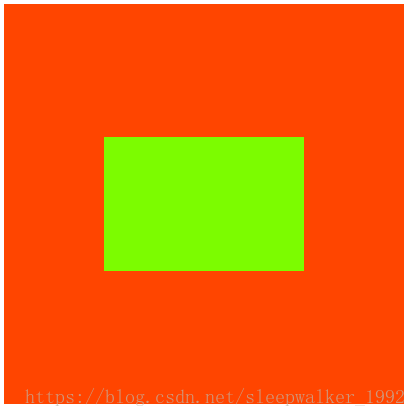
上面几种方法结果都是如下所示:
补充知识点:
绝对定位:
一个绝对定位的元素,如果父辈元素中出现了也定位了的元素,那么将以父辈这个元素,为参考点。
工程上,“子绝父相”有意义,父亲没有脱标,儿子脱标在父亲的范围里面移动。
绝对定位之后,所有标准流的规则,都不适用了。所以margin:0 auto;失效。
display:inline和display:inline-block,会使margin:0 auto;失效。
固定宽度的盒子才能使用margin:0 auto;居中