水平垂直居中固定比例 Div
场景:div 宽度百分比,高宽固定比例,水平垂直居中展示
对于这种情况肯定会有多种实现,有的可能用 js 去计算设计,有的可能直接用 css 实现,而 css 实现又会有多种实现方式。下面主要讨论的是用 css 绝对定位实现的一种方式。对于本文来说,这种效果的实现是次要的,我们主要来讨论一下它里面所涉及到的知识点,细细分析下来,是会有很多值得注意的知识点的。
好的,先看效果图: 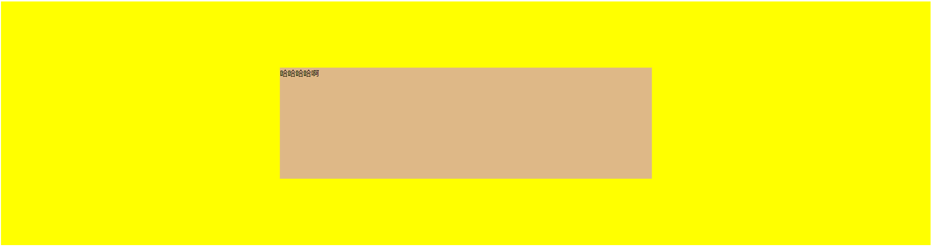
代码:
<!DOCTYPE html>
<html lang="en">

<head>
	<meta charset="UTF-8">
	<title>transition</title>
	<style type="text/css">
		.main {
			width: 100%;
			height: 800px;
			background: yellow;
		}

		.wrap {
			position: relative;
			width: 40%;
			height: 100%;
			left: 50%;
			transform: translate(-50%);
		}

		.a1 {
			position: absolute;
			width: 100%;
			height: 0;
			padding-bottom: 75%;
			background: burlywood;
			top: 50%;
			transform: translate(0, -50%);
		}
	</style>
</head>

<body>
	<div class="main">
		<div class="wrap">
			<div class="a1">哈哈哈哈啊</div>
		</div>
	</div>
</body>

</html>
知识点1.
首先,对于 position 属性有很多可选值,我们用到的 relative、absolute 当然还包括fixed 都是让 top/bottom/left/right 属性生效的 position 属性。所以我们可以在居中元素的外层包裹一层 wrap,先让它左右居中。通过 left 属性的设置,还有就是 transform: translate(-50%);。
知识点2.
现在就要讲一讲 transform 了。
MDN transform:
The CSStransformproperty lets you modify the coordinate space of the CSS visual formatting model. Using it, elements can be translated, rotated, scaled, and skewed.
transform 可以修改的是元素在 CSS 视觉模型中的坐标空间,translate 是其中的平移操作,我们让元素向左平移自己的 50% 的宽度,就实现它的水平居中了。
知识点3.
padding-bottom: 75%
因为我们要实现的是 div 等比例展示,这个例子中的就是宽高比 4:3。我们把居中元素的 height 属性设置为 0,然后用 padding-bottom 撑开它的高度,利用的就是 padding 属性百分比的计算是以父级元素的宽度为基准的。居中元素的 width 是父级的 100%,padding-bottom: 75% 高度撑开就是父级的 75%,然后就是 4:3 啦。
对于 padding-bottom Values:
<length>
The size of the padding as a fixed value. Must be nonnegative.
<percentage>
The size of the padding as a percentage, relative to the width of the containing block.
总结
这就是利用绝对定位垂直水平居中等比元素的一种方式,灵活利用盒模型,可以组合出多种方式来,可以多多测试一下。