参考资料:Python编程从入门到实践
使用的Python版本:Python 3.6.5
系统:Windows
需要安装的包:matplotlib 版本2.2.2
matplotlib的官网:https://matplotlib.org/
mtaplotlib的简介:
Matplotlib is a Python 2D plotting library which produces publication quality figures in a variety of hardcopy formats and interactive environments across platforms. Matplotlib can be used in Python scripts, the Python and IPython shells, the Jupyter notebook, web application servers, and four graphical user interface toolkits.
matplotlib是一个 Python 2D 绘图库。
参照Python编程从入门到实践的15.1.3 在window安装 matplotlib,安装后进行测试,无误后开始学习matplotlib。
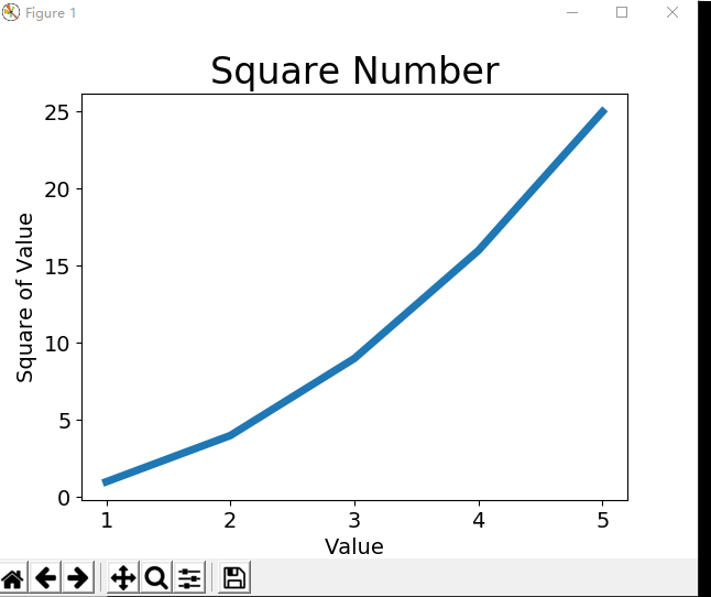
1.绘制简单的折线图
#导入模板pyplot并指定别名plt,pyplot包含很多生成图表的函数
import matplotlib.pyplot as plt

#创建2个列表
input_values = [1, 2, 3, 4, 5]
squares = [1, 4, 9, 16, 25]
#传输入值x和输出y值给squares,让plot()函数根据这些点绘制折线图,参数linewidth决定线条粗细
plt.plot(input_values, squares, linewidth=5)

#设置标题,给坐标轴加标签
plt.title("Square Number", fontsize=24)
plt.xlabel("Value", fontsize=14)
plt.ylabel("Square of Value", fontsize=14)

#设置刻度标记的大小
plt.tick_params(axis='both', labelsize=14)

#show()函数 打开matplotlib查看器,显示绘制的图形
plt.show()
显示如下:
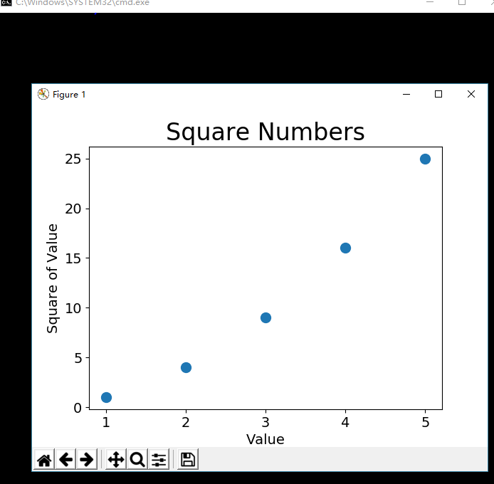
2.绘制散点图
#导入模板pyplot并指定别名plt
import matplotlib.pyplot as plt

#创建2个列表
x_values = [1, 2, 3, 4, 5]
y_values = [1, 4, 9, 16, 25]
#使用scatter()绘制散点
plt.scatter(x_values, y_values,s=100)

#设置图表标title()题并给坐标轴加上标签x/ylabel()
plt.title("Square Numbers", fontsize=24)
plt.xlabel("Value", fontsize=14)
plt.ylabel("Square of Value", fontsize=14)

#设置刻度标记大小tick_params()
plt.tick_params(axis='both', which='major',labelsize=14)

#plt.show()显示绘制的图形
plt.show()
图形如下:
scatter()的参数
c可以设置颜色。