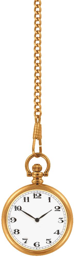
先为大家提供两张钟表和指针的图:(具体大小需要自己下去调)
然后是效果图:


代码如下:
<!DOCTYPE html>
<html lang="en">
<head>
    <meta charset="UTF-8">
    <title>摆动的钟表</title>
    <style type="text/css">
        body{
            margin: 0;
            background: #111;
            text-align: center;
        }
        h1{
            font-size: 14px;
            font-family: "Microsoft YaHei UI";
            text-align: center;
        }
        .stage{
            width: 120px;
            height:auto;
            margin: 0 auto;
            position: relative;
            -webkit-transform-origin: center top;
            -webkit-transform: rotate(-30deg);
            -webkit-animation: sway 2.2s infinite alternate ease-in-out;/*alternate:反向*/
        }
        .watch{
            width: 100%;
            height: auto;
        }
        .seconds{
            position: absolute;
            width: 8%;
            height:auto;
            bottom:11%;
            left:45.5%;
            -webkit-transform-origin: center 68%;
            -webkit-animation: second 60s infinite linear;/*infinite:无限循环*/
        }
        @-webkit-keyframes second {
            to{
                -webkit-transform: rotate(355deg);
            }
        }
        @-webkit-keyframes sway {
            to{
                -webkit-transform: rotate(30deg);
            }
        }
    </style>
</head>
<body>
    <div class="stage">
        <div class="watch"><img src="../img/clock.png" alt="" width="120" height="410"></div>
        <div class="seconds"><img src="../img/secondHand.png" alt="" width="10" height="55"></div>
    </div>
</body>
</html>