嗨嗨嗨这里是我的暑期学习日志。
第四天

今日学习
一、盒子模型
1. 外边距
Marigin属性用于设置外边距,即控制盒子和盒子之间的距离
         <style>
        div {


            width: 200px;
            height: 200px;
            background-color: pink;
        }

        .one {


            margin-bottom: 20px;
        }
    </style>
效果如下:
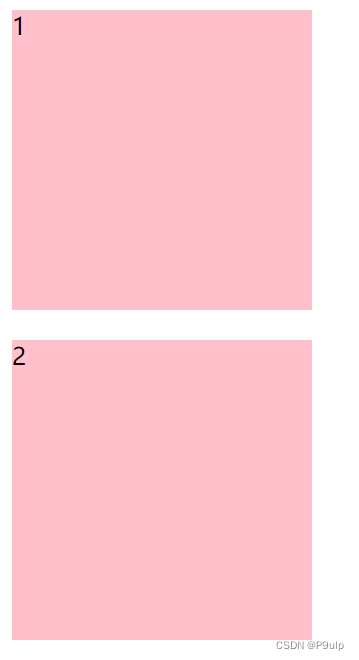
margin复合写法和padding一致
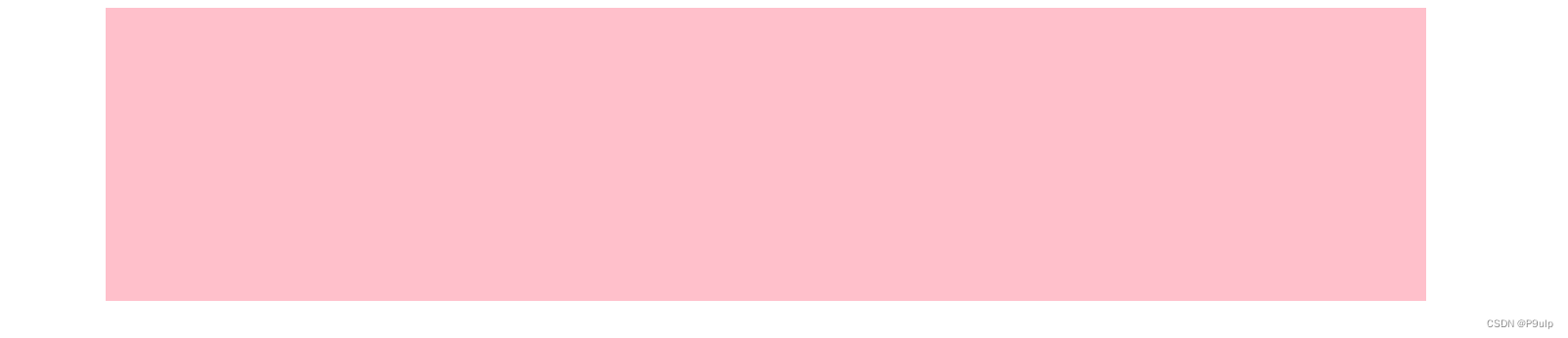
1.2 块级盒子的水平居中
- 盒子必须指定宽度(width)
- 盒子左右外边距都设置为auto
    <style>
        .headr {


            width: 900px;
            height: 200px;
            background-color: pink;
            margin:0 auto;
        }
    </style>
效果如下:
1.3 外边距典型应用
- 行内元素或行内块元素水平居中给其夫元素添加 text-align:center即可
1.4 外边距合并-嵌套块元素塌陷
使用margin定义块元素的垂直外边距时,可能会出现外边距合并。
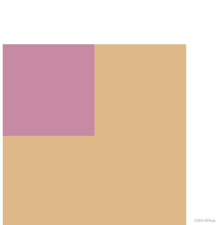
嵌套块元素垂直外边距的塌陷
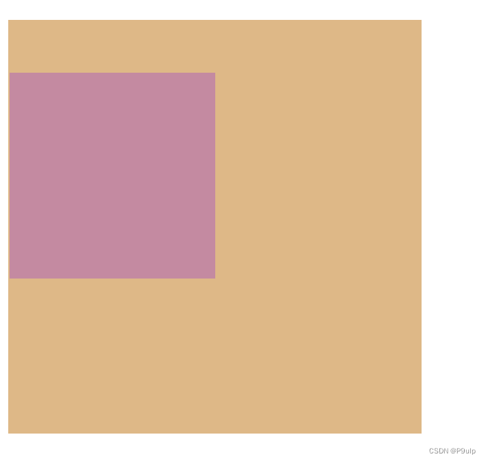
对于两个嵌套关系(父子关系)的块元素,父元素有上外边距同时子元素也有山外边距,此时父元素会塌陷较大的外边距值。
 <style>
        .father {


            width: 400px;
            height: 400px;
            background-color: burlywood;
            margin-top: 50px;
        }

        .son {


            width: 200px;
            height: 200px;
            background-color: rgb(196, 138, 161);
            margin-top: 100px;
        }
    </style>
效果如下: 父元素出现了塌陷
解决方案:
- 可以为父元素定义上边框
- 可以为父元素定义上内边距
- 可以为父元素添加Overflow:hidden
    <style>
        .father {


            width: 400px;
            height: 400px;
            background-color: burlywood;
            margin-top: 50px;
            border: 1px solid transparent;
            //给定一个边框
        }

        .son {


            width: 200px;
            height: 200px;
            background-color: rgb(196, 138, 161);
            margin-top: 50px;
        }
    </style>
效果如下:
1.5 清除内外边距
网页元素很多都带有默认的内外边距,且不同浏览器默认的也不一致。因此在布局前需要清楚网页元素的内外边距。
 <style>
        * {


            margin: 0;
            padding: 0;
        }
    </style>
PS:
- 行内元素为了照顾兼容性,尽量只设置左右内外边距,不要设置上下内外边距。
- 但是转换为块级和行内块元素就可以了
二、圆角边框
盒子可以变成圆角了!
border-radius属性用于设置元素的外边框圆角
<style>
        .box {


            height: 300px;
            width: 300px;
            background-color: rgb(255, 193, 206);
            /* 设置圆角边框 */
            border-radius: 100px;
        }
    </style>
| 值 | 描述 |
|---|---|
| h-shadow | 必需。水平阴影 |
| v-shadow | 必需。垂直阴影 |
| blur | 模糊距离 |
| spread | 阴影尺寸 |
| color | 阴影颜色 |
| inset | 将外部阴影改为内部阴影 |
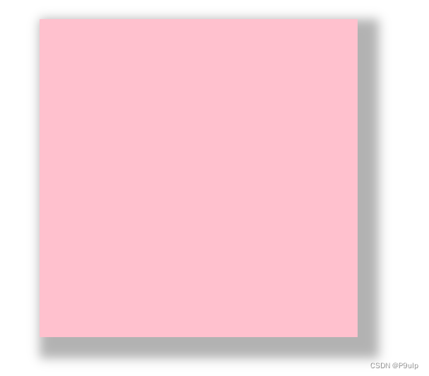
<style>
        .box {


            height: 300px;
            width: 300px;
            background-color: rgb(255, 193, 206);
            margin: 100px auto;
            /* 分别为水平阴影、垂直阴影、模糊距离、尺寸、颜色(半透明) */
            box-shadow: 10px 10px 10px 10px rgba(0, 0, 0, .3);

        }
    </style>
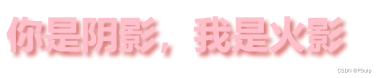
四、文字阴影
<style>
        p {


            color: pink;
            font-size: 50px;
            font-weight: 700;
            text-shadow: 5px 5px 6px rgb(216, 110, 110);
        }
    </style>
五、浮动
1. 传统网页布局的三种方式
- 普通流
- 浮动
- 定位
实际开发中一个页面包含三种布局方式
普通流
就是标签按照规定好默认方式排列
- 块级元素独占一行,从上向下顺序排
- 行内元素按左右顺序排
2. 为什么需要浮动
- 最典型的浮动:可以让多个块级元素一行内排列显示
- 网页布局第一准则:多个块级元素纵向排列用标准流,横向排列用浮动
3. 什么是浮动
float属性用于创建浮动框,将其移动到一边,直到左边缘或右边缘触及包含块或另一个浮动框的效果
语法:
选择器{float:属性值}
| 属性值 | 描述 |
|---|---|
| none | 不浮动(默认) |
| left | 向左浮动 |
| right | 向右浮动 |
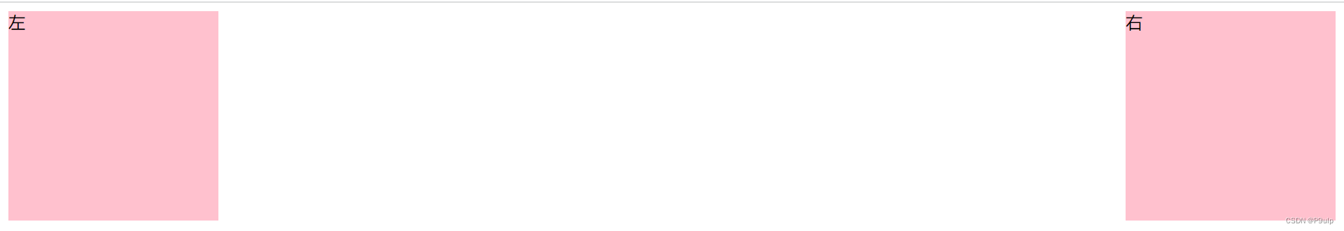
  <style>
        .left {


            height: 200px;
            width: 200px;
            background-color: rgb(255, 193, 206);
            /* 靠左 */
            float: left;
        }

        .right {


            height: 200px;
            width: 200px;
            background-color: rgb(255, 193, 206);
            /* 靠右 */
            float: right;
        }
    </style>
4.浮动特性(重难点)
1.设置浮动元素最重要特性:
- 脱离标准流的控制移动到指定位置,称为脱标
- 浮动的盒子不再保留原先的位置
2.浮动的元素是互相仅靠在一起(不会有缝隙),如果父级宽度装不下这些浮动的盒子,多出的盒子会另起一行对齐
3.浮动元素具有行内块元素特性
任何元素添加浮动之后都会有行内块元素特性
5. 浮动元素经常和标准流父级搭配使用
为了约束浮动元素位置,我们网页布局一般采取的策略是:
先用标准流的父级元素排列上下位置,之后内部子元素采取浮动排列左右位置,符合网页布局第一准则
6. 浮动布局注意点
- 浮动和标准流的父盒子搭配
先用标准流的父元素排列上下位置,之后内部子元素采取浮动排列左右位置 - 一个元素浮动了,其余兄弟元素也要浮动
- 一个盒子里面有多个盒子,如果其中一个盒子浮动了,那么其他兄弟也应该浮动,以防止引起问题
浮动的盒子只会影响盒子后面的标准流,不会影响前面的标准流
7.清除浮动
在某些情况下不方便直接给父元素设置高度
但由于浮动元素不再占用原文档流的位置,所以会对后面的元素排版产生影响
所以这时候需要清除浮动
清除浮动之后,父级就会根据浮动的子盒子自动检测高度 ,父级有了高度,就不会影响下面的标准流了
选择器{clear:属性}
清除浮动的方法
- 额外标签法——w3c推荐
- 父级添加overflow属性
- 父级添加alfter伪元素
- 父级添加双伪元素
7.1额外标签法
在浮动元素末尾添加一个空的标签
    <style>
        .clear{


            clear: both;
        }
    </style>
</head>
<body>
    <div class="box">
        <div class="damao">大毛</div>
        <div class="ermao">二毛</div>
        <!-- 添加新的标签 -->
        <div class="clear"></div>
    </div>
</body>
7.2 给父亲添加overflow
  <style>
        .box{


        	<!--添加overflow-->
            overflow: hidden;
        }
    </style>
</head>
<body>
    <div class="box">
        <div class="damao">大毛</div>
        <div class="ermao">二毛</div>
    </div>
- 优点:代码简洁
- 缺点:无法显示溢出部分
7.3 after伪元素
<style>
 .clearfix:after{


            content: '';
            display: block;
            height: 0;
            clear: both;
            visibility: hidden;
        }
        .clearfix{


            /* IE6、7专有 */
            *ZMM:1;
        }
       </style>
额外标签法的升级版,给父类添元素
- 优点:没有增加标签,结构更简单
- 缺点:没有照顾低版本浏览器
7.4 双伪元素清除浮动
也是给父类添加元素
 <style>
        .clearfix:before,
        .clearfix:after{


            content: '';
            /* 将模式转换为表格 */
            display: table;
        }
        .clearfix:after{


            clear: both;
        }
        .clearfix{


            /* IE6、7专有 */
            *ZMM:1;

        }
    </style>
- 优点:代码更简单
- 缺点:没有照顾低版本浏览器
六、案例
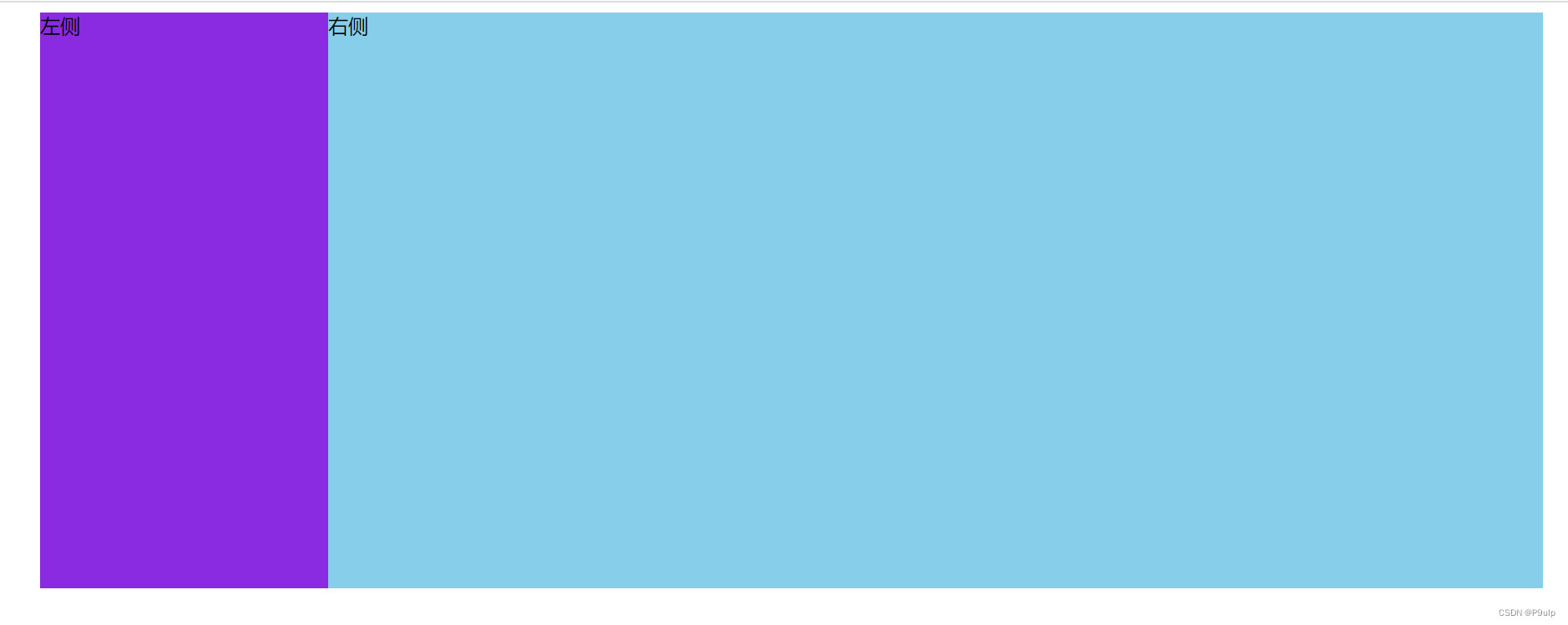
1.布局1
<!DOCTYPE html>
<html lang="en">

<head>
    <meta charset="UTF-8">
    <meta http-equiv="X-UA-Compatible" content="IE=edge">
    <meta name="viewport" content="width=device-width, initial-scale=1.0">
    <title>小米商场</title>
    <style>
        .box {


            width: 1200px;
            height: 460px;
            background-color: pink;
            margin: 0 auto;
        }

        .left {


            float: left;
            width: 230px;
            height: 460px;
            background-color: blueviolet;
        }

        .right {


            float: left;
            ;
            width: 970px;
            height: 460px;
            background-color: skyblue;
        }
    </style>
</head>

<body>
    <div class="box">
        <div class="left">左侧</div>
        <div class="right">右侧</div>
    </div>
</body>

</html>
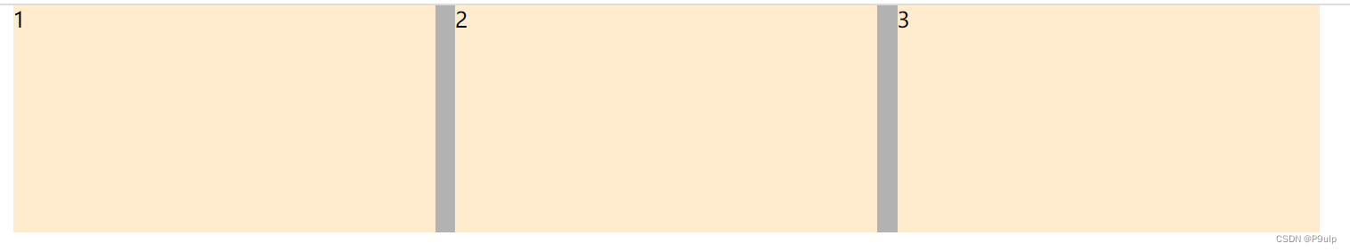
2.布局2
<!DOCTYPE html>
<html lang="en">

<head>
    <meta charset="UTF-8">
    <meta http-equiv="X-UA-Compatible" content="IE=edge">
    <meta name="viewport" content="width=device-width, initial-scale=1.0">
    <title>布局案例2</title>
    <style>
        * {


            margin: 0;
            padding: 0;
        }

        li {


            list-style: none;
        }

        .box {


            width: 978px;
            height: 170px;
            background-color: rgb(179, 178, 178);
            margin: 0 auto;
        }

        ul li {


            float: left;
            width: 316px;
            height: 170px;
            background-color: blanchedalmond;
            margin-right: 15px;
        }

        .last {


            margin-right: 0;
        }
    </style>
</head>

<body>
    <ul class="box">
        <li>1</li>
        <li>2</li>
        <li class="last">3</li>
    </ul>
</body>

</html>
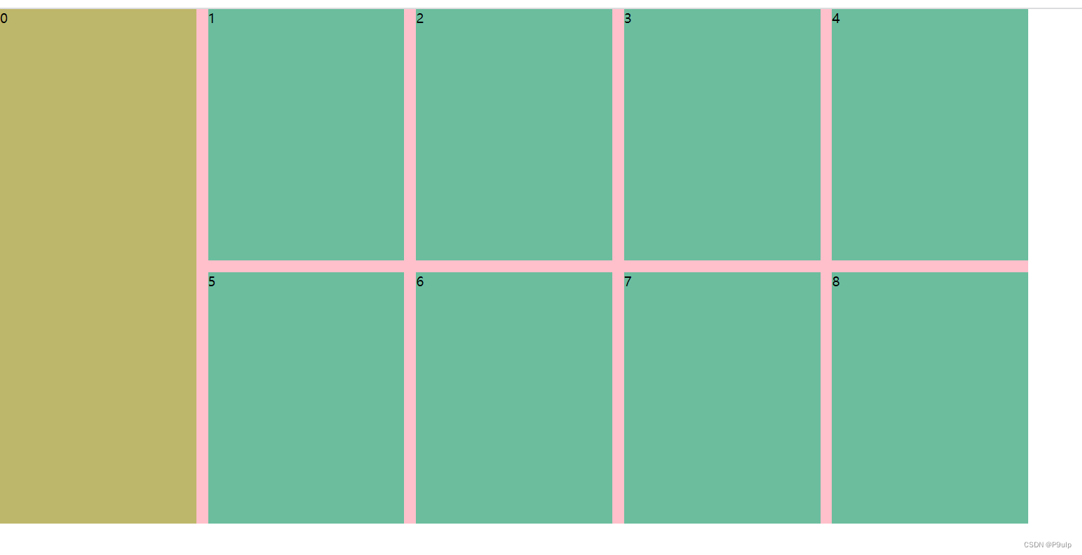
3.布局3
<!DOCTYPE html>
<html lang="en">

<head>
    <meta charset="UTF-8">
    <meta http-equiv="X-UA-Compatible" content="IE=edge">
    <meta name="viewport" content="width=device-width, initial-scale=1.0">
    <title>案例三</title>
    <style>
        * {


            margin: 0;
            padding: 0;
        }

        li {


            list-style: none;
        }

        .box {


            width: 1226px;
            height: 614px;
            background-color: pink;
        }

        .left {


            float: left;
            width: 234px;
            height: 614px;
            background-color: darkkhaki;
        }

        ul li {


            float: left;
            width: 234px;
            height: 300px;
            background-color: rgb(107, 189, 158);
            margin-left: 14px;
            margin-bottom: 14px;
        }

        ul li .last {


            margin-bottom: 0;
        }
    </style>
</head>

<body>
    <div class="box">
        <div class="left">0</div>
        <ul>
            <li>1</li>
            <li>2</li>
            <li>3</li>
            <li>4</li>
            <li class="last">5</li>
            <li class="last">6</li>
            <li class="last">7</li>
            <li class="last">8</li>
        </ul>
    </div>

</body>

</html>
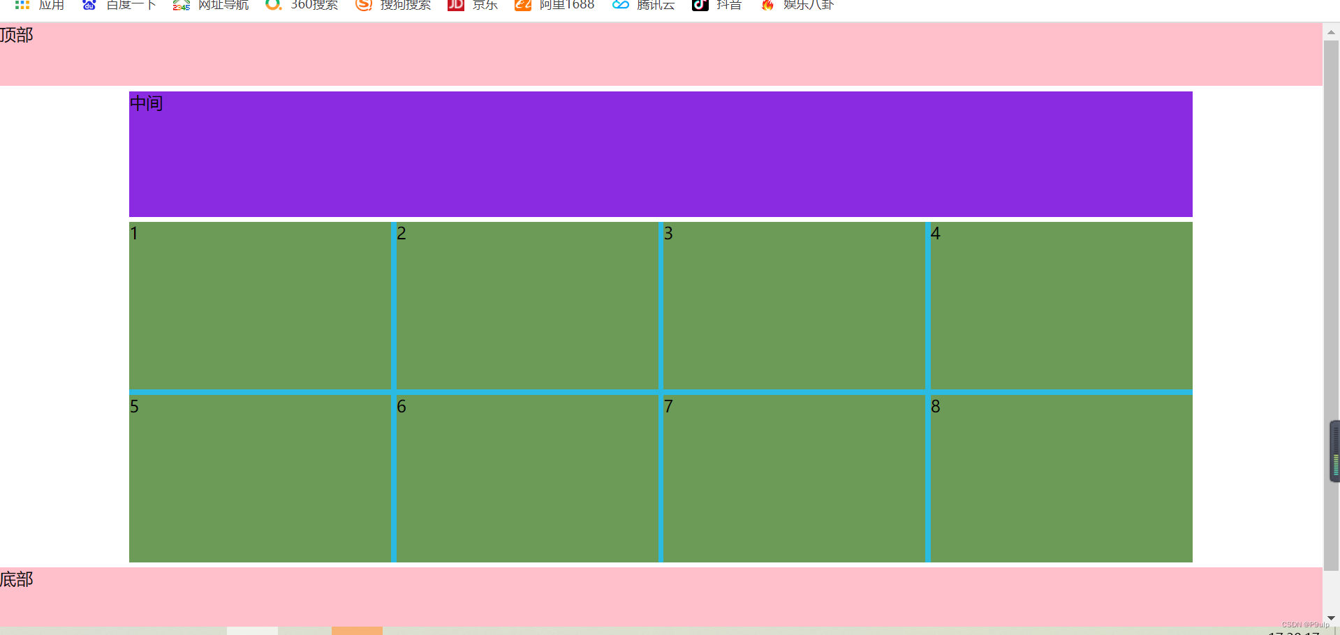
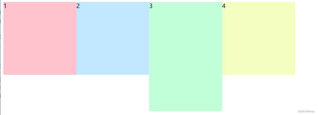
4.布局案例4
<!DOCTYPE html>
<html lang="en">

<head>
    <meta charset="UTF-8">
    <meta http-equiv="X-UA-Compatible" content="IE=edge">
    <meta name="viewport" content="width=device-width, initial-scale=1.0">
    <title>Document</title>
    <style>
        * {


            margin: 0;
            padding: 0;
        }

        li {


            list-style: none;
        }

        .top {


            height: 60px;
            background-color: pink;
        }

        .banner {


            width: 1015px;
            height: 120px;
            background-color: blueviolet;
            margin: 5px auto;
        }

        .box {


            width: 1015px;
            height: 325px;
            background-color: rgb(43, 186, 226);
            margin: 5px auto;
        }

        .box .one {


            float: left;
            width: 250px;
            height: 160px;
            background-color: rgb(108, 155, 88);
            margin-right: 5px;
            margin-bottom: 5px;

        }

        .box .two {


            float: left;
            width: 250px;
            height: 160px;
            background-color: rgb(108, 155, 88);
            margin-right: 5px;
            margin-bottom: 0;

        }

        .box .last {


            float: left;
            width: 250px;
            height: 160px;
            background-color: rgb(108, 155, 88);
            margin-bottom: 0;
        }

        .bottom {


            height: 100px;
            background-color: pink;
        }
    </style>
</head>

<body>
    <div class="top">顶部</div>
    <div class="banner">中间</div>
    <div class="box">
        <ul>
            <li class="one">1</li>
            <li class="one">2</li>
            <li class="one">3</li>
            <li class="last">4</li>
            <li class="two">5</li>
            <li class="two">6</li>
            <li class="two">7</li>
            <li class="last">8</li>
        </ul>
    </div>
    <div class="bottom">底部</div>
</body>