4.4圆角边框
圆角边框:
<!DOCTYPE html>
<html lang="en">
<head>
    <meta charset="UTF-8">
    <title>Title</title>

<!--
    边框border:左上 右上 右下 左下:顺时针方向

    圆圈:圆角=半径 + 边框


    -->
    <style>
        div{


            width: 100px;
            height: 100px;
            border: 10px solid red;
            border-radius: 50px 20px;
        }

    </style>


</head>
<body>

<!--div是空标签 可以设置宽高-->

<div></div>
</body>
</html>
4.5盒子阴影
<!DOCTYPE html>
<html lang="en">
<head>
    <meta charset="UTF-8">
    <title>Title</title>
<!--margin: 0 auto
使用的前提条件:要有块元素,块元素有固定的宽度


    -->
    <style>
        img{


            border-radius: 50px;
            box-shadow:10px 10px 100px yellow;
        }
    </style>


</head>
<body>
<div style="width: 500px; height: 1000px; display: block;text-align: center">

        <img src="images/12.jpg" alt="">

</div>


<div>   </div>
</body>
</html>
推荐网站:模板之家 vue-element-admin 飞冰(阿里)
5浮动
5.1标准文档流
块级元素:独占一行
h1~h6 p div 列表
行内元素:不独占一行
span a img strong ...
行内元素可以 包含在块级元素中,反之,则不可以
5.2 display
<!DOCTYPE html>
<html lang="en">
<head>
    <meta charset="UTF-8">
    <title>Title</title>
<!--
     block:块元素
     inline 行内元素
     inline-block:即是行类元素也是块元素  保持块的形状写成一行
     none:消失


      -->

    <style>
        div{


            width:100px;
            height: 100px;
            border: 1px solid red;
            display: inline-block;
        }
        span{


            width:100px;
            height: 100px;
            border: 1px solid red;
            display:inline-block ;

        }
    </style>


</head>
<body>


<div>div块元素</div>
<span>span行内元素</span>
</body>
</html>
1.这个也是一种实现行内元素排列的方式,但是我们很多情况都是用float
5.3float
1.左右浮动float
div{


    margin: 10px;
    padding: 5px;
}
#father {


    border: 1px #000 solid;
}
.layer01{


    border: 1px #F00 dashed;
    display: inline-block;
    float: left;
    clear: both;
}
.layer02{


    border: 1px #00F dashed;
    display: inline-block;
    float: right;
    clear: both;
}
.layer03{


    border: 1px #060 dashed;
    display: inline-block;
    float:right;
    clear: both;
}
.layer04{


    border: 1px #666 dashed;
    font-size: 12px;
    line-height: 23px;
    display: inline-block;
    float: right;
    clear: both;

}
<!DOCTYPE html>
<html lang="en">
<head>
    <meta charset="UTF-8">
    <title>浮动</title>
    <link  href="css/style.css" rel="stylesheet" type="text/css"/>
</head>
<body>
<div id="father">
    <div class="layer01"><img src="images/2.jpg" alt=""></div>
    <div class="layer02"><img src="images/3.jpg" alt=""></div>
    <div class="layer03"><img src="images/5.jpg." alt=""></div>
    <div class="layer04">浮动的盒子可以向左浮动,也可以向右浮动,直到他的外边缘碰到包含区域另一个浮动盒子为止</div>

</div>

</body>
</html>
5.4父级边框塌陷的问题
clear:
/*
clear:right; 右侧不允许有浮动元素
clear:left;左侧不允许有浮动元素
clear:both;两侧不允许有浮动元素
clear:none;可以浮动

*/
解决方案:
1.增加父级元素的高度
#father {


    border: 1px #000 solid;
    height: 2800px;
}
2.增加一个空的div 标签,清楚浮动
<!DOCTYPE html>
<html lang="en">
<head>
    <meta charset="UTF-8">
    <title>浮动</title>
    <link  href="css/style.css" rel="stylesheet" type="text/css"/>
</head>
<body>
<div id="father">
    <div class="layer01"><img src="images/2.jpg" alt=""></div>
    <div class="layer02"><img src="images/3.jpg" alt=""></div>
    <div class="layer03"><img src="images/5.jpg." alt=""></div>
    <div class="layer04">浮动的盒子可以向左浮动,也可以向右浮动,直到他的外边缘碰到包含区域另一个浮动盒子为止</div>

    <div>class="clear"</div>

</div>

</body>
</html>
.clear{


    clear: both;
    margin: 0;
    padding: 0;
}
3.overflow
在父级元素中增加一个overflow:hidden (里面没有高度是被内容元素所覆盖的,最后的高度是根据内容元素来的)
4.父类中添加一个伪类:after
#father:after{


    content: '';
    display: block;
    clear: both;

}
小结:
1.浮动元素后面增加空div
简单,代码中尽量避免空div
2.设置父元素的高度
简单,元素假设有了固定的高度,就会被限制
3.overflow
简单,下拉的一些场景避免使用
4.父类中添加一个伪类:after(推荐使用)
写法稍微复杂一点,但是没有副作用,推荐使用
5.5对比
display:
方向不可以控制
float:
浮动起来的话会脱离标准文档流,所以要解决父级边框塌陷的问题
6定位
默认情况:
<!DOCTYPE html>
<html lang="en">
<head>
    <meta charset="UTF-8">
    <title>Title</title>
    <style>
        div{


            margin: 10px;
            padding: 5px;
            font-size: 12px;
            line-height: 25px;
        }
        #father{


            border: 1px solid #666;
            padding: 0;

        }
        #first{


            background-color: #9e1818;
            border: 1px dashed #e03f3f;

        }
        #second{


            background-color: #bdd412;
            border: 1px dashed #9aa833;

        }
        #third{


            background-color: #e78d07;
            border: 1px dashed #de9322;

        }
    </style>


</head>
<body>


<div id="father">
    <div id="first">第一个盒子</div>
    <div id="second">第二个盒子</div>
    <div id="third">第三个盒子</div>


</div>

</body>
</html>
6.1 相对定位
<!DOCTYPE html>
<html lang="en">
<head>
    <meta charset="UTF-8">
    <title>Title</title>
<!--    相对定位
   相对于自己原来的位置进行偏移


      -->
    <style>
        div{


            margin: 20px;
            padding: 5px;
            font-size: 12px;
            line-height: 25px;
        }
        #father{


            border: 1px solid #666;
            padding: 0;

        }
        #first{


            background-color: #9e1818;
            border: 1px dashed #e03f3f;
        /*    relative:相对于原来位置移动,元素设置此属性之后仍然处在文档流中,不影响其它元素的布局*/
            position: relative;/*相对定位:上下左右*/
            top:-20px;
            left: 20px;

        }
        #second{


            background-color: #bdd412;
            border: 1px dashed #9aa833;

        }
        #third{


            background-color: #e78d07;
            border: 1px dashed #de9322;
            position: relative;
            bottom: -20px;
            right: 20px;

        }
    </style>


</head>
<body>

<div id="father">
    <div id="first">第一个盒子</div>
    <div id="second">第二个盒子</div>
    <div id="third">第三个盒子</div>

</div>

</body>
</html>
相对定位:position :relative;
相对于原来的位置,进行指定的偏移,相对定位的话,它任然在标准文档流中,原来的位置会被保留。
top:-20px;
left: 20px;
bottom: -20px;
right: 20px;
练习
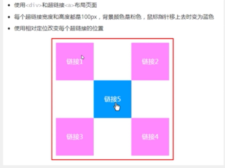
<!DOCTYPE html>
<html lang="en">
<head>
    <meta charset="UTF-8">
    <title>Title</title>
    <style>
        #box{


            width: 300px;
            height: 300px;
            padding: 10px;
            border: 2px solid red;
        }
        a{


            width: 100px;
            height: 100px;
            text-decoration: none;
            background: #b470b4;
            line-height: 100px;
            text-align: center;
            color: white;
            /*display: block;把类元素变成为块元素*/
            display: block;
        }
        a:hover{


            background: deepskyblue;
        }
        .a2,.a4 {


            position: relative;
            left: 200px;
            top: -100px;
        }
        .a5{


            position: relative;
            left: 100px;
            top: -300px;
        }
    </style>

</head>
<body>
<div id="box">
    <a class="a1" href="#">链接1</a>
    <a class="a2" href="#">链接2</a>
    <a class="a3" href="#">链接3</a>
    <a class="a4" href="#">链接4</a>
    <a class="a5" href="#">链接5</a>

</div>

</body>
</html>
6.2绝对定位
定位:基于xxx定位,上下左右
1.没有父级元素定位的前提下,相对于浏览器定位
2.假设父级元素存在定位,我们通常会相对于父级元素进行偏移
3.在父级元素范围内移动
相对于父级或浏览器的位置,进行指定的偏移,绝对定位的话,它不在标准文档流中,原来的位置不会被保留。
<!DOCTYPE html>
<html lang="en">
<head>
    <meta charset="UTF-8">
    <title>Title</title>
    <style>
        div{


            margin: 10px;
            padding: 5px;
            font-size: 12px;
            line-height: 25px;
        }
        #father{


            border: 1px solid #666;
            padding: 0;
            position: relative;

        }
        #first{


            background-color: #9e1818;
            border: 1px dashed #e03f3f;

        }
        #second{


            background-color: #bdd412;
            border: 1px dashed #9aa833;
            position: absolute;

            left: 100px;

        }
        #third{


            background-color: #e78d07;
            border: 1px dashed #de9322;

        }
    </style>

</head>
<body>


<div id="father">
    <div id="first">第一个盒子</div>
    <div id="second">第二个盒子</div>
    <div id="third">第三个盒子</div>
</div>

</body>
</html>
6.3固定定位fixed
<!DOCTYPE html>
<html lang="en">
<head>
    <meta charset="UTF-8">
    <title>Title</title>

    <style>
       body{


           height: 1000px;
       }
       div:nth-of-type(1){

     /*绝对定位:相对于浏览器 在没有父级元素时*/
           width: 100px;
           height: 100px;
           background: red;
           position: absolute;
           right: 0;
           bottom: 0;
       }
       div:nth-of-type(2){


           /*fixed 固定定位*/
           width: 50px;
           height: 50px;
           background: yellow;
           position: fixed;
           right: 0;
           bottom: 0;

       }
    </style>


</head>
<body>
<div>div1</div>
<div>div2</div>
</body>
</html>
6.4 z-index
图层
z-index:默认是0,最高无限
<!DOCTYPE html>
<html lang="en">
<head>
    <meta charset="UTF-8">
    <title>Title</title>
    <link rel="stylesheet" href="css/style.css">


</head>
<body>
<div id="content">
    <ul>
        <li><img src="images/2.jpg" alt=""></li>
        <li class="tipText">学习微服务,找狂神</li>
        <li class="tipBg"></li>
        <li>时间:2099-01-02</li>
        <li>地点:1022星球一号基地</li>
    </ul>
</div>
</body>
</html>
opacity: 0.3;背景透明度
#content{


    width: 1000px;
    padding: 0px;
    margin: 0px;
    overflow: hidden;
    font-size: 12px;
    line-height: 25px;
    border: 1px #000 solid;
}
ul,li{


    padding: 0px;
    margin: 0px;
    /*去标题的小黑点*/
    list-style: none;

}
/*父级元素相对对位 子级元素可以进行绝对定位了*/
#content ul{


    position: relative;


}
.tipText,.tipBg{


    position: absolute;
    width: 1000px;
    height: 25px;
    top: 770px;
}
.tipText{


    color: white;
    /*z-index: 999;*/
}
.tipBg{


    background: #000;
    /*opacity: 0.3;!*背景透明度*!*/
    filter: opacity(0.2);

}