一. 前言
清晨一醒,抬头一望。哇,阳光明媚,心想:这天气简直和今天的儿童节绝配,又可以好好过个儿童节了。于是乎,哼着小歌,高高兴兴上班去,好好体验下临近而立之年的大龄儿童节。本以为可以非常愉悦地过个儿童节,可是一上班,PM童靴就把我给喊过去说临时加个需求,并且在今天内完成上线 ---- xx模块的列表字段太多,并且每个用户对每个字段的显隐和排序(列表头)不一样,现在要实现列表的自定义功能。那一刻,多想回复她 ---- “这个需求做不了”,“这个需求要时间”等一系列拒绝的理由。可是本着“日进有功”的初心,那就好好搞定它吧。
二. 需求分析
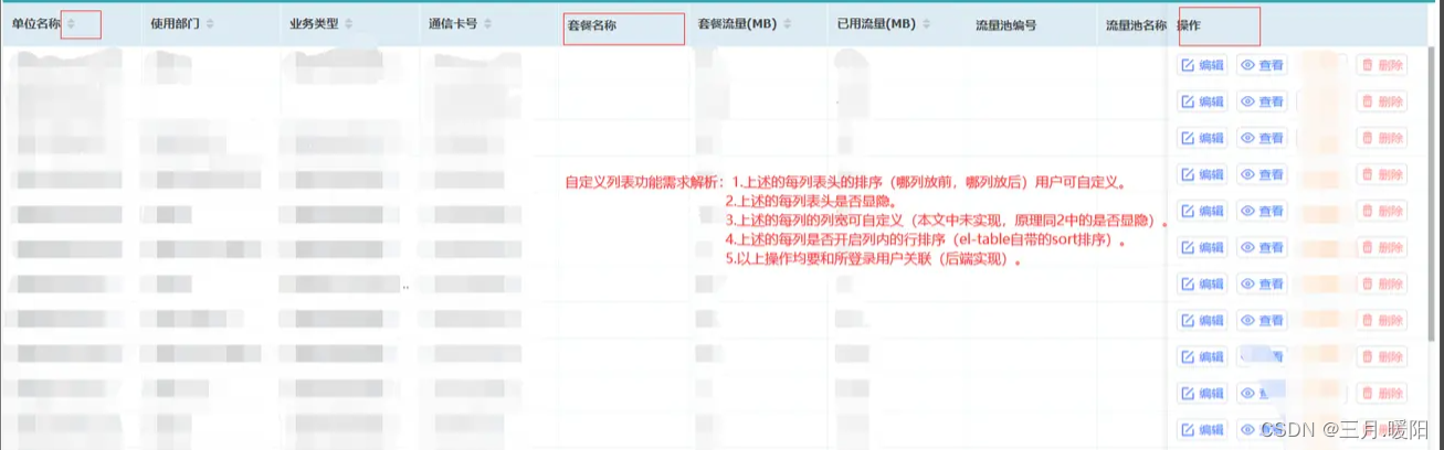
- 需求说明:
xx模块的列表展示有将近20个字段(包含操作栏:编辑,查看等功能),每个登录用户对每个表头字段前后排版(列表表头的排序,而非单独一列的行排序)和是否显隐对应字段的列、每个字段的列框、是否有排序功能、是否需转换码值等都是不一样的。还有就是这个自定义列表要和用户关联(当然这是后端童靴的事情)。
- 需求图示:
三. 自定义列表功能实现解析
- 实现说明:
通过以上的需求分析,那么很容易想到实现该需求的重点就是 ---- 动态。那么怎么理解这个动态呢,无疑就是以下两部分。
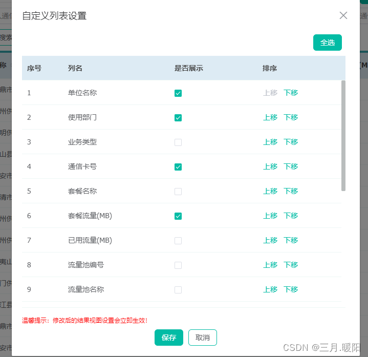
- 用于实际展示列表的部分 ---- 动态获取已经排好序(列表头排序)和筛选好(是否显示)的表头数据(也就是每个el-table-column的渲染数据),拿到这个数据后通过v-for遍历,之后针对每个el-table-column做每种专门的处理(列宽、是否开启列内行排序、是否转码值等)即可。
2. 用于设置动态展示的核心功能部分 ---- 拿到列表的所有字段(列表头)的对应字段(上文1中的el-table-column中对应的prop和label),并根据实际需求情况,同后端童靴商量好列宽、是否展示等字段组成的对象数组。后可以自定义勾选每个展示字段是够显隐和填写每个展示字段的列宽值等操作,字段自定义排序等。最后保存操作后将排好序(列表头排序)和筛选好(是否显示)的对象数组数据传递给后端童靴,保存接口成功后要通知上文1中的展示列表组件去同步更新展示字段和对应排序等信息(友情提示:这里很重要的是,最好把这部分自定义列表功能的核心部分封装成公用组件,用于给上文1中的列表展示组件通讯,1作为父组件,2作为子组件。)
- 实现图示:
四. 自定义列表功能实现的核心代码
- 用于实际展示列表的部分:
<el-table
            :data="tableData"
            :height="tableHeight"
            border
            header-cell-class-name="g-table-header-cell"
            @sort-change="sortFunc"
            v-loading="loading"
          >
            <template v-for="(item, index) in rightCardlistData">
              <el-table-column
                v-if="item.columnType == 'cz'"
                :key="item.columnDesc"
                :label="item.columnDesc"
                min-width="300"
                fixed="right"
              >
                <template slot-scope="{ row }">
                  <span
                    class="g-table-btn blue"
                    @click="openXgxqxx(row)"
                    v-if="apiPower['/cardOperate/editOneCard']"
                    ><i class="icon iconfont iconedit"></i>编辑</span
                  >
                  <span class="g-table-btn blue" @click="handleDetails(row)"
                    ><i class="icon iconfont iconsee"></i>查看</span
                  >
                  <span
                    class="g-table-btn yellow"
                    @click="handleDResult(row)"
                    v-if="apiPower['/Card/diagnosis']"
                    ><i class="icon iconfont icondiagnose"></i>诊断</span
                  >
                  <span
                    v-if="apiPower['/cardDeleteControl/delOneCard']"
                    class="g-table-btn red"
                    @click="handleOnedel(row)"
                    ><i class="icon iconfont icondelete"></i>删除</span
                  >
                </template>
              </el-table-column>
              <el-table-column
                v-else-if="item.columnType == 'payType'"
                :key="item.columnDesc"
                :prop="item.columnType"
                :label="item.columnDesc"
                min-width="120"
                show-overflow-tooltip
                sortable="custom"
              >
                <template slot-scope="{ row }">
                  <span v-if="row.payType == '1'">电力付费</span>
                  <span v-else-if="row.payType == '2'">厂家付费</span>
                </template>
              </el-table-column>
              <el-table-column
                v-else
                :key="item.columnDesc"
                :prop="item.columnType"
                :label="item.columnDesc"
                min-width="160"
                show-overflow-tooltip
                sortable="custom"
              >
              </el-table-column>

              <!--引入组件部分-->
              <custom v-model="custom_obj.show" :customData="custom_obj.data" @customSuccess="getConfig" @customCancel="getConfig"></custom>

             components: {
    custom: (resolve) => require(["./custom.vue"], resolve),
  },

              methods: {
    //获取用户自定义列表配置
    getConfig() {
      let data = new Object();
      data.listType = "cardlist";
      this.customLoading = true;
      this.cardlistData = [];
      this.rightCardlistData = [];
      API.getConfig(data)
        .then((res) => {
          this.customLoading = false;
          if (res.code == 200) {
            this.cardlistData = res.data;
            this.rightCardlistData = res.data.filter(
              (i) => i.displayStatus == 1
            );

            if (this.roleTag == "sa") {
              this.rightCardlistData.push(
                {
                  columnDesc: "更新日期",
                  columnType: "dataUpdateTime",
                },
                {
                  columnDesc: "操作",
                  columnType: "cz",
                }
              );
            } else {
              this.rightCardlistData.push({
                columnDesc: "操作",
                columnType: "cz",
              });
            }
          }
        })
        .catch((err) => {
          this.customLoading = false;
        });
    },

    //打开自定义列表对话框
    openCustom() {
      this.custom_obj.show = true;
      this.custom_obj.data = this.cardlistData;
    },
- 用于设置动态展示的核心功能部分:
<template>
<el-dialog
title="自定义列表设置"
:visible.sync="show"
width="680px"
:before-close="handleClose"
append-to-body
:close-on-click-modal="false"
>
<div class="conbox">
<div class="check-box">
<el-button type="primary" @click="cancelcheckAll" v-if="isAllchecked">取消全选</el-button>
<el-button type="primary" @click="checkAll" v-else>全选</el-button>
</div>
<el-table :data="tableData" ref="curtable" height="500">
<el-table-column type="index" label="序号" width="80"></el-table-column>
<el-table-column
label="列名"
prop="columnDesc"
min-width="180"
show-overflow-tooltip
></el-table-column>
<el-table-column
label="是否展示"
prop="displayStatus"
min-width="150"
show-overflow-tooltip
>
<template slot-scope="scope">
<el-checkbox :true-label="1" :false-label="0" v-model="scope.row.displayStatus" @change="changeStatus"></el-checkbox>
</template>
</el-table-column>
<el-table-column label="排序" min-width="150">
<template slot-scope="scope">
<el-button
type="text"
style="padding: 0"
:disabled="scope.$index == 0"
@click="moveUpward(scope.row, scope.$index)"
>上移</el-button
>
<el-button
type="text"
style="padding: 0"
:disabled="scope.$index + 1 == tableData.length"
@click="moveDown(scope.row, scope.$index)"
>下移</el-button
>
</template>
</el-table-column>
</el-table>
</div>
<p style="font-size:12px;color:red;margin: 50px 0 5px 0">温馨提示:修改后的结果视图设置会立即生效!</p>
<div class="btn-box">
<el-button type="primary" @click="submitCus" v-loading="btn_loading">保存</el-button>
<el-button @click="handleClose">取消</el-button>
</div>
</el-dialog>
</template>
<script>
import * as API from "api/communication_card_manage/communication_card_manage";
export default {
props: {
value: {
type: Boolean,
default: false,
},
customData: {
type: Object,
default() {
return {};
},
},
},
data() {
return {
show: false,
btn_loading: false,
tableData: [],
isAllchecked: true,
};
},
watch: {
value(bool) {
this.show = bool;
if (bool) {
this.tableData = this.customData;
this.judgeAll(this.tableData);
}
},
},
beforeDestroy() {
this.$emit("input", false);
},
methods: {
//是不是已经全选
judgeAll(arr){
this.isAllchecked = arr.every(i => i.displayStatus == 1);
},
//上移
moveUpward(row, index) {
if (index > 0) {
let upData = this.tableData[index - 1];
this.tableData.splice(index - 1, 1);
this.tableData.splice(index, 0, upData);
} else {
this.$message({
message: "已经是第一条,上移失败",
type: "error",
});
}
},
//下移
moveDown(row, index) {
if (index + 1 == this.tableData.length) {
this.$message({
message: "已经是最后一条,下移失败",
type: "error",
});
} else {
let downData = this.tableData[index + 1];
this.tableData.splice(index + 1, 1);
this.tableData.splice(index, 0, downData);
}
},
//单选
changeStatus(val){
this.judgeAll(this.tableData);
},
//全选
checkAll(){
this.tableData.map(i => {
this.$set(i,'displayStatus',1)
});
this.judgeAll(this.tableData);
},
//取消全选
cancelcheckAll(){
this.tableData.map(i => {
this.$set(i,'displayStatus',0)
});
this.judgeAll(this.tableData);
},
//保存
submitCus(){
let res = this.tableData.every(i => i.displayStatus == 0)
if(res){
this.$message({
message: "请至少保留一项展示项",
type: "error",
});
}else{
let data = new Object;
data.listType = 'cardlist';
data.userListConfigDtoList = this.tableData;
this.btn_loading = true;
API.saveUserListConfig(data).then(res => {
this.btn_loading = false;
if(res.code == 200){
this.$message({
message: "保存成功",
type: "success",
});
this.tableData = [];
this.$emit("input", false);
this.$emit('customSuccess');
}
}).catch(err => {
this.btn_loading = false;
})
}
},
//取消
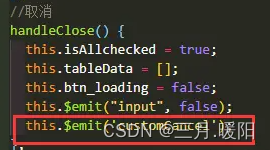
handleClose() {
this.isAllchecked = true;
this.tableData = [];
this.btn_loading = false;
this.$emit("input", false);
this.$emit('customCancel');
},
}
};
</script>
<style lang="less" scoped>
/deep/ .el-dialog__close {
font-size: 24px !important;
}
.conbox {
height: 500px;
margin-top: -15px;
.check-box{
float: right;
margin: 0 15px 10px 0;
}
}
/deep/ .el-table {
height: 500px;
overflow: scroll;
}
.btn-box{
text-align: center;
margin: 10px 0 -10px 0;
}
</style>
五. 总结。
有几个注意点容易导致翻车,这里给大家做个总结,也是给自己做个记录。
- 每次重新拉取实际展示列表列表头数据的时候都要先重置下自定义的那个表头数组集合,然后在根据请求后端得到的数据进行赋值等操作,不然会导致列表不会实时更新。
2.动态设置自定义列表功能的时候,如果经过一系列自定义操作,但是最后点击取消或者关闭(未保存)的时候,也要和父组件通讯下,不然会导致第二次进来的时候的实际勾选和排序是上一次未保存的,而不是真是的列表展示和排序。
六. 写在最后。
以上就是本文的所有内容,主要描述和处理了自定义表格功能的一种可行性实现方案。后期也会将这套扩展封装成轮子,以便高效使用。码字不易,还请各路大佬多多支持 ---- 三连。最后,祝大家,儿童节快乐。