前言 功能介绍
最近遇到一个功能,需要的是把表格的列可以配置,
用户可以根据自己想要看的数据来改变表头列显示哪些隐藏哪些。
于是我做了两个版本。第一个版本是自由搭配的。
就是提前顶号所有的列,然后自己可以拖拽到想要位置顺序。
也可以自己新增一个二级表头自定义一个名称把表头都拖进去组成多级表头表格。不过这种的毕竟复杂。
第二个版本就简单一些了,是固定的列,比如十列写好了,然后用户只能在这十列里面选择显示或隐藏哪些。
位置不能动,文字也不能动。就是单纯的显示隐藏列
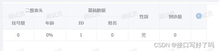
效果图
外面的表格样子,点击右边的小齿轮开始设置
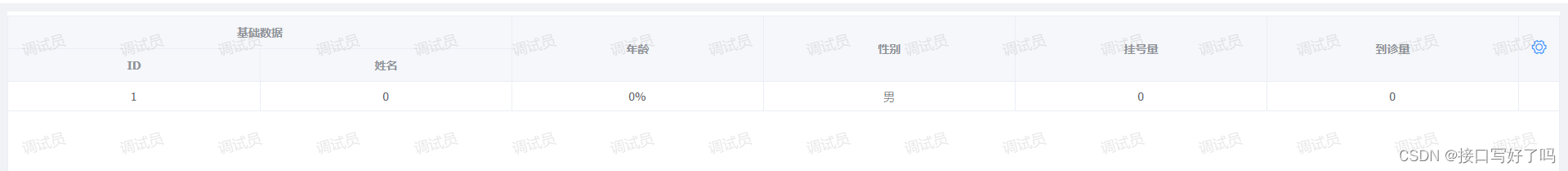
打开后是这样的。左边可以勾选需要的列,会添加到右边。然后右边可以拖拽到想要的顺序。也可以添加一个蓝色表头自定义名字,然后把黑色的拖进去组成一个多级表头的表格。
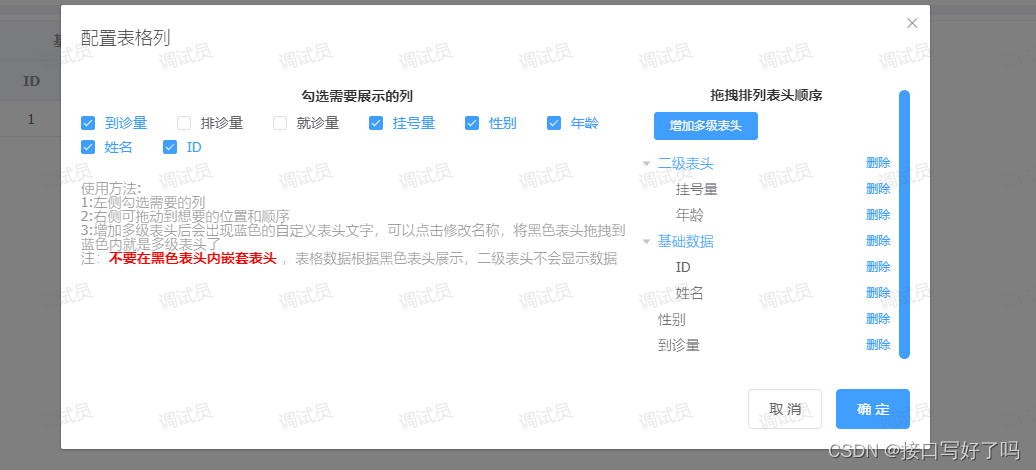
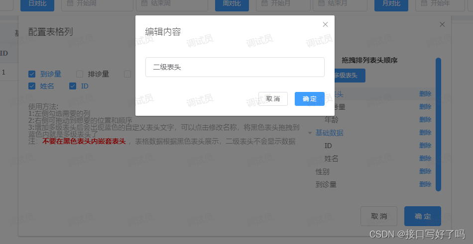
可以修改蓝色的表头名称
自由搭配版本视频演示
el-table自定义列显示隐藏自由搭配版本
代码
html部分
<el-table :data="tableDatas" border style="width: 100%" v-loading="loadings" :height="height"
                    ref="configurationTable">
                    <el-table-column v-for="(arrd,index) in headers" :key="Math.random()" :label="arrd.title"
                        align="center" width='100' show-overflow-tooltip>
                        <!-- 有子级 -->
                        <el-table-column v-for="(arrd2,index2) in arrd.children" align="center" :label="arrd2.title"
                            show-overflow-tooltip width='100' :key="Math.random()">
                            <template slot-scope="{row, $index}">
                                <span>{

    {

    row[arrd2.key]}}</span>
                            </template>
                        </el-table-column>
                        <!-- 无子级 -->
                        <template slot-scope="{row, $index}">
                            <span>{

    {

    row[arrd.key]}}</span>
                        </template>
                    </el-table-column>
                    <el-table-column align="center" width="50">
                        <template slot="header" slot-scope="scope">
                            <i class="el-icon-setting" style="font-size:20px;cursor: pointer;color: #409EFF;"
                                @click="createInfo"></i>
                        </template>
                    </el-table-column>
                </el-table>
                <!-- 组件:自定义表头(getherders是接受返回的表头,deflist是默认表头) -->
                <dynamiccolumn ref="dynamic_column" @getherders="getherders" :deflist="defList"></dynamiccolumn>
data
defList:[{


                            type: 'zdy',
                            title: '基础数据',
                            id:Math.random(),
                            children: [{


                                title: 'ID',
                                key: 'id'
                            }, {


                                title: '姓名',
                                key: 'name'
                            }]
                        },
                        {


                            title: '年龄',
                            key: 'age'
                        },
                        {


                            title: '性别',
                            key: 'sex'
                        },
                        {


                            title: '挂号量',
                            key: 'ghl'
                        },
                        {


                            title: '到诊量',
                            key: 'dzl'
                        },
                    ]
methods
// 初始化表头
            createInfo(){


                this.$refs.dynamic_column.createInfo(this.defList) //打开编辑列弹框
            },
            // 修改表头返回
            getherders(arr){


                this.headers=arr //表头列数据
                this.$nextTick(() => {


                    this.$refs.configurationTable.doLayout(); // 解决表格错位
                });
            },
组件
简单说一下逻辑:
1,父页面通过createInfo初始化方法调用子组件弹框。并展示信息
2,子组件打开后调用方法getColumnConfig,获取到一个所有列的配置。然后展示在弹框内,并传一份给父组件表格
3,通过tree自带的拖拽事件实现表头列位置的移动,上面添加多级表头用来添加一个自定义的名称,比如你想要把几列放到某一个表头下面,这几列都属于基本信息,那我就可以新增一个蓝色的表头,点击他改名叫基础信息。然后把黑色表头都拖进去,就可以得到一个这种多级表头。
这里注意:
黑色只能拖到蓝色里面,黑色表头内不能嵌套表头
黑色表头的key对应后台的数据,所以要跟后台对好才行。这种自由搭配的写法需要互相配合,嫌麻烦的还是直接用下面的固定写法
<template>
  <div>
    <!-- 表格列配置 -->
    <el-dialog title="配置表格列" :visible.sync="columnShow" width="60%">
      <el-row>
        <el-col :span="16">
          <p
            style="
              text-align: center;
              color: #333;
              font-weight: bold;
              margin-bottom: 10px;
            "
          >
            勾选需要展示的列
          </p>
          <el-checkbox-group v-model="columnCheckList" @change="getCheckList">
            <el-checkbox
              :label="item.key"
              v-for="(item, index) in columnAll"
              :key="'cols' + index"
              style="margin-bottom: 5px"
              >{

    {

     item.title }}</el-checkbox
            >
          </el-checkbox-group>
          <p style="margin-top: 20px; color: #999">使用方法:</p>
          <p style="color: #999">1:左侧勾选需要的列</p>
          <p style="color: #999">2:右侧可拖动到想要的位置和顺序</p>
          <p style="color: #999">
            3:增加多级表头后会出现蓝色的自定义表头文字,可以点击修改名称,将黑色表头拖拽到蓝色内就是多级表头了
          </p>
          <p style="color: #999">
            注:<span style="color: red;font-weight:bold">不要在黑色表头内嵌套表头</span>
            ,表格数据根据黑色表头展示,二级表头不会显示数据
          </p>
        </el-col>
        <el-col :span="8" style="max-height: 500px; overflow: auto">
          <p
            style="
              text-align: center;
              color: #333;
              font-weight: bold;
              margin-bottom: 10px;
            "
          >
            拖拽排列表头顺序
          </p>
          <el-button
            @click="append2"
            size="mini"
            style="margin-left: 20px; margin-bottom: 10px"
            type="primary"
            >增加多级表头</el-button
          >
          <el-tree
            :data="data"
            node-key="id"
            default-expand-all
            :expand-on-click-node="false"
            draggable
            :props="defaultProps"
          >
            <span class="custom-tree-node" slot-scope="{ node, data }">
              <span
                :style="{ color: data.type == 'zdy' ? '#409EFF' : '' }"
                @click="editNodeInfo(data)"
                >{

    {

     node.label }}</span
              >
              <span>
                <!-- <el-button type="text" size="mini" @click="() => append(data)">
                                    add
                                </el-button> -->
                <el-button
                  type="text"
                  size="mini"
                  @click="() => remove(node, data)"
                >
                  删除
                </el-button>
              </span>
            </span>
          </el-tree>
        </el-col>
      </el-row>
      <span slot="footer" class="dialog-footer">
        <el-button @click="columnShow = false">取 消</el-button>
        <el-button type="primary" @click="setUpColumn">确 定</el-button>
      </span>
    </el-dialog>
    <!-- 编辑tree表头内容 -->
    <el-dialog title="编辑内容" :visible.sync="columnShow2" width="400px">
      <div>
        <el-input placeholder="请输入内容" v-model="input" clearable>
        </el-input>
      </div>
      <span slot="footer" class="dialog-footer">
        <el-button @click="columnShow2 = false" size="mini">取 消</el-button>
        <el-button type="primary" @click="setUpTitle" size="mini"
          >确 定</el-button
        >
      </span>
    </el-dialog>
  </div>
</template>

<script>
module.exports = {


  name: "test",
  props: ["deflist"],//默认数据
  data() {


    return {


      eid: "",
      input: "", //编辑多级菜单名称
      data: [], //tree
      //tree配置
      defaultProps: {


        children: "children",
        label: "title",
      },
      columnShow: false, //设置也弹框显示
      columnShow2: false, //编辑tree表头内容
      columnAll: [], //表头总列
      columnCheckList: [], //列勾选项
      columnCheckList2: [], //列勾选项2
      pxHeader: [], //排序表头
      copyTreeList: [], //备份tree
    };
  },
  mounted() {


    this.pxHeader = this.deflist;
    this.getColumnConfig();
  },
  methods: {


    // 初始化
    createInfo(e) {


      this.pxHeader = e;
      this.getColumnConfig(); //获取所有列数据
      this.columnShow = true;
    },
    // 添加节点
    append(data) {


      const newChild = {


        id: id++,
        title: "自定义表头",
        children: [],
      };
      console.log(data, "data");
      if (!data.children) {


        this.$set(data, "children", []);
      }
      data.children.push(newChild);
    },
    // 添加一个节点
    append2() {


      const newChild = {


        id: id++,
        title: "自定义表头" + id,
        type: "zdy",
        children: [],
      };
      this.data.unshift(newChild);
    },
    // 编辑节点信息
    editNodeInfo(e) {


      if (e.type == "zdy") {


        this.eid = e.id;
        this.input = e.title;
        this.columnShow2 = true;
      }
    },
    // 保存节点信息
    setUpTitle() {


      this.data.forEach((item) => {


        if (item.id && item.id == this.eid) {


          item.title = this.input;
          return;
        }
        if (item.children) {


          item.children.forEach((i) => {


            if (i.id && i.id == this.eid) {


              i.title = this.input;
              return;
            }
          });
        }
      });
      this.columnShow2 = false;
    },
    // 删除节点信息
    remove(node, data) {


      const parent = node.parent;
      const children = parent.data.children || parent.data;
      const index = children.findIndex((d) => d.id === data.id);
      children.splice(index, 1);
      //删除节点时把勾选项取消
      let ckIndex = this.columnCheckList.indexOf(data.key);
      if (ckIndex !== -1) {


        this.columnCheckList.splice(ckIndex, 1);
        this.columnCheckList2 = JSON.parse(
          JSON.stringify(this.columnCheckList)
        );
      }
      if (data.type == "zdy") {


        this.columnCheckList = this.getAllId([], this.data);
        this.columnCheckList2 = JSON.parse(
          JSON.stringify(this.columnCheckList)
        );
      }
    },
    // 创建节点dom
    renderContent(h, {

      node, data, store }) {


      return `<span class="custom-tree-node">
                    <span>{node.label}</span>
                    <span>
                    <el-button size="mini" type="text" on-click={ () => this.append(data) }>Append</el-button>
                    <el-button size="mini" type="text" on-click={ () => this.remove(node, data) }>Delete</el-button>
                    </span>
                </span>`;
    },
    // 筛选勾选列表头
    getCheckList(e) {


      // 筛选勾选中的列数据
      let result = this.columnAll.filter((item) => {


        if (e.length == 0) {


          return this.columnAll;
        } else {


          return e.some((curVal) => curVal === item.key);
        }
      });
      let arr = [];
      // 按顺序把列头排列
      e.forEach((item) => {


        result.forEach((i) => {


          if (item == i.key) {


            arr.push(i);
          }
        });
      });
      this.pxHeader = arr; //排序展示出来
      let chazhi = [...this.columnCheckList2].filter((x) =>
        [...e].every((y) => y != x)
      ); //差值删除
      let chazhiDelete = [...e].filter((x) =>
        [...this.columnCheckList2].every((y) => y != x)
      ); //差值新增
      // 有差值变动
      if (chazhi.length && this.columnCheckList2.indexOf(chazhi[0]) !== -1) {


        this.removeObjects(this.data, chazhi[0]);
        this.columnCheckList2 = e;
      } else {


        this.columnAll.forEach((item) => {


          if (item.key == chazhiDelete[0]) {


            this.data.push(item);
          }
        });
        this.columnCheckList2 = e;
      }
    },
    // 获取所有表头配置
    getColumnConfig() {


      http
        .get(
          "group_data",
          {


            page: 1,
            limit: 1000,
            gid: 136,
            hospital_id: userinfo.hosId,
          },
          {


            headers: {


              hosId: userinfo.hospital_id,
            },
          }
        )
        .then((res) => {


          this.columnAll = res.data.data.list;
          this.columnCheckList = [];
          this.columnCheckList2 = [];
          // 默认排序列配置
          //   this.pxHeader = [];
          let headers = JSON.parse(JSON.stringify(this.pxHeader)); //默认表头展示
          this.$emit("getherders", headers); //列配置传给父组件
          this.columnCheckList = this.getAllId([], this.pxHeader); //默认列勾选项
          this.columnCheckList2 = this.getAllId([], this.pxHeader); //默认列勾选项保存副本(用于后面比对)
          this.data = this.pxHeader; //默认tree展示结构
        });
    },
    // 设置表格列展示
    setUpColumn() {


      let headers = JSON.parse(JSON.stringify(this.data)); //表头展示
      if (this.filterObjects(headers, "zdy")) {


        this.$emit("getherders", headers); //列配置传给父组件
        this.columnShow = false; //关闭弹框
      } else {


        this.$message({


          type: "info",
          message: "黑色表头内不能嵌套其他表头!",
        });
      }
    },
    // 递归:获取所有key值
    getAllId(keys, dataList) {


      if (dataList && dataList.length) {


        for (let i = 0; i < dataList.length; i++) {


          keys.push(dataList[i].key);
          if (dataList[i].children) {


            keys = this.getAllId(keys, dataList[i].children);
          }
        }
      }
      return keys;
    },
    // 递归:找到对应数据删除
    removeObjects(arr, key) {


      // 数组不存在不执行
      if (!arr) {


        return;
      }
      // 遍历数组
      for (let i = 0; i < arr.length; i++) {


        // 检查当前对象是否符合条件
        if (arr[i].key == key) {


          // 删除当前对象
          arr.splice(i, 1);
          // 由于已经删除了一个对象,所以需要调整索引以避免跳过下一个对象
          i--;
        } else {


          // 如果当前对象不符合条件,则递归检查其子对象
          this.removeObjects(arr[i].children, key);
        }
      }
    },
    // 递归:判断黑色表头是否有子级
    filterObjects(arr, key) {


      // 数组不存在不执行
      if (!arr) {


        return;
      }
      // 遍历数组
      for (let i = 0; i < arr.length; i++) {


        let item=arr[i]
        // 条件:数据如果没有type字段并且还有子级的,代表是黑色表头但是嵌套了表头,不允许通过
        if (!item.type && item.children && item.children.length > 0) {


          return false;
        }
        if (item.children) {


          this.filterObjects(item.children, key);
        }
      }
      return true;
    },
  },
};
</script>

  <style>
</style>
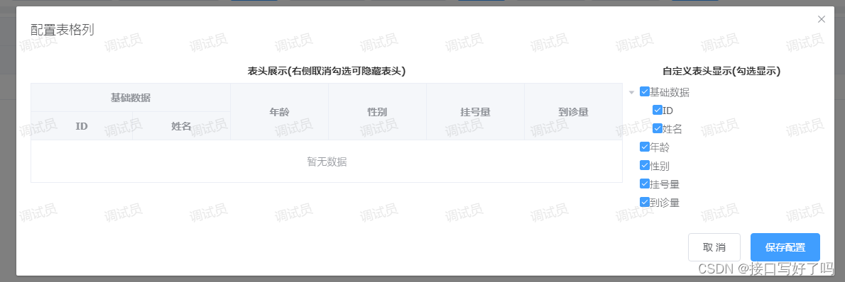
固定列,显示隐藏版本
效果图
外面表格的样子
打开组件弹框,左侧展示表头,右侧勾选表头,取消勾选就会隐藏列,然后保存就会返回表头到父组件上
固定搭配版本视频演示
el-table自定义列显示隐藏固定搭配版本
html页面代码
引入组件然后页面上显示 getherders是返回给你勾选过后的表头的。
后面children和label是配置组件内tree和表格显示的
<!-- 组件:表格自定义列 -->
        <dynamiccolumnrole ref="dynamic_column_role" @getherders="getherders" :children="'children'" :label="'title'">
        </dynamiccolumnrole>
methods
这个方法就是调用组件内的方法并传入默认的表头数据
// 初始化表头
            createInfo() {


                this.$refs.dynamic_column_role.createInfo(this.headers) //打开编辑列弹框
            },
我的data默认数组结构,这里表头中id和isshow必须有,没有字段的,自行添加
headers: [{


                        title: '基础数据',
                        id: 7,
                        isshow: true,
                        children: [{


                            id: 5,
                            isshow: true,
                            title: 'ID',
                            key: 'id'
                        }, {


                            id: 6,
                            isshow: true,
                            title: '姓名',
                            key: 'name'
                        }]
                    },
                    {


                        id: 1,
                        isshow: true,
                        title: '年龄',
                        key: 'age'
                    },
                    {


                        id: 2,
                        isshow: true,
                        title: '性别',
                        key: 'sex'
                    },
                    {


                        id: 3,
                        isshow: true,
                        title: '挂号量',
                        key: 'ghl'
                    },
                    {


                        id: 4,
                        isshow: true,
                        title: '到诊量',
                        key: 'dzl'
                    },
                ],
组件代码
组件注释了,比较通俗易懂。
说一下注意点:使用这个组件,只需要引入他,然后当成组件使用就行
然后注意第一次默认传入一个表头,也就是你后端请求的表头。
然后这个表头结构里面需要有id和isshow这个字段(true是显示,false是隐藏),如果没有自行添加。
逻辑简单描述一下:通过tree展示表头的树形结构,然后通过勾选后的回调函数handleCheckChange监听到是取消还是勾选,然后通过递归找到对应id的数据给他isshow字段更改显示隐藏,表格中对应用v-if显示隐藏这个字段。通过itemKey变量更新表格数据显示。最后把表头数据返回给父组件,父组件表格也通过v-if控制显示隐藏
<template>
  <div>
    <!-- 表格列配置 -->
    <el-dialog title="配置表格列" :visible.sync="columnShow" width="60%" top="10vh">
      <el-row>
        <el-col :span="18">
          <p
            style="
              text-align: center;
              color: #333;
              font-weight: bold;
              margin-bottom: 10px;
            "
          >
            表头展示(右侧取消勾选可隐藏表头)
          </p>
          <div style="max-width: 100%; overflow: auto">
            <el-table
              :data="tableData"
              border
              style="width: 100%"
              ref="configurationTable"
              :key="itemKey"
              :cell-style="tableCellStyle"
              :header-cell-style="tableHeaderCellStyle"
            >
              <template v-for="(arrd, index) in headers">
                <el-table-column
                  :key="'yi' + index"
                  :label="arrd[label]"
                  align="center"
                  show-overflow-tooltip
                  v-if="arrd.isshow"
                >
                  <template v-for="(arrd2, index2) in arrd[children]">
                    <!-- 有子级(第二层表头) -->
                    <el-table-column
                      align="center"
                      :label="arrd2[label]"
                      show-overflow-tooltip
                      :key="'er' + index2"
                      v-if="arrd2.isshow"
                    >
                      <template v-for="(arrd3, index3) in arrd2[children]">
                        <!-- 有子级(第三层表头) -->
                        <el-table-column
                          align="center"
                          :label="arrd3[label]"
                          show-overflow-tooltip
                          :key="'san' + index3"
                          v-if="arrd3.isshow"
                        >
                        </el-table-column>
                      </template>
                    </el-table-column>
                  </template>
                </el-table-column>
              </template>
            </el-table>
          </div>
        </el-col>
        <el-col :span="6" style="max-height: 500px; overflow: auto">
          <p
            style="
              text-align: center;
              color: #333;
              font-weight: bold;
              margin-bottom: 10px;
            "
          >
            自定义表头显示(勾选显示)
          </p>
          <el-tree
            ref="tree"
            :data="data"
            node-key="id"
            default-expand-all
            :expand-on-click-node="false"
            show-checkbox
            :props="defaultProps"
            @check-change="handleCheckChange"
          >
            <span class="custom-tree-node" slot-scope="{ node, data }">
              <span>{

    {

     node.label }}</span>
            </span>
          </el-tree>
        </el-col>
      </el-row>
      <span slot="footer" class="dialog-footer">
        <el-button @click="columnShow = false">取 消</el-button>
        <el-button type="primary" @click="setUpColumn">保存配置</el-button>
      </span>
    </el-dialog>
  </div>
</template>

<script>
module.exports = {


  name: "column",
  props: {


    // tree节点和表格表头的子级的字段名
    children: {


      type: String,
      default() {


        return "children";
      },
    },
    // tree节点和表格表头的字段名
    label: {


      type: String,
      default() {


        return "title";
      },
    },
  },
  data() {


    return {


      itemKey: 0, //更新表格的key
      defaultKeys: [], //默认选中tree勾选框
      tableData: [], //表格数据
      headers: [], //表头
      data: [], //tree
      //tree配置
      defaultProps: {


        children: this.children,
        label: this.label,
      },
      columnShow: false, //设置弹框
    };
  },
  methods: {


    // tree勾选
    handleCheckChange(data, checked, indeterminate) {


      // 取消勾选
      if (checked == false&&indeterminate==false) {


        this.getTreeItem2(this.headers, data.id);
      }
      // 勾选
      if (checked == true) {


        this.getTreeItem(this.headers, data.id);
      }
      // 多级表头判断:子级全部为隐藏状态,父级也隐藏,自己存在显示状态,父级就显示
      this.headers.forEach(item => {


        if(item[this.children]){


          let num=1
          item[this.children].forEach(i=>{


            if(i.isshow==true){


              num=2
            }
          })
          if(num==1){


            this.getTreeItem2(this.headers, item.id);
          }
          if (num==2) {


            this.getTreeItem(this.headers, item.id);
          }
        }
      });
      this.itemKey++; //更新表格,防止数据不更新
    },
    // 初始化
    createInfo(e) {


      this.headers = JSON.parse(JSON.stringify(e)); //传入默认表头
      this.data = JSON.parse(JSON.stringify(this.headers)); //默认tree展示结构
      this.defaultKeys = this.getAllIds([], e); //默认tree选中勾选
      this.defaultChecked()//默认选中,父子关联时仍然可以再父级选中状态下不全选子级
      this.columnShow = true; //打开弹框
    },
    // 设置表格列展示
    setUpColumn() {


      this.$emit("getherders", this.headers); //处理好的表头传给父级
      this.columnShow = false; //关闭弹框
      this.$message({


        message: "保存配置成功!",
        type: "success",
      });
    },
    // 递归:获取所有id值
    getAllIds(keys, dataList) {


      if (dataList && dataList.length) {


        for (let i = 0; i < dataList.length; i++) {


          if (dataList[i].isshow == true) {


            keys.push(dataList[i].id);
          }
          if (dataList[i].children) {


            keys = this.getAllIds(keys, dataList[i].children);
          }
        }
      }
      return keys;
    },
    // 递归:找到对应id数据修改字段为true或者false
    getTreeItem(data, id) {


      data.map((item) => {


        if (item.id == id) {


          item.isshow = true; // 结果赋值
        } else {


          if (item.children) {


            this.getTreeItem(item.children, id);
          }
        }
      });
    },
    getTreeItem2(data, id) {


      data.map((item) => {


        if (item.id == id) {


          item.isshow = false; // 结果赋值
        } else {


          if (item.children) {


            this.getTreeItem2(item.children, id);
          }
        }
      });
    },
    // 修改 table cell边框的背景色
    tableCellStyle() {


      return 'border-color: #999;'
    },
    // 修改 table header cell的背景色
    tableHeaderCellStyle() {


      return 'border-color: #999;'
    },
    // 默认选中:父子关联时,默认数组中没有的id不会选中
    defaultChecked () {


      this.$nextTick(() => {


        const arr = []
        this.defaultKeys.forEach(item => {


          if (!this.$refs.tree.getNode(item).childNodes || !this.$refs.tree.getNode(item).childNodes.length) {


            arr.push(item)
          }
        })
        this.$refs.tree.setCheckedKeys(arr)
      })
    },
  },
};
</script>

  <style>
</style>