码来
- 可调整角度与颜色值来改变效果
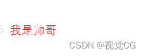
<p class="gf-gx-color">我是帅哥</p>
<style>
 .gf-gx-color {


   background: -webkit-linear-gradient(135deg,
       red,
       red 25%,
       red 50%,
       #fff 55%,
       red 60%,
       red 80%,
       red 95%,
       red);
   -webkit-text-fill-color: transparent;
   -webkit-background-clip: text;
   -moz-background-clip: text;
   -o-background-clip: text;
   background-clip: text;
   -webkit-background-size: 200% 100%;
   -moz-background-size: 200% 100%;
   -o-background-size: 200% 100%;
   background-size: 200% 100%;
   -webkit-animation: gf-gx 4s infinite linear;
   -moz-animation: gf-gx 4s infinite linear;
   -o-animation: gf-gx 4s infinite linear;
   animation: gf-gx 4s infinite linear;
 }

 @keyframes gf-gx {


   0% {


     /* 移动背景位置 */
     background-position: 0 0;
   }

   100% {


     background-position: -400% 0;
   }
 }
</style>
效果图
一束白光扫到了帅 字