今天手把手教大家用CSS3制作圆形滚动进度条动画!
先看一下效果图,会提升我们的学习兴趣哟:
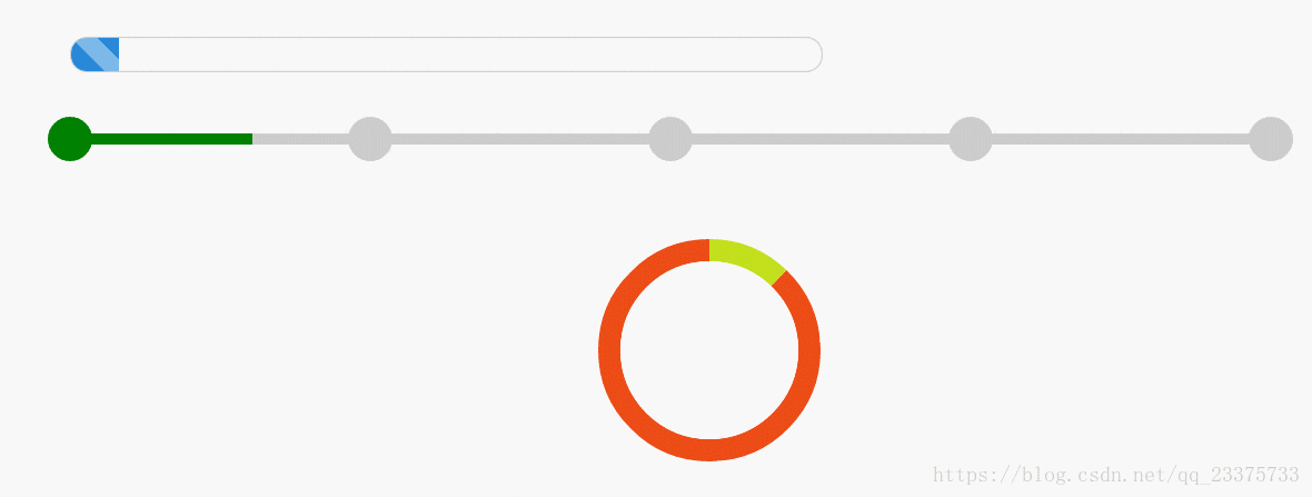
第一种效果:
html结构:
<div id="progress">
    <span></span>
</div>
css样式:
#progress {
   width: 50%;
   height: 30px;
   border: 1px solid #ccc;
   border-radius: 15px;
   margin: 50px 0 0 100px;
   overflow: hidden;
   box-shadow: 0 0 5px 0px #ddd inset;
}

#progress span {
   display: inline-block;
   width: 100%;
   height: 100%;
   background: #2989d8; /* Old browsers */
   /* linear-gradient() 函数用于创建一个线性渐变的 "图像",也就是渐变背景 */
   background: -moz-linear-gradient(45deg, #2989d8 33%, #7db9e8 34%, #7db9e8 59%, #2989d8 60%); /* FF3.6+ */
   background: -webkit-gradient(linear, left bottom, right top, color-stop(33%, #2989d8), color-stop(34%, #7db9e8), color-stop(59%, #7db9e8), color-stop(60%, #2989d8)); /* Chrome,Safari4+ */
   background: -webkit-linear-gradient(45deg, #2989d8 33%, #7db9e8 34%, #7db9e8 59%, #2989d8 60%); /* Chrome10+,Safari5.1+ */
   background: -o-linear-gradient(45deg, #2989d8 33%, #7db9e8 34%, #7db9e8 59%, #2989d8 60%); /* Opera 11.10+ */
   background: -ms-linear-gradient(45deg, #2989d8 33%, #7db9e8 34%, #7db9e8 59%, #2989d8 60%); /* IE10+ */
   background: linear-gradient(45deg, #2989d8 33%, #7db9e8 34%, #7db9e8 59%, #2989d8 60%); /* W3C */
   filter: progid:DXImageTransform.Microsoft.gradient(startColorstr='#2989d8', endColorstr='#2989d8', GradientType=1); /* IE6-9 fallback on horizontal gradient */
   background-size: 60px 30px;
   text-align: center;
   color: #fff;
   -webkit-animation: load 3s ease-in;
}

@-webkit-keyframes load {
   0% {
      width: 0%;
   }

   100% {
      width: 100%;
   }
}
可以看到其实这种进度条的动画是最容易实现的,根据具体进度百分比设置默认的width百分比和动画里100%处的width百分比就行了,比如说,我想实现70%的进度条动画效果,那么我只需要修改下一处地方:
@-webkit-keyframes load {
   0% {
      width: 0%;
   }

   100% {
      width: 70%; /* 只要把这个值设置为70%就OK了 */
   }
}
第二种效果:
html结构:
<div id="progressBar">
   <!-- 进度条 -->
   <div>
      <span></span>
   </div>

   <!-- 五个圆 -->
   <span></span>
   <span></span>
   <span></span>
   <span></span>
   <span></span>
</div>
css样式:
#progressBar {
   width: 80%;
   height: 50px;
   position: relative;
   margin: 50px 0 0 100px;
}

#progressBar div {
   width: 100%;
   height: 10px;
   position: absolute;
   top: 50%;
   left: 0;
   margin-top: -20px;
   background: #ccc;
}

#progressBar div span {
   position: absolute;
   display: inline-block;
   background: green;
   height: 10px;
   width: 100%;
   -webkit-animation: bgLoad 5.5s linear;
}

@-webkit-keyframes bgLoad {
   0% {
      width: 0%;
   }

   18.18%, 27.27% {
      width: 25%;
   }

   45.45%, 54.54% {
      width: 50%;
   }

   72.72%, 81.81% {
      width: 75%;
   }

   100% {
      width: 100%;
   }
}

#progressBar>span {
   position: absolute;
   top: 0;
   margin-top: -10px;
   width: 40px;
   height: 40px;
   border-radius: 50%;
   background: #ccc;
   margin-left: -20px;
   color: #fff;
}

@-webkit-keyframes circleLoad_1 {
   0%, 66.66% {
      background: #ccc;
   }

   100% {
      background: green;
   }
}

@-webkit-keyframes circleLoad_2 {
   0%, 83.34% {
      background: #ccc;
   }

   100% {
      background: green;
   }
}

@-webkit-keyframes circleLoad_3 {
   0%, 88.88% {
      background: #ccc;
   }

   100% {
      background: green;
   }
}

@-webkit-keyframes circleLoad_4 {
   0%, 91.67% {
      background: #ccc;
   }

   100% {
      background: green;
   }
}

#progressBar span:nth-child(2) {
   left: 0%;
   background: green;
}

#progressBar span:nth-child(3) {
   left: 25%;
   background: green;
   -webkit-animation: circleLoad_1 1.5s ease-in;
}

#progressBar span:nth-child(4) {
   left: 50%;
   background: green;
   -webkit-animation: circleLoad_2 3s ease-in;
}

#progressBar span:nth-child(5) {
   left: 75%;
   background: green;
   -webkit-animation: circleLoad_3 4.5s ease-in;
}

#progressBar span:nth-child(6) {
   left: 100%;
   background: green;
   -webkit-animation: circleLoad_4 6s ease-in;
}可以看到,其实对于动画本身是很简单的,一看就明白了,主要就是动画持续时间的计算,由于这个动画效果只执行一次,所以其实也可以用动画延迟时间来保证各个动画在指定的时间点开始执行,但是对于循环或者多次动画效果,延迟很不灵活,所以这里还是用持续时间的长短来控制动画的执行时间。
这个订单进度条,我是设置了走一段用时1秒,然后每到一个圆点就停顿0.5秒,而这0.5秒就是相对应的圆点的动画持续执行时间。但是再次强调这个是单次动画,如果想实现循环动画,还是得做调整的,必须让所有动画的持续执行时间是一样的,不然循环起来就错乱的。而时间的改动也会影响动画关键帧的改动,下面对第一小段和第二个圆的动画时间讲解一下:
首先,细长条的动画持续时间通过计算:
4小段x1秒 + 中间3个圆点 x 0.5秒 = 5.5秒
接下来就是计算细长条动画关键帧的时间分配,设每一份0.5秒,那么共总就是11份,每小段得2份,每个圆点得1份,用100%除以11,可得每份大约是9.09%,接下来就是分配时间了,这个就简单了,不多说。
接着,当细长条完成第一小段的动画效果到达第二个圆点时,会停顿0.5秒,而这0.5秒就是第二个圆点的动画时间,所以第二个圆点的动画持续时间就是:
等待细长条执行完1小段 x1秒+自身的动画完成时间x0.5秒=1.5秒
同样的方法计算每一份的时间然后进行分配。同理,其他动画效果相似,就不再赘述了。
第三种效果:
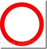
今天就重点讲解这个效果,首先,当有人说你能不能做一个圆形进度条效果出来时,如果是静态完整圆形进度条,那么就很简单了:
html结构:
<div class='circleprogress'></div>css样式:
.circleprogress {
   width: 160px;
   height: 160px;
   border: 20px solid red;
   border-radius: 50%;
}
然后就会说,这很简单嘛。但是如果不是完整圆形的呢?想了想:
.circleprogress {
   width: 160px;
   height: 160px;
   border: 20px solid red;
   border-left: 20px solid transparent;   /* transparent: 就是透明的意思 */
   border-bottom: 20px solid transparent;
   border-radius: 50%;
}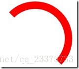
然后还是会说,这个也不难啦。可是,如果不是刚好都是45度的倍数呢?
OK,我们先设置一个200x200的方块,然后我们在这里面完成我们的效果:
html结构:
<div class="circleProgress_wrapper">
   <div class="wrapper right">
      <div class="circleProgress rightcircle"></div>
   </div>
   <div class="wrapper left">
      <div class="circleProgress leftcircle"></div>
   </div>
</div>
css样式:
.circleProgress_wrapper {
   width: 200px;
   height: 200px;
   margin: 50px auto;
   position: relative;
   border: 1px solid #ddd;
}
接下来我将在这个容器里再放两个矩形,每个矩形都占一半:
.wrapper {
   width: 100px;
   height: 200px;
   position: absolute;
   top: 0;
   overflow: hidden;
}

.right {
   right: 0;
}

.left {
   left: 0;
}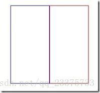
这里重点说一下class=‘wrapper’的overflow:hidden; 起着关键性作用。这两个矩形都设置了溢出隐藏,那么当我们去旋转矩形里面的圆形的时候,溢出部分就被隐藏掉了,这样我们就可以达到我们想要的效果。
从html结构也已看到,在左右矩形里面还会各自有一个圆形,先讲一下右半圆:
.circleProgress {
   width: 160px;
   height: 160px;
   border: 20px solid transparent;
   border-radius: 50%;
   position: absolute;
   top: 0;
}

.rightcircle {
   border-top: 20px solid green;
   border-right: 20px solid green;
   right: 0;
}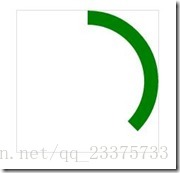
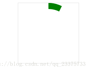
可以看到,效果已经出来了,其实本来是一个半圆弧,但由于我们设置了上边框和右边框,所以上边框有一半溢出而被隐藏了,所以我们可以通过旋转得以还原:
.circleProgress {
   width: 160px;
   height: 160px;
   border: 20px solid transparent;
   border-radius: 50%;
   position: absolute;
   top: 0;
   -webkit-transform: rotate(45deg);
}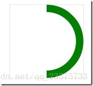
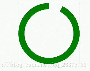
所以只要旋转自己想要的角度就可以实现任意比例的进度条。接下来把左半圆弧也实现,变成一个圆:
.leftcircle {
   border-bottom: 20px solid green;
   border-left: 20px solid green;
   left: 0;
}
紧接着,就是让它动起来,原理是这样的,先让右半圆弧旋转180度,再让左半圆弧旋转180度,这样,两个半圆弧由于先后都全部溢出而消失了,所以看起来就是进度条再滚动的效果:
.rightcircle {
   border-top: 20px solid green;
   border-right: 20px solid green;
   right: 0;
   -webkit-animation: circleProgressLoad_right 5s linear infinite;
}

.leftcircle {
   border-bottom: 20px solid green;
   border-left: 20px solid green;
   left: 0;
   -webkit-animation: circleProgressLoad_left 5s linear infinite;
}

@-webkit-keyframes circleProgressLoad_right {
   0% {
      -webkit-transform: rotate(45deg);
   }

   50%, 100% {
      -webkit-transform: rotate(225deg);
   }
}

@-webkit-keyframes circleProgressLoad_left {
   0%, 50% {
      -webkit-transform: rotate(45deg);
   }

   100% {
      -webkit-transform: rotate(225deg);
   }
}
当然,我们只需要调整一下角度就可以实现反向的效果:
.circleProgress {
   width: 160px;
   height: 160px;
   border: 20px solid transparent;
   border-radius: 50%;
   position: absolute;
   top: 0;
   -webkit-transform: rotate(-135deg);
}

@-webkit-keyframes circleProgressLoad_right {
   0% {
      -webkit-transform: rotate(-135deg);
   }

   50%, 100% {
      -webkit-transform: rotate(45deg);
   }
}

@-webkit-keyframes circleProgressLoad_left {
   0%, 50% {
      -webkit-transform: rotate(-135deg);
   }

   100% {
      -webkit-transform: rotate(45deg);
   }
}
好的,接下来就是奔向最终效果了,正如我们一开始看到的那样,有点像我们使用360卫士清理垃圾时的类似效果,当然不是很像啦:
.circleProgress_wrapper {
   width: 200px;
   height: 200px;
   margin: 50px auto;
   position: relative;
   border: 1px solid #ddd;
}

.wrapper {
   width: 100px;
   height: 200px;
   position: absolute;
   top: 0;
   overflow: hidden;
}

.right {
   right: 0;
}

.left {
   left: 0;
}

.circleProgress {
   width: 160px;
   height: 160px;
   border: 20px solid rgb(232, 232, 12);
   border-radius: 50%;
   position: absolute;
   top: 0;
   -webkit-transform: rotate(45deg);
}

.rightcircle {
   border-top: 20px solid green;
   border-right: 20px solid green;
   right: 0;
   -webkit-animation: circleProgressLoad_right 5s linear infinite;
}

.leftcircle {
   border-bottom: 20px solid green;
   border-left: 20px solid green;
   left: 0;
   -webkit-animation: circleProgressLoad_left 5s linear infinite;
}

@-webkit-keyframes circleProgressLoad_right {
   0% {
      border-top: 20px solid #ed1a1a;
      border-right: 20px solid #ed1a1a;
      -webkit-transform: rotate(45deg);
   }

   50% {
      border-top: 20px solid rgb(232, 232, 12);
      border-right: 20px solid rgb(232, 232, 12);
      border-left: 20px solid rgb(81, 197, 81);
      border-bottom: 20px solid rgb(81, 197, 81);
      -webkit-transform: rotate(225deg);
   }

   100% {
      border-left: 20px solid green;
      border-bottom: 20px solid green;
      -webkit-transform: rotate(225deg);
   }
}

@-webkit-keyframes circleProgressLoad_left {
   0% {
      border-bottom: 20px solid #ed1a1a;
      border-left: 20px solid #ed1a1a;
      -webkit-transform: rotate(45deg);
   }

   50% {
      border-bottom: 20px solid rgb(232, 232, 12);
      border-left: 20px solid rgb(232, 232, 12);
      border-top: 20px solid rgb(81, 197, 81);
      border-right: 20px solid rgb(81, 197, 81);
      -webkit-transform: rotate(45deg);
   }

   100% {
      border-top: 20px solid green;
      border-right: 20px solid green;
      border-bottom: 20px solid green;
      border-left: 20px solid green;
      -webkit-transform: rotate(225deg);
   }
}可以看到,其实就是多了一些改变不同边框颜色的动画而已,这个就给大家自己去实践吧!主要还是利用两个矩形来完成这么一个圆形进度条效果,特别注意overflow这条规则,起着关键作用。