文章目录
一、导读
今天给大家推荐一个高级的可视化神器:cufflinks
学习过可视化库matplotlib和seaborn的朋友都知道:seaborn是matplotlib的高级封装。在这里我也告诉大家:cufflinks就是plotly的高级封装。
plotly的绘图已经够简洁和优雅,没有想到cufflinks更甚之。在这里用一句话形容cufflinks:
cufflinks之于plotly,犹如seaborn之于matplotlib
那到底什么是cufflinks呢?
cufflinks是一个基于Python的数据可视化库,它建立在Plotly库之上,为用户提供了一种简单而强大的方式来创建交互式的、美观的图表和可视化。它的设计旨在使绘图过程变得简单且具有灵活性,无需编写复杂的代码。
使用cufflinks可以轻松地将Pandas DataFrame和Series对象转换为交互式图表。它提供了与Pandas紧密集成的API,使数据可视化的过程变得直观且易于操作。通过几行简单的代码,就可以创建各种类型的图表,包括线图、柱状图、散点图、面积图、箱线图、热图等。
cufflinks还具有许多便捷的功能和选项,可让用户自定义图表的外观和样式。此外可以设置标题、轴标签、颜色、图例等,并通过拖动和缩放等交互式功能与图表进行互动。
此外,cufflinks还提供了简便的导出功能,可以将生成的图表保存为静态图像或动态HTML文件,以便与他人共享或嵌入到网页中。
二、安装
安装非常简单:
pip install cufflinks
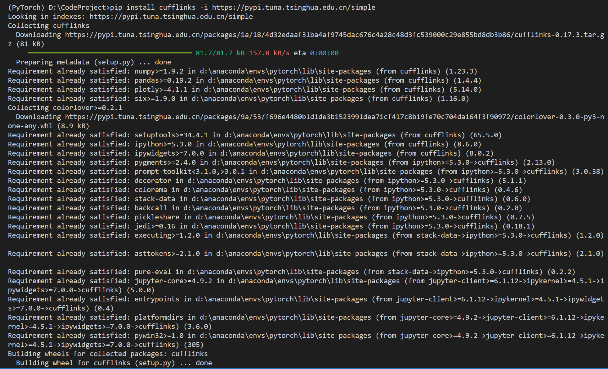
建议用清华源加速:
pip install cufflinks -i https://pypi.tuna.tsinghua.edu.cn/simple
三、使用方法
import pandas as pd
import numpy as np

import cufflinks as cf
# 设置配置文件
#  theme的7个选择项: 'ggplot', 'pearl', 'solar', 'space', 'white', 'polar', 'henanigans'
cf.set_config_file(world_readable=True, theme="pearl", offline=True)

%reload_ext autoreload
%autoreload 2
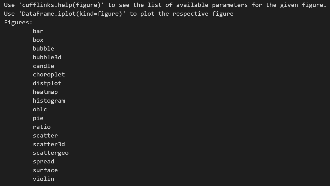
查看cufflinks的帮助文档,目前cufflinks绘制的图形:
cf.help()
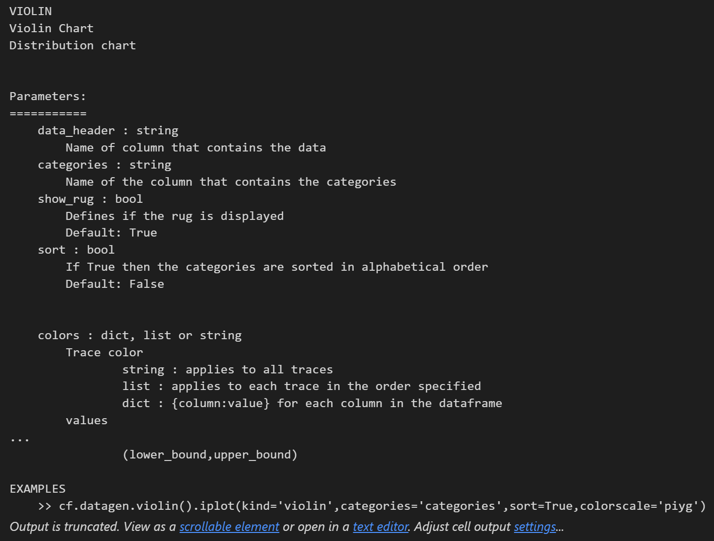
查看某个图形的参数:
cf.help("violin")
使用说明:
DataFrame.Figure.iplot()
- DataFrame:pandas中的数据框
- Figure:指定图形,比如box、bar等
- iplot():参数设置
参数说明:
df.iplot(
    kind='scatter',data=None,layout=None,filename='',sharing=None,
    title='',xTitle='',yTitle='',zTitle='',theme=None,
    colors=None,colorscale=None,fill=False,width=None,dash='solid',
    mode='',interpolation='linear',symbol='circle',size=12,barmode='',
    sortbars=False,bargap=None,bargroupgap=None,bins=None,histnorm='',
    histfunc='count',orientation='v',boxpoints=False,annotations=None,keys=False,
    bestfit=False,bestfit_colors=None,mean=False,mean_colors=None,categories='',
    x='',y='',z='',text='',gridcolor=None,zerolinecolor=None,
    margin=None,labels=None,values=None,secondary_y='',secondary_y_title='',
    subplots=False,shape=None,error_x=None,error_y=None,error_type='data',
    locations=None,lon=None,lat=None,asFrame=False,asDates=False,
    asFigure=False,asImage=False,dimensions=None,asPlot=False,asUrl=False,online=None,**kwargs,
)
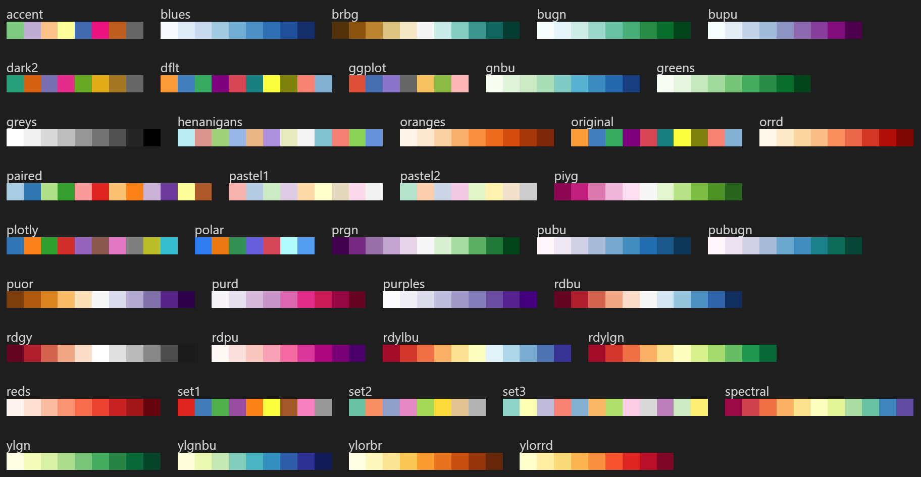
cufflinks的7大绘图主题风格:
cf.getThemes()

cufflinks支持的色盘:
cf.colors.scales()
四、数据说明
我们使用sklearn自带的iris数据集:
from sklearn import datasets
iris = datasets.load_iris()
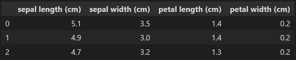
df = pd.DataFrame(iris.data,columns=iris.feature_names)
df.head(3)
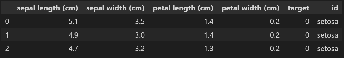
df["target"] = iris.target
df.head(3)

基于对应关系进行转换:
0:'setosa', 1:'versicolor', 2:'virginica'
df["id"] = df["target"].map({

    0:'setosa', 1:'versicolor', 2:'virginica'})
df.head(3)
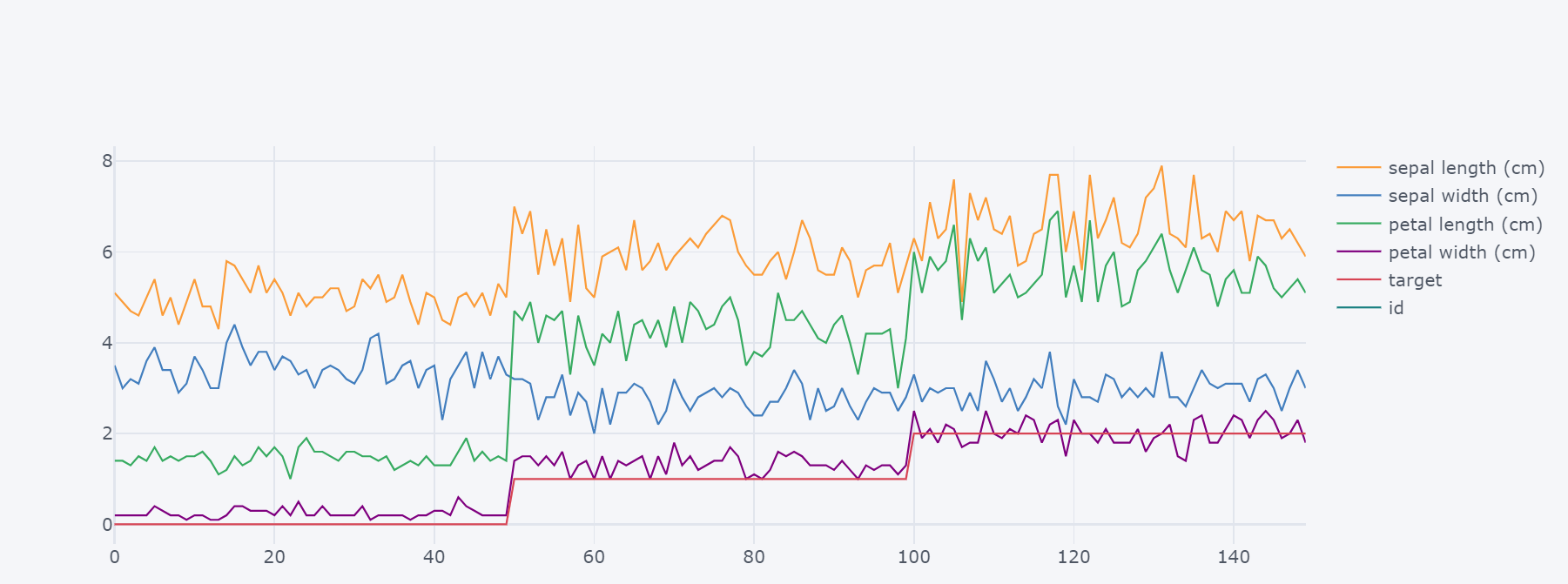
五、折线图
默认是折线图:
df.iplot()

# df.iplot(kind="scatter")  # 等价
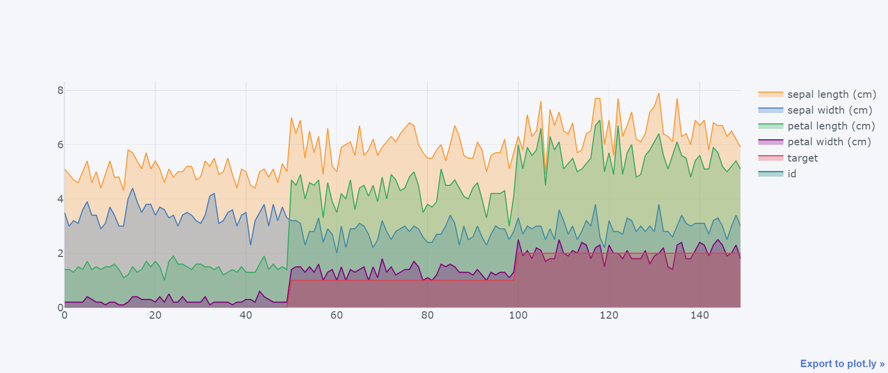
对折线进行填充:
df.iplot(kind="scatter",fill=True)
六、散点图
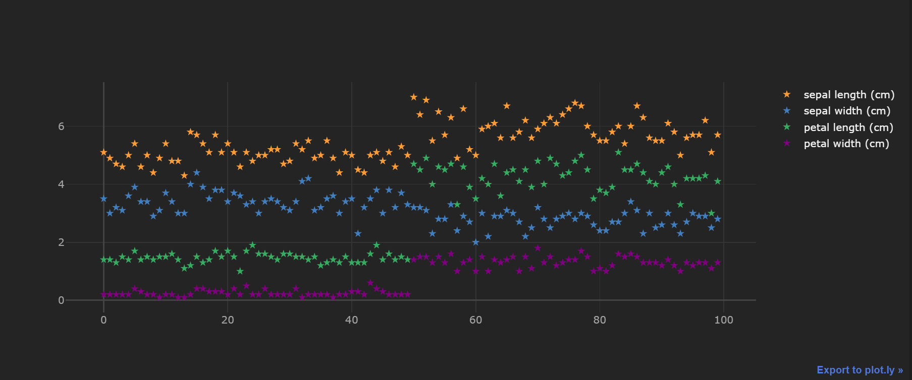
df.iloc[:100,:4].iplot(kind="scatter",
                       mode="markers", # 指定类型
                       # colors=["red","orange","blue","black"], # 颜色
                       size=7,  # 大小
                       theme="henanigans",  # 指定主题
                       symbol="star"  # 散点形状;默认是圆点
                      )
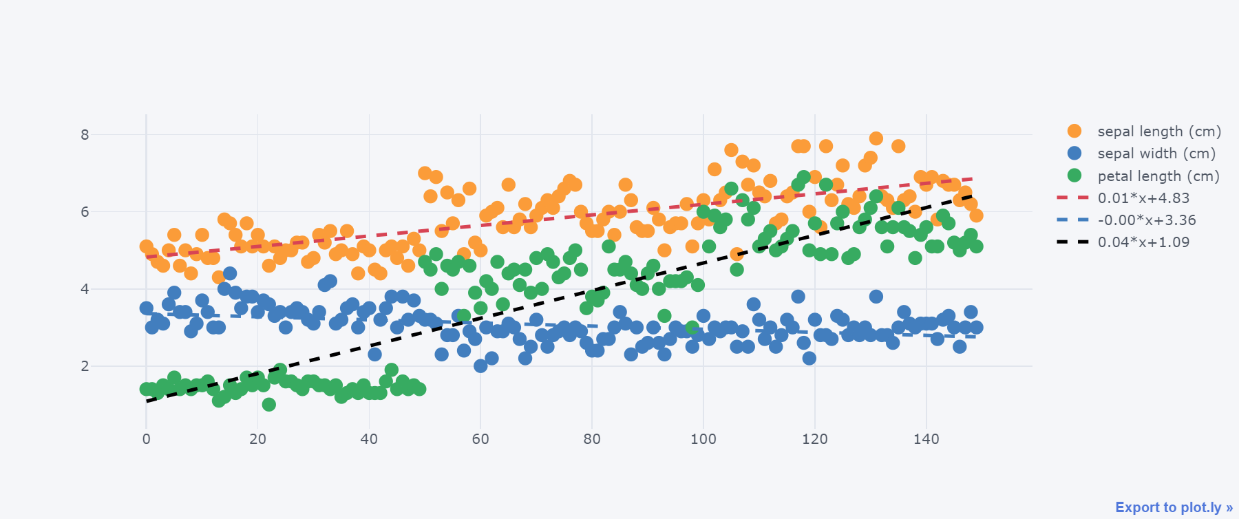
绘制带有回归趋势的散点图:
df.iloc[:,:3].iplot(kind="scatter",
                    mode="markers",
                    bestfit=True,  # 拟合趋势
                    bestfit_colors=["red","blue","black"]  # 拟合线颜色
                      )
七、气泡图
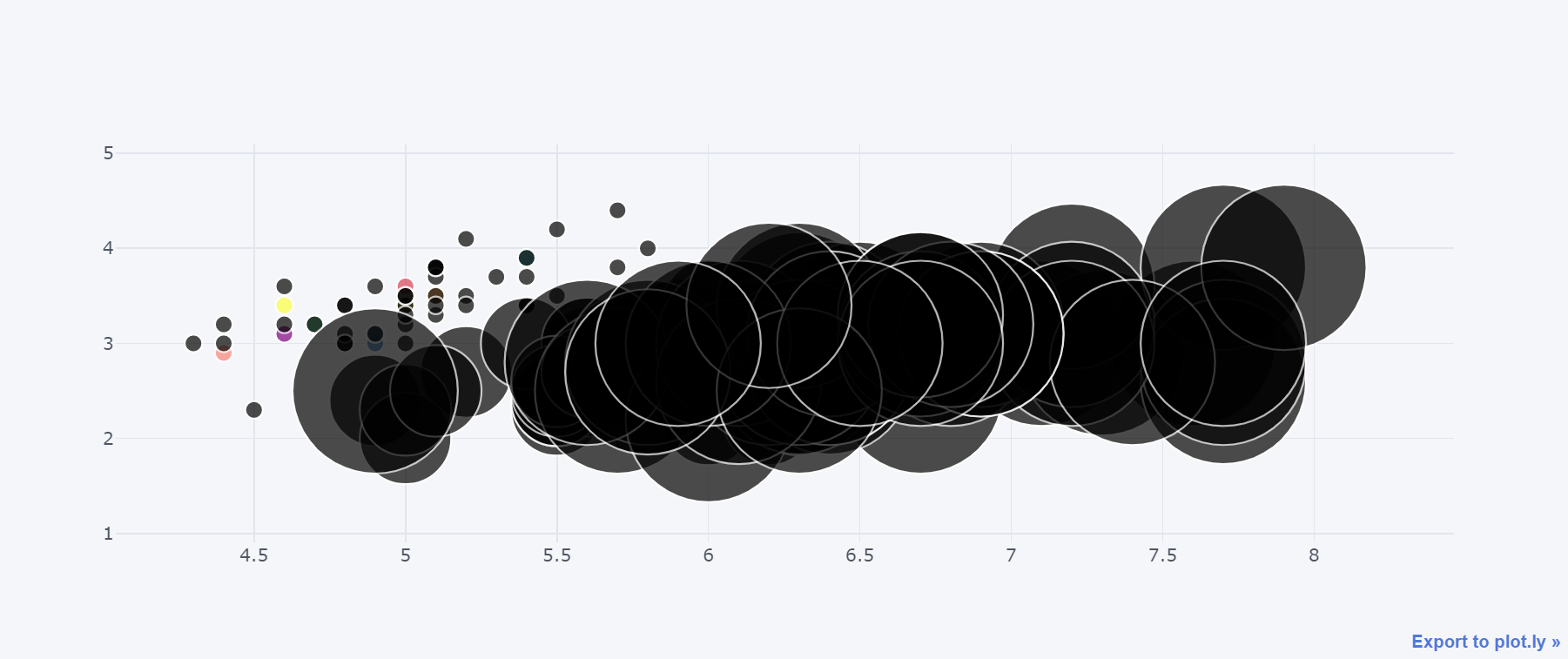
df.iplot(kind="bubble",x="sepal length (cm)",y="sepal width (cm)",size="target")
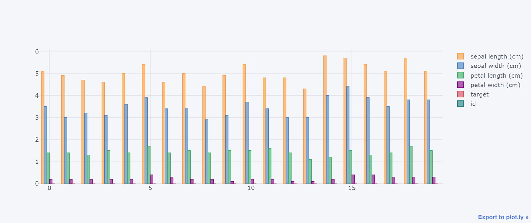
八、柱状图
df.head(20).iplot(kind="bar")
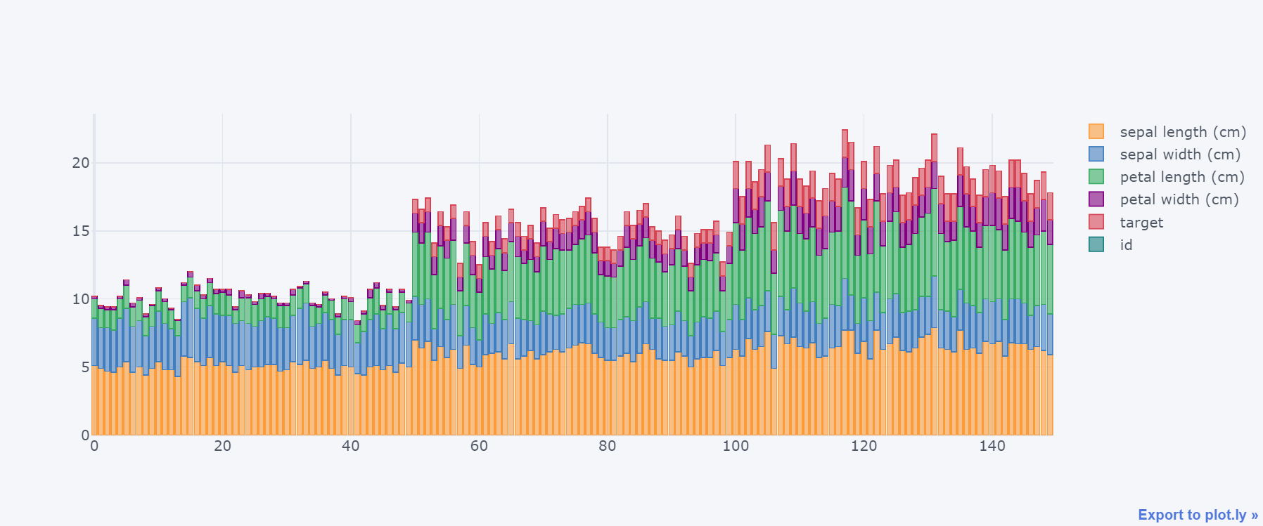
堆叠柱状图 :
df.iplot(kind="bar", barmode="stack")
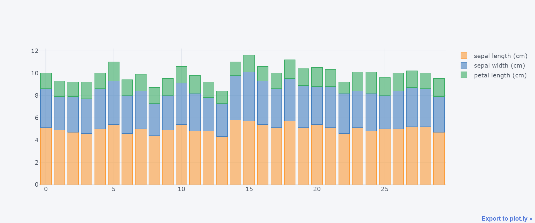
取出部分dataframe数据下绘图:
df.iloc[:30,:3].iplot(kind="bar", barmode="stack")
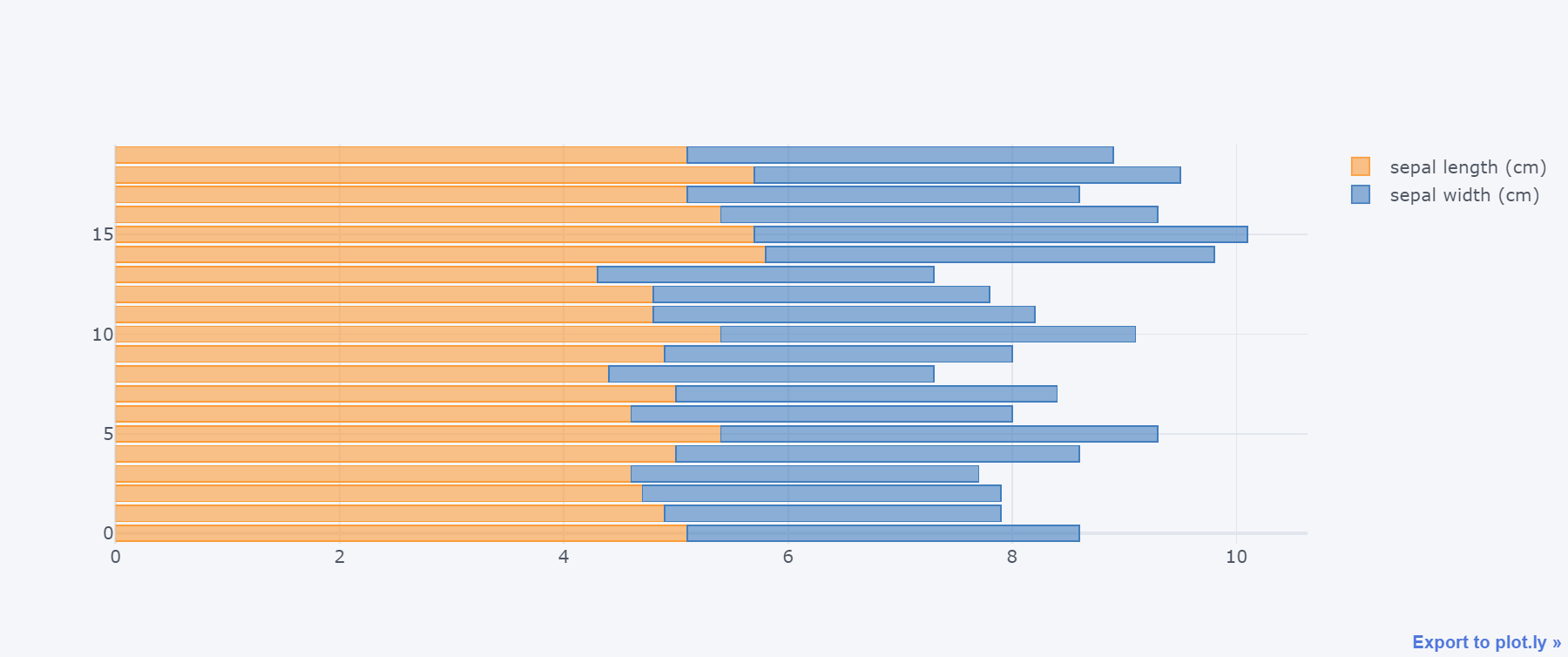
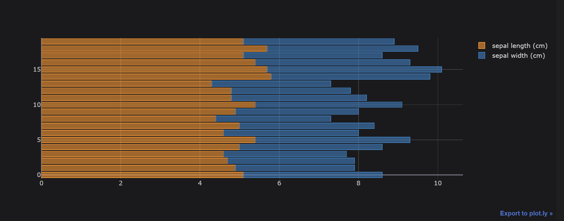
水平柱状图:
df.iloc[:20,:2].iplot(kind="barh", barmode="stack")
也可以通过参数orientation进行设置:v-垂直方向,h-水平方向
df.iloc[:20,:2].iplot(kind="bar",
                      barmode="stack",
                      orientation="h",
                      theme="space",  # 指定主题
                     )
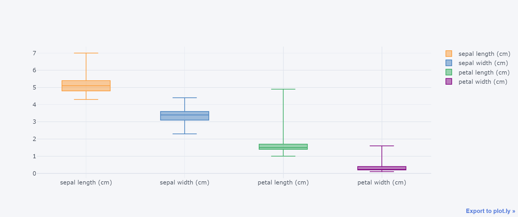
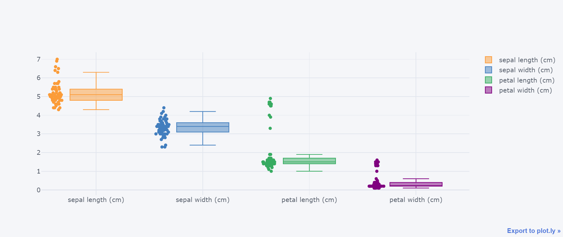
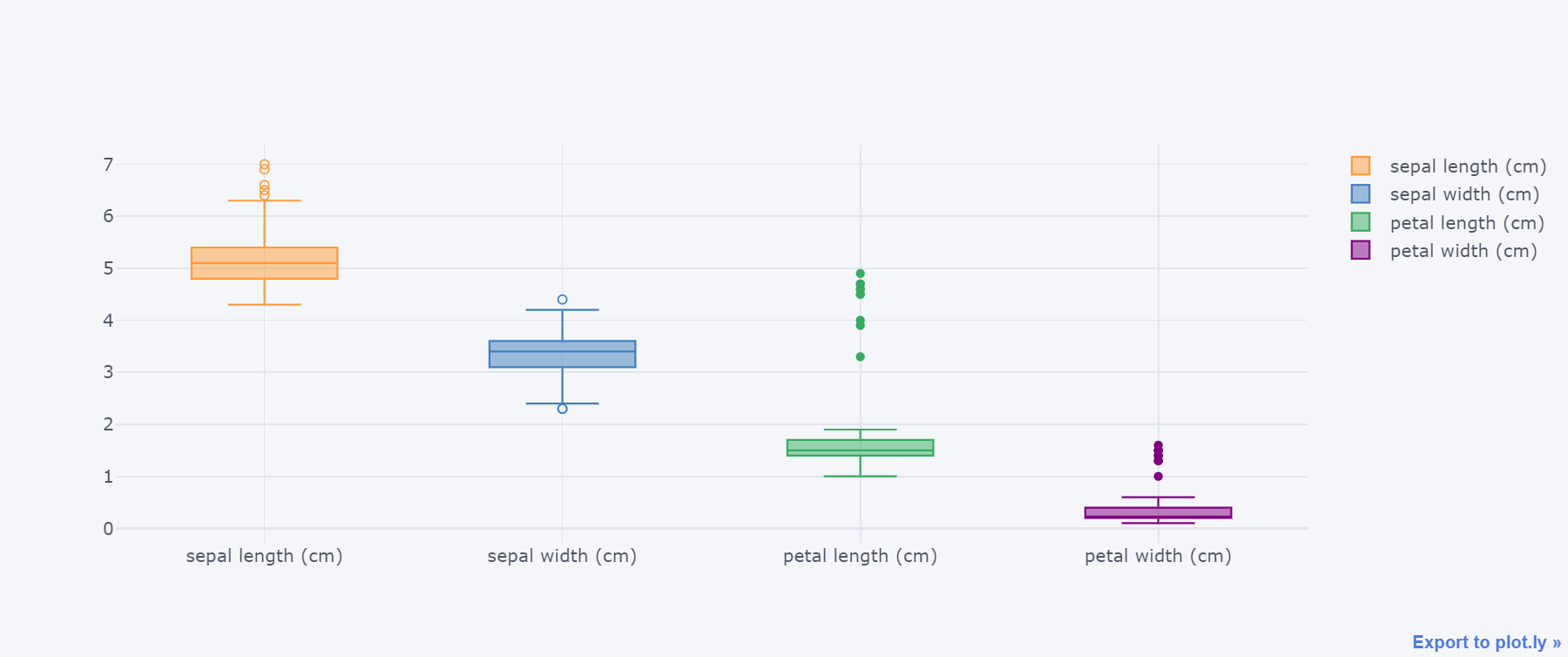
九、箱型图box
df.iloc[:60,:4].iplot(kind="box")
df.iloc[:60,:4].iplot(kind="box",boxpoints="all")
df.iloc[:60,:4].iplot(kind="box",boxpoints="outliers")
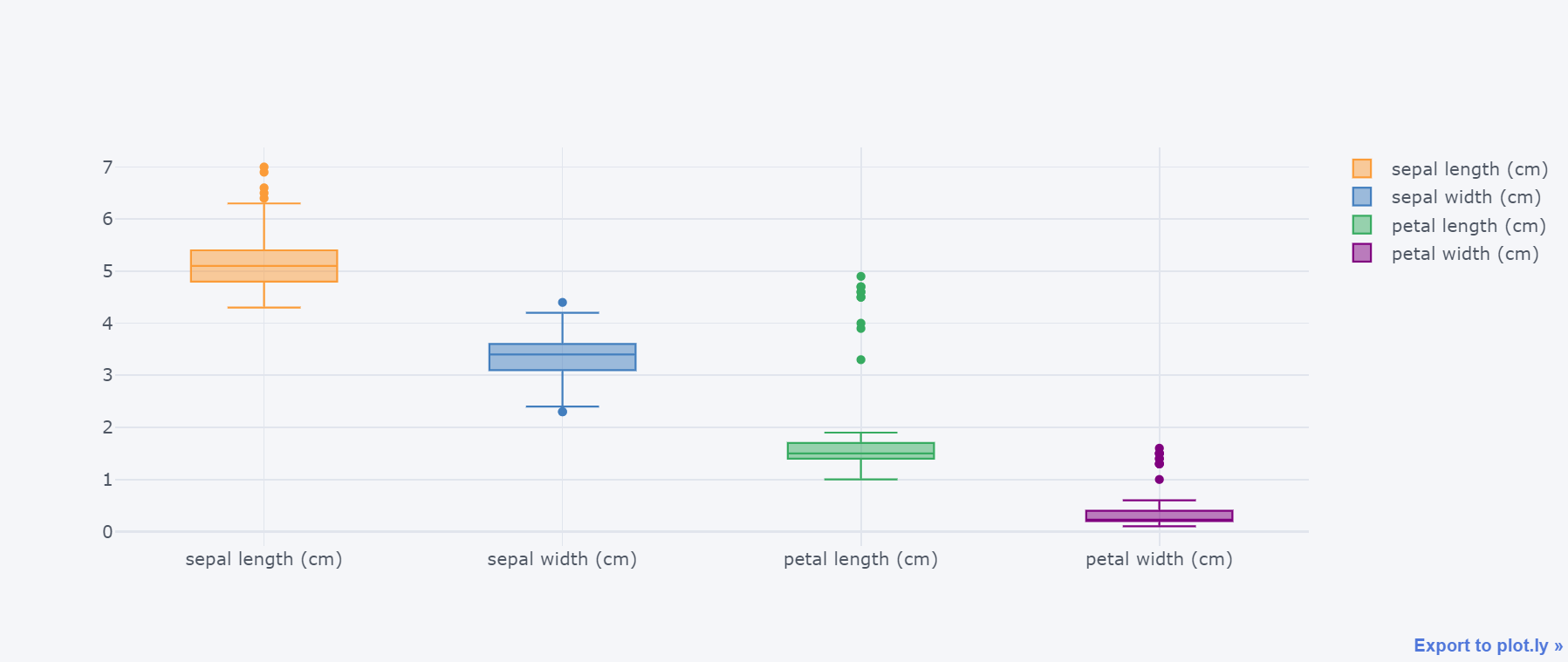
df.iloc[:60,:4].iplot(kind="box",boxpoints="suspectedoutliers")
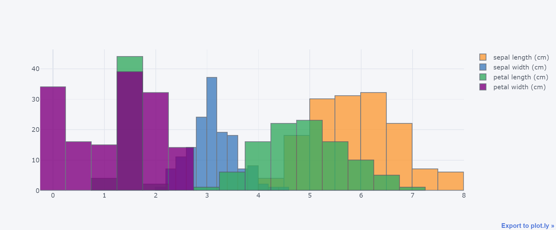
十、直方图
df.iloc[:,:4].iplot(kind="histogram")
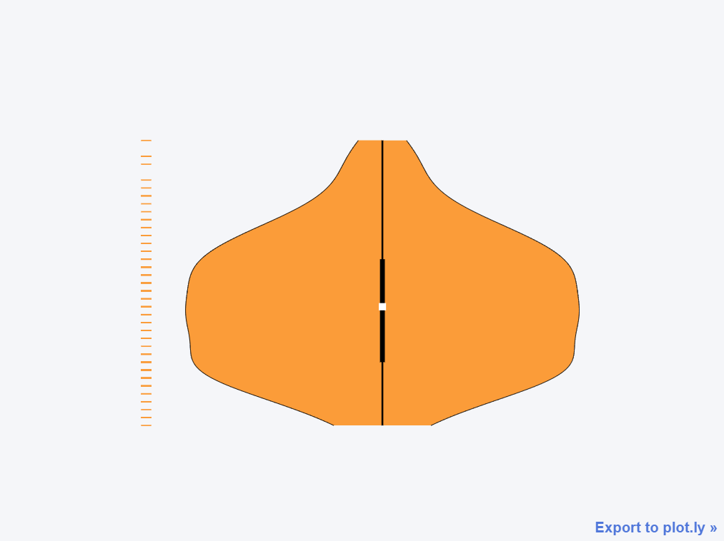
十一、小提琴图
df.columns
Index(['sepal length (cm)', 'sepal width (cm)', 'petal length (cm)',
       'petal width (cm)', 'target', 'id'],
      dtype='object')
df.iloc[:,:].iplot(kind="violin",data_header='sepal length (cm)')
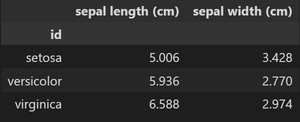
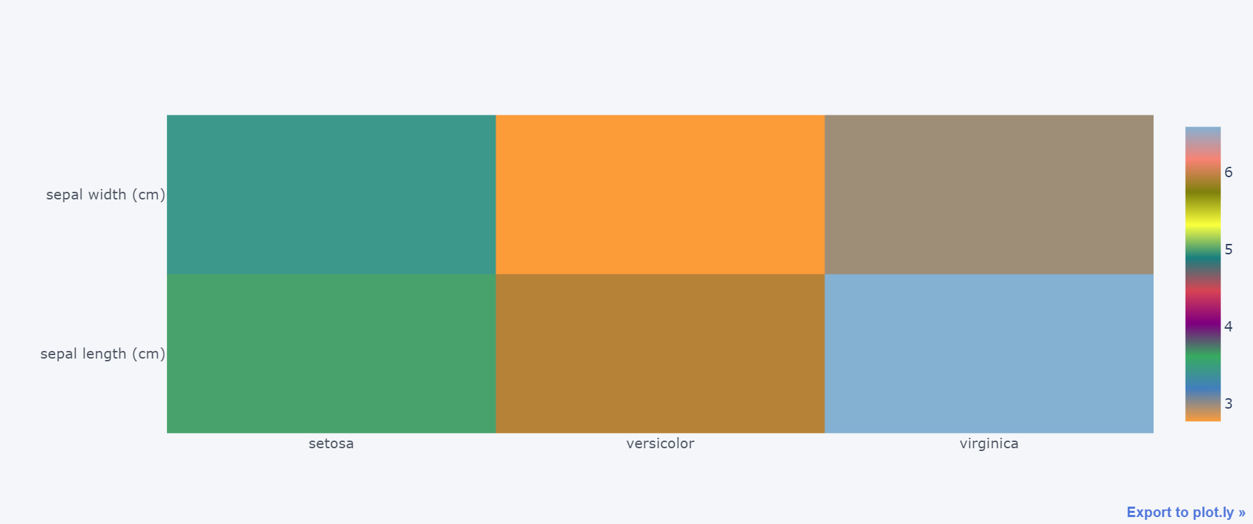
十二、热力图heatmap
我们需要先生成透视表的数据:
data = pd.pivot_table(df,index="id",values=["sepal length (cm)","sepal width (cm)"])
data
data.iplot(kind="heatmap")
十三、3d图
df.iplot(kind="scatter3d",
         x="sepal length (cm)", # 指定三个轴的数据
         y="sepal width (cm)",
         z="petal length (cm)",
         categories="id",
         xTitle="sepal length",  # 指定3个轴的标题
         yTitle="sepal width",
         zTitle="petal length"
        )

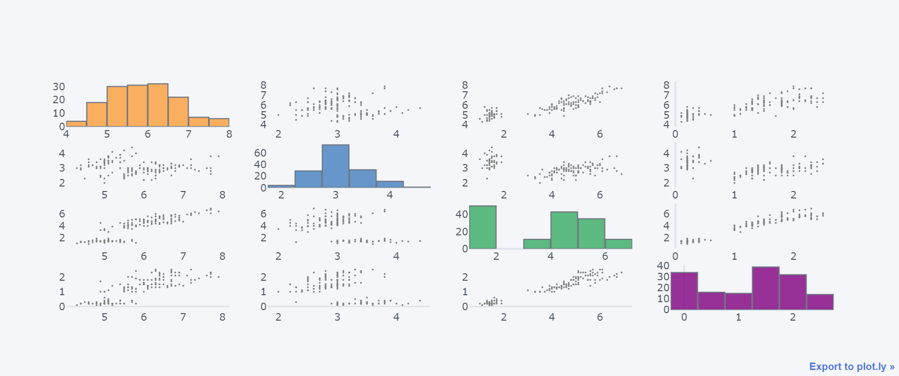
十四、散点矩阵图
df.iloc[:,:4].scatter_matrix()
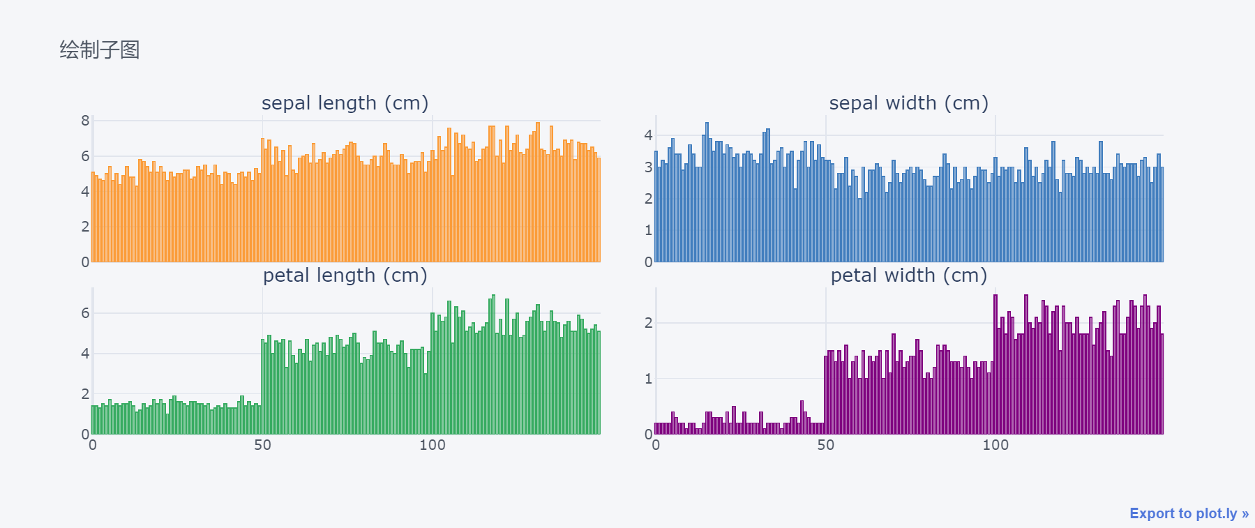
十五、子图
df.iloc[:,:4].iplot(kind="bar",
                    barmode="stack", # 模式
                    title="绘制子图",  # 标题
                    subplots=True, # 子图开始
                    shape=(2,2),  # n行m列
                    shared_xaxes=True,  # 是否共享x轴
                    vertical_spacing=0.08,  # 垂直和水平间距
                    horizontal_spacing=0.05,
                    subplot_titles=True,  # 开启子图名称
                    legend=False  # 是否显示图例
                   )