序言
在深入浅出统计学的第一张中一共出现了4类图像:
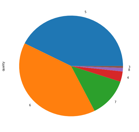
1. 比较基本比例—>饼图
2. 比较数值的高低条形图(基本条形图,堆积条形图,分段条形图)
3. 连续数据的对比(等距直方图—>频数,非等距直方图—>频数密度)
4. 截止到某时间点的累计总量—>累积频数图
Python中是实现方式有两种,matplotlib和Pandas,一般而言直接使用Pandas即可.此处我们先给出Pandas中的实现,然后再做部分补充.数据我们依然使用数据探索那篇文章中用过的UCI红酒质量数据集.
本处最后区域图与散点图,六边形容器图代码与文字基本来自于Pandas的文档,仅仅略加修改,链接请参见文章末尾.
读取数据
import pandas as pd
import numpy as np
import matplotlib.pyplot as plt
%matplotlib inline

# 定义读取数据的函数
def ReadAndSaveDataByPandas(target_url = None,file_save_path = None ,save=False):

    if target_url !=None:
        target_url = ("http://archive.ics.uci.edu/ml/machine-learning-databases/wine-quality/winequality-red.csv")
    if file_save_path != None:
        file_save_path = "/home/fonttian/Data/UCI/Glass/glass.csv"

    wine = pd.read_csv(target_url, header=0, sep=";")
    if save == True:
        wine.to_csv(file_save_path, index=False)

    return wine

def GetDataByPandas():
    wine = pd.read_csv("/home/font/Data/UCI/WINE/wine.csv")
    y = np.array(wine.quality)
    X = np.array(wine.drop("quality", axis=1))
    # X = np.array(wine)

    columns = np.array(wine.columns)

    return X, y, columns

# X,y,names = GetDataByPandas()
# wine = pd.DataFrame(X)
wine = pd.read_csv("/home/font/Data/UCI/WINE/wine.csv")
print(list(wine.columns))
print(set(wine['quality'].value_counts()))
print(wine['quality'].value_counts())
wine['quality'].value_counts().plot.pie(subplots=True,figsize=(8,8))
plt.show()['fixed acidity', 'volatile acidity', 'citric acid', 'residual sugar', 'chlorides', 'free sulfur dioxide', 'total sulfur dioxide', 'density', 'pH', 'sulphates', 'alcohol', 'quality']
{199, 681, 10, 18, 53, 638}
5 681
6 638
7 199
4 53
8 18
3 10
Name: quality, dtype: int64
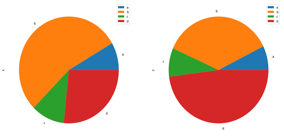
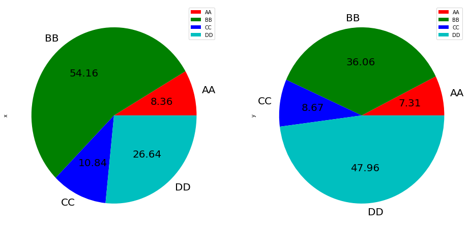
df = pd.DataFrame(3 * np.random.rand(4, 2), index=['a', 'b', 'c', 'd'], columns=['x', 'y'])
print(df)
df.plot.pie(subplots=True, figsize=(16,8 ))
df.plot.pie(subplots=True,labels=['AA', 'BB', 'CC', 'DD'], colors=['r', 'g', 'b', 'c'],autopct='%.2f', fontsize=20, figsize=(16, 8))
plt.show()
x y
a 0.357865 0.423390
b 2.318759 2.089677
c 0.464072 0.502673
d 1.140500 2.779330
wine['quality'][0:10].plot(kind='bar',figsize=(16,8)); plt.axhline(0, color='k')
plt.show()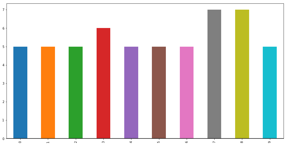
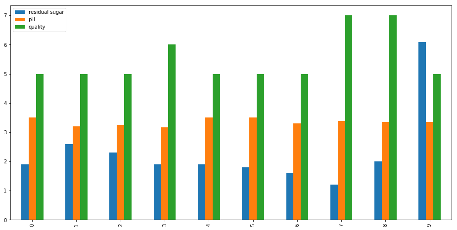
wine[['residual sugar','pH','quality']][0:10].plot.bar(figsize=(16,8))
wine[['residual sugar','pH']][0:10].plot.bar(figsize=(16,8),stacked=True)
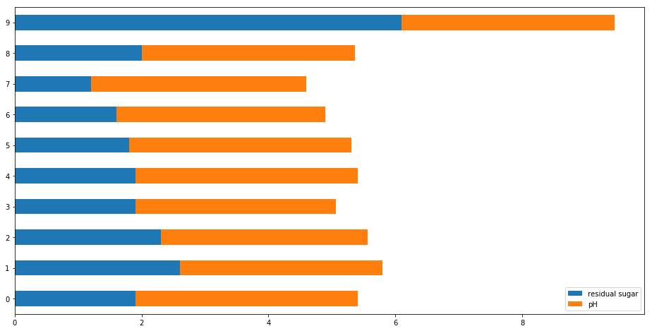
wine[['residual sugar','pH']][0:10].plot.barh(figsize=(16,8),stacked=True)
plt.show()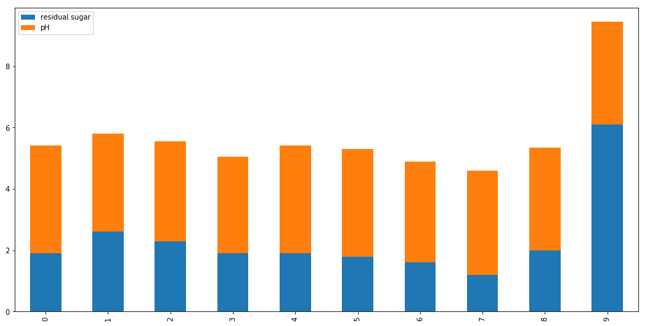
# 普通画法
wine[['residual sugar','alcohol']].plot.hist(bin==20,figsize=(16,10),alpha=0.5)
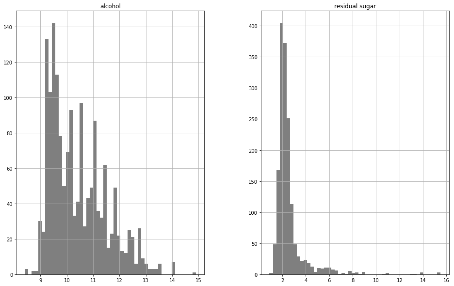
# 分开画
wine[['residual sugar','alcohol']].hist(color='k', alpha=0.5, bins=50,figsize=(16,10))
plt.show() 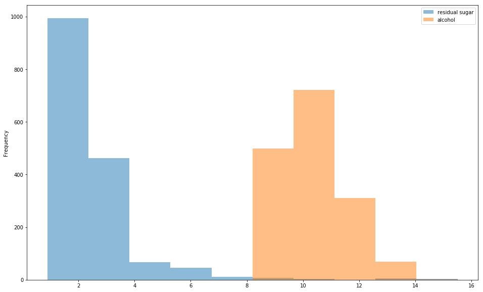
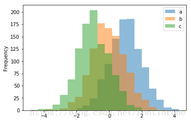
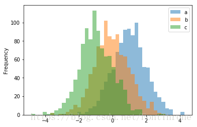
df_hist = pd.DataFrame({'a': np.random.randn(1000) + 1, 'b': np.random.randn(1000),'c': np.random.randn(1000) - 1}, columns=['a', 'b', 'c'])
df_hist.plot.hist(alpha=0.5)
plt.show()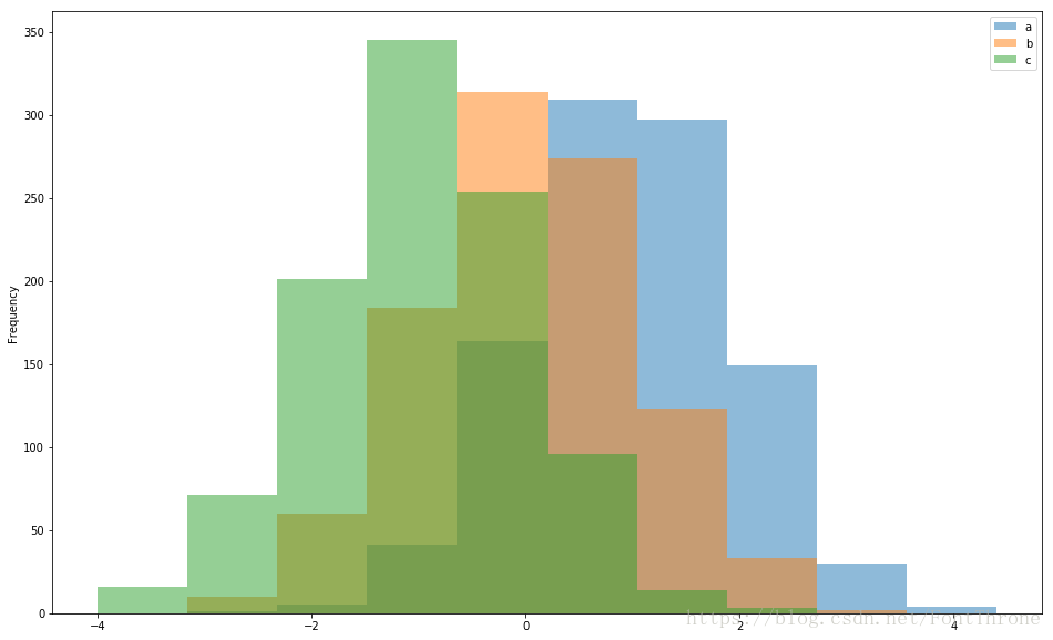
# orientation='horizontal', 斜向
# cumulative=True, 是否累积
df_hist['b'].plot.hist(orientation='horizontal', cumulative=True)
plt.show()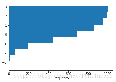
wine[['fixed acidity', 'residual sugar', 'alcohol', 'quality']][0:15].plot()
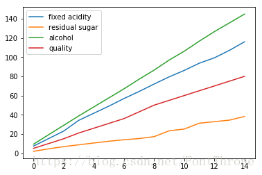
wine[['fixed acidity', 'residual sugar', 'alcohol', 'quality']][0:15].cumsum().plot()
plt.show()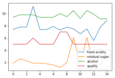
其他的常用图形
除了这几种图像之外,Pandas还提供了很多种其他的数据可视化方法,这里我们介绍其中较为简单和常用的几种余下的几种会在机器学习的数据探索中介绍,之前已经写过一篇简单的入门,余下内容日后补充—>https://blog.csdn.net/FontThrone/article/details/78188401
三种图像的作用
1. 箱型图 ---> 展示数据分布,发现异常点
2. 两种区域图 ---> 对比数据大小
3. 散点图,六边形容器图 ---> 数据分布与趋势
1.箱型图
在竖向的箱型图中从上到下的五个横线分别是,上界,上四分位数,中位数,下四分位数,下界,上下界以外的点可作为异常点的一个参考,这个图形在书中第三章有将为详细的解释
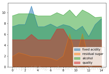
2.区域图
叠加与非叠加区域图,有点在于可以更好地比较区域(x * y)的大小
3.散点图与六边形容器图
可以一定程度上观察数据分布,比如发现数据分布的区域和分布趋势,对于发现数据分布的区域,或者找到一定的拟合规律还是有很大帮助的.有必要的话,还可以使用三维散点图,但是这需要matplotlib实现.
wine[['fixed acidity', 'residual sugar', 'alcohol', 'quality']].plot.box()
# vert=False, 横向
# positions=[1, 4, 6, 8], y轴位置
# color=color, 颜色
# sym='r+', 异常点的样式
color = dict(boxes='DarkGreen', whiskers='DarkOrange', medians='DarkBlue', caps='Gray')
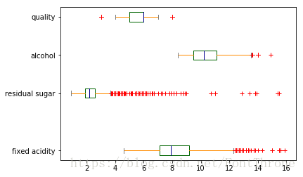
wine[['fixed acidity', 'residual sugar', 'alcohol', 'quality']].plot.box(vert=False, positions=[1, 4, 6, 8],color=color,sym='r+')
plt.show()
# pandas 自带接口 ----> boxplot(),此处不再演示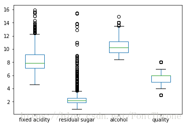
wine[['fixed acidity', 'residual sugar', 'alcohol', 'quality']][0:15].plot.area()
wine[['fixed acidity', 'residual sugar', 'alcohol', 'quality']][0:15].plot.area(stacked=False)
plt.show()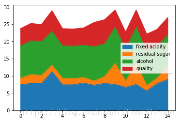
# 可以使用DataFrame.plot.scatter()方法绘制散点图。散点图需要x和y轴的数字列。这些可以分别由x和y关键字指定。
df = pd.DataFrame(np.random.rand(50, 4), columns=['a', 'b', 'c', 'd'])
df.plot.scatter(x='a', y='b');
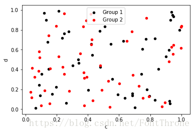
# 要在单个轴上绘制多个列组,请重复指定目标ax的plot方法。建议使用color和label关键字来区分每个组。
ax = df.plot.scatter(x='a', y='b', color='black', label='Group 1');
df.plot.scatter(x='c', y='d', color='red', label='Group 2', ax=ax);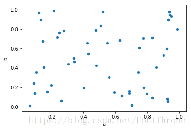
# 可以给出关键字c作为列的名称以为每个点提供颜色:
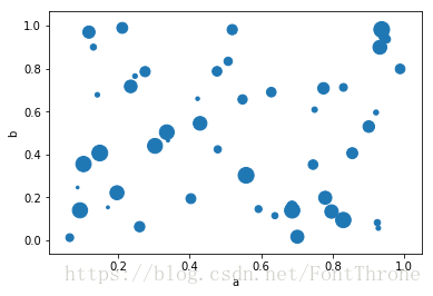
# 您可以传递matplotlib scatter支持的其他关键字。以下示例显示了使用数据框列值作为气泡大小的气泡图。
df.plot.scatter(x='a', y='b', c='c', s=50);
df.plot.scatter(x='a', y='b', s=df['c']*200);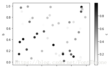
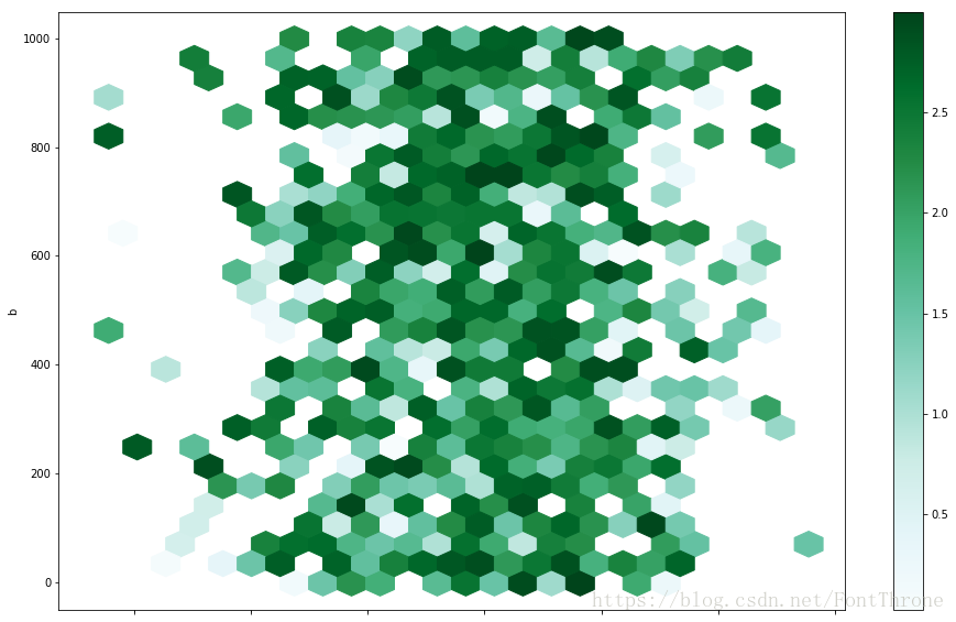
您可以使用DataFrame.plot.hexbin()创建六边形箱图。如果数据过于密集而无法单独绘制每个点,则Hexbin图可能是散点图的有用替代方案。
df = pd.DataFrame(np.random.randn(1000, 2), columns=['a', 'b'])

df['b'] = df['b'] + np.arange(1000)

df.plot.hexbin(x='a', y='b', gridsize=25,figsize=(16,10))

plt.show()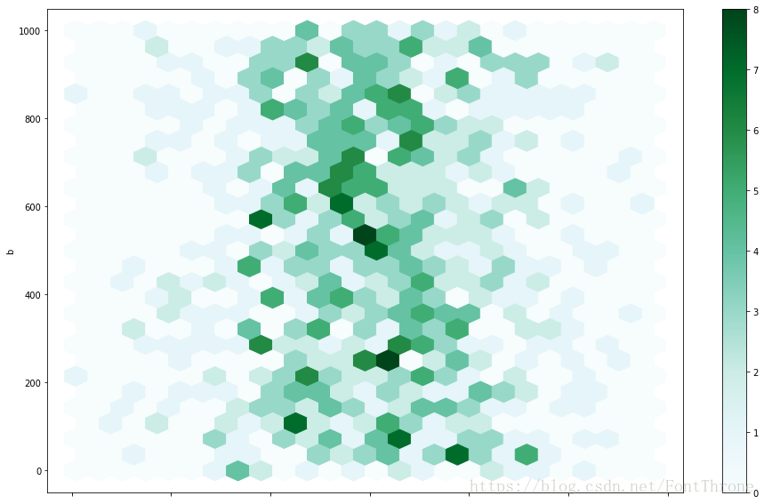
一个有用的关键字参数是gridsize;它控制x方向上的六边形数量,默认为100。更大的gridsize意味着更多,更小的分组。
默认情况下,计算每个(x, y)点周围计数的直方图。您可以通过将值传递给C和reduce_C_function参数来指定替代聚合。C specifies the value at each (x, y) point and reduce_C_function is a function of one argument that reduces all the values in a bin to a single number (e.g. mean, max, sum, std). 在这个例子中,位置由列a和b给出,而值由列z给出。箱子与numpy的max函数聚合。
df = pd.DataFrame(np.random.randn(1000, 2), columns=['a', 'b'])

df['b'] = df['b'] = df['b'] + np.arange(1000)

df['z'] = np.random.uniform(0, 3, 1000)

df.plot.hexbin(x='a', y='b', C='z', reduce_C_function=np.max,gridsize=25,figsize=(16,10))

plt.show()