打算结合python再回顾下这本统计学入门书的内容
深入浅出统计学
第一章 信息图形化
这一章的主要知识点是介绍常见的统计图以及相应的画法
1.饼图
import numpy as np
import pandas as pd
import matplotlib.pyplot as plt
from matplotlib.font_manager import FontProperties
import matplotlib
matplotlib.rcParams['font.sans-serif'] = ['SimHei']
matplotlib.rcParams['axes.unicode_minus'] = False
matplotlib.pyplot.style.use('ggplot')
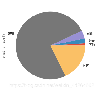
data = pd.Series({'其他':1500,'射击':3500,'动作':6000,'策略':115000,'体育':27500})
data
其他      1500
射击      3500
动作      6000
策略    115000
体育     27500
dtype: int64
data.plot(kind='pie',figsize=(5,5),label='what\'s label?')
2.条形图
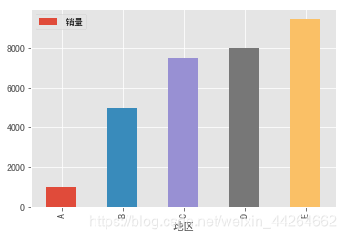
data = pd.DataFrame({'地区':['A','B','C','D','E'],'销量':[1000,5000,7500,8000,9500]})
data
| 地区 | 销量 | |
|---|---|---|
| 0 | A | 1000 |
| 1 | B | 5000 |
| 2 | C | 7500 |
| 3 | D | 8000 |
| 4 | E | 9500 |
data.plot.bar(x='地区',y='销量')
<matplotlib.axes._subplots.AxesSubplot at 0x121868b00>
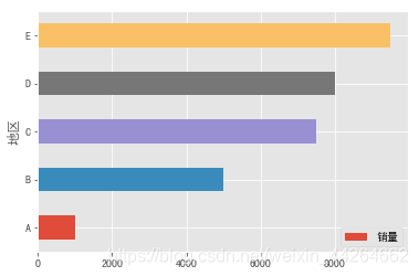
data.plot.barh(x='地区',y='销量')
<matplotlib.axes._subplots.AxesSubplot at 0x1218a8d68>
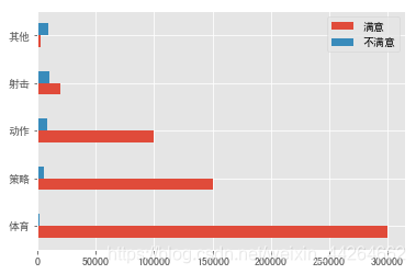
data = pd.DataFrame({'满意':[300000,150000,100000,20000,3000],'不满意':[2000,5000,8000,10000,9000]},index=['体育','策略','动作','射击','其他'])
data.plot.barh()
<matplotlib.axes._subplots.AxesSubplot at 0x1219166d8>
plt.bar(x=data.index,height=data['满意'])
plt.bar(x=data.index,height=data['不满意'],bottom=data['满意'])
<BarContainer object of 5 artists>
![[外链图片转存失败,源站可能有防盗链机制,建议将图片保存下来直接上传(img-96lD1qJg-1573113796584)(output_16_1.png)]](https://img-blog.csdnimg.cn/20191107160453617.png?x-oss-process=image/watermark,type_ZmFuZ3poZW5naGVpdGk,shadow_10,text_aHR0cHM6Ly9ibG9nLmNzZG4ubmV0L3dlaXhpbl80NDI2NDY2Mg==,size_16,color_FFFFFF,t_70)
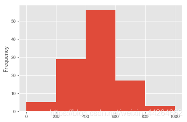
3.直方图
适用于数值型数据
data = pd.DataFrame({'name':np.arange(0,110),'得分':np.array([5]*5+[250]*29+[410]*56+[650]*17+[820]*3)})
data['得分'].plot.hist(bins=[0,200,400,600,800,1000])
<matplotlib.axes._subplots.AxesSubplot at 0x1a322d6b00>
data = pd.Series(np.array([0.5]*4300+[2.5]*6900+[4]*4900+[6]*2000+[23]*2100))
import seaborn as sns
sns.distplot(data,bins=[0,1,3,5,10,24],norm_hist=True,kde=False)#norm_hist控制是绘制成频率直方图,还是频率密度直方图
<matplotlib.axes._subplots.AxesSubplot at 0x1a3248c518>
![[外链图片转存失败,源站可能有防盗链机制,建议将图片保存下来直接上传(img-Twg2zn5o-1573113796585)(output_21_1.png)]](https://img-blog.csdnimg.cn/20191107160512879.png?x-oss-process=image/watermark,type_ZmFuZ3poZW5naGVpdGk,shadow_10,text_aHR0cHM6Ly9ibG9nLmNzZG4ubmV0L3dlaXhpbl80NDI2NDY2Mg==,size_16,color_FFFFFF,t_70)
norm_hist
If True, the histogram height shows a density rather than a count.
This is implied if a KDE or fitted density is plotted.
累计频数图
bins = [0,1,3,5,10,24]
a = data.value_counts(bins=bins)#value_counts中可以控制分箱的方式
a = a.sort_index()
a
(-0.001, 1.0]    4300
(1.0, 3.0]       6900
(3.0, 5.0]       4900
(5.0, 10.0]      2000
(10.0, 24.0]     2100
dtype: int64
cum = np.cumsum(a)
cum
(-0.001, 1.0]     4300
(1.0, 3.0]       11200
(3.0, 5.0]       16100
(5.0, 10.0]      18100
(10.0, 24.0]     20200
dtype: int64
plt.plot([*map(lambda x:eval(re.findall(',(.*)]',str(x))[0]),cum.index.values)],cum.values)
[<matplotlib.lines.Line2D at 0x1a32556be0>]
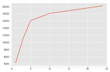
这个横轴数据的获取感觉相当扭曲,应该会有更好的方式吧,暂时先这样
