border-radius
总所周知:border-radius是设置dom元素的圆角属性,熟为人知的操作是
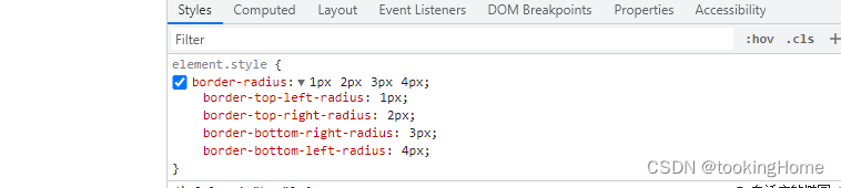
border-radius: 1px 2px 3px 4px
其中值分别代表了左上、右上、右下、左下的圆角程度
有图有真相(滑稽)
其还可以接收%的使用

这里有个一个不为人知的小知识,border-radius可以单独指定水平和垂直半径。通过斜杠(/)分隔两个值即可。
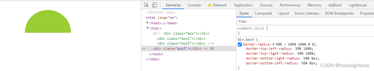
第一个值是x,第二个值是y(斜杠 / 后的值)。
当border-radius值为10px / 5px 20px,
其效果相当于10px 10px 10px 10px / 5px 20px 5px 20px
还是很难理解?
看下面两幅图
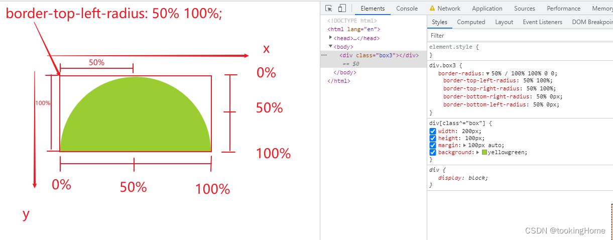
画图太麻烦了,第二张图我就展示了一下border-radius的值,这里感觉和第一张图有冲突,因为第二张图中border-radiusx标明的是100%,但是为什么只有一般的高度呢,而第一张图中标明了50%,可是占整个半圆呢。
因为我们要注意border-radius分解成top-left、top-right、bottom-right、bottom-left,第二张图中x占用了100%,即整个dom的宽度,所以角度会出现向上移动。
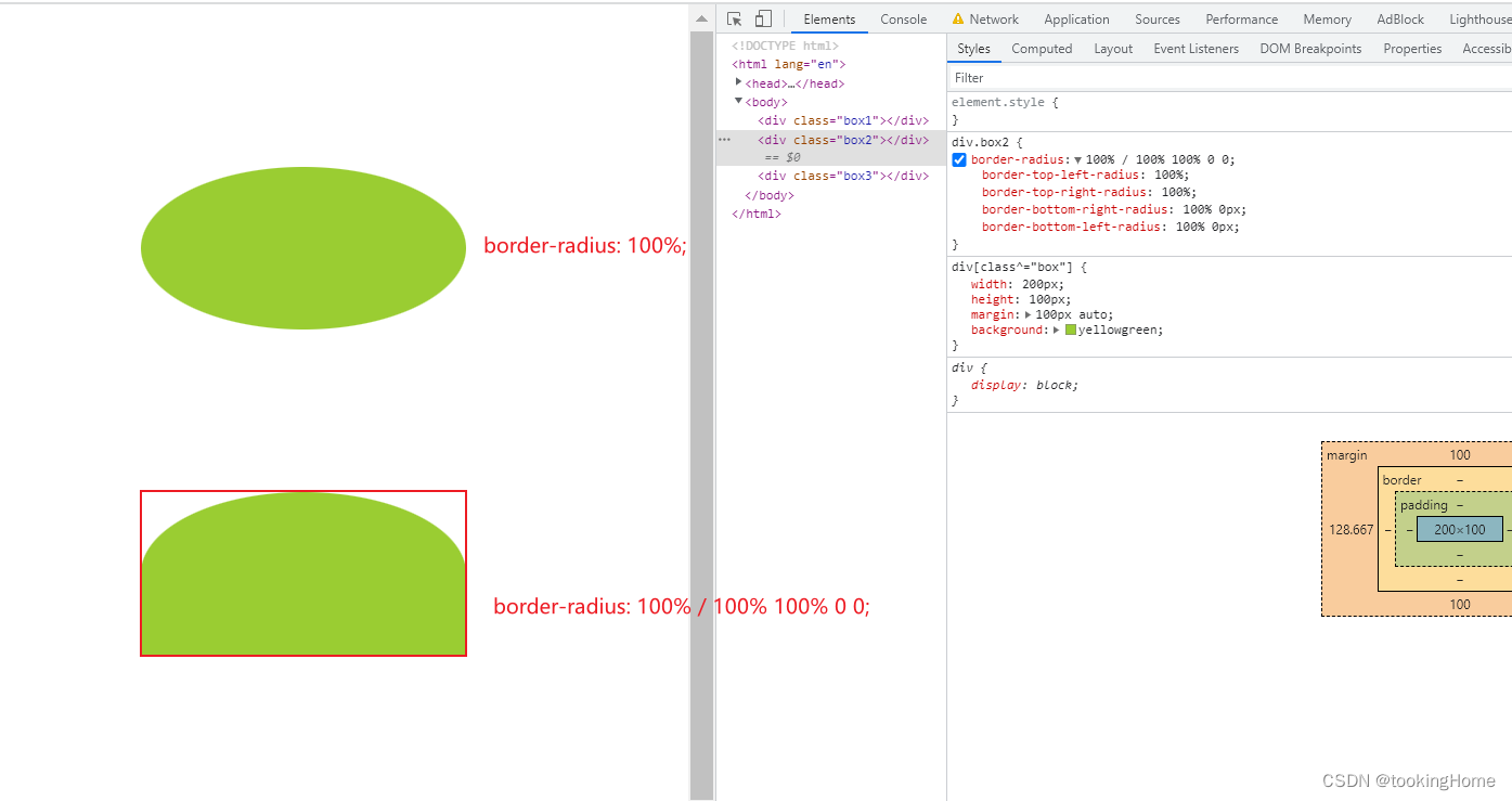
这里做几个案例,分别为椭圆、半圆;
效果图:
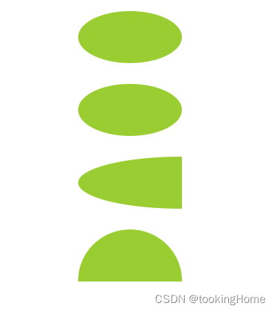
代码:
<style>
    div[class^="box"] {


      width: 100px;
      height: 50px;
      margin: 20px auto;
      background: yellowgreen;
    }
    .box {


      border-radius: 50%;
    }
    div.box1 {


      border-radius: 50px / 25px;
    }

    div.box2 {


      border-radius: 100% 0 0 100% / 50%;
    }
    div.box3 {


      border-radius: 50% / 100% 100% 0 0;
    }
  </style>

  <div class="box"></div>
  <div class="box1"></div>
  <div class="box2"></div>
  <div class="box3"></div>