关于css的border-radius
最近在做公司的项目,要求在官网展示app端上传的头像且要求圆形展示,有这样两种情况,一是在app端上传的是正方形的头像,一是展示app提供的默认的长方形头像
- 关于正方形头像的展示,很简单 一句border-radius:50%搞定
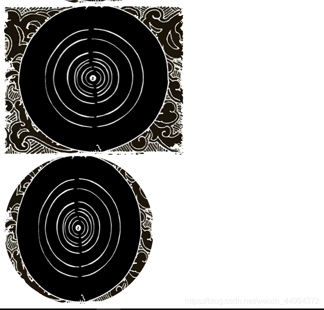
- 关于长方形头像的展示,用了圆角之后发现的情况如下图,上图为长方形的头像,下图为border-radius:50%之后的头像
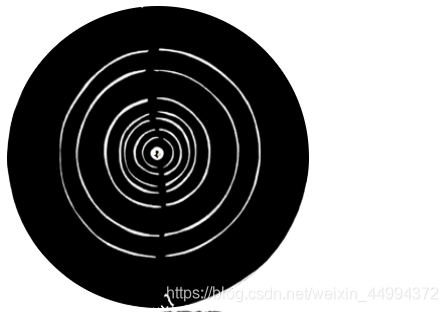
发现css的border-radius是把长方形的图片压缩成正方形之后又换成圆角的,我之前一直以为是取中间的正方形再变成圆角的(笑哭),l老板要求展示成一个下图的效果
所以我这边做个处理,获取到图片之后先对比图片的宽高,假如不是正方形的话,就把这个长方形图片作为背景图片,然后把背景图片的宽变长,上代码
this.$nextTick(()=>{


    var img = new Image()
     img.url = this.info.avatar
     img.onload = function(){


         console.log(img.width)
         if(img.width!=img.height){


             that.ifCircle = false
         }else{


             that.ifCircle  = true
         }
     }
})
//下面的vue的展示部分
<div class="photo" v-show="ifCircle">
   <img :src="info.avatar" alt="" class="user-photo">
</div>
<div class="photoBox" v-show="!ifCircle" :style="{backgroundImage:'url('+ info.avatar}"></div>
/**下面是css对背景图片的处理**/
.photoBox
   width l(78)
   height l(78)
   border-radius 50%
   background-size: 121% 105%;
   background-position: center center;
   border-radius: 50%;
.photo
   width l(78)
   height l(78)
   position relative
   .user-photo
       border-radius 50%
这是本人想到的办法,不知道大家有啥好办法吗,欢迎指正哦