一, 首先当然是配置环境了
在Windows的DOM窗口中输入如下命令(在pycharm下面的Terminal中同)
pip install -i https://pypi.tuna.tsinghua.edu.cn/simple matplotlib
(注:小编没有记错的话,这个包有五十多M,如果不加国内镜像源,将会持续下载几小时之久。。。)
二,3分钟快速入门
1,导入模块
import matplotlib.pyplot as plt  # 导入matplotlib模块
# 导入numpy和pandas模块,后面可能会用到
import numpy as np
import pandas as pd
2, 几种常见函数图像(y=x, y=x^2 +3, y=sin(x))
① y=x图像
x = np.linspace(-10, 10, 10)  # 设置y=x的x轴

# plt.plot()表示画折线图,第一个x表示x轴上的数值,第二个x表示y轴轴上的数值(因为y=x的x轴和y轴一样),
# marker表示每个所取点对应的标记形状 , color='r'表示线颜色是red红色, linestyle='--' 表示折线
# 的线条风格为'--', linewidth表示折线的线宽度, label表示标记图形内容的标签文本
plt.plot(x, x, marker='o', color='r', linestyle='--', linewidth=1, label='y=x')
plt.legend()
plt.show()  # 展示图

注:代码简写
plt.plot(x, x, marker='o', color='r', linestyle='--', linewidth=1, label='y=x')

plt.plot(x, x, marker='o', c='r', ls='--', lw=1, label='y=x')  # 效果同上

plt.plot(x, x, 'o--r', lw=1, label='y=x')  # 同上,即 marker,color,linestyle中的参数可以混在一起写,不区分顺序(但是不能把--中的两个-分开写)
注:关于marker,color, linestyle中的参数还有很多,帮助手册中的内容如下
**Markers**

=============   ===============================
character       description
=============   ===============================
``'.'``         point marker
``','``         pixel marker
``'o'``         circle marker
``'v'``         triangle_down marker
``'^'``         triangle_up marker
``'<'``         triangle_left marker
``'>'``         triangle_right marker
``'1'``         tri_down marker
``'2'``         tri_up marker
``'3'``         tri_left marker
``'4'``         tri_right marker
``'8'``         octagon marker
``'s'``         square marker
``'p'``         pentagon marker
``'P'``         plus (filled) marker
``'*'``         star marker
``'h'``         hexagon1 marker
``'H'``         hexagon2 marker
``'+'``         plus marker
``'x'``         x marker
``'X'``         x (filled) marker
``'D'``         diamond marker
``'d'``         thin_diamond marker
``'|'``         vline marker
``'_'``         hline marker
=============   ===============================

**Line Styles**

=============    ===============================
character        description
=============    ===============================
``'-'``          solid line style
``'--'``         dashed line style
``'-.'``         dash-dot line style
``':'``          dotted line style
=============    ===============================
**Colors**

The supported color abbreviations are the single letter codes

=============    ===============================
character        color
=============    ===============================
``'b'``          blue
``'g'``          green
``'r'``          red
``'c'``          cyan
``'m'``          magenta
``'y'``          yellow
``'k'``          black
``'w'``          white
=============    ===============================
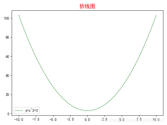
② y=x^2 +3图像
# 解决中文乱码问题
plt.rcParams['font.sans-serif'] = ['SimHei']
plt.rcParams['axes.unicode_minus'] = False

x = np.linspace(-10, 10, 100)  # 设置x轴的数值
y = x**2 + 3  # 设置y轴的数值

plt.plot(x, y, '--g', lw=1, label='y=x^2+3')
# size表示图形内容的标题
plt.title('折线图', c='r', size=15)
plt.legend()
plt.show()  # 展示图
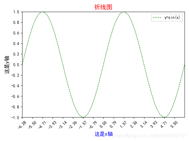
③ y=sin(x)图像
# 解决中文乱码问题
plt.rcParams['font.sans-serif'] = ['SimHei']
plt.rcParams['axes.unicode_minus'] = False

x = np.linspace(-10, 10, 100)
y = np.sin(x)

plt.plot(x, y, '--g', lw=1, label='y=sin(x)')
plt.title('折线图', c='r', size=15)
plt.legend()
plt.xlabel('这是x轴', c='b', size=13)  # 设置x轴的标签文本
plt.ylabel('这是y轴', c='k', size=13)  # 设置y轴的标签文本
plt.xlim(-2*np.pi, 2*np.pi)  # 设置x轴的显示范围
plt.ylim(-1, 1)  # 设置y轴的显示范围
plt.xticks(np.arange(-2*np.pi, 2*np.pi, np.pi/4), rotation=45)  # 限制x轴的显示密度,rotation=45表示x轴上刻度字体旋转45°
plt.yticks(np.arange(-1, 1.1, 0.2))  # 限制y轴的显示密度
plt.show()
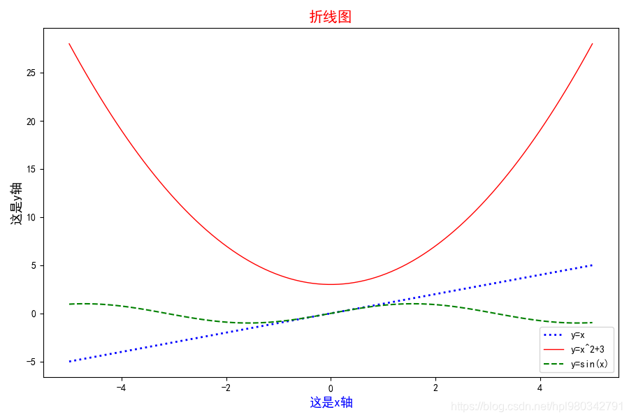
④ 将3个图合成一张图
# 解决中文乱码问题
plt.rcParams['font.sans-serif'] = ['SimHei']
plt.rcParams['axes.unicode_minus'] = False

x = np.linspace(-5, 5, 100)
y1 = x
y2 = x**2 + 3
y3 = np.sin(x)

plt.figure(figsize=(9, 6))  # 设置画布大小,9 即900px,6 即600px(不要设置的过大奥)
plt.plot(x, y1, ':b', lw=2, label='y=x')
plt.plot(x, y2, '-r', lw=1, label='y=x^2+3')
plt.plot(x, y3, '--g', lw=1.5, label='y=sin(x)')
plt.title('折线图', c='r', size=15)
plt.legend()
plt.xlabel('这是x轴', c='b', size=13)
plt.ylabel('这是y轴', c='k', size=13)
plt.show()
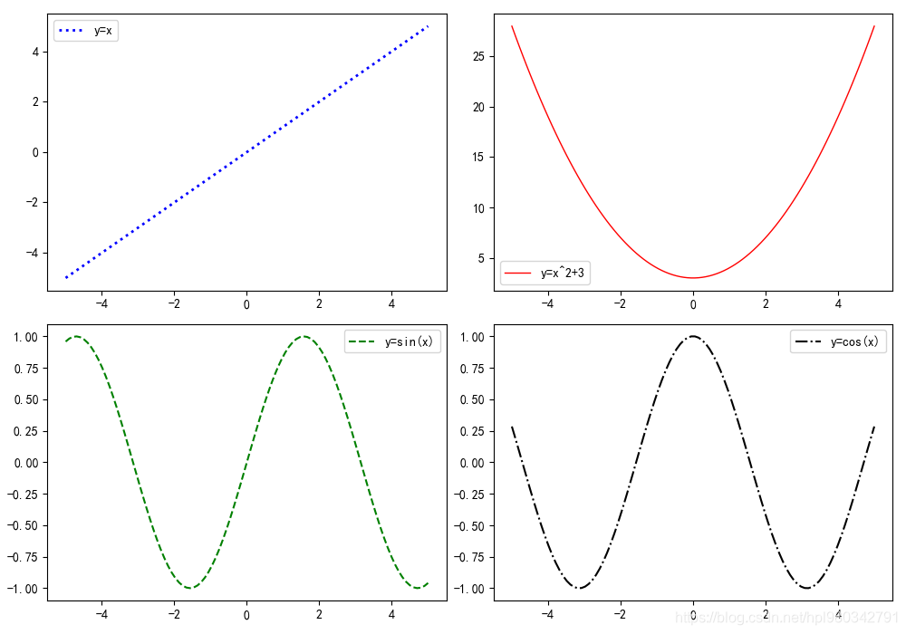
⑤ 一张画布上画多张图
# 解决中文乱码问题
plt.rcParams['font.sans-serif'] = ['SimHei']
plt.rcParams['axes.unicode_minus'] = False

x = np.linspace(-5, 5, 100)
y1 = x
y2 = x**2 + 3
y3 = np.sin(x)
y4 = np.cos(x)

pf = plt.figure(figsize=(10, 7))
as1 = pf.add_subplot(2, 2, 1)  # 表示将画图分为2行2列,as1在第1个位置
as2 = pf.add_subplot(2, 2, 2)  # 表示将画图分为2行2列,as2在第2个位置
as3 = pf.add_subplot(2, 2, 3)  # 表示将画图分为2行2列,as3在第3个位置
as4 = pf.add_subplot(2, 2, 4)  # 表示将画图分为2行2列,as4在第4个位置
as1.plot(x, y1, ':b', lw=2, label='y=x')
as2.plot(x, y2, '-r', lw=1, label='y=x^2+3')
as3.plot(x, y3, '--g', lw=1.5, label='y=sin(x)')
as4.plot(x, y4, '-.k', lw=1.5, label='y=cos(x)')
as1.legend()
as2.legend()
as3.legend()
as4.legend()
plt.show()
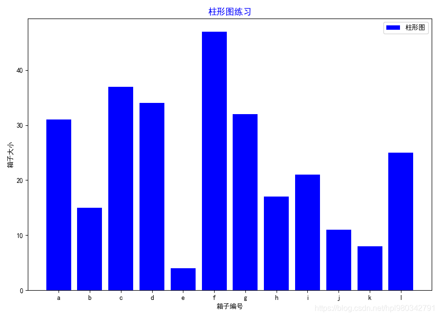
三,画柱状图
# 解决中文乱码问题
plt.rcParams['font.sans-serif'] = ['SimHei']
plt.rcParams['axes.unicode_minus'] = False

x = np.arange(1, 13)
y = np.random.randint(1, 50, 12)
lab = ['a', 'b', 'c', 'd', 'e', 'f', 'g', 'h', 'i', 'j', 'k', 'l']

plt.figure(figsize=(9, 6.5))
plt.bar(x, y, color='b', tick_label=lab, label='柱形图')
plt.xticks(np.arange(1, 13))
plt.title('柱形图练习', color='b', size=13)
plt.legend()
plt.xlabel('箱子编号')
plt.ylabel('箱子大小')
plt.show()
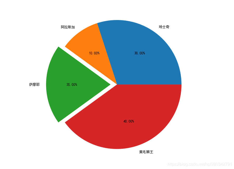
四,画饼图
# 解决中文乱码问题
plt.rcParams['font.sans-serif'] = ['SimHei']
plt.rcParams['axes.unicode_minus'] = False

kinds = ['哈士奇', '阿拉斯加', '萨摩耶', '黄毛狮王']
num = [0.3, 0.1, 0.2, 0.4]

plt.figure(figsize=(9, 6.5))  # plt.figure 表示画饼图
# explode=[0, 0, 0.1, 0] 重点突出显示
plt.pie(num, labels=kinds, autopct='%.2f%%', explode=[0, 0, 0.1, 0])
plt.show()
五,小试牛刀
1,爬取数据
爬取某批发菜市场近一年菜价
import requests
from lxml import etree
import csv
from concurrent.futures import ThreadPoolExecutor
import time

f = open("vegetables.csv", mode="w", newline='', encoding="utf-8")
csv_write = csv.writer(f)


def down_one_page(url):
    res = requests.get(url=url, headers=headers).text
    # print(res)
    html = etree.HTML(res)
    table = html.xpath('/html/body/div[2]/div[4]/div[1]/table')[0]
    # print(table)
    # trs = table.xpath('./tr')[1:]
    trs = table.xpath('./tr[position()>1]')
    # print(len(trs))
    for tr in trs:
        txt = tr.xpath('./td/text()')
        # 去掉\\ /
        txt = (item.replace("\\", "").replace("/", "") for item in txt)
        # print(list(txt))
        csv_write.writerow(list(txt))
        # print(list(txt))
    new_name = url.split("/")[-1].split(".")[0]
    print("第 \033[31;1m%s\033[0m 页下载完成!!!" % new_name)


if __name__ == '__main__':
    headers = {


        "User-Agent": "Mozilla/5.0 (Windows NT 10.0; Win64; x64) AppleWebKit/537.36 (KHTML, like Gecko) Chrome/89.0.4389.90 Safari/537.36 Edg/89.0.774.54"
    }

    # for i in range(1, 14870):
    #     down_one_page("http://www.xinfadi.com.cn/marketanalysis/0/list/%s.shtml" % i)

    user_input = int(input("Total 15069 pages,please input a page number>>>:"))
    start_time = time.time()
    with ThreadPoolExecutor(32) as t:
        for i in range(1, user_input + 1):
            t.submit(down_one_page, "http://www.xinfadi.com.cn/marketanalysis/0/list/%s.shtml" % i)

    print("Download over,it takes \033[31;1m%s\033[0m seconds" % (time.time() - start_time))

大约10万条数据!
2,数据的简单处理
先读取前几行看看数据
import pandas as pd

output_file = 'vage.csv'
vege_data = pd.read_csv('vegetables.csv', header=None)
print(vege_data.head(5))

     0     1     2     3    4  5           6
0  沙蜜托  20.0  22.5  25.0  樱桃类  斤  2021-05-15
1  羊上脑  42.0  42.5  43.0  羊肉类  斤  2021-05-15
2  羊骨头  11.0  11.5  12.0  羊肉类  斤  2021-05-15
3   羊腩  32.0  32.0  32.0  羊肉类  斤  2021-05-15
4  羊里脊  42.0  42.0  42.0  羊肉类  斤  2021-05-15
为了后面方便画图,对时间列进行排序
import pandas as pd

output_file = 'vage.csv'
vege_data = pd.read_csv('vegetables.csv', header=None, index_col=6).sort_index()
print(vege_data.head(5))

               0    1     2    3    4  5
6
2020-05-13    线茄  1.0  1.50  2.0  |粤云  斤
2020-05-13    苦菊  1.2  1.60  2.0    辽  斤
2020-05-13   油麦菜  1.2  1.50  1.8    辽  斤
2020-05-13    荸荠  1.8  1.90  2.0    皖  斤
2020-05-13  金丝南瓜  0.9  1.05  1.2  琼吊瓜  斤
筛选出‘整牛’对应的所有行
import pandas as pd

output_file = 'vage.csv'
vege_data = pd.read_csv('vegetables.csv', header=None, index_col=6).sort_index()
new_data = vege_data[vege_data[0] == '整牛']
print(new_data)

             0      1      2      3    4  5
6
2020-05-15  整牛  30.00  30.50  31.00   普通  斤
2020-05-16  整牛  30.00  30.50  31.00   普通  斤
2020-05-17  整牛  30.00  30.50  31.00   普通  斤
2020-05-18  整牛  30.50  30.75  31.00   普通  斤
2020-05-19  整牛  30.50  30.75  31.00   普通  斤
...         ..    ...    ...    ...  ... ..
2021-05-12  整牛  34.00  34.00  34.00  牛肉类  斤
2021-05-13  整牛  34.00  34.00  34.00  牛肉类  斤
2021-05-14  整牛  34.25  34.25  34.25  牛肉类  斤
2021-05-15  整牛  34.25  34.25  34.25  牛肉类  斤
2021-05-16  整牛  34.25  34.25  34.25  牛肉类  斤

[250 rows x 6 columns]
发现明明有一年的数据,却只有250行,先保存下来再看看
import pandas as pd

output_file = 'vage.csv'
vege_data = pd.read_csv('vegetables.csv', header=None, index_col=6).sort_index()
# print(vege_data.head(5))
new_data = vege_data[vege_data[0] == '整牛']
# print(new_data)
new_data.to_csv(output_file, header=False, encoding='utf-8')

观察时发现中间有一段时间是没有价格的

所以取2020-09-30这个时间段之后的数据
import pandas as pd
import matplotlib.pyplot as plt
import numpy as np

data = pd.read_csv('vage.csv', header=None)[29:]
print(data)

              0   1      2      3      4    5  6
29   2020-09-30  整牛  34.00  34.00  34.00   普通  斤
30   2020-10-01  整牛  34.00  34.00  34.00   普通  斤
31   2020-10-02  整牛  33.00  33.50  34.00   普通  斤
32   2020-10-03  整牛  33.00  33.50  34.00   普通  斤
33   2020-10-04  整牛  33.00  33.50  34.00   普通  斤
..          ...  ..    ...    ...    ...  ... ..
245  2021-05-12  整牛  34.00  34.00  34.00  牛肉类  斤
246  2021-05-13  整牛  34.00  34.00  34.00  牛肉类  斤
247  2021-05-14  整牛  34.25  34.25  34.25  牛肉类  斤
248  2021-05-15  整牛  34.25  34.25  34.25  牛肉类  斤
249  2021-05-16  整牛  34.25  34.25  34.25  牛肉类  斤

[221 rows x 7 columns]

Process finished with exit code 0
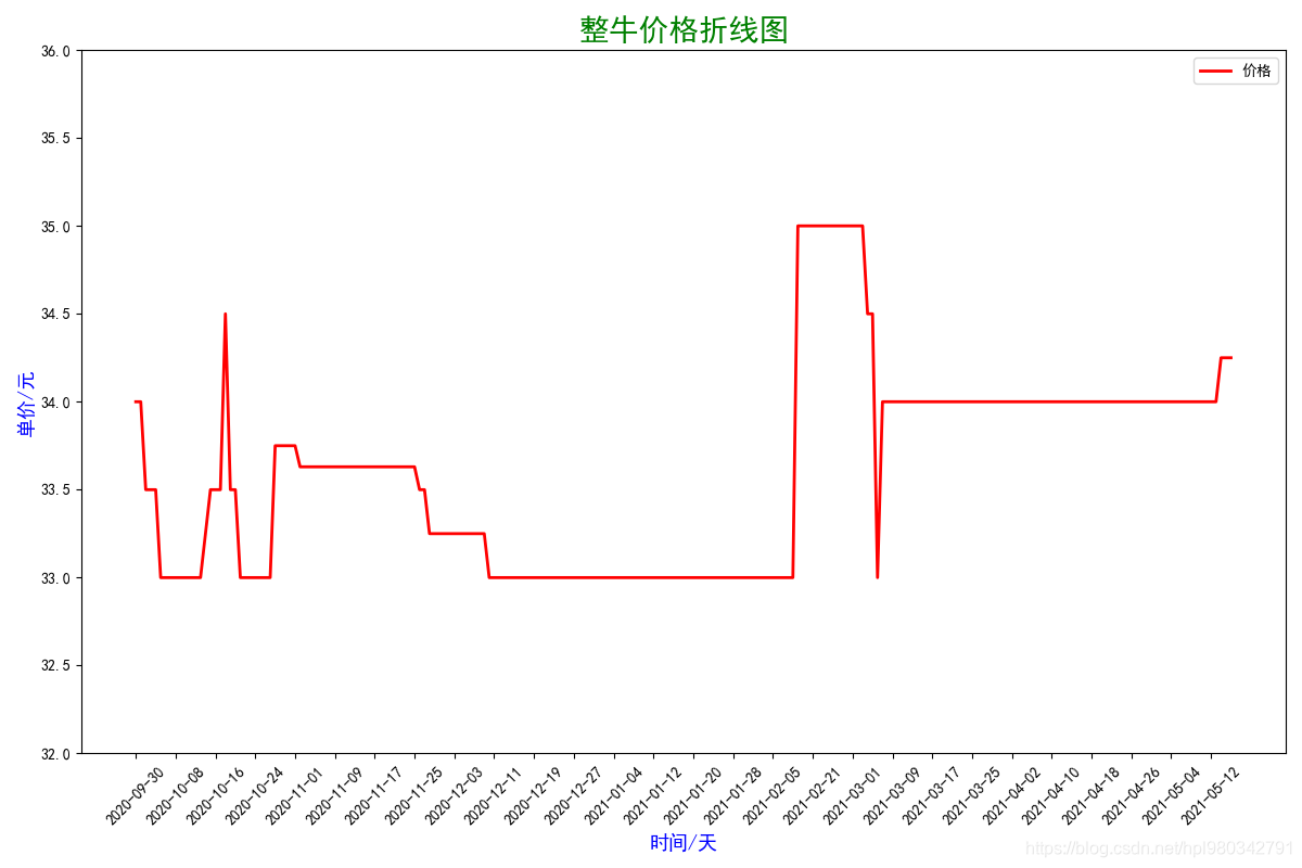
3,对‘整牛’价格绘制折线图
import pandas as pd
import matplotlib.pyplot as plt
import numpy as np

data = pd.read_csv('vage.csv', header=None)[29:]
# print(data)

# 解决中文乱码问题
plt.rcParams['font.sans-serif'] = ['SimHei']
plt.rcParams['axes.unicode_minus'] = False

x = data[0]
y = data[3]

plt.figure(figsize=(12, 8))
plt.plot(x, y, '-r', lw=2, label='价格')
plt.legend()
plt.xlabel('时间/天', c='b', size=13)
plt.ylabel('单价/元', c='b', size=13)
plt.title('整牛价格折线图', c='g', size=20)
plt.ylim(32, 36)
plt.xticks(np.arange(0, 220, 8), rotation=45)
plt.show()