最近公司需要做一款app,需要中间按钮凸起,在网上找了一些,参考文献,做了一个demo;
H5效果图如下:

小程序效果图如下:

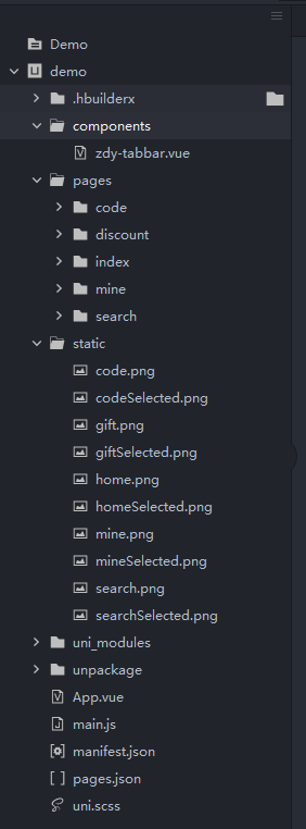
目录结构如下:
page.json的配置如下:
{
"pages": [{
"path": "pages/index/index",
"style": {
"navigationBarTitleText": "简介"
}
}, {
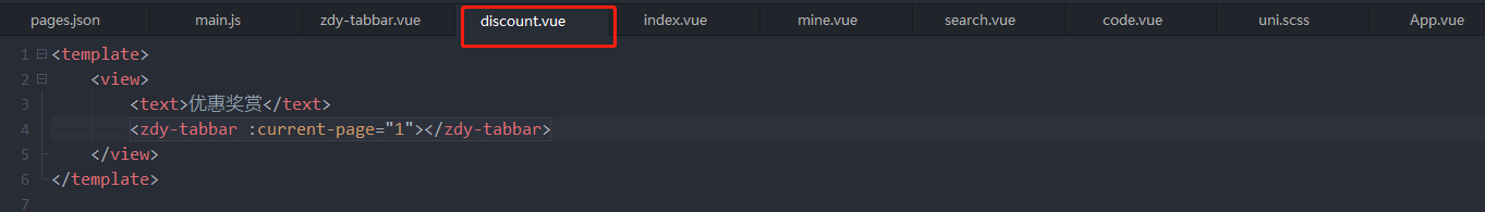
"path": "pages/discount/discount",
"style": {
"navigationBarTitleText": "优惠"
}
}, {
"path": "pages/code/code",
"style": {
"navigationBarTitleText": "二维码"
}
}, {
"path": "pages/search/search",
"style": {
"navigationBarTitleText": "探索"
}
}, {
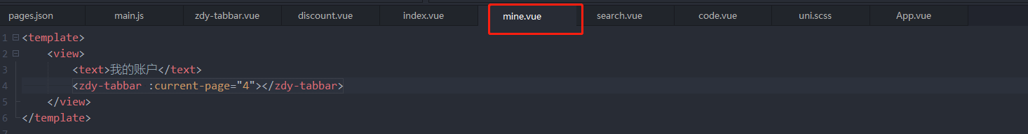
"path": "pages/mine/mine",
"style": {
"navigationBarTitleText": "我的"
}
}],
"globalStyle": {
"navigationBarTextStyle": "black",
"navigationBarTitleText": "CRM",
"navigationBarBackgroundColor": "#F8F8F8",
"backgroundColor": "#F8F8F8",
"app-plus": {
"background": "#efeff4"
}
},
"tabBar": {
"color": "#999999",
"selectedColor": "#f00",
"borderStyle": "black",
"backgroundColor": "#ffffff",
"midButton":{
"text":"二维码",
"pagePath":"pages/code/code",
"iconPath":"static/code.png",
"selectedIconPath":"static/codeSelected.png"
},
"list":[
{
"pagePath":"pages/index/index",
"iconPath":"static/home.png",
"selectedIconPath":"static/homeSelected.png",
"text":"简介"
},
{
"pagePath":"pages/discount/discount",
"iconPath":"static/gift.png",
"selectedIconPath":"static/giftSelected.png",
"text":"优惠"
},
{
"pagePath":"pages/code/code",
"iconPath":"static/code.png",
"selectedIconPath":"static/codeSelected.png",
"text":"二维码"
},
{
"pagePath":"pages/search/search",
"iconPath":"static/search.png",
"selectedIconPath":"static/searchSelected.png",
"text":"探索"
},
{
"pagePath":"pages/mine/mine",
"iconPath":"static/mine.png",
"selectedIconPath":"static/mineSelected.png",
"text":"我的"
}
]
}
}
注册全局组件tabbar在main.js文件中,配置如下:
import Vue from 'vue'
import App from './App'
import zdyTabbar from "components/zdy-tabbar.vue"

// 注册全局组件
Vue.component('zdy-tabbar', zdyTabbar)

Vue.config.productionTip = false

App.mpType = 'app'

const app = new Vue({
	...App
})
app.$mount()
zdy-tabbar.vue文件编写:
<template>
	<view class="tabbar-container">
		<block>
			<view class="tabbar-item" v-for="(item, index) in tabbarList" :class="[item.centerItem ? ' center-item' : '']" @click="changeItem(item)">
				<view class="item-top"><image :src="currentItem == item.id ? item.selectIcon : item.icon"></image></view>
				<view class="item-bottom" :class="[currentItem == item.id ? 'item-active' : '']">
					<text>{

   { item.text }}</text>
				</view>
			</view>
		</block>
	</view>
</template>

<script>
export default {
	props: {
		currentPage: {
			type: Number,
			default: 0
		}
	},
	data() {
		return {
			currentItem: 0,
			tabbarList: [
				{
					id: 0,
					path: '/pages/index/index',
					icon: '/static/home.png',
					selectIcon: '/static/homeSelected.png',
					text: '简介',
					centerItem: false
				},
				{
					id: 1,
					path: '/pages/discount/discount',
					icon: '/static/gift.png',
					selectIcon: '/static/giftSelected.png',
					text: '优惠',
					centerItem: false
				},
				{
					id: 2,
					path: '/pages/code/code',
					icon: '/static/code.png',
					selectIcon: '/static/codeSelected.png',
					text: '二维码',
					centerItem: true
				},
				{
					id: 3,
					path: '/pages/search/search',
					icon: '/static/search.png',
					selectIcon: '/static/searchSelected.png',
					text: '探索',
					centerItem: false
				},
				{
					id: 4,
					path: '/pages/mine/mine',
					icon: '/static/mine.png',
					selectIcon: '/static/mineSelected.png',
					text: '我的',
					centerItem: false
				}
			]
		};
	},
	mounted() {
		this.currentItem = this.currentPage;
		uni.hideTabBar();
	},
	methods: {
		changeItem(item) {
			let _this = this;
			//_this.currentItem = item.id;
			uni.switchTab({
				url: item.path
			});
		}
	}
};
</script>
<style>
view {
	padding: 0;
	margin: 0;
	box-sizing: border-box;
}
.tabbar-container {
	position: fixed;
	bottom: 0;
	left: 0;
	width: 100%;
	height: 110rpx;
	box-shadow: 0 0 5px #999;
	display: flex;
	align-items: center;
	padding: 5rpx 0;
	color: #999999;
}
.tabbar-container .tabbar-item {
	width: 20%;
	height: 100rpx;
	display: flex;
	flex-direction: column;
	justify-content: center;
	align-items: center;
	text-align: center;
}
.tabbar-container .item-active {
	color: #f00;
}
.tabbar-container .center-item {
	display: block;
	position: relative;
}
.tabbar-container .tabbar-item .item-top {
	width: 70rpx;
	height: 70rpx;
	padding: 10rpx;
}
.tabbar-container .center-item .item-top {
	flex-shrink: 0;
	width: 100rpx;
	height: 100rpx;
	position: absolute;
	top: -50rpx;
	left: calc(50% - 50rpx);
	border-radius: 50%;
	box-shadow: 0 0 5px #999;
	background-color: #ffffff;
}
.tabbar-container .tabbar-item .item-top image {
	width: 100%;
	height: 100%;
}
.tabbar-container .tabbar-item .item-bottom {
	font-size: 28rpx;
	width: 100%;
}
.tabbar-container .center-item .item-bottom {
	position: absolute;
	bottom: 5rpx;
}
</style>
所有的tabbar页面引入自定义tabbar:
<zdy-tabbar :current-page="0"></zdy-tabbar>