原生tabBar是相对固定的配置方式,可能无法满足所有场景,这就涉及到自定义tabBar。
但注意除了H5端,自定义tabBar的性能体验会低于原生tabBar。App和小程序端非必要不要自定义
没办法为了美,为了diy
实现方式
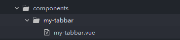
1.在components目录下新建my-tabbar组件
2.my-tabbar.vue 文件内容如下
<template>
	<view class="tabBar">
		<view
		 v-for="(item,index) in tabBar"
		 :key="item.url"
		 class="tabbar_item"
		 :class="{'active':item.url == currentPage}"
		 @click="navTo(item)"
		 >
			<image v-if="item.url == currentPage" :src="item.imgClick" mode=""></image>
			<image v-else :src="item.imgNormal" mode=""></image>
			<view class="text">{

   {item.text}}</view>
		</view>
	</view>
</template>

<script>
	export default {
		props:{
			currentPage:{
				type:String,
				default:'index'
			}
		},
		data() {
			return {
				tabBar:[{
						url:'tabBar1',
						text:'首页',
						imgNormal:'../../static/tabbar/home.png',
						imgClick:'../../static/tabbar/s_home.png'
					},
					{
						url:'tabBar2',
						text:'分类',
						imgNormal:'../../static/tabbar/box.png',
						imgClick:'../../static/tabbar/s_box.png'

					},
					{
						url:'tabBar3',
						text:'我的',
						imgNormal:'../../static/tabbar/user.png',
						imgClick:'../../static/tabbar/s_user.png'

					}]
			};
		},
		created() {
			uni.hideTabBar({})
		},
		computed:{

		},
		methods:{
			navTo(item){
				if(item.url !== this.currentPage){
					var isUrl = `/pages/${item.url}/${item.url}`
					const that = this
					uni.switchTab({
						url: isUrl
					})
				} else{
					this.$parent.toTop()
				}
			}
		}
	}
</script>

<style lang="scss" scoped>
	  //导航栏设置
		$isRadius:20upx; //左上右上圆角
		$isWidth:85vw; //导航栏宽度
		$isBorder:0px solid white; //边框 不需要则设为0px
		$isBg:white; //背景

	  // 选中设置
		$chooseTextColor:#000; //选中时字体颜色
		$chooseBgColor:transparent; //选中时背景颜色 transparent为透明

	  //未选中设置
		$normalTextColor:#999; //未选中颜色
	.tabBar{
		width: $isWidth;
		height: 100upx;
		position: fixed;
		bottom: 106rpx;
		left: 0;
		right: 0;
		box-shadow: 0upx 2upx 10upx rgba(89,125,172,.4);
		margin:0 auto;
		z-index: 998;
		background-color: $isBg;
		color: $normalTextColor;
		border-left: $isBorder;
		border-top: $isBorder;
		border-right: $isBorder;
		display: flex;
		justify-content: space-around;
		border-radius: 80rpx;
		box-sizing: border-box;
		overflow: hidden;
		.tabbar_item{
			width: 25%;
			font-size: 12px;
			display: flex;
			flex-direction: column;
			justify-content: center;
			align-items: center;
			&.active{
				border-left: $isBorder;
				border-top: $isBorder;
				background: $chooseBgColor;
				color: $chooseTextColor;
			}
		}
		image{
			width: 48upx;
			height:48upx;
		}
	}
</style>
注意的是page.json也有添加tabBar选项,在组件里面隐藏系统内置的tabBar
3.在需要的页面引用my-tabbar组件
<template>
	<view class="container">
		<my-tabbar :currentPage="currentPage"></my-tabbar>
	</view>
</template>

<script>
	export default {

		data() {
			return {
				currentPage: 'tabBar1'
			}
		},
		onLoad() {

		},
		methods: {

		}
	}
</script>

<style>


</style>
4.编译运行效果

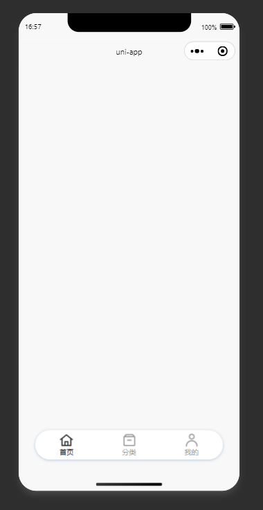
优缺点
优点就是自定义可以非常的强,缺点是首次点击会闪一下,性能会比原生差。