There has never been a better time to get into machine learning. With the learning resources available online, free open-source tools with implementations of any algorithm imaginable, and the cheap availability of computing power through cloud services such as AWS, machine learning is truly a field that has been democratized by the internet. Anyone with access to a laptop and a willingness to learn can try out state-of-the-art algorithms in minutes. With a little more time, you can develop practical models to help in your daily life or at work (or even switch into the machine learning field and reap the economic benefits). This post will walk you through an end-to-end implementation of the powerful random forest machine learning model. It is meant to serve as a complement to my conceptual explanation of the random forest, but can be read entirely on its own as long as you have the basic idea of a decision tree and a random forest. A follow-up post details how we can improve upon the model built here.
There will of course be Python code here, however, it is not meant to intimate anyone, but rather to show how accessible machine learning is with the resources available today! The complete project with data is available on GitHub, and the data file and Jupyter Notebook can also be downloaded from Google Drive. All you need is a laptop with Python installed and the ability to start a Jupyter Notebook and you can follow along. (For installing Python and running a Jupyter notebook check out this guide). There will be a few necessary machine learning topics touched on here, but I will try to make them clear and provide resources for learning more for those interested.

Problem Introduction
The problem we will tackle is predicting the max temperature for tomorrow in our city using one year of past weather data. I am using Seattle, WA but feel free to find data for your own city using the NOAA Climate Data Online tool. We are going to act as if we don’t have access to any weather forecasts (and besides, it’s more fun to make our own predictions rather than rely on others). What we do have access to is one year of historical max temperatures, the temperatures for the previous two days, and an estimate from a friend who is always claiming to know everything about the weather. This is a supervised, regression machine learning problem. It’s supervised because we have both the features (data for the city) and the targets (temperature) that we want to predict. During training, we give the random forest both the features and targets and it must learn how to map the data to a prediction. Moreover, this is a regression task because the target value is continuous (as opposed to discrete classes in classification). That’s pretty much all the background we need, so let’s start!
Roadmap
Before we jump right into programming, we should lay out a brief guide to keep us on track. The following steps form the basis for any machine learning workflow once we have a problem and model in mind:
- State the question and determine required data
- Acquire the data in an accessible format
- Identify and correct missing data points/anomalies as required
- Prepare the data for the machine learning model
- Establish a baseline model that you aim to exceed
- Train the model on the training data
- Make predictions on the test data
- Compare predictions to the known test set targets and calculate performance metrics
- If performance is not satisfactory, adjust the model, acquire more data, or try a different modeling technique
- Interpret model and report results visually and numerically
Step 1 is already checked off! We have our question: “can we predict the max temperature tomorrow for our city?” and we know we have access to historical max temperatures for the past year in Seattle, WA.
Data Acquisition
First, we need some data. To use a realistic example, I retrieved weather data for Seattle, WA from 2016 using the NOAA Climate Data Online tool. Generally, about 80% of the time spent in data analysis is cleaning and retrieving data, but this workload can be reduced by finding high-quality data sources. The NOAA tool is surprisingly easy to use and temperature data can be downloaded as clean csv files which can be parsed in languages such as Python or R. The complete data file is available for download for those wanting to follow along.
The following Python code loads in the csv data and displays the structure of the data:
# Pandas is used for data manipulation
import pandas as pd
# Read in data and display first 5 rows
features = pd.read_csv('temps.csv')
features.head(5)
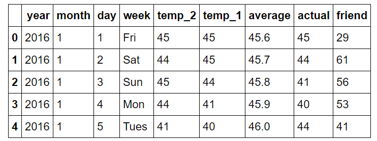
The information is in the tidy data format with each row forming one observation, with the variable values in the columns.
Following are explanations of the columns:
year: 2016 for all data points
month: number for month of the year
day: number for day of the year
week: day of the week as a character string
temp_2: max temperature 2 days prior
temp_1: max temperature 1 day prior
average: historical average max temperature
actual: max temperature measurement
friend: your friend’s prediction, a random number between 20 below the average and 20 above the average
Identify Anomalies/ Missing Data
If we look at the dimensions of the data, we notice only there are only 348 rows, which doesn’t quite agree with the 366 days we know there were in 2016. Looking through the data from the NOAA, I noticed several missing days, which is a great reminder that data collected in the real-world will never be perfect. Missing data can impact an analysis as can incorrect data or outliers. In this case, the missing data will not have a large effect, and the data quality is good because of the source. We also can see there are nine columns which represent eight features and the one target (‘actual’).
print('The shape of our features is:', features.shape)
The shape of our features is: (348, 9)
To identify anomalies, we can quickly compute summary statistics.
# Descriptive statistics for each column
features.describe()
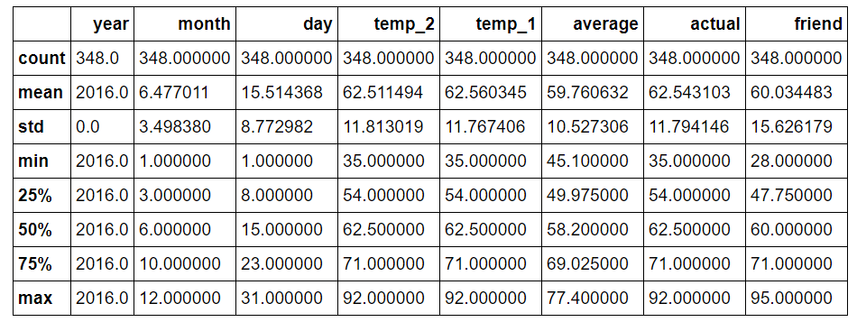
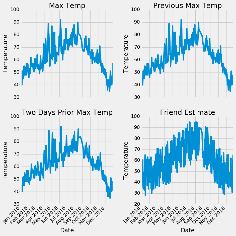
There are not any data points that immediately appear as anomalous and no zeros in any of the measurement columns. Another method to verify the quality of the data is make basic plots. Often it is easier to spot anomalies in a graph than in numbers. I have left out the actual code here, because plotting is Python is non-intuitive but feel free to refer to the notebook for the complete implementation (like any good data scientist, I pretty much copy and pasted the plotting code from Stack Overflow).
Examining the quantitative statistics and the graphs, we can feel confident in the high quality of our data. There are no clear outliers, and although there are a few missing points, they will not detract from the analysis.
Data Preparation
Unfortunately, we aren’t quite at the point where you can just feed raw data into a model and have it return an answer (although people are working on this)! We will need to do some minor modification to put our data into machine-understandable terms. We will use the Python library Pandas for our data manipulation relying, on the structure known as a dataframe, which is basically an excel spreadsheet with rows and columns.
The exact steps for preparation of the data will depend on the model used and the data gathered, but some amount of data manipulation will be required for any machine learning application.
One-Hot Encoding
The first step for us is known as one-hot encoding of the data. This process takes categorical variables, such as days of the week and converts it to a numerical representation without an arbitrary ordering. Days of the week are intuitive to us because we use them all the time. You will (hopefully) never find anyone who doesn’t know that ‘Mon’ refers to the first day of the workweek, but machines do not have any intuitive knowledge. What computers know is numbers and for machine learning we must accommodate them. We could simply map days of the week to numbers 1–7, but this might lead to the algorithm placing more importance on Sunday because it has a higher numerical value. Instead, we change the single column of weekdays into seven columns of binary data. This is best illustrated pictorially. One hot encoding takes this:
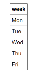
and turns it into
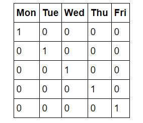
So, if a data point is a Wednesday, it will have a 1 in the Wednesday column and a 0 in all other columns. This process can be done in pandas in a single line!
# One-hot encode the data using pandas get_dummies
features = pd.get_dummies(features)
# Display the first 5 rows of the last 12 columns
features.iloc[:,5:].head(5)
Snapshot of data after one-hot encoding:
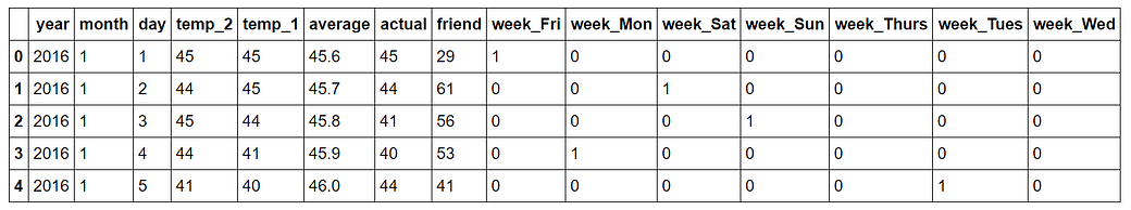
The shape of our data is now 349 x 15 and all of the column are numbers, just how the algorithm likes it!
Features and Targets and Convert Data to Arrays
Now, we need to separate the data into the features and targets. The target, also known as the label, is the value we want to predict, in this case the actual max temperature and the features are all the columns the model uses to make a prediction. We will also convert the Pandas dataframes to Numpy arrays because that is the way the algorithm works. (I save the column headers, which are the names of the features, to a list to use for later visualization).
# Use numpy to convert to arrays
import numpy as np
# Labels are the values we want to predict
labels = np.array(features['actual'])
# Remove the labels from the features
# axis 1 refers to the columns
features= features.drop('actual', axis = 1)
# Saving feature names for later use
feature_list = list(features.columns)
# Convert to numpy array
features = np.array(features)
Training and Testing Sets
There is one final step of data preparation: splitting data into training and testing sets. During training, we let the model ‘see’ the answers, in this case the actual temperature, so it can learn how to predict the temperature from the features. We expect there to be some relationship between all the features and the target value, and the model’s job is to learn this relationship during training. Then, when it comes time to evaluate the model, we ask it to make predictions on a testing set where it only has access to the features (not the answers)! Because we do have the actual answers for the test set, we can compare these predictions to the true value to judge how accurate the model is. Generally, when training a model, we randomly split the data into training and testing sets to get a representation of all data points (if we trained on the first nine months of the year and then used the final three months for prediction, our algorithm would not perform well because it has not seen any data from those last three months.) I am setting the random state to 42 which means the results will be the same each time I run the split for reproducible results.
The following code splits the data sets with another single line:
# Using Skicit-learn to split data into training and testing sets
from sklearn.model_selection import train_test_split
# Split the data into training and testing sets
train_features, test_features, train_labels, test_labels = train_test_split(features, labels, test_size = 0.25, random_state = 42)
We can look at the shape of all the data to make sure we did everything correctly. We expect the training features number of columns to match the testing feature number of columns and the number of rows to match for the respective training and testing features and the labels :
print('Training Features Shape:', train_features.shape)
print('Training Labels Shape:', train_labels.shape)
print('Testing Features Shape:', test_features.shape)
print('Testing Labels Shape:', test_labels.shape)
Training Features Shape: (261, 14)
Training Labels Shape: (261,)
Testing Features Shape: (87, 14)
Testing Labels Shape: (87,)
It looks as if everything is in order! Just to recap, to get the data into a form acceptable for machine learning we:
- One-hot encoded categorical variables
- Split data into features and labels
- Converted to arrays
- Split data into training and testing sets
Depending on the initial data set, there may be extra work involved such as removing outliers, imputing missing values, or converting temporal variables into cyclical representations. These steps may seem arbitrary at first, but once you get the basic workflow, it will be generally the same for any machine learning problem. It’s all about taking human-readable data and putting it into a form that can be understood by a machine learning model.
Establish Baseline
Before we can make and evaluate predictions, we need to establish a baseline, a sensible measure that we hope to beat with our model. If our model cannot improve upon the baseline, then it will be a failure and we should try a different model or admit that machine learning is not right for our problem. The baseline prediction for our case can be the historical max temperature averages. In other words, our baseline is the error we would get if we simply predicted the average max temperature for all days.
# The baseline predictions are the historical averages
baseline_preds = test_features[:, feature_list.index('average')]
# Baseline errors, and display average baseline error
baseline_errors = abs(baseline_preds - test_labels)
print('Average baseline error: ', round(np.mean(baseline_errors), 2))
Average baseline error: 5.06 degrees.
We now have our goal! If we can’t beat an average error of 5 degrees, then we need to rethink our approach.
Train Model
After all the work of data preparation, creating and training the model is pretty simple using Scikit-learn. We import the random forest regression model from skicit-learn, instantiate the model, and fit (scikit-learn’s name for training) the model on the training data. (Again setting the random state for reproducible results). This entire process is only 3 lines in scikit-learn!
# Import the model we are using
from sklearn.ensemble import RandomForestRegressor
# Instantiate model with 1000 decision trees
rf = RandomForestRegressor(n_estimators = 1000, random_state = 42)
# Train the model on training data
rf.fit(train_features, train_labels);
Make Predictions on the Test Set
Our model has now been trained to learn the relationships between the features and the targets. The next step is figuring out how good the model is! To do this we make predictions on the test features (the model is never allowed to see the test answers). We then compare the predictions to the known answers. When performing regression, we need to make sure to use the absolute error because we expect some of our answers to be low and some to be high. We are interested in how far away our average prediction is from the actual value so we take the absolute value (as we also did when establishing the baseline).
Making predictions with out model is another 1-line command in Skicit-learn.
# Use the forest's predict method on the test data
predictions = rf.predict(test_features)
# Calculate the absolute errors
errors = abs(predictions - test_labels)
# Print out the mean absolute error (mae)
print('Mean Absolute Error:', round(np.mean(errors), 2), 'degrees.')
Mean Absolute Error: 3.83 degrees.
Our average estimate is off by 3.83 degrees. That is more than a 1 degree average improvement over the baseline. Although this might not seem significant, it is nearly 25% better than the baseline, which, depending on the field and the problem, could represent millions of dollars to a company.
Determine Performance Metrics
To put our predictions in perspective, we can calculate an accuracy using the mean average percentage error subtracted from 100 %.
# Calculate mean absolute percentage error (MAPE)
mape = 100 * (errors / test_labels)
# Calculate and display accuracy
accuracy = 100 - np.mean(mape)
print('Accuracy:', round(accuracy, 2), '%.')
Accuracy: 93.99 %.
That looks pretty good! Our model has learned how to predict the maximum temperature for the next day in Seattle with 94% accuracy.
Improve Model if Necessary
In the usual machine learning workflow, this would be when start hyperparameter tuning. This is a complicated phrase that means “adjust the settings to improve performance” (The settings are known as hyperparametersto distinguish them from model parameters learned during training). The most common way to do this is simply make a bunch of models with different settings, evaluate them all on the same validation set, and see which one does best. Of course, this would be a tedious process to do by hand, and there areautomated methods to do this process in Skicit-learn. Hyperparameter tuning is often more engineering than theory-based, and I would encourage anyone interested to check out the documentation and start playing around! An accuracy of 94% is satisfactory for this problem, but keep in mind that the first model built will almost never be the model that makes it to production.
Interpret Model and Report Results
At this point, we know our model is good, but it’s pretty much a black box. We feed in some Numpy arrays for training, ask it to make a prediction, evaluate the predictions, and see that they are reasonable. The question is: how does this model arrive at the values? There are two approaches to get under the hood of the random forest: first, we can look at a single tree in the forest, and second, we can look at the feature importances of our explanatory variables.
Visualizing a Single Decision Tree
One of the coolest parts of the Random Forest implementation in Skicit-learn is we can actually examine any of the trees in the forest. We will select one tree, and save the whole tree as an image.
The following code takes one tree from the forest and saves it as an image.
# Import tools needed for visualization
from sklearn.tree import export_graphviz
import pydot
# Pull out one tree from the forest
tree = rf.estimators_[5]
# Import tools needed for visualization
from sklearn.tree import export_graphviz
import pydot
# Pull out one tree from the forest
tree = rf.estimators_[5]
# Export the image to a dot file
export_graphviz(tree, out_file = 'tree.dot', feature_names = feature_list, rounded = True, precision = 1)
# Use dot file to create a graph
(graph, ) = pydot.graph_from_dot_file('tree.dot')
# Write graph to a png file
graph.write_png('tree.png')
Let’s take a look:
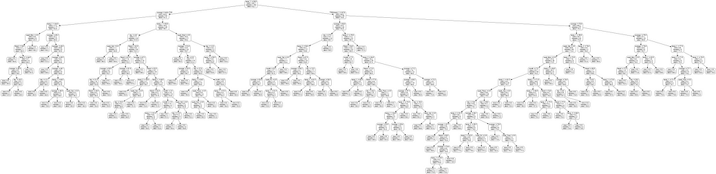
Wow! That looks like quite an expansive tree with 15 layers (in reality this is quite a small tree compared to some I’ve seen). You can download this imageyourself and examine it in greater detail, but to make things easier, I will limit the depth of trees in the forest to produce an understandable image.
# Limit depth of tree to 3 levels
rf_small = RandomForestRegressor(n_estimators=10, max_depth = 3)
rf_small.fit(train_features, train_labels)
# Extract the small tree
tree_small = rf_small.estimators_[5]
# Save the tree as a png image
export_graphviz(tree_small, out_file = 'small_tree.dot', feature_names = feature_list, rounded = True, precision = 1)
(graph, ) = pydot.graph_from_dot_file('small_tree.dot')
graph.write_png('small_tree.png');
Here is the reduced size tree annotated with labels
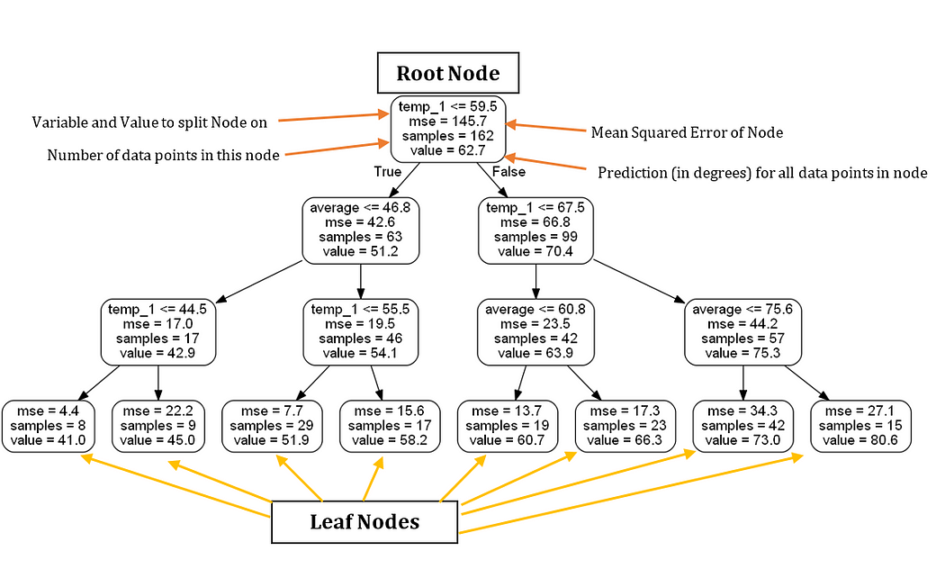
Based solely on this tree, we can make a prediction for any new data point. Let’s take an example of making a prediction for Wednesday, December 27, 2017. The (actual) variables are: temp_2 = 39, temp_1 = 35, average = 44, and friend = 30. We start at the root node and the first answer is True because temp_1 ≤ 59.5. We move to the left and encounter the second question, which is also True as average ≤ 46.8. Move down to the left and on to the third and final question which is True as well because temp_1 ≤ 44.5. Therefore, we conclude that our estimate for the maximum temperature is 41.0 degrees as indicated by the value in the leaf node. An interesting observation is that in the root node, there are only 162 samples despite there being 261 training data points. This is because each tree in the forest is trained on a random subset of the data points with replacement (called bagging, short for bootstrap aggregating). (We can turn off the sampling with replacement and use all the data points by setting bootstrap = False when making the forest). Random sampling of data points, combined with random sampling of a subset of the features at each node of the tree, is why the model is called a ‘random’ forest.
Furthermore, notice that in our tree, there are only 2 variables we actually used to make a prediction! According to this particular decision tree, the rest of the features are not important for making a prediction. Month of the year, day of the month, and our friend’s prediction are utterly useless for predicting the maximum temperature tomorrow! The only important information according to our simple tree is the temperature 1 day prior and the historical average. Visualizing the tree has increased our domain knowledge of the problem, and we now know what data to look for if we are asked to make a prediction!
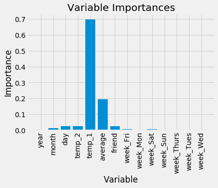
Variable Importances
In order to quantify the usefulness of all the variables in the entire random forest, we can look at the relative importances of the variables. The importances returned in Skicit-learn represent how much including a particular variable improves the prediction. The actual calculation of the importance is beyond the scope of this post, but we can use the numbers to make relative comparisons between variables.
The code here takes advantage of a number of tricks in the Python language, namely list comprehensive, zip, sorting, and argument unpacking. It’s not that important to understand these at the moment, but if you want to become skilled at Python, these are tools you should have in your arsenal!
# Get numerical feature importances
importances = list(rf.feature_importances_)
# List of tuples with variable and importance
feature_importances = [(feature, round(importance, 2)) for feature, importance in zip(feature_list, importances)]
# Sort the feature importances by most important first
feature_importances = sorted(feature_importances, key = lambda x: x[1], reverse = True)
# Print out the feature and importances
[print('Variable: {:20} Importance: {}'.format(*pair)) for pair in feature_importances];
Variable: temp_1               Importance: 0.7
Variable: average              Importance: 0.19
Variable: day                  Importance: 0.03
Variable: temp_2               Importance: 0.02
Variable: friend               Importance: 0.02
Variable: month                Importance: 0.01
Variable: year                 Importance: 0.0
Variable: week_Fri             Importance: 0.0
Variable: week_Mon             Importance: 0.0
Variable: week_Sat             Importance: 0.0
Variable: week_Sun             Importance: 0.0
Variable: week_Thurs           Importance: 0.0
Variable: week_Tues            Importance: 0.0
Variable: week_Wed             Importance: 0.0
At the top of the list is temp_1, the max temperature of the day before. This tells us the best predictor of the max temperature for a day is the max temperature of the day before, a rather intuitive finding. The second most important factor is the historical average max temperature, also not that surprising. Your friend turns out to not be very helpful, along with the day of the week, the year, the month, and the temperature 2 days prior. These importances all make sense as we would not expect the day of the week to be a predictor of maximum temperature as it has nothing to do with weather. Moreover, the year is the same for all data points and hence provides us with no information for predicting the max temperature.
In future implementations of the model, we can remove those variables that have no importance and the performance will not suffer. Additionally, if we are using a different model, say a support vector machine, we could use the random forest feature importances as a kind of feature selection method. Let’s quickly make a random forest with only the two most important variables, the max temperature 1 day prior and the historical average and see how the performance compares.
# New random forest with only the two most important variables
rf_most_important = RandomForestRegressor(n_estimators= 1000, random_state=42)
# Extract the two most important features
important_indices = [feature_list.index('temp_1'), feature_list.index('average')]
train_important = train_features[:, important_indices]
test_important = test_features[:, important_indices]
# Train the random forest
rf_most_important.fit(train_important, train_labels)
# Make predictions and determine the error
predictions = rf_most_important.predict(test_important)
errors = abs(predictions - test_labels)
# Display the performance metrics
print('Mean Absolute Error:', round(np.mean(errors), 2), 'degrees.')
mape = np.mean(100 * (errors / test_labels))
accuracy = 100 - mape
print('Accuracy:', round(accuracy, 2), '%.')
Mean Absolute Error: 3.9 degrees.
Accuracy: 93.8 %.
This tells us that we actually do not need all the data we collected to make accurate predictions! If we were to continue using this model, we could only collect the two variables and achieve nearly the same performance. In a production setting, we would need to weigh the decrease in accuracy versus the extra time required to obtain more information. Knowing how to find the right balance between performance and cost is an essential skill for a machine learning engineer and will ultimately depend on the problem!
At this point we have covered pretty much everything there is to know for a basic implementation of the random forest for a supervised regression problem. We can feel confident that our model can predict the maximum temperature tomorrow with 94% accuracy from one year of historical data. From here, feel free to play around with this example, or use the model on a data set of your choice. I will wrap up this post by making a few visualizations. My two favorite parts of data science are graphing and modeling, so naturally I have to make some charts! In addition to being enjoyable to look at, charts can help us diagnose our model because they compress a lot of numbers into an image that we can quickly examine.
Visualizations
The first chart I’ll make is a simple bar plot of the feature importances to illustrate the disparities in the relative significance of the variables. Plotting in Python is kind of non-intuitive, and I end up looking up almost everything on Stack Overflow when I make graphs. Don’t worry if the code here doesn’t quite make sense, sometimes fully understanding the code isn’t necessary to get the end result you want!
# Import matplotlib for plotting and use magic command for Jupyter Notebooks
import matplotlib.pyplot as plt
%matplotlib inline
# Set the style
plt.style.use('fivethirtyeight')
# list of x locations for plotting
x_values = list(range(len(importances)))
# Make a bar chart
plt.bar(x_values, importances, orientation = 'vertical')
# Tick labels for x axis
plt.xticks(x_values, feature_list, rotation='vertical')
# Axis labels and title
plt.ylabel('Importance'); plt.xlabel('Variable'); plt.title('Variable Importances');
Next, we can plot the entire dataset with predictions highlighted. This requires a little data manipulation, but its not too difficult. We can use this plot to determine if there are any outliers in either the data or our predictions.
# Use datetime for creating date objects for plotting
import datetime
# Dates of training values
months = features[:, feature_list.index('month')]
days = features[:, feature_list.index('day')]
years = features[:, feature_list.index('year')]
# List and then convert to datetime object
dates = [str(int(year)) + '-' + str(int(month)) + '-' + str(int(day)) for year, month, day in zip(years, months, days)]
dates = [datetime.datetime.strptime(date, '%Y-%m-%d') for date in dates]
# Dataframe with true values and dates
true_data = pd.DataFrame(data = {'date': dates, 'actual': labels})
# Dates of predictions
months = test_features[:, feature_list.index('month')]
days = test_features[:, feature_list.index('day')]
years = test_features[:, feature_list.index('year')]
# Column of dates
test_dates = [str(int(year)) + '-' + str(int(month)) + '-' + str(int(day)) for year, month, day in zip(years, months, days)]
# Convert to datetime objects
test_dates = [datetime.datetime.strptime(date, '%Y-%m-%d') for date in test_dates]
# Dataframe with predictions and dates
predictions_data = pd.DataFrame(data = {'date': test_dates, 'prediction': predictions})
# Plot the actual values
plt.plot(true_data['date'], true_data['actual'], 'b-', label = 'actual')
# Plot the predicted values
plt.plot(predictions_data['date'], predictions_data['prediction'], 'ro', label = 'prediction')
plt.xticks(rotation = '60');
plt.legend()
# Graph labels
plt.xlabel('Date'); plt.ylabel('Maximum Temperature (F)'); plt.title('Actual and Predicted Values');
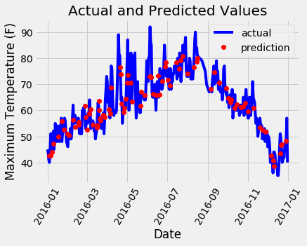
A little bit of work for a nice looking graph! It doesn’t look as if we have any noticeable outliers that need to be corrected. To further diagnose the model, we can plot residuals (the errors) to see if our model has a tendency to over-predict or under-predict, and we can also see if the residuals are normally distributed. However, I will just make one final chart showing the actual values, the temperature one day previous, the historical average, and our friend’s prediction. This will allow us to see the difference between useful variables and those that aren’t so helpful.
# Make the data accessible for plotting
true_data['temp_1'] = features[:, feature_list.index('temp_1')]
true_data['average'] = features[:, feature_list.index('average')]
true_data['friend'] = features[:, feature_list.index('friend')]
# Plot all the data as lines
plt.plot(true_data['date'], true_data['actual'], 'b-', label  = 'actual', alpha = 1.0)
plt.plot(true_data['date'], true_data['temp_1'], 'y-', label  = 'temp_1', alpha = 1.0)
plt.plot(true_data['date'], true_data['average'], 'k-', label = 'average', alpha = 0.8)
plt.plot(true_data['date'], true_data['friend'], 'r-', label = 'friend', alpha = 0.3)
# Formatting plot
plt.legend(); plt.xticks(rotation = '60');
# Lables and title
plt.xlabel('Date'); plt.ylabel('Maximum Temperature (F)'); plt.title('Actual Max Temp and Variables');
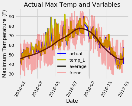
It is a little hard to make out all the lines, but we can see why the max temperature one day prior and the historical max temperature are useful for predicting max temperature while our friend is not (don’t give up on the friend yet, but maybe also don’t place so much weight on their estimate!). Graphs such as this are often helpful to make ahead of time so we can choose the variables to include, but they also can be used for diagnosis. Much as in the case of Anscombe’s quartet, graphs are often more revealing than quantitative numbers and should be a part of any machine learning workflow.
Conclusions
With those graphs, we have completed an entire end-to-end machine learning example! At this point, if we want to improve our model, we could try different hyperparameters (settings) try a different algorithm, or the best approach of all, gather more data! The performance of any model is directly proportional to the amount of valid data it can learn from, and we were using a very limited amount of information for training. I would encourage anyone to try and improve this model and share the results. From here you can dig more into the random forest theory and application using numerous online (free) resources. For those looking for a single book to cover both theory and Python implementations of machine learning models, I highly recommend Hands-On Machine Learning with Scikit-Learn and Tensorflow. Moreover, I hope everyone who made it through has seen how accessible machine learning has become and is ready to join the welcoming and helpful machine learning community.
https://towardsdatascience.com/random-forest-in-python-24d0893d51c0