Qt Quick - TabBar使用总结
一、概述
TabBar其实就是选项卡,TabBar是由TabButton控件填充,TabBar可以与任何提供currentIndex属性的布局或容器控件一起使用,如StackLayout或SwipeView。TabBar其实只是一个导航控件,就类似于一组RadioButton用来切换一个一个的。TabBar并不和这个内容的容器一起绑定使用的,TabBar和Qt里面的QTabWidget不一样,QTabWidget是把那个导航和内容容器结合在一起的,而TabBar已经分离开这些逻辑啦,我们也可以用这个TabBar来当RadioButton用也未尝不可。
import QtQuick 2.12
import QtQuick.Window 2.12
import QtQuick.Layouts 1.3
import QtQuick.Controls 2.5

Window {


    visible: true
    width: 640
    height: 480
    title: qsTr("Hello World")

    TabBar {


        id: bar
        width: parent.width
        TabButton {


            text: qsTr("Home")
        }
        TabButton {


            text: qsTr("Discover")
        }
        TabButton {


            text: qsTr("Activity")
        }
    }

    StackLayout {


        id:stackLayout
        anchors.topMargin: 41
        anchors.fill: parent
        currentIndex: bar.currentIndex

        Item {


            id: homeTab
            Text {


                id: homeLabel
                x: 308
                y: 196
                text: qsTr("home")
                anchors.verticalCenter: parent.verticalCenter
                anchors.horizontalCenter: parent.horizontalCenter
            }
        }
        Item {


            id: discoverTab
            Text {


                id: discoverLabel
                x: 308
                y: 196
                text: qsTr("discover")
                anchors.verticalCenter: parent.verticalCenter
                anchors.horizontalCenter: parent.horizontalCenter
            }
        }
        Item {


            id: activityTab
            Text {


                id: activityLabel
                x: 308
                y: 196
                text: qsTr("activity")
                anchors.verticalCenter: parent.verticalCenter
                anchors.horizontalCenter: parent.horizontalCenter
            }
        }
    }

}
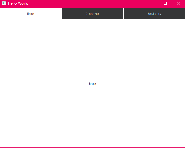
如上所示,TabBar通常用一组静态的选项卡按钮填充,这些选项卡按钮被内联定义为选项卡栏的子元素。还可以在运行时动态地添加、插入、移动和删除元素。可以使用itemAt()或contentChildren来访问元素项。
二、调整选项卡
默认情况下,TabBar调整其按钮大小以适应控件的宽度。可用空间平均分配给每个按钮。可以通过为按钮设置一个显式的宽度来覆盖默认的缩放行为。这个就会让Bar大小适应内容大小。
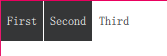
下面的例子演示了如何保持每个选项卡按钮的隐式大小,而不是调整大小以适应选项卡栏:
  TabBar {


      width: parent.width
      TabButton {


          text: "First"
          width: implicitWidth
      }
      TabButton {


          text: "Second"
          width: implicitWidth
      }
      TabButton {


          text: "Third"
          width: implicitWidth
      }
  }
三、Flickable标签
如果按钮的总宽度超过了标签栏的可用宽度,它会自动变成可闪烁的。
TabBar {


      id: bar
      width: parent.width

      Repeater {


          model: ["First", "Second", "Third", "Fourth", "Fifth"]

          TabButton {


              text: modelData
              width: Math.max(100, bar.width / 5)
          }
      }
  }
三、定制化

这个定制化其实就只是定制的TabBar的最外层的边框,内容还需要对 TabButton 美化
 import QtQuick 2.12
  import QtQuick.Controls 2.12

  TabBar {


      id: control

      background: Rectangle {


          color: "#46a2da"
      }

      TabButton {


          text: qsTr("Home")
      }
      TabButton {


          text: qsTr("Discover")
      }
      TabButton {


          text: qsTr("Activity")
      }
  }