一、概述
RadioButton,也叫单选按钮,可以打开(选中)或关闭(未选中)。单选按钮通常用于从一组选项中选择一项。也就是多选1的方式
RadioButton从AbstractButton继承了API。例如,您可以使用AbstractButton API设置文本并对单击作出反应。
单选按钮的状态可以通过checked属性设置。
单选按钮默认是自动 exclusive 的。也就是说在属于同一父元素的单选按钮中,只能同时选中一个按钮;选中另一个按钮会自动取消选中之前选中的按钮。
对于不共享共同父级的单选按钮,可使用ButtonGroup来管理 这个 独占性。
二、使用
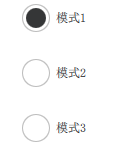
实现的效果就是:
对应的内容:
import QtQuick 2.0
import QtQuick.Layouts 1.3
import QtQuick.Window 2.3
import QtQuick.Controls 2.5

Window {


    id: window
    ColumnLayout
    {


        anchors.fill: parent

        RadioButton
        {


            text: "模式1"
            Layout.alignment: Qt.AlignHCenter
        }

        RadioButton
        {


            text: "模式2"
            Layout.alignment: Qt.AlignHCenter
        }

        RadioButton
        {


            text: "模式3"
            Layout.alignment: Qt.AlignHCenter
        }
    }
}
三、定制外观
定制外观,就是将 RadioButton 的三个 可视化组件重新给定义一下
也就是这三个属性: background, content item 和 indicator
实现的效果:

对应代码:
  import QtQuick 2.12
  import QtQuick.Controls 2.12

  RadioButton {


      id: control
      text: qsTr("RadioButton")
      checked: true

      indicator: Rectangle {


          implicitWidth: 26
          implicitHeight: 26
          x: control.leftPadding
          y: parent.height / 2 - height / 2
          radius: 13
          border.color: control.down ? "#17a81a" : "#21be2b"

          Rectangle {


              width: 14
              height: 14
              x: 6
              y: 6
              radius: 7
              color: control.down ? "#17a81a" : "#21be2b"
              visible: control.checked
          }
      }

      contentItem: Text {


          text: control.text
          font: control.font
          opacity: enabled ? 1.0 : 0.3
          color: control.down ? "#17a81a" : "#21be2b"
          verticalAlignment: Text.AlignVCenter
          leftPadding: control.indicator.width + control.spacing
      }
  }