naive-UI中的进度条标签的渐变斜角的使用记录
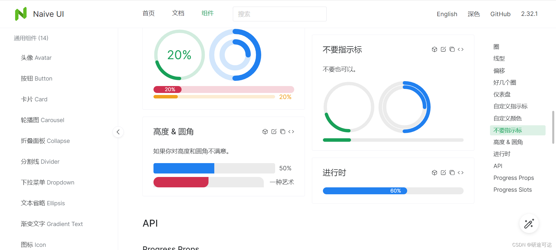
上面图片是UI组件中的常见的展示样式,可以直接就给出的代码案例上去进行颜色等样式的修改。
现在我们需要在特定的环境下进行特殊定制,现在的项目UI的需求为:进度条为渐进色,且有一端为斜角(斜角这个太麻烦,目前选择使用大圆弧来替代)。如下图所示
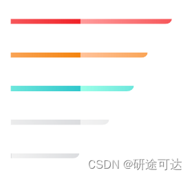
上面这个图片是一个动态的进度条,颜色从左到右渐变,
找了好多案例没遇见比较接近的案例,随记录一下这个点怎么攻克:
 <div class="Line-progress">
                <div class="process">
                  <div
                    class="child"
                    style="
                      background-image: linear-gradient(269deg, #f02127 0%, rgba(255, 19, 19, 0.42) 100%);
                      width: 85%;
                    "
                  ></div>
                </div>
                <div class="index-area-number">300ms</div>
              </div>
相应的样式
 .Line-progress {


          width: 346px;
          margin-left: 15px;
          margin-right: 20px;
          display: flex;
          flex-direction: row;
          align-items: center;
          //div 实现动态渐变进度条
          .process {


            width: 100%;
            height: 10px;
            background-color: #ffffff 100%;
            border-radius: 0px;
            overflow: hidden;
            display: flex;
            .child {


              width: 85%;
              height: 10px;
              //将背景色设置为渐变色
              background-image: linear-gradient(269deg, #f02127 0%, rgba(255, 19, 19, 0.42) 100%);
              border-radius: 0 0 15px 0;
              // background-size: 20px 20px;
              animation: process 0.8s infinite linear;
            }
          }
//关键的动态效果
          @keyframes process {


            from {


              background-position: 0 0;
            }

            to {


              background-position: 200px 0;
            }
          }
          .index-area-number {


            font-size: 16px;
            font-family: PingFang-SC-Bold;
            color: #333333;
            letter-spacing: 0.4px;
          }
        }