【教程地址】
同济子豪兄教学视频: https://space.bilibili.com/1900783/channel/collectiondetail?sid=606800
项目代码: https://github.com/TommyZihao/Train_Custom_Dataset
配置环境
安装依赖包
pip install numpy pandas scikit-learn matplotlib seaborn requests tqdm opencv-python pillow kaleido
pip install umap-learn datashader bokeh holoviews scikit-image colorcet
pip3 install torch torchvision torchaudio --extra-index-url https://download.pytorch.org/whl/cu113
设置matplotlib中文字体
import matplotlib.pyplot as plt
# windows操作系统
plt.rcParams['font.sans-serif']=['SimHei']  # 用来正常显示中文标签
plt.rcParams['axes.unicode_minus']=False  # 用来正常显示负号
测试一下
plt.plot([1,2,3], [100,500,300])
plt.title('matplotlib中文字体测试', fontsize=25)
plt.xlabel('X轴', fontsize=15)
plt.ylabel('Y轴', fontsize=15)
plt.show()
准备图像分类数据集和模型文件
这里使用的是fruit30_split数据集
# 下载数据集压缩包
!wget https://zihao-openmmlab.obs.cn-east-3.myhuaweicloud.com/20220716-mmclassification/dataset/fruit30/fruit30_split.zip
我们可以使用三、利用迁移学习进行模型微调(Datawhale组队学习)得到的类别名称和ID索引号的映射字典idx_to_labels.npy,也可以通过以下代码进行下载
# 下载 类别名称 和 ID索引号 的映射字典
!wget https://zihao-openmmlab.obs.cn-east-3.myhuaweicloud.com/20220716-mmclassification/dataset/fruit30/idx_to_labels.npy
同样的我们可以使用三、利用迁移学习进行模型微调(Datawhale组队学习)自己训练好的模型fruit30_pytorch_20230123.pth,也可以通过以下代码进行下载
# 下载样例模型文件
!wget https://zihao-openmmlab.obs.cn-east-3.myhuaweicloud.com/20220716-mmclassification/checkpoints/fruit30_pytorch_20220814.pth -P checkpoints
测试集图像分类预测结果
使用训练好的图像分类模型,预测测试集的所有图像,得到预测结果表格。
#导入所需的工具包
import os
from tqdm import tqdm

import numpy as np
import pandas as pd

from PIL import Image

import torch
import torch.nn.functional as F

# 有 GPU 就用 GPU,没有就用 CPU
device = torch.device('cuda:0' if torch.cuda.is_available() else 'cpu')
print('device', device)
对测试集的图像进行预处理
from torchvision import transforms
# 测试集图像预处理-RCTN:缩放、裁剪、转 Tensor、归一化
test_transform = transforms.Compose([transforms.Resize(256),
                                     transforms.CenterCrop(224),
                                     transforms.ToTensor(),
                                     transforms.Normalize(
                                         mean=[0.485, 0.456, 0.406],
                                         std=[0.229, 0.224, 0.225])
                                    ])
载入测试集
# 数据集文件夹路径
dataset_dir = 'fruit30_split'
test_path = os.path.join(dataset_dir, 'val')
from torchvision import datasets
# 载入测试集
test_dataset = datasets.ImageFolder(test_path, test_transform)
print('测试集图像数量', len(test_dataset))
print('类别个数', len(test_dataset.classes))
print('各类别名称', test_dataset.classes)
# 载入类别名称 和 ID索引号 的映射字典
idx_to_labels = np.load('idx_to_labels.npy', allow_pickle=True).item()
# 获得类别名称
classes = list(idx_to_labels.values())
print(classes)
测试集图像数量 1078
类别个数 30
各类别名称 [‘哈密瓜’, ‘圣女果’, ‘山竹’, ‘杨梅’, ‘柚子’, ‘柠檬’, ‘桂圆’, ‘梨’, ‘椰子’, ‘榴莲’, ‘火龙果’, ‘猕猴桃’, ‘石榴’, ‘砂糖橘’, ‘胡萝卜’, ‘脐橙’, ‘芒果’, ‘苦瓜’, ‘苹果-红’, ‘苹果-青’, ‘草莓’, ‘荔枝’, ‘菠萝’, ‘葡萄-白’, ‘葡萄-红’, ‘西瓜’, ‘西红柿’, ‘车厘子’, ‘香蕉’, ‘黄瓜’]
[‘哈密瓜’, ‘圣女果’, ‘山竹’, ‘杨梅’, ‘柚子’, ‘柠檬’, ‘桂圆’, ‘梨’, ‘椰子’, ‘榴莲’, ‘火龙果’, ‘猕猴桃’, ‘石榴’, ‘砂糖橘’, ‘胡萝卜’, ‘脐橙’, ‘芒果’, ‘苦瓜’, ‘苹果-红’, ‘苹果-青’, ‘草莓’, ‘荔枝’, ‘菠萝’, ‘葡萄-白’, ‘葡萄-红’, ‘西瓜’, ‘西红柿’, ‘车厘子’, ‘香蕉’, ‘黄瓜’]
导入训练好的模型
model = torch.load('checkpoints/fruit30_pytorch_20230123.pth')
model = model.eval().to(device)
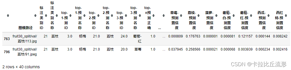
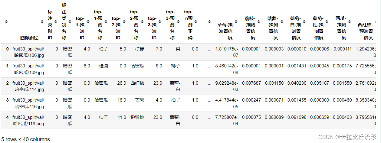
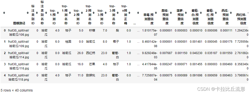
表格A-测试集图像路径及标注
img_paths = [each[0] for each in test_dataset.imgs]
df = pd.DataFrame()
df['图像路径'] = img_paths
df['标注类别ID'] = test_dataset.targets
df['标注类别名称'] = [idx_to_labels[ID] for ID in test_dataset.targets]
df
表格B-测试集每张图像的图像分类预测结果,以及各类别置信度
# 记录 top-n 预测结果
n = 3
df_pred = pd.DataFrame()
for idx, row in tqdm(df.iterrows()):
    img_path = row['图像路径']
    img_pil = Image.open(img_path).convert('RGB')
    input_img = test_transform(img_pil).unsqueeze(0).to(device) # 预处理
    pred_logits = model(input_img) # 执行前向预测,得到所有类别的 logit 预测分数
    pred_softmax = F.softmax(pred_logits, dim=1) # 对 logit 分数做 softmax 运算

    pred_dict = {

    }

    top_n = torch.topk(pred_softmax, n) # 取置信度最大的 n 个结果
    pred_ids = top_n[1].cpu().detach().numpy().squeeze() # 解析出类别

    # top-n 预测结果
    for i in range(1, n+1):
        pred_dict['top-{}-预测ID'.format(i)] = pred_ids[i-1]
        pred_dict['top-{}-预测名称'.format(i)] = idx_to_labels[pred_ids[i-1]]
    pred_dict['top-n预测正确'] = row['标注类别ID'] in pred_ids
    # 每个类别的预测置信度
    for idx, each in enumerate(classes):
        pred_dict['{}-预测置信度'.format(each)] = pred_softmax[0][idx].cpu().detach().numpy()

    df_pred = df_pred.append(pred_dict, ignore_index=True)
df_pred
拼接AB两张表格并导出完整表格
df = pd.concat([df, df_pred], axis=1)
df.to_csv('测试集预测结果.csv', index=False)
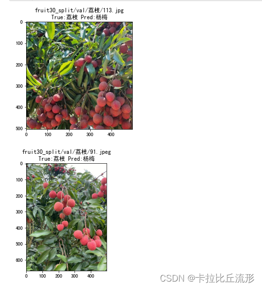
可视化测试集中被误判的图像
以荔枝和杨梅进行距离,找出预测为杨梅实际为荔枝的图像
true_A = '荔枝'
pred_B = '杨梅'
wrong_df = df[(df['标注类别名称']==true_A)&(df['top-1-预测名称']==pred_B)]
wrong_df
可视化上表中所有被误判的图像,通过观察被误判的图像我们可以知道算法将其误判的原因,给我们后续改进算法提供了思路
for idx, row in wrong_df.iterrows():
    img_path = row['图像路径']
    img_bgr = cv2.imread(img_path)
    img_rgb = cv2.cvtColor(img_bgr, cv2.COLOR_BGR2RGB)
    plt.imshow(img_rgb)
    title_str = img_path + '\nTrue:' + row['标注类别名称'] + ' Pred:' + row['top-1-预测名称']
    plt.title(title_str)
    plt.show()
测试集总体准确率评估指标
分析测试集预测结果表格,计算总体准确率评估指标和各类别准确率评估指标。
#导入工具包
import pandas as pd
import numpy as np
from tqdm import tqdm
载入类别名称和ID
idx_to_labels = np.load('idx_to_labels.npy', allow_pickle=True).item()
# 获得类别名称
classes = list(idx_to_labels.values())
print(classes)
载入测试集预测结果表格
df = pd.read_csv('测试集预测结果.csv')
常见评估指标
准确率
预测概率最大的一项预测为正确的准确率
sum(df['标注类别名称'] == df['top-1-预测名称']) / len(df)
0.87569573283859
top-n准确率
预测概率最大的前N项预测为正确的准确率,n越大准确率越高
sum(df['top-n预测正确']) / len(df)
0.9647495361781077
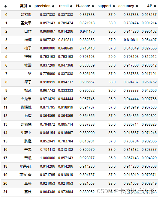
这里采用sklearn.metrics里面的classification_report对各类别结果进行评估
from sklearn.metrics import classification_report
print(classification_report(df['标注类别名称'], df['top-1-预测名称'], target_names=classes))
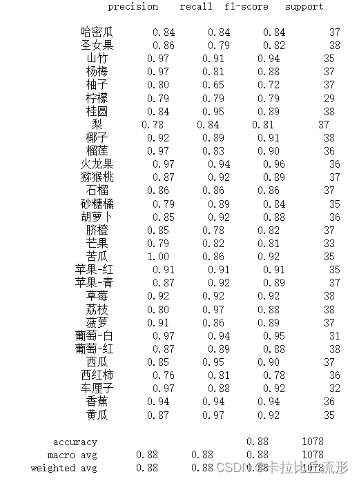
macro avg 宏平均:直接将每一类的评估指标求和取平均(算数平均值)
weighted avg 加权平均:按样本数量(support)加权计算评估指标的平均值
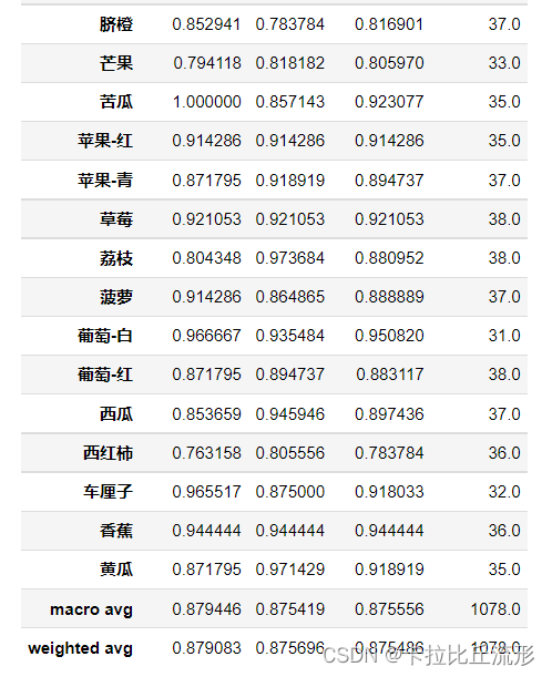
report = classification_report(df['标注类别名称'], df['top-1-预测名称'], target_names=classes, output_dict=True)
del report['accuracy']
df_report = pd.DataFrame(report).transpose()
df_report
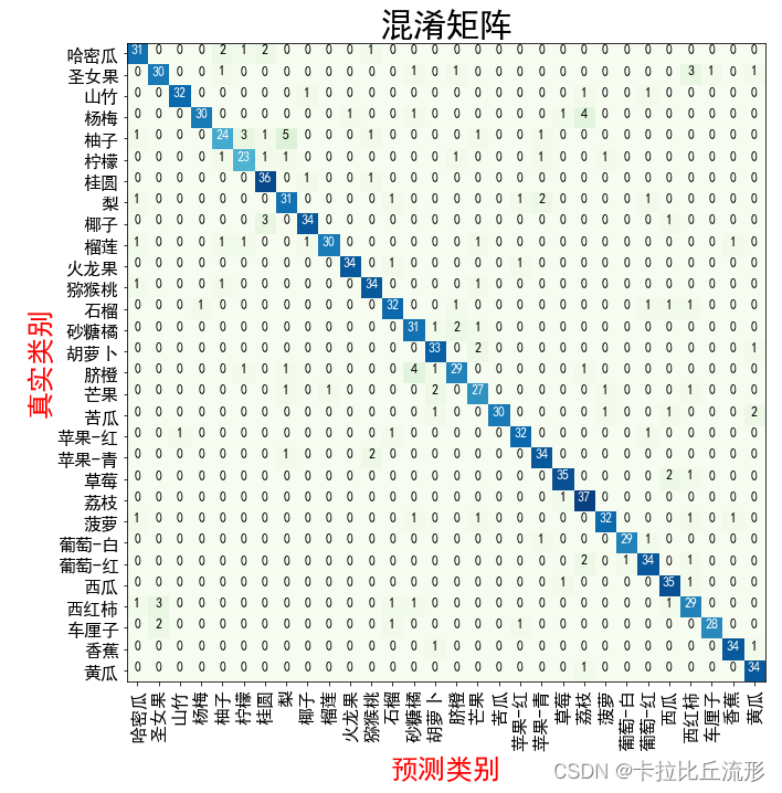
混淆矩阵
生成混淆矩阵
通过测试集所有图像预测结果,生成多类别混淆矩阵,评估模型准确度。
import pandas as pd
import numpy as np
from tqdm import tqdm

import math
import cv2

import matplotlib.pyplot as plt
%matplotlib inline

# windows操作系统
plt.rcParams['font.sans-serif']=['SimHei']  # 用来正常显示中文标签
plt.rcParams['axes.unicode_minus']=False  # 用来正常显示负号
载入各类别名称
idx_to_labels = np.load('idx_to_labels.npy', allow_pickle=True).item()
# 获得类别名称
classes = list(idx_to_labels.values())
print(classes)
载入测试集预测结果表格
df = pd.read_csv('测试集预测结果.csv')
df.head()
生成混淆矩阵,得混淆矩阵的大小是30×30
from sklearn.metrics import confusion_matrix
confusion_matrix_model = confusion_matrix(df['标注类别名称'], df['top-1-预测名称'])
confusion_matrix_model.shape
(30, 30)
对混淆矩阵进行可视化
import itertools
def cnf_matrix_plotter(cm, classes, cmap=plt.cm.Blues):
    """
    传入混淆矩阵和标签名称列表,绘制混淆矩阵
    """
    plt.figure(figsize=(10, 10))

    plt.imshow(cm, interpolation='nearest', cmap=cmap)
    # plt.colorbar() # 色条
    tick_marks = np.arange(len(classes))

    plt.title('混淆矩阵', fontsize=30)
    plt.xlabel('预测类别', fontsize=25, c='r')
    plt.ylabel('真实类别', fontsize=25, c='r')
    plt.tick_params(labelsize=16) # 设置类别文字大小
    plt.xticks(tick_marks, classes, rotation=90) # 横轴文字旋转
    plt.yticks(tick_marks, classes)

    # 写数字
    threshold = cm.max() / 2.
    for i, j in itertools.product(range(cm.shape[0]), range(cm.shape[1])):
        plt.text(j, i, cm[i, j],
                 horizontalalignment="center",
                 color="white" if cm[i, j] > threshold else "black",
                 fontsize=12)

    plt.tight_layout()

    plt.savefig('混淆矩阵.pdf', dpi=300) # 保存图像
    plt.show()
我们可以通过dir(plt.cm)查看所有的配色方案,下面这几种是子豪兄精选配色方案,我们尝试使用其中的一种配色方案
# Blues# BuGn# Reds# Greens# Greys# binary# Oranges# Purples# BuPu# GnBu# OrRd# RdPu
cnf_matrix_plotter(confusion_matrix_model, classes, cmap='GnBu')
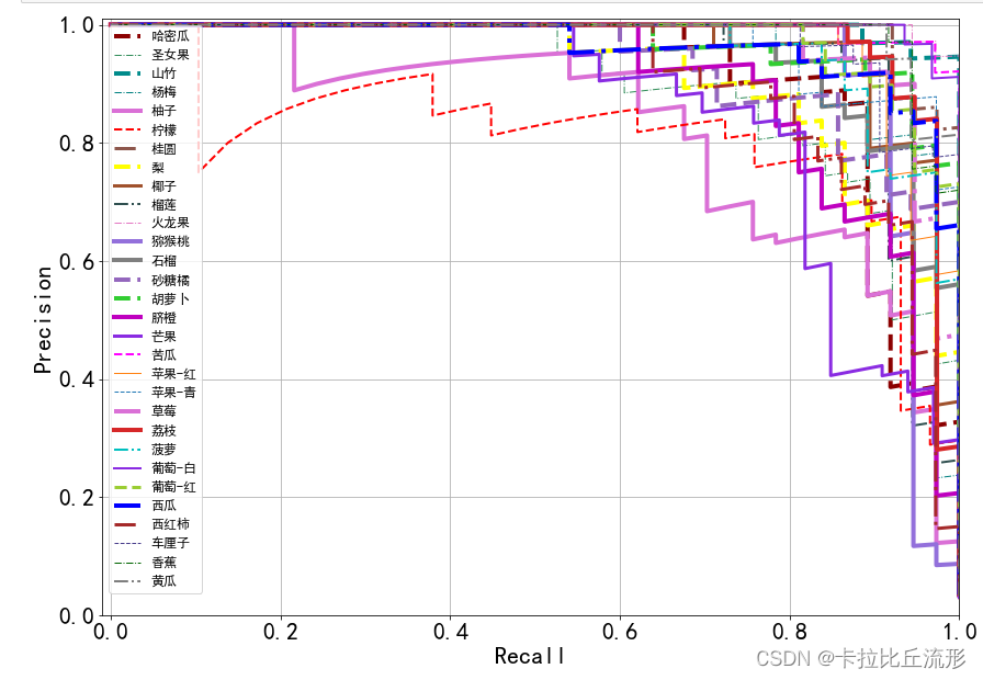
PR曲线
绘制每个类别的PR曲线,计算AP值。
import pandas as pd
import numpy as np

import matplotlib.pyplot as plt
%matplotlib inline

# windows操作系统
plt.rcParams['font.sans-serif']=['SimHei']  # 用来正常显示中文标签
plt.rcParams['axes.unicode_minus']=False  # 用来正常显示负号
载入类别名称和ID
idx_to_labels = np.load('idx_to_labels.npy', allow_pickle=True).item()
# 获得类别名称
classes = list(idx_to_labels.values())
载入测试集预测结果表格
df = pd.read_csv('测试集预测结果.csv')
df.head()
绘制某一类别的PR曲线
specific_class = '荔枝'
# 二分类标注
y_test = (df['标注类别名称'] == specific_class)
# 二分类预测置信度
y_score = df['荔枝-预测置信度']
from sklearn.metrics import precision_recall_curve
from sklearn.metrics import average_precision_score
precision, recall, thresholds = precision_recall_curve(y_test, y_score)
AP = average_precision_score(y_test, y_score, average='weighted')

plt.figure(figsize=(12, 8))
# 绘制 PR 曲线
plt.plot(recall, precision, linewidth=5, label=specific_class)

# 随机二分类模型
# 阈值小,所有样本都被预测为正类,recall为1,precision为正样本百分比
# 阈值大,所有样本都被预测为负类,recall为0,precision波动较大
plt.plot([0, 0], [0, 1], ls="--", c='.3', linewidth=3, label='随机模型')
plt.plot([0, 1], [0.5, sum(y_test==1)/len(df)], ls="--", c='.3', linewidth=3)

plt.xlim([-0.01, 1.0])
plt.ylim([0.0, 1.01])
plt.rcParams['font.size'] = 22
plt.title('{} PR曲线  AP:{:.3f}'.format(specific_class, AP))
plt.xlabel('Recall')
plt.ylabel('Precision')
plt.legend()
plt.grid(True)
plt.savefig('{}-PR曲线.pdf'.format(specific_class), dpi=120, bbox_inches='tight')
plt.show()

绘制所有类别的ROC曲线
随机产生一种线型
from matplotlib import colors as mcolors
import random
random.seed(124)
colors = ['b', 'g', 'r', 'c', 'm', 'y', 'k', 'tab:blue', 'tab:orange', 'tab:green', 'tab:red', 'tab:purple', 'tab:brown', 'tab:pink', 'tab:gray', 'tab:olive', 'tab:cyan', 'black', 'indianred', 'brown', 'firebrick', 'maroon', 'darkred', 'red', 'sienna', 'chocolate', 'yellow', 'olivedrab', 'yellowgreen', 'darkolivegreen', 'forestgreen', 'limegreen', 'darkgreen', 'green', 'lime', 'seagreen', 'mediumseagreen', 'darkslategray', 'darkslategrey', 'teal', 'darkcyan', 'dodgerblue', 'navy', 'darkblue', 'mediumblue', 'blue', 'slateblue', 'darkslateblue', 'mediumslateblue', 'mediumpurple', 'rebeccapurple', 'blueviolet', 'indigo', 'darkorchid', 'darkviolet', 'mediumorchid', 'purple', 'darkmagenta', 'fuchsia', 'magenta', 'orchid', 'mediumvioletred', 'deeppink', 'hotpink']
markers = [".",",","o","v","^","<",">","1","2","3","4","8","s","p","P","*","h","H","+","x","X","D","d","|","_",0,1,2,3,4,5,6,7,8,9,10,11]
linestyle = ['--', '-.', '-']
def get_line_arg():
    '''
    随机产生一种绘图线型
    '''
    line_arg = {

    }
    line_arg['color'] = random.choice(colors)
    # line_arg['marker'] = random.choice(markers)
    line_arg['linestyle'] = random.choice(linestyle)
    line_arg['linewidth'] = random.randint(1, 4)
    # line_arg['markersize'] = random.randint(3, 5)
    return line_arg
get_line_arg()
{‘color’: ‘seagreen’, ‘linestyle’: ‘-’, ‘linewidth’: 1}
plt.figure(figsize=(14, 10))
plt.xlim([-0.01, 1.0])
plt.ylim([0.0, 1.01])
# plt.plot([0, 1], [0, 1],ls="--", c='.3', linewidth=3, label='随机模型')
plt.xlabel('Recall')
plt.ylabel('Precision')
plt.rcParams['font.size'] = 22
plt.grid(True)

ap_list = []
for each_class in classes:
    y_test = list((df['标注类别名称'] == each_class))
    y_score = list(df['{}-预测置信度'.format(each_class)])
    precision, recall, thresholds = precision_recall_curve(y_test, y_score)
    AP = average_precision_score(y_test, y_score, average='weighted')
    plt.plot(recall, precision, **get_line_arg(), label=each_class)
    plt.legend()
    ap_list.append(AP)

plt.legend(loc='best', fontsize=12)
plt.savefig('各类别PR曲线.pdf'.format(specific_class), dpi=120, bbox_inches='tight')
plt.show()
将AP增加至各类别准确率评估指标表格中
df_report = pd.read_csv('各类别准确率评估指标.csv')
# 计算 AUC值 的 宏平均 和 加权平均
macro_avg_auc = np.mean(ap_list)
weighted_avg_auc = sum(ap_list * df_report.iloc[:-2]['support'] / len(df))

ap_list.append(macro_avg_auc)
ap_list.append(weighted_avg_auc)

df_report['AUC'] = auc_list
df_report
df_report.to_csv('各类别准确率评估指标.csv', index=False)
ROC曲线
绘制每个类别的ROC曲线,计算AUC值。
import pandas as pd
import numpy as np

import matplotlib.pyplot as plt
%matplotlib inline

# windows操作系统
plt.rcParams['font.sans-serif']=['SimHei']  # 用来正常显示中文标签
plt.rcParams['axes.unicode_minus']=False  # 用来正常显示负号
载入类别名称和ID
idx_to_labels = np.load('idx_to_labels.npy', allow_pickle=True).item()
# 获得类别名称
classes = list(idx_to_labels.values())
载入测试集预测结果表格
df = pd.read_csv('测试集预测结果.csv')
df.head()
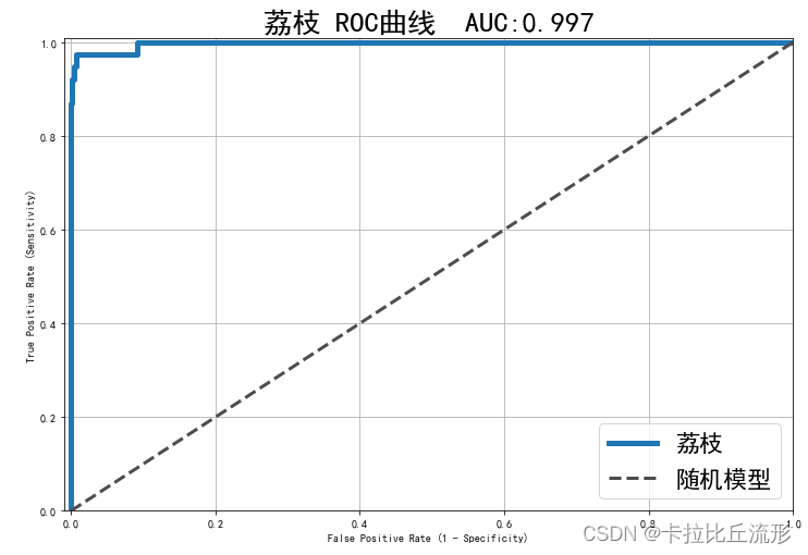
绘制某一类别的ROC曲线
specific_class = '荔枝'
# 二分类标注
y_test = (df['标注类别名称'] == specific_class)
# 二分类置信度
y_score = df['荔枝-预测置信度']
from sklearn.metrics import roc_curve, auc
fpr, tpr, threshold = roc_curve(y_test, y_score)

plt.figure(figsize=(12, 8))
plt.plot(fpr, tpr, linewidth=5, label=specific_class)
plt.plot([0, 1], [0, 1],ls="--", c='.3', linewidth=3, label='随机模型')
plt.xlim([-0.01, 1.0])
plt.ylim([0.0, 1.01])
plt.rcParams['font.size'] = 22
plt.title('{} ROC曲线  AUC:{:.3f}'.format(specific_class, auc(fpr, tpr)))
plt.xlabel('False Positive Rate (1 - Specificity)')
plt.ylabel('True Positive Rate (Sensitivity)')
plt.legend()
plt.grid(True)

plt.savefig('{}-ROC曲线.pdf'.format(specific_class), dpi=120, bbox_inches='tight')
plt.show()

# yticks = ax.yaxis.get_major_ticks()
# yticks[0].label1.set_visible(False)
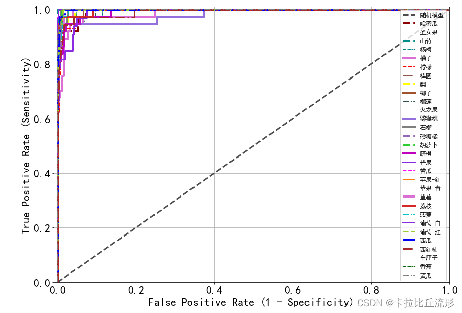
绘制所有类别的ROC曲线
随机产生一种线型
from matplotlib import colors as mcolors
import random
random.seed(124)
colors = ['b', 'g', 'r', 'c', 'm', 'y', 'k', 'tab:blue', 'tab:orange', 'tab:green', 'tab:red', 'tab:purple', 'tab:brown', 'tab:pink', 'tab:gray', 'tab:olive', 'tab:cyan', 'black', 'indianred', 'brown', 'firebrick', 'maroon', 'darkred', 'red', 'sienna', 'chocolate', 'yellow', 'olivedrab', 'yellowgreen', 'darkolivegreen', 'forestgreen', 'limegreen', 'darkgreen', 'green', 'lime', 'seagreen', 'mediumseagreen', 'darkslategray', 'darkslategrey', 'teal', 'darkcyan', 'dodgerblue', 'navy', 'darkblue', 'mediumblue', 'blue', 'slateblue', 'darkslateblue', 'mediumslateblue', 'mediumpurple', 'rebeccapurple', 'blueviolet', 'indigo', 'darkorchid', 'darkviolet', 'mediumorchid', 'purple', 'darkmagenta', 'fuchsia', 'magenta', 'orchid', 'mediumvioletred', 'deeppink', 'hotpink']
markers = [".",",","o","v","^","<",">","1","2","3","4","8","s","p","P","*","h","H","+","x","X","D","d","|","_",0,1,2,3,4,5,6,7,8,9,10,11]
linestyle = ['--', '-.', '-']
def get_line_arg():
    '''
    随机产生一种绘图线型
    '''
    line_arg = {

    }
    line_arg['color'] = random.choice(colors)
    # line_arg['marker'] = random.choice(markers)
    line_arg['linestyle'] = random.choice(linestyle)
    line_arg['linewidth'] = random.randint(1, 4)
    # line_arg['markersize'] = random.randint(3, 5)
    return line_arg
get_line_arg()
{‘color’: ‘seagreen’, ‘linestyle’: ‘-’, ‘linewidth’: 1}
plt.figure(figsize=(14, 10))
plt.xlim([-0.01, 1.0])
plt.ylim([0.0, 1.01])
plt.plot([0, 1], [0, 1],ls="--", c='.3', linewidth=3, label='随机模型')
plt.xlabel('False Positive Rate (1 - Specificity)')
plt.ylabel('True Positive Rate (Sensitivity)')
plt.rcParams['font.size'] = 22
plt.grid(True)

auc_list = []
for each_class in classes:
    y_test = list((df['标注类别名称'] == each_class))
    y_score = list(df['{}-预测置信度'.format(each_class)])
    fpr, tpr, threshold = roc_curve(y_test, y_score)
    plt.plot(fpr, tpr, **get_line_arg(), label=each_class)
    plt.legend()
    auc_list.append(auc(fpr, tpr))

plt.legend(loc='best', fontsize=12)
plt.savefig('各类别ROC曲线.pdf'.format(specific_class), dpi=120, bbox_inches='tight')
plt.show()
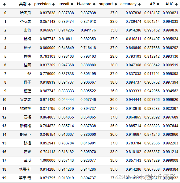
将AUC增加至各类别准确率评估指标表格中
df_report = pd.read_csv('各类别准确率评估指标.csv')

# 计算 AUC值 的 宏平均 和 加权平均
macro_avg_auc = np.mean(auc_list)
weighted_avg_auc = sum(auc_list * df_report.iloc[:-2]['support'] / len(df))

auc_list.append(macro_avg_auc)
auc_list.append(weighted_avg_auc)

df_report['AUC'] = auc_list
df_report
df_report.to_csv('各类别准确率评估指标.csv', index=False)
测试集语义特征可视化
抽取Pytorch训练得到的图像分类模型中间层的输出特征,作为输入图像的语义特征。
计算测试集所有图像的语义特征,使用t-SNE和UMAP两种降维方法降维至二维和三维,可视化。
分析不同类别的语义距离、异常数据、细粒度分类、高维数据结构。
图像语义特征提取
from tqdm import tqdm

import pandas as pd
import numpy as np

import torch

import cv2
from PIL import Image

# 忽略烦人的红色提示
import warnings
warnings.filterwarnings("ignore")

# 有 GPU 就用 GPU,没有就用 CPU
device = torch.device('cuda:0' if torch.cuda.is_available() else 'cpu')
print('device', device)
对测试集图像进行预处理
from torchvision import transforms

test_transform = transforms.Compose([transforms.Resize(256),
                                     transforms.CenterCrop(224),
                                     transforms.ToTensor(),
                                     transforms.Normalize(
                                         mean=[0.485, 0.456, 0.406],
                                         std=[0.229, 0.224, 0.225])
                                    ])
导入训练好的模型
model = torch.load('checkpoints/fruit30_pytorch_20230123.pth')
model = model.eval().to(device)
载入测试集预测结果表格
df = pd.read_csv('测试集预测结果.csv')
df.head()
抽取模型中间层输出结果作为语义特征,我们这里获取avgpool这一层的结果作为语义特征
from torchvision.models.feature_extraction import create_feature_extractor
model_trunc = create_feature_extractor(model, return_nodes={

    'avgpool': 'semantic_feature'})
计算单张图像的语义特征
一张图像获得一个512维的语义特征向量
img_path = 'fruit30_split/val/菠萝/105.jpg'
img_pil = Image.open(img_path)
input_img = test_transform(img_pil) # 预处理
input_img = input_img.unsqueeze(0).to(device)
# 执行前向预测,得到指定中间层的输出
pred_logits = model_trunc(input_img)

pred_logits['semantic_feature'].squeeze().detach().cpu().numpy().shape
(512,)
计算测试集每张图像的语义特征
测试集总共1078张图片,对每张图片计算语义特征得到一个1078×512的特征矩阵
encoding_array = []
img_path_list = []

for img_path in tqdm(df['图像路径']):
    img_path_list.append(img_path)
    img_pil = Image.open(img_path).convert('RGB')
    input_img = test_transform(img_pil).unsqueeze(0).to(device) # 预处理
    feature = model_trunc(input_img)['semantic_feature'].squeeze().detach().cpu().numpy() # 执行前向预测,得到 avgpool 层输出的语义特征
    encoding_array.append(feature)
encoding_array = np.array(encoding_array)

encoding_array.shape

# 保存为本地的 npy 文件
np.save('测试集语义特征.npy', encoding_array)
(1078, 512)
测试集语义特征t-SNE降维可视化
import numpy as np
import pandas as pd
import cv2
# windows操作系统
import matplotlib.pyplot as plt
plt.rcParams['font.sans-serif']=['SimHei']  # 用来正常显示中文标签
plt.rcParams['axes.unicode_minus']=False  # 用来正常显示负号
载入测试集图像语义特征
encoding_array = np.load('测试集语义特征.npy', allow_pickle=True)
encoding_array.shape
(1079, 512)
载入测试集预测结果表格
df = pd.read_csv('测试集预测结果.csv')
df.head()
可视化配置
import seaborn as sns
marker_list = ['.', ',', 'o', 'v', '^', '<', '>', '1', '2', '3', '4', '8', 's', 'p', 'P', '*', 'h', 'H', '+', 'x', 'X', 'D', 'd', '|', '_', 0, 1, 2, 3, 4, 5, 6, 7, 8, 9, 10, 11]
class_list = np.unique(df['标注类别名称'])
class_list
array([‘哈密瓜’, ‘圣女果’, ‘山竹’, ‘杨梅’, ‘柚子’, ‘柠檬’, ‘桂圆’, ‘梨’, ‘椰子’, ‘榴莲’, ‘火龙果’,
‘猕猴桃’, ‘石榴’, ‘砂糖橘’, ‘胡萝卜’, ‘脐橙’, ‘芒果’, ‘苦瓜’, ‘苹果-红’, ‘苹果-青’, ‘草莓’,
‘荔枝’, ‘菠萝’, ‘葡萄-白’, ‘葡萄-红’, ‘西瓜’, ‘西红柿’, ‘车厘子’, ‘香蕉’, ‘黄瓜’],
dtype=object)
根据测试集标签类别数得到配色方案数
n_class = len(class_list) # 测试集标签类别数
palette = sns.hls_palette(n_class) # 配色方案
sns.palplot(palette)

# 随机打乱颜色列表和点型列表
import random
random.seed(1234)
random.shuffle(marker_list)
random.shuffle(palette)
t-SNE降维至二维
# 降维到二维
from sklearn.manifold import TSNE

tsne = TSNE(n_components=2, n_iter=20000)
X_tsne_2d = tsne.fit_transform(encoding_array)
X_tsne_2d.shape
(1078, 2)
对降维结果进行可视化
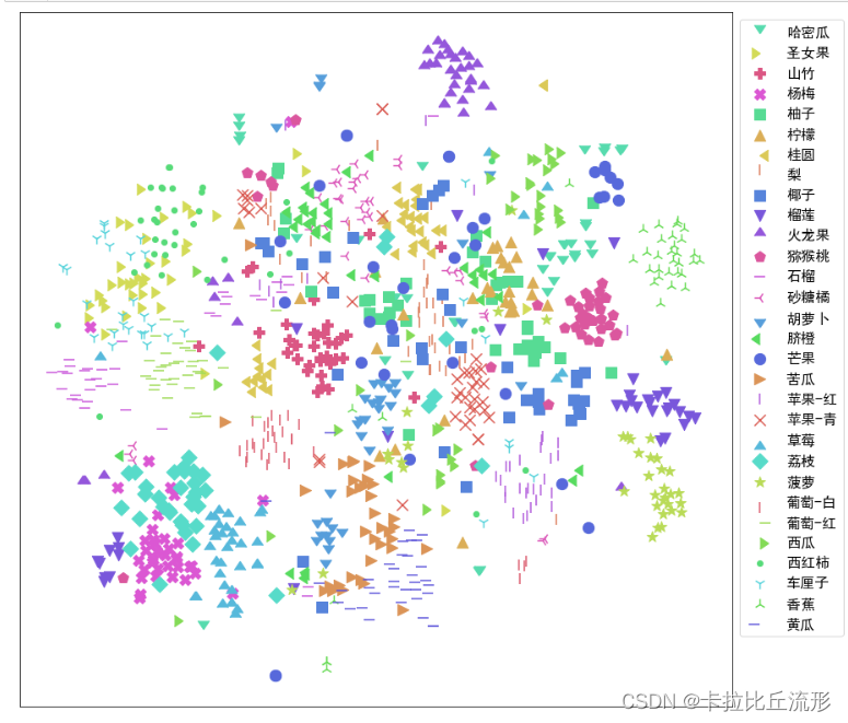
# 不同的 符号 表示 不同的 标注类别
show_feature = '标注类别名称'
plt.figure(figsize=(14, 14))
for idx, fruit in enumerate(class_list): # 遍历每个类别
    # 获取颜色和点型
    color = palette[idx]
    marker = marker_list[idx%len(marker_list)]

    # 找到所有标注类别为当前类别的图像索引号
    indices = np.where(df[show_feature]==fruit)
    plt.scatter(X_tsne_2d[indices, 0], X_tsne_2d[indices, 1], color=color, marker=marker, label=fruit, s=150)

plt.legend(fontsize=16, markerscale=1, bbox_to_anchor=(1, 1))
plt.xticks([])
plt.yticks([])
plt.savefig('语义特征t-SNE二维降维可视化.pdf', dpi=300) # 保存图像
plt.show()
使用plotply实现交互式可视化
import plotly.express as px
df_2d = pd.DataFrame()
df_2d['X'] = list(X_tsne_2d[:, 0].squeeze())
df_2d['Y'] = list(X_tsne_2d[:, 1].squeeze())
df_2d['标注类别名称'] = df['标注类别名称']
df_2d['预测类别'] = df['top-1-预测名称']
df_2d['图像路径'] = df['图像路径']
df_2d.to_csv('t-SNE-2D.csv', index=False)
df_2d
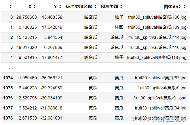
fig = px.scatter(df_2d,
                 x='X',
                 y='Y',
                 color=show_feature,
                 labels=show_feature,
                 symbol=show_feature,
                 hover_name='图像路径',
                 opacity=0.8,
                 width=1000,
                 height=600
                )
# 设置排版
fig.update_layout(margin=dict(l=0, r=0, b=0, t=0))
fig.show()
fig.write_html('语义特征t-SNE二维降维plotly可视化.html')
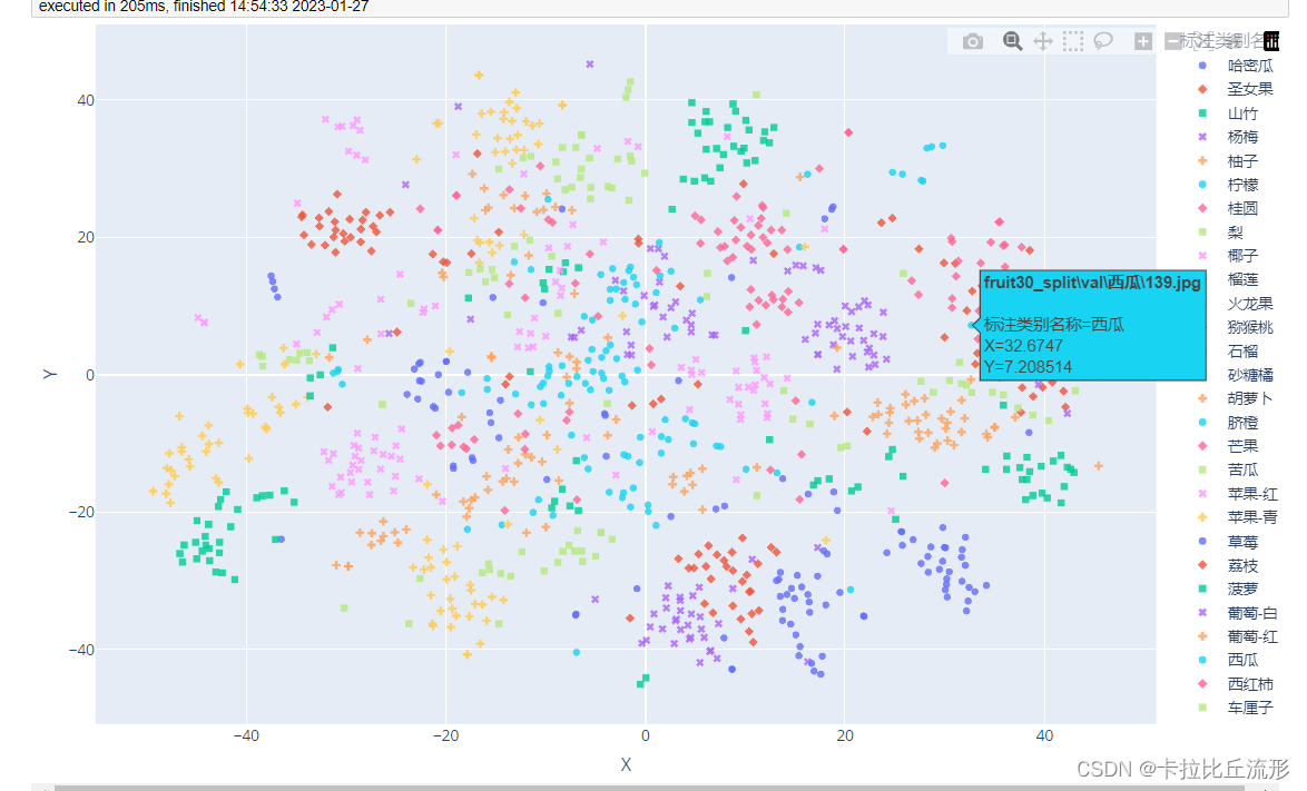
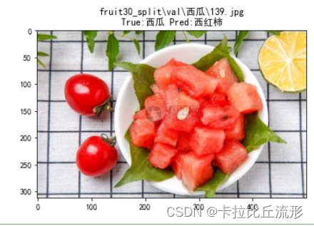
我们可以看到有一张西瓜图片周围全是圣女果图片,我们可以查看这张图片的特征
# 查看图像
img_path_temp = 'fruit30_split\\val\\西瓜\\139.jpg'
#img_bgr = cv2.imread(img_path_temp)
img_bgr = cv2.imdecode(np.fromfile(img_path_temp, dtype=np.uint8), 1) #解决路径中存在中文的问题
img_rgb = cv2.cvtColor(img_bgr, cv2.COLOR_BGR2RGB)
plt.imshow(img_rgb)
temp_df = df[df['图像路径'] == img_path_temp]
title_str = img_path_temp + '\nTrue:' + temp_df['标注类别名称'].item() + ' Pred:' + temp_df['top-1-预测名称'].item()
plt.title(title_str)
plt.show()
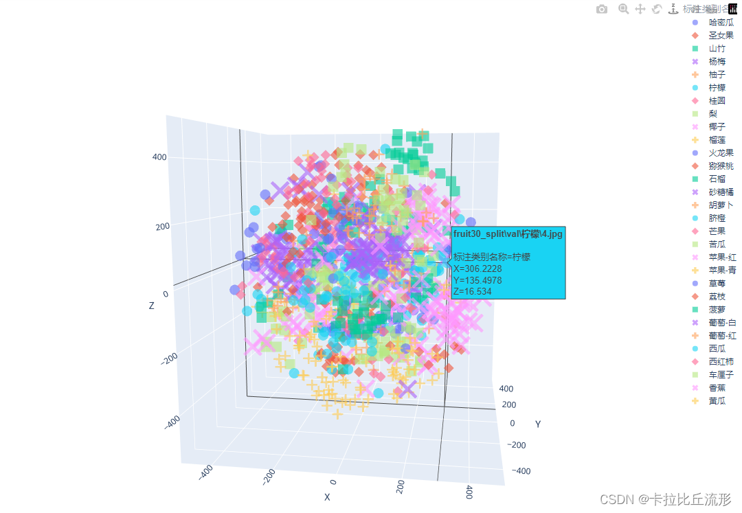
t-SNE降维至三维,并可视化
# 降维到三维
from sklearn.manifold import TSNE
tsne = TSNE(n_components=3, n_iter=10000)
X_tsne_3d = tsne.fit_transform(encoding_array)
X_tsne_3d.shape
(1078, 3)
show_feature = '标注类别名称'
# show_feature = '预测类别'
df_3d = pd.DataFrame()
df_3d['X'] = list(X_tsne_3d[:, 0].squeeze())
df_3d['Y'] = list(X_tsne_3d[:, 1].squeeze())
df_3d['Z'] = list(X_tsne_3d[:, 2].squeeze())
df_3d['标注类别名称'] = df['标注类别名称']
df_3d['预测类别'] = df['top-1-预测名称']
df_3d['图像路径'] = df['图像路径']
df_3d.to_csv('t-SNE-3D.csv', index=False)
df_3d
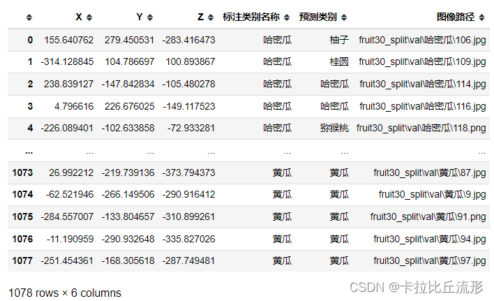
fig = px.scatter_3d(df_3d,
                    x='X',
                    y='Y',
                    z='Z',
                    color=show_feature,
                    labels=show_feature,
                    symbol=show_feature,
                    hover_name='图像路径',
                    opacity=0.6,
                    width=1000,
                    height=800)

# 设置排版
fig.update_layout(margin=dict(l=0, r=0, b=0, t=0))
fig.show()
fig.write_html('语义特征t-SNE三维降维plotly可视化.html')
测试集语义特征UMAP降维可视化
import numpy as np
import pandas as pd
import cv2
# windows操作系统
import matplotlib.pyplot as plt
plt.rcParams['font.sans-serif']=['SimHei']  # 用来正常显示中文标签
plt.rcParams['axes.unicode_minus']=False  # 用来正常显示负号
载入测试集图像语义特征
encoding_array = np.load('测试集语义特征.npy', allow_pickle=True)
encoding_array.shape
(1079, 512)
载入测试集预测结果表格
df = pd.read_csv('测试集预测结果.csv')
df.head()
可视化配置
import seaborn as sns
marker_list = ['.', ',', 'o', 'v', '^', '<', '>', '1', '2', '3', '4', '8', 's', 'p', 'P', '*', 'h', 'H', '+', 'x', 'X', 'D', 'd', '|', '_', 0, 1, 2, 3, 4, 5, 6, 7, 8, 9, 10, 11]
class_list = np.unique(df['标注类别名称'])
class_list
array([‘哈密瓜’, ‘圣女果’, ‘山竹’, ‘杨梅’, ‘柚子’, ‘柠檬’, ‘桂圆’, ‘梨’, ‘椰子’, ‘榴莲’, ‘火龙果’,
‘猕猴桃’, ‘石榴’, ‘砂糖橘’, ‘胡萝卜’, ‘脐橙’, ‘芒果’, ‘苦瓜’, ‘苹果-红’, ‘苹果-青’, ‘草莓’,
‘荔枝’, ‘菠萝’, ‘葡萄-白’, ‘葡萄-红’, ‘西瓜’, ‘西红柿’, ‘车厘子’, ‘香蕉’, ‘黄瓜’],
dtype=object)
根据测试集标签类别数得到配色方案数
n_class = len(class_list) # 测试集标签类别数
palette = sns.hls_palette(n_class) # 配色方案
sns.palplot(palette)
# 随机打乱颜色列表和点型列表
import random
random.seed(1234)
random.shuffle(marker_list)
random.shuffle(palette)
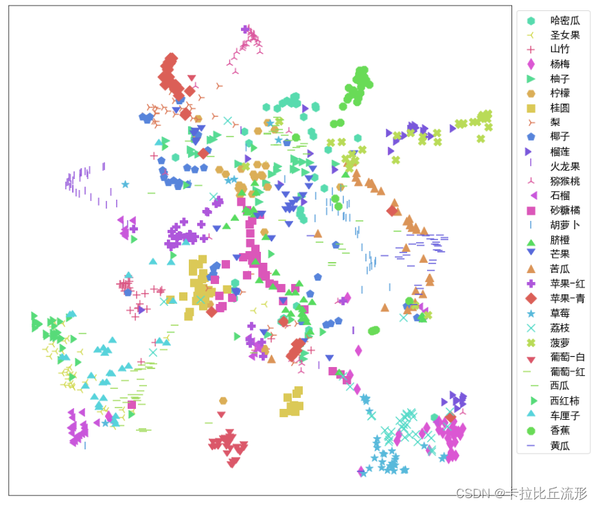
UMAP降维至二维可视化
import umap
import umap.plot
mapper = umap.UMAP(n_neighbors=10, n_components=2, random_state=12).fit(encoding_array)
X_umap_2d = mapper.embedding_
X_umap_2d.shape
(1078, 2)
# 不同的 符号 表示 不同的 标注类别
show_feature = '标注类别名称'
plt.figure(figsize=(14, 14))
for idx, fruit in enumerate(class_list): # 遍历每个类别
    # 获取颜色和点型
    color = palette[idx]
    marker = marker_list[idx%len(marker_list)]

    # 找到所有标注类别为当前类别的图像索引号
    indices = np.where(df[show_feature]==fruit)
    plt.scatter(X_umap_2d[indices, 0], X_umap_2d[indices, 1], color=color, marker=marker, label=fruit, s=150)

plt.legend(fontsize=16, markerscale=1, bbox_to_anchor=(1, 1))
plt.xticks([])
plt.yticks([])
plt.savefig('语义特征UMAP二维降维可视化.pdf', dpi=300) # 保存图像
plt.show()
plotply交互式可视化
import plotly.express as px
df_2d = pd.DataFrame()
df_2d['X'] = list(X_umap_2d[:, 0].squeeze())
df_2d['Y'] = list(X_umap_2d[:, 1].squeeze())
df_2d['标注类别名称'] = df['标注类别名称']
df_2d['预测类别'] = df['top-1-预测名称']
df_2d['图像路径'] = df['图像路径']
df_2d.to_csv('UMAP-2D.csv', index=False)
# 增加新图像的一行
new_img_row = {


    'X':new_embedding[0],
    'Y':new_embedding[1],
    '标注类别名称':img_path,
    '图像路径':img_path
}

df_2d = df_2d.append(new_img_row, ignore_index=True)
df_2d
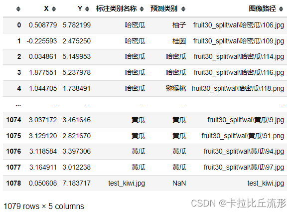
fig = px.scatter(df_2d,
                 x='X',
                 y='Y',
                 color=show_feature,
                 labels=show_feature,
                 symbol=show_feature,
                 hover_name='图像路径',
                 opacity=0.8,
                 width=1000,
                 height=600
                )
# 设置排版
fig.update_layout(margin=dict(l=0, r=0, b=0, t=0))
fig.show()
fig.write_html('语义特征UMAP二维降维plotly可视化.html')
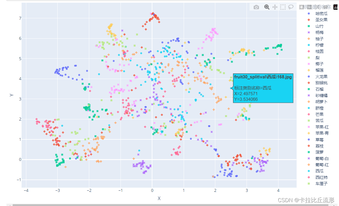
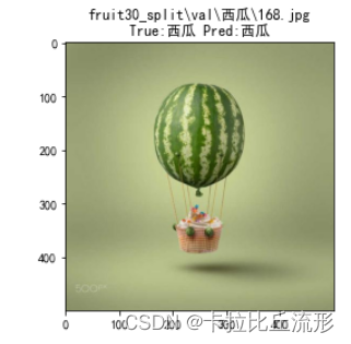
# 查看图像
img_path_temp = 'fruit30_split\\val\\西瓜\\168.jpg'
#img_bgr = cv2.imread(img_path_temp)
img_bgr = cv2.imdecode(np.fromfile(img_path_temp, dtype=np.uint8), 1) #解决路径中存在中文的问题
img_rgb = cv2.cvtColor(img_bgr, cv2.COLOR_BGR2RGB)
plt.imshow(img_rgb)
temp_df = df[df['图像路径'] == img_path_temp]
title_str = img_path_temp + '\nTrue:' + temp_df['标注类别名称'].item() + ' Pred:' + temp_df['top-1-预测名称'].item()
plt.title(title_str)
plt.show()
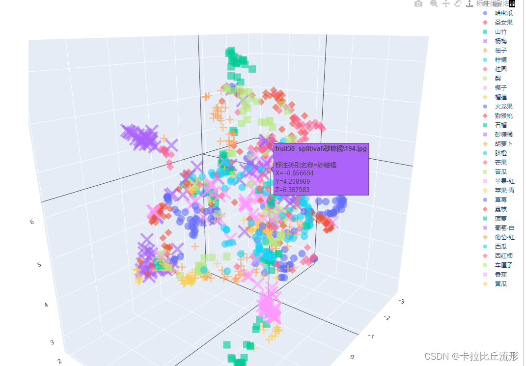
UMAP降维至三维,并可视化
mapper = umap.UMAP(n_neighbors=10, n_components=3, random_state=12).fit(encoding_array)
X_umap_3d = mapper.embedding_
X_umap_3d.shape
(1078, 3)
show_feature = '标注类别名称'
# show_feature = '预测类别'
df_3d = pd.DataFrame()
df_3d['X'] = list(X_umap_3d[:, 0].squeeze())
df_3d['Y'] = list(X_umap_3d[:, 1].squeeze())
df_3d['Z'] = list(X_umap_3d[:, 2].squeeze())
df_3d['标注类别名称'] = df['标注类别名称']
df_3d['预测类别'] = df['top-1-预测名称']
df_3d['图像路径'] = df['图像路径']
df_3d.to_csv('UMAP-3D.csv', index=False)
df_3d
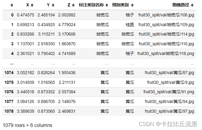
fig = px.scatter_3d(df_3d,
                    x='X',
                    y='Y',
                    z='Z',
                    color=show_feature,
                    labels=show_feature,
                    symbol=show_feature,
                    hover_name='图像路径',
                    opacity=0.6,
                    width=1000,
                    height=800)

# 设置排版
fig.update_layout(margin=dict(l=0, r=0, b=0, t=0))
fig.show()
fig.write_html('语义特征UMAP三维降维plotly可视化.html')
计算新图像语义特征
导入模型,预处理
import cv2
import torch
from PIL import Image
from torchvision import transforms

# 有 GPU 就用 GPU,没有就用 CPU
device = torch.device('cuda:0' if torch.cuda.is_available() else 'cpu')

model = torch.load('checkpoints/fruit30_pytorch_20230123.pth')
model = model.eval().to(device)

from torchvision.models.feature_extraction import create_feature_extractor
model_trunc = create_feature_extractor(model, return_nodes={

    'avgpool': 'semantic_feature'})

# 测试集图像预处理-RCTN:缩放、裁剪、转 Tensor、归一化
test_transform = transforms.Compose([transforms.Resize(256),
                                     transforms.CenterCrop(224),
                                     transforms.ToTensor(),
                                     transforms.Normalize(
                                         mean=[0.485, 0.456, 0.406],
                                         std=[0.229, 0.224, 0.225])
                                    ])
计算新图像的语义特征
img_path = 'test_kiwi.jpg'
img_pil = Image.open(img_path)
input_img = test_transform(img_pil) # 预处理
input_img = input_img.unsqueeze(0).to(device)
# 执行前向预测,得到指定中间层的输出
pred_logits = model_trunc(input_img)
semantic_feature = pred_logits['semantic_feature'].squeeze().detach().cpu().numpy().reshape(1,-1)
semantic_feature.shape
(1, 512)
新图像语义特征降维至两维
对新图像语义特征降维至两维,得到的语义特征如下
# umap降维
mapper = umap.UMAP(n_neighbors=10, n_components=2, random_state=12).fit(encoding_array)
new_embedding = mapper.transform(semantic_feature)[0]
array([0.05060809, 7.183717 ], dtype=float32)
plt.figure(figsize=(14, 14))
for idx, fruit in enumerate(class_list): # 遍历每个类别
    # 获取颜色和点型
    color = palette[idx]
    marker = marker_list[idx%len(marker_list)]

    # 找到所有标注类别为当前类别的图像索引号
    indices = np.where(df[show_feature]==fruit)
    plt.scatter(X_umap_2d[indices, 0], X_umap_2d[indices, 1], color=color, marker=marker, label=fruit, s=150)

plt.scatter(new_embedding[0], new_embedding[1], color='r', marker='X', label=img_path, s=1000)

plt.legend(fontsize=16, markerscale=1, bbox_to_anchor=(1, 1))
plt.xticks([])
plt.yticks([])
plt.savefig('语义特征UMAP二维降维可视化-新图像.pdf', dpi=300) # 保存图像
plt.show()
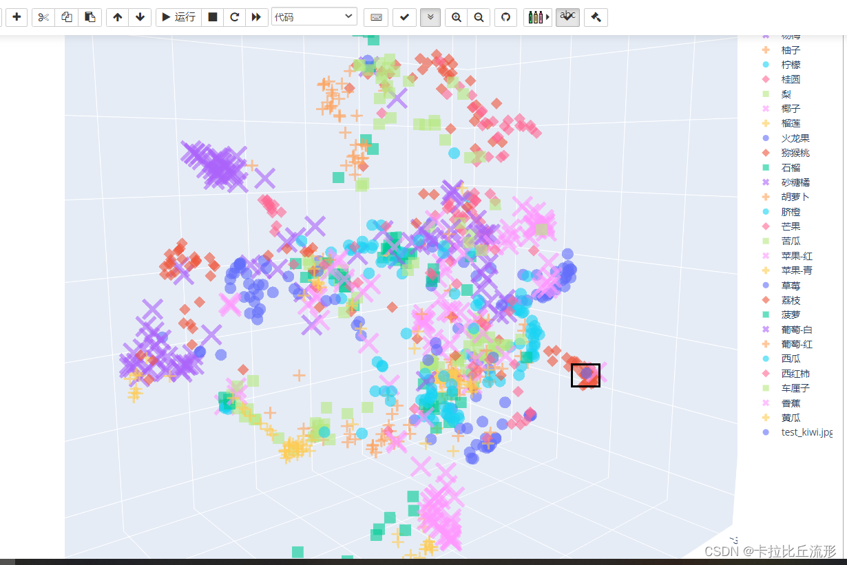
新图像语义特征降维至三维
# umap降维
mapper = umap.UMAP(n_neighbors=10, n_components=3, random_state=12).fit(encoding_array)
new_embedding = mapper.transform(semantic_feature)[0]
将新图片的信息添加到表格中
# 增加新图像的一行
new_img_row = {


    'X':new_embedding[0],
    'Y':new_embedding[1],
    'Z':new_embedding[2],
    '标注类别名称':img_path,
    '图像路径':img_path
}

df_3d = df_3d.append(new_img_row, ignore_index=True)
df_3d
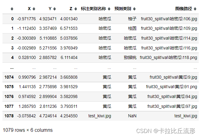
fig = px.scatter_3d(df_3d,
                    x='X',
                    y='Y',
                    z='Z',
                    color=show_feature,
                    labels=show_feature,
                    symbol=show_feature,
                    hover_name='图像路径',
                    opacity=0.6,
                    width=1000,
                    height=800)

# 设置排版
fig.update_layout(margin=dict(l=0, r=0, b=0, t=0))
fig.show()
fig.write_html('语义特征UMAP三维降维plotly可视化.html')
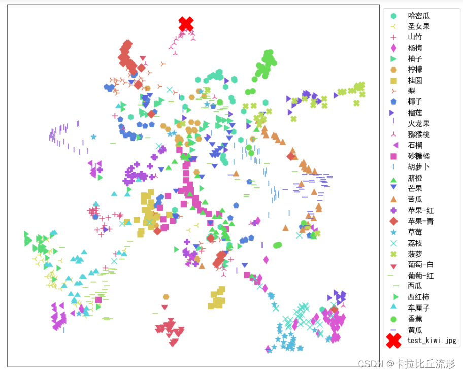
我们可以在三维空间中找到新图片(猕猴桃)的位置,它周围也是猕猴桃的图片
扩展学习
机器学习分类评估指标
公众号 人工智能小技巧 回复 混淆矩阵
手绘笔记讲解:https://www.bilibili.com/video/BV1iJ41127wr?p=3
混淆矩阵:
https://www.bilibili.com/video/BV1iJ41127wr?p=4
https://www.bilibili.com/video/BV1iJ41127wr?p=5
ROC曲线:
https://www.bilibili.com/video/BV1iJ41127wr?p=6
https://www.bilibili.com/video/BV1iJ41127wr?p=7
https://www.bilibili.com/video/BV1iJ41127wr?p=8
F1-score:https://www.bilibili.com/video/BV1iJ41127wr?p=9
F-beta-score:https://www.bilibili.com/video/BV1iJ41127wr?p=10
语义特征降维可视化
【斯坦福CS231N】可视化卷积神经网络:https://www.bilibili.com/video/BV1K7411W7So
五万张ImageNet 验证集图像的语义特征降维可视化:https://cs.stanford.edu/people/karpathy/cnnembed/
谷歌可视化降维工具Embedding Projector https://www.bilibili.com/video/BV1iJ41127wr?p=11
思考题
-
语义特征图的符号,应该显示标注类别,还是预测类别?
-
如果同一个类别,语义特征降维可视化后却有两个或多个聚类簇,可能原因是什么?
-
如果一个类别里混入了另一个类别的图像,可能原因是什么?
-
语义特征可以取训练集图像计算得到吗?为什么?
-
取由浅至深不同中间层的输出结果作为语义特征,效果会有何不同?
-
”神经网络的强大之处,就在于,输入无比复杂的图像像素分布,输出在高维度线性可分的语义特征分布,最后一层分类层就是线性分类器"。如何理解这句话?
-
如何进一步改进语义特征的可视化?
-
如何做出扩展阅读里第二个链接的效果?
-
对视频或者摄像头实时画面,绘制语义特征降维点的轨迹
1.应该显示标注类别,语义特征图是根据预测类别得到的,使用标注类别可以得到真实图片标签在语义特征图中的位置。如果使用预测类别,图中聚在一起的都是同一类别的图像
2.例如胡萝卜、胡萝卜片、胡萝卜丝都是胡萝卜,但是它们有不同的语义类别
3.可能的原因:标注错误、图像中包含多类、太像、细粒度分类
4.不能,因为语义特征是通过训练出来的模型预测得到的
5.浅层网络处理基本的图像特征(例如颜色、板块等),越到深层处理的图像特征越复杂
6.神经网络可以拟合出一个高度复杂的高维非凸边界获得每一张图像的语义特征,这些特征在高维度上是线性可分的,我们最后只用使用一个线性分类器就可以了
7.8.9.
总结
本文主要介绍了如何在测试集上评估图像分类算法精度以及图像语义特征的可视化。包括准确率、top-n准确率、召回率、AUC、AP等常见的模型评价指标。对于分类错误的图片我们可以单独展示出来,便于我们找到分类错误的原因并给我们未来算法的改进提供思路。
对于图像特征的可视化我们可以采用t-SNE降维和UMAP降维的方法,这两种方法大致思想都是使高维空间中接近的点在低维空间中任然接近。对于通过降维算法我们可以将图片降维至于二维或者三维,这样可以方便我们对其进行可视化展示。
后续我们可以将t-SNE和UMAP等降维方法和聚类方法结合起来,可以方便的找出错误分类的图片是被错分到了那个类别里面。