1.三角形实现
<!DOCTYPE html>
<html>
	<head>
		<meta charset="UTF-8">
		<title></title>
		<style>
		.left-shape{


			width:0;
			height: 0;
			border-right: 30px solid #333333;
		    border-top: 30px solid transparent;
		    border-bottom: 30px solid transparent;
		}

		.top-shape{


			width:0;
			height: 0;
			border-bottom: 30px solid #333333;
		    border-left: 30px solid transparent;
		    border-right: 30px solid transparent;
		}

		.right-shape{


			width:0;
			height: 0;
			border-left: 30px solid #333333;
		    border-top: 30px solid transparent;
		    border-bottom: 30px solid transparent;
		}

		.bottom-shape{


			width:0;
			height: 0;
			border-top: 30px solid #333333;
		    border-left: 30px solid transparent;
		    border-right: 30px solid transparent;
		}
		</style>
	</head>
	<body>
		<p>尖朝左:</p><div class="left-shape"></div>

		<p>尖朝上:</p><div class="top-shape"></div>

		<p>尖朝右:</p><div class="right-shape"></div>

		<p>尖朝下:</p><div class="bottom-shape"></div>
	</body>
</html>
效果图:
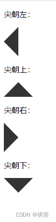
好像被我摸到规律了:
当你想要尖朝向哪边的时候(比如尖朝上),你就将对面的一条边(下)设置成有颜色有像素的边框,另外两条边(左右)设置成有像素的透明的边框。
要写三角形的容器不需要给宽高,设置为0即可。
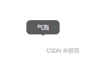
2.气泡的实现:在三角形的基础上添加一个内容框即可。
这里实现的方式:display:flex 进行行排序或者列排序。
这种方式比较适用于内容框和三角形垂直或者水平居中
如果是需要三角形在侧面或者其他地方,也可以通过position: absolute来实现
也可以通过after伪类+position:absolute来实现
<!DOCTYPE html>
<html>
	<head>
		<meta charset="UTF-8">
		<title></title>
		<style>
			.hover-shape {


				display: flex;
				flex-direction: column;
				justify-content: center;
				align-items: center;
			}

			.hover-tip {


				width: 68px;
				height: 29px;
				border-radius: 8px;
				background: rgba(51, 51, 51, 0.8);
			}

			.tip-text {


				font-size: 12px;
				font-weight: 500;
				color: #FFFFFF;
				line-height: 29px;
				text-align: center;
			}

			.tip-text p {


				margin: 0;
			}

			.tip-shape {


				width: 0;
				height: 0;
				border-top: 3px solid;
				border-color: rgba(51, 51, 51, 0.8);
				border-left: 3px solid transparent;
				border-right: 3px solid transparent;
			}
		</style>
	</head>

	<body>
		<div class="hover-shape">
			<div class="hover-tip">
				<div class="tip-text">
					<p>气泡</p>
				</div>
			</div>
			<div class="tip-shape"></div>
		</div>
	</body>
</html>
效果图: