Matplotlib教程
文章目录
一. 什么是Matplotlib?
Matplotlib是python中的一个低级图形绘制库,它可以作为一个可视化工具。
Matplotlib主要是用python写的,有一些是用C, Objective-C和Javascript写的。
二. 安装Matplitlib
C:\Users\Your Name>pip install matplotlib
并且在之后的.py文件中导入matplotlib
import matplotlib
至此,matplotlib便可用。
若想查看matplotlib版本,则使用__version__。
import matplotlib

print(matplotlib.__version__)
三. Matplotlib Pyplot
大多数Matplotlib实用程序位于pyplot子模块下,通常以plt别名导入:
import matplotlib.pyplot as plt
1.绘制直线
plot()函数用于绘制图表中的点(标记)。
默认情况下,plot()函数在点与点之间绘制一条直线。
该函数接受参数来指定图中的点。
参数1是一个包含x轴上的点的数组。
参数2是一个包含y轴上的点的数组。
如果我们需要绘制从(1,3)到(8,10)的直线,我们必须传递两个数组[1,8]和[3,10]给plot函数。
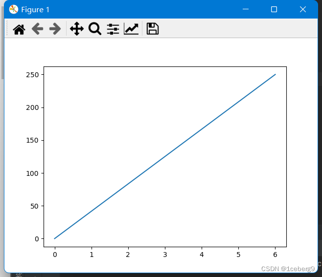
例子:在图标中画一条从(0,0)到(6,250)的直线:
import matplotlib.pyplot as plt
import numpy as np

# 注意这里array中存储的不是点的(x,y)坐标,x和y坐标单独存放在各自数组
xpoints = np.array([0, 6])
ypoints = np.array([0, 250])

plt.plot(xpoints, ypoints)
plt.show()
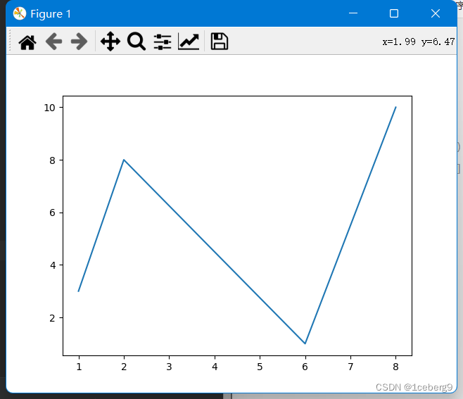
你可以画出任意多的点,只要确保在两个轴上有相同数量的点。
import matplotlib.pyplot as plt
import numpy as np
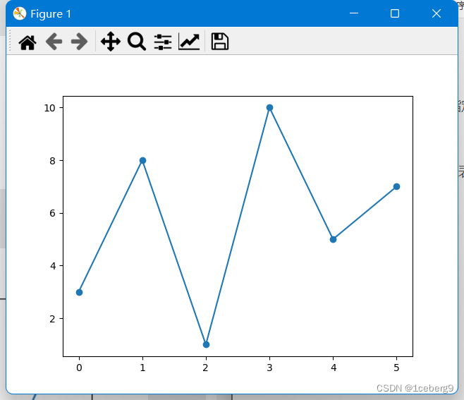
xpoints = np.array([1, 2, 6, 8])
ypoints = np.array([3, 8, 1, 10])
plt.plot(xpoints, ypoints)
plt.show()
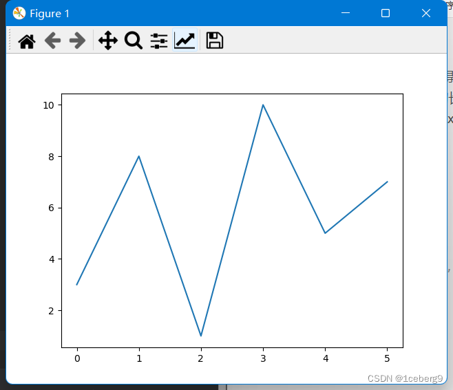
2. 默认x点
如果我们不指定x轴上的点,它们将得到默认值0、1、2、3(等等,取决于y轴上点的长度)。
所以,如果我们取上面的例子,去掉x点,图就会像这样:
import matplotlib.pyplot as plt
import numpy as np

ypoints = np.array([3, 8, 1, 10, 5, 7])

plt.plot(ypoints)
plt.show()
四. Matplotlib Marker
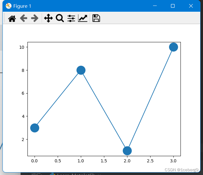
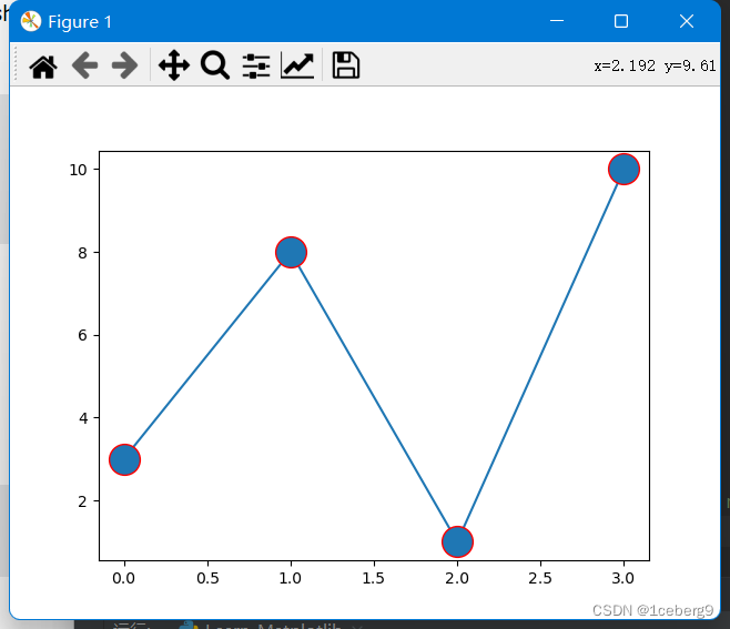
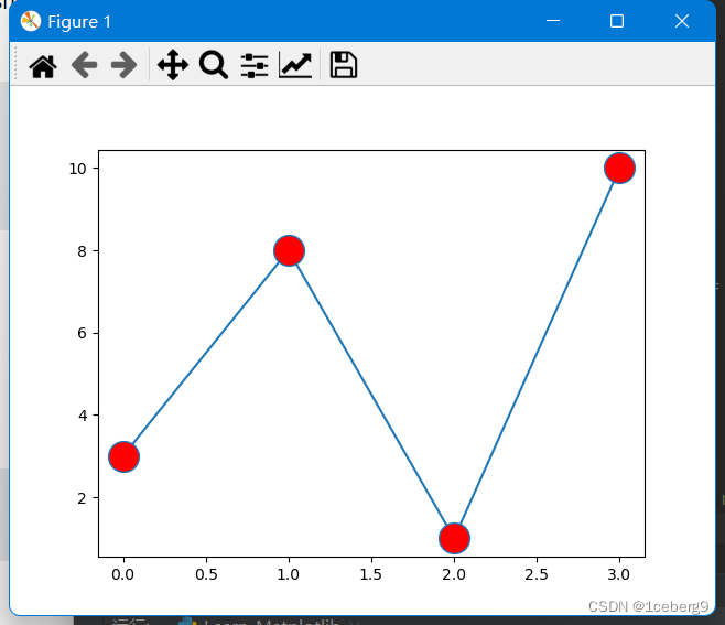
你可以使用关键字参数marker通过指定的标记来强调每个点。
1.绘制标记
注意:
- 要只绘制标记,可以使用快捷字符串表示法参数
'o',它的意思是’环’。 - 若想要绘制标记+连线,需要
marker='o'
import matplotlib.pyplot as plt
import numpy as np

xpoints = np.array([1, 8])
ypoints = np.array([3, 10])

# 下面这两句分别对应图一、图二
plt.plot(xpoints, ypoints, 'o')
# plt.plot(xpoints, ypoints, marker = 'o')

plt.show()
图一:
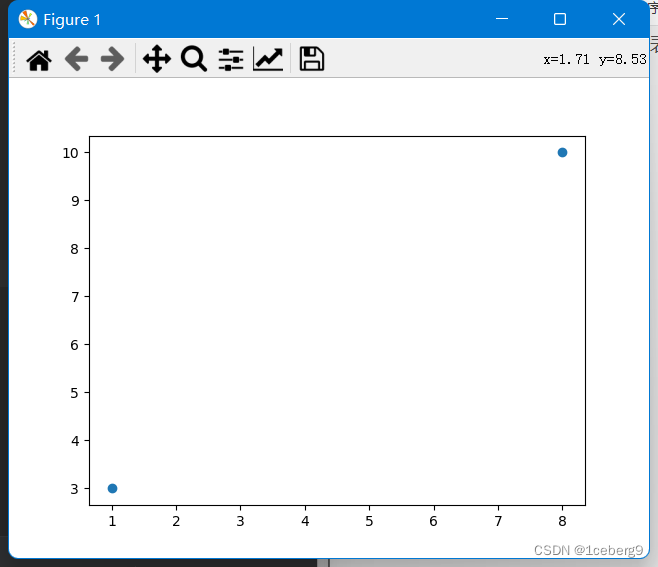
图二:
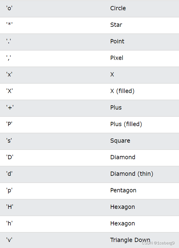
除o之外,还可以使用很多其他符号:
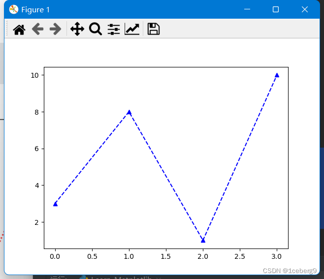
2. 格式字符串fmt
参数格式:
marker|line|color
使用如下参数:
^--b
以上参数表示:marker=^ line=-- color=b
import matplotlib.pyplot as plt
import numpy as np

ypoints = np.array([3, 8, 1, 10])

plt.plot(ypoints, '^--b')
plt.show()
3.标记的大小
参数:markersize,使用ms表示
import matplotlib.pyplot as plt
import numpy as np

ypoints = np.array([3, 8, 1, 10])

plt.plot(ypoints, marker = 'o', ms = 20)
plt.show()
4.标记的颜色
- 参数:
markeredgecolor,使用mec表示
import matplotlib.pyplot as plt
import numpy as np

ypoints = np.array([3, 8, 1, 10])

plt.plot(ypoints, marker = 'o', ms = 20, mec = 'r')
plt.show()
- 参数:
markerfacecolor,使用mfc表示
import matplotlib.pyplot as plt
import numpy as np

ypoints = np.array([3, 8, 1, 10])

plt.plot(ypoints, marker = 'o', ms = 20, mfc = 'r')
plt.show()
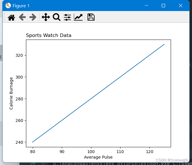
五. Matplotlib lables and Title
使用Pyplot,可以使用xlabel()和ylabel()函数设置x轴和y轴的标签。
可以使用title()函数为情节设置标题。
参数loc可以调整标题的位置。
import numpy as np
import matplotlib.pyplot as plt

x = np.array([80, 85, 90, 95, 100, 105, 110, 115, 120, 125])
y = np.array([240, 250, 260, 270, 280, 290, 300, 310, 320, 330])

plt.title("Sports Watch Data", loc = 'left')
plt.xlabel("Average Pulse")
plt.ylabel("Calorie Burnage")

plt.plot(x, y)
plt.show()
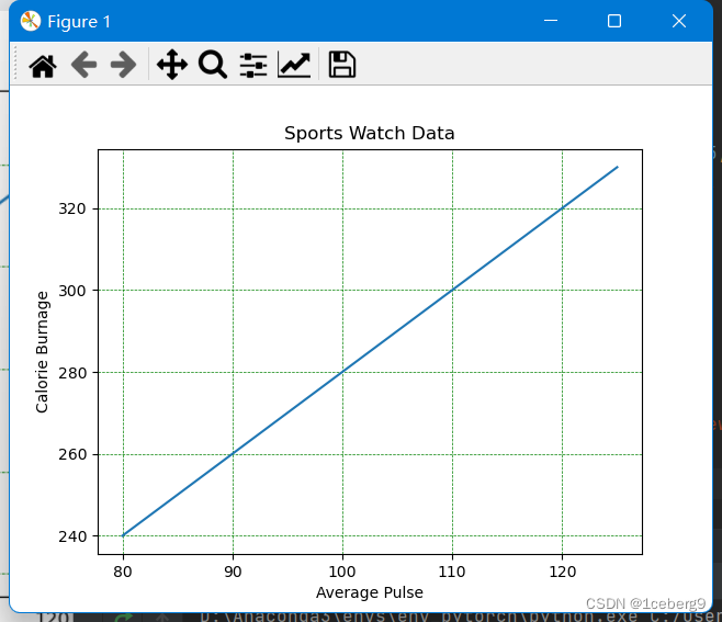
六.Matplotlib Adding Grid Lines
使用Pyplot,可以使用grid()函数向图中添加网格线。
import numpy as np
import matplotlib.pyplot as plt

x = np.array([80, 85, 90, 95, 100, 105, 110, 115, 120, 125])
y = np.array([240, 250, 260, 270, 280, 290, 300, 310, 320, 330])

plt.title("Sports Watch Data")
plt.xlabel("Average Pulse")
plt.ylabel("Calorie Burnage")

plt.plot(x, y)

plt.grid(color = 'green', linestyle = '--', linewidth = 0.5)

plt.show()
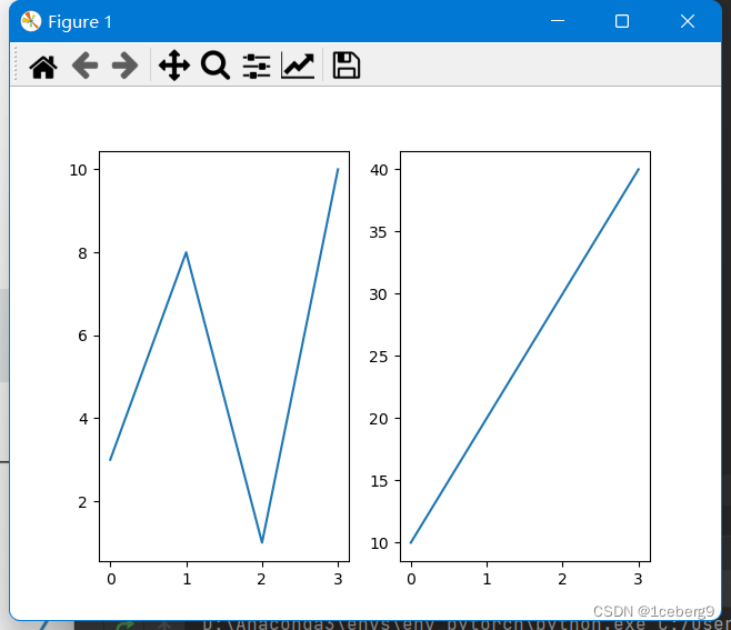
七. Matplotlib Subplot
使用subplot()函数,你可以在一个图形中绘制多个图形:
import matplotlib.pyplot as plt
import numpy as np

#plot 1:
x = np.array([0, 1, 2, 3])
y = np.array([3, 8, 1, 10])

#the figure has 1 row, 2 columns, and this plot is the first plot.
plt.subplot(1, 2, 1)
plt.plot(x,y)

#plot 2:
x = np.array([0, 1, 2, 3])
y = np.array([10, 20, 30, 40])

#the figure has 1 row, 2 columns, and this plot is the second plot.
plt.subplot(1, 2, 2)
plt.plot(x,y)

plt.show()
八. Matplotlib Scatter
- 使用Pyplot,您可以使用
scatter()函数来绘制散点图。
scatter()函数为每次观测绘制一个点。它需要两个相同长度的数组,一个是x轴上的值,另一个是y轴上的值:
import matplotlib.pyplot as plt
import numpy as np

x = np.array([5,7,8,7,2,17,2,9,4,11,12,9,6])
y = np.array([99,86,87,88,111,86,103,87,94,78,77,85,86])
plt.scatter(x, y, color = 'hotpink')

x = np.array([2,2,8,1,15,8,12,9,7,3,11,4,7,14,12])
y = np.array([100,105,84,105,90,99,90,95,94,100,79,112,91,80,85])
plt.scatter(x, y, color = '#88c999')

plt.show()
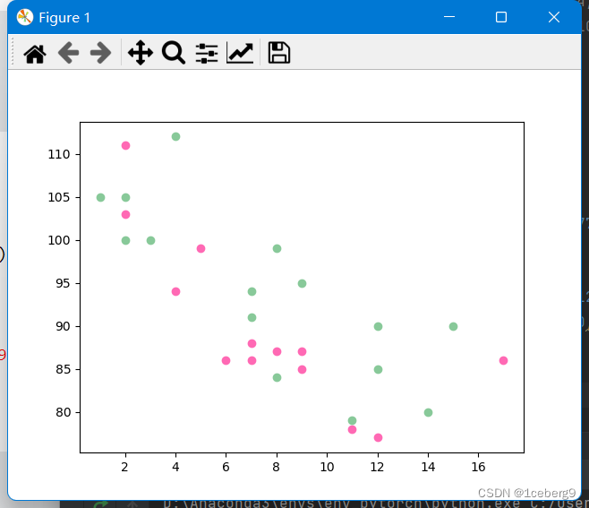
注意:这两个绘图使用了两种不同的颜色,默认是蓝色和橙色。
- 可以每个点位都使用不同颜色:
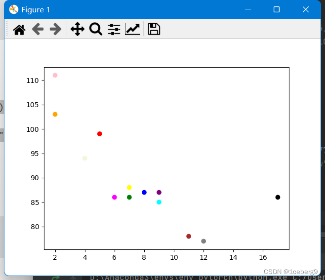
import matplotlib.pyplot as plt
import numpy as np

x = np.array([5,7,8,7,2,17,2,9,4,11,12,9,6])
y = np.array([99,86,87,88,111,86,103,87,94,78,77,85,86])
colors = np.array(["red","green","blue","yellow","pink","black","orange","purple","beige","brown","gray","cyan","magenta"])

plt.scatter(x, y, c=colors)

plt.show()
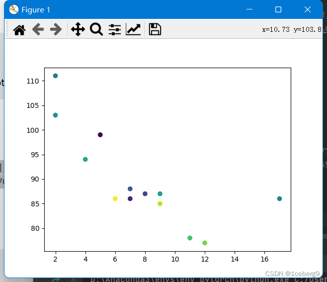
- 可以使用ColorMap
你可以使用关键字参数cmap指定colormap的值,在本例中是'viridis',它是Matplotlib中可用的内置colormap之一。
此外,你必须创建一个数组值(从0到100),散点图中的每个点都有一个值:
import matplotlib.pyplot as plt
import numpy as np

x = np.array([5,7,8,7,2,17,2,9,4,11,12,9,6])
y = np.array([99,86,87,88,111,86,103,87,94,78,77,85,86])
colors = np.array([0, 10, 20, 30, 40, 45, 50, 55, 60, 70, 80, 90, 100])

plt.scatter(x, y, c=colors, cmap='viridis')

plt.show()
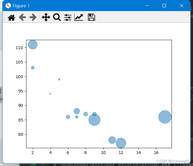
- 使用
s控制尺寸:
import matplotlib.pyplot as plt
import numpy as np

x = np.array([5,7,8,7,2,17,2,9,4,11,12,9,6])
y = np.array([99,86,87,88,111,86,103,87,94,78,77,85,86])
sizes = np.array([20,50,100,200,500,1000,60,90,10,300,600,800,75])

plt.scatter(x, y, s=sizes)

plt.show()

- 你可以通过
alpha参数来调整圆点的透明度。
就像颜色一样,确保用于大小的数组与用于x和y轴的数组具有相同的长度:
import matplotlib.pyplot as plt
import numpy as np

x = np.array([5,7,8,7,2,17,2,9,4,11,12,9,6])
y = np.array([99,86,87,88,111,86,103,87,94,78,77,85,86])
sizes = np.array([20,50,100,200,500,1000,60,90,10,300,600,800,75])

plt.scatter(x, y, s=sizes, alpha=0.5)

plt.show()
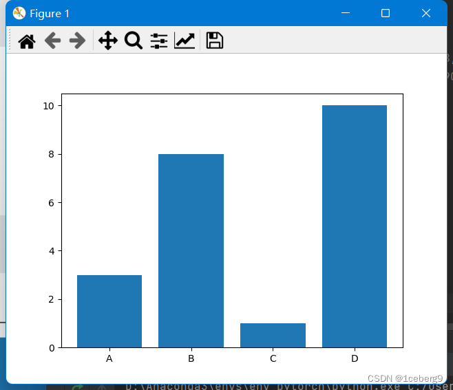
九. Matplotlib Bars
- 使用Pyplot,可以使用
bar()函数绘制条形图:
import matplotlib.pyplot as plt
import numpy as np

x = np.array(["A", "B", "C", "D"])
y = np.array([3, 8, 1, 10])

plt.bar(x,y)
plt.show()
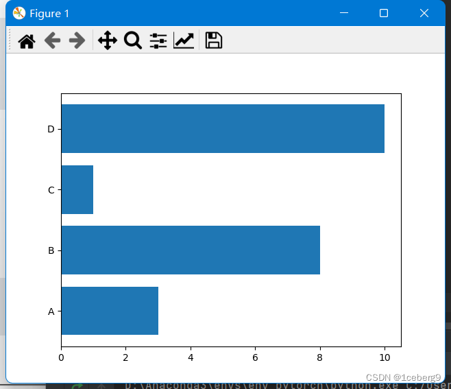
- 如果你想让条形图水平显示而不是垂直显示,使用
barh()函数:
import matplotlib.pyplot as plt
import numpy as np

x = np.array(["A", "B", "C", "D"])
y = np.array([3, 8, 1, 10])

plt.barh(x, y)
plt.show()
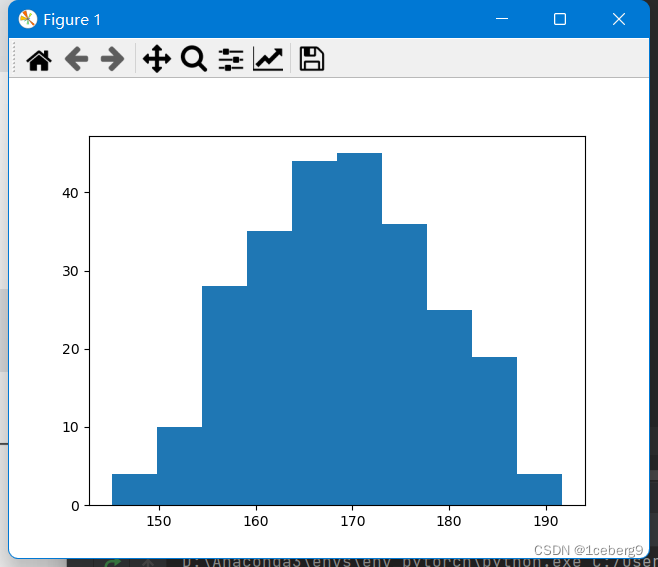
十. Matplotlib Histograms
直方图是显示频率分布的图表。
它是一个图表,显示了每个给定区间内的观察次数。
在Matplotlib中,我们使用hist()函数来创建直方图。
hist()函数将使用一个数字数组来创建一个直方图,这个数组作为参数发送到函数中。
import matplotlib.pyplot as plt
import numpy as np

x = np.random.normal(170, 10, 250)

plt.hist(x)
plt.show()
十一. Matplotlib Pie Charts
使用Pyplot,您可以使用pie()函数来绘制饼图:
import matplotlib.pyplot as plt
import numpy as np

y = np.array([35, 25, 25, 15])
mylabels = ["Apples", "Bananas", "Cherries", "Dates"]
myexplode = [0.2, 0, 0, 0]

plt.pie(y, labels = mylabels, explode = myexplode)
plt.legend()# 显示解释列表
plt.show()
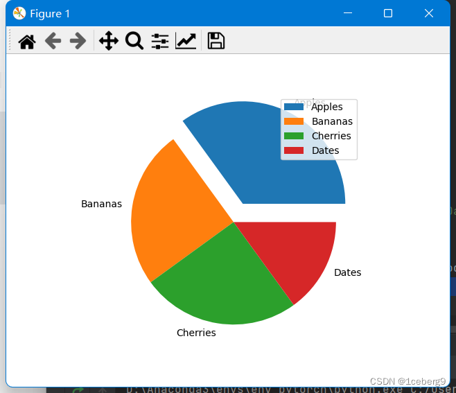
默认情况下,第一个楔子从x轴开始绘制,并逆时针移动:

注:每个楔子的大小是通过与所有其他值比较来确定的,使用这个公式:
值除以所有值的和:x/sum(x)