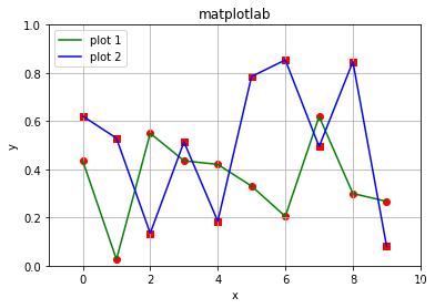
import numpy as np
import matplotlib.pyplot as plt

np.random.seed(2)
y = np.random.random(10)
z = np.random.random(10)
x = range(len(y))

plt.grid()  # 网格
plt.plot(y, c='g', linewidth=1.5, label='plot 1')  # 折线图
plt.plot(z, c='b', linewidth=1.5, label='plot 2')  # 折线图

plt.xlabel('x')  # 设置x轴标签
plt.ylabel('y')  # 设置y轴标签

plt.xlim(-1, 10)  # 设置x轴的范围
plt.ylim(0, 1)  # 设置y轴的范围

plt.scatter(x, y, marker='o', c='r')  # 散点
plt.scatter(x, z, marker='s', c='r')  # 散点
plt.legend()  # 图例

plt.title('matplotlab')  # 设置标题
plt.show()
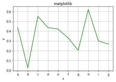
import numpy as np
import matplotlib.pyplot as plt

np.random.seed(2)
y = np.random.random(10)
x = range(len(y))

plt.grid()  # 网格
plt.plot(y, c='g')  # 画折线图,颜色为绿色
plt.xlabel('x')  # 设置x轴标签
plt.ylabel('y')  # 设置y轴标签
plt.xticks(x, ('a', 'b', 'c', 'd', 'e', 'f', 'g', 'h', 'i', 'g'))  # 设置x轴刻度
plt.title('matplotlib')
plt.show()
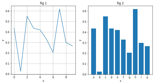
import numpy as np
import matplotlib.pyplot as plt

np.random.seed(2)
y = np.random.random(10)
z = np.random.random(10)
x = range(len(y))

plt.figure(figsize=(10, 5))  # 子图
plt.subplot(121)
plt.plot(x, y)
plt.grid()
plt.title('fig 1')
plt.xlabel('x')
plt.ylabel('y')

plt.subplot(122)
plt.bar(x, y)
plt.title('fig 2')
plt.xlabel('x')
plt.ylabel('y')
plt.xticks(x, ('a', 'b', 'c', 'd', 'e', 'f', 'g', 'h', 'i', 'g'))

plt.show()
import matplotlib.pyplot as plt
import numpy as np

np.random.seed(0)

x = range(10)
y = np.random.random(10)

plt.figure(figsize=(10, 4)) # 设置图的大小
plt.subplots_adjust(wspace=0.3, hspace=0.2)  # 设置子图间距

plt.subplot(121)
plt.grid() # 设置网格
plt.plot(x, y, marker='o', c='k', lw=2, ls='-', label='linear',
         markersize=8,
         markerfacecolor='gray',
         markeredgecolor='k') # 设置标记形状、线条颜色、线条宽度、线条类型、标签、标记大小、标记填充颜色、标记边界颜色
plt.legend() # 图例
plt.xlabel('x') # x轴标签
plt.ylabel('y') # y轴标签
plt.title('plot')  # 标题
plt.xticks(x, range(10)) # x轴刻度

plt.subplot(122)
plt.bar(x, y, color='w', edgecolor='k', hatch='//', label='bar') #  设置柱子颜色、边界颜色、填充形状、标签
plt.legend()
plt.xlabel('x')
plt.ylabel('y')
plt.title('bar')
plt.xticks(x, range(10))

plt.show()
import numpy as np
import matplotlib.pyplot as plt

np.random.seed(1)

x = np.random.random((100, 2))

plt.scatter(x[:, 0], x[:, 1], marker='o', c='g')  # 散点图
plt.xlabel('x')
plt.ylabel('y')
plt.title('scatter')

plt.show()
import numpy as np
import matplotlib.pyplot as plt

np.random.seed(1)

x = np.random.randn(100)

plt.hist(x, bins=10, color='g', density=True, edgecolor='black', alpha=0.8, label='hist')  # 直方图
plt.title('hist')
plt.xlabel('x')
plt.ylabel('y')
plt.legend()

plt.show()
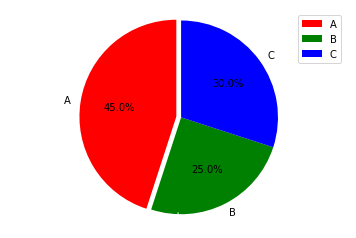
import matplotlib.pyplot as plt
import numpy as np

labels = ["A", "B", "C"]
size = [45, 25, 30]
color = ["red", "green", "blue"]
explode = [0.05, 0, 0]

# 饼图
plt.pie(size, explode=explode, colors=color, labels=labels, labeldistance=1.1, autopct="%1.1f%%", shadow=False, startangle=90, pctdistance=0.6)
plt.axis("equal")
plt.legend()
plt.show()
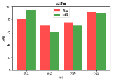
import matplotlib.pyplot as plt
import matplotlib

# 设置中文字体和字体正常显示
matplotlib.rcParams['font.sans-serif'] = ['SimHei']
matplotlib.rcParams['axes.unicode_minus'] = False

labels = ['语文', '数学', '英语', '化学']
data1 = [80, 70, 75, 92]
data2 = [95, 60, 70, 90]
x = range(len(labels))

#  条形图
r1 = plt.bar(left=x, height=data1, width=0.4, alpha=0.7, color='r', label="张三")
r2 = plt.bar(left=[i + 0.4 for i in x], height=data2, width=0.4, alpha=0.7, color='g', label="李四")
plt.ylim(0, 100)
plt.ylabel("成绩")

plt.xticks([index + 0.2 for index in x], labels)
plt.xlabel("学生")
plt.title("成绩单")
plt.legend()

plt.show()
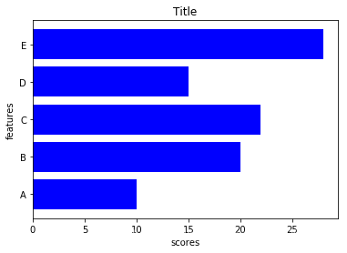
import matplotlib.pyplot as plt
import numpy as np

x = [10, 20, 22, 15, 28]
y = ['A', 'B', 'C', 'D', 'E']

fig, ax = plt.subplots()
y_ = np.arange(len(y))
ax.barh(y_, x, color='blue', align='center')
ax.set_yticks(y_)
ax.set_yticklabels(y)
ax.set_xlabel('scores')
ax.set_ylabel('features')
ax.set_title('Title')

plt.show()
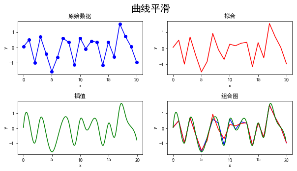
曲线平滑
import matplotlib.pyplot as plt
import matplotlib
import numpy as np
from scipy import interpolate

matplotlib.rcParams['font.sans-serif'] = ['SimHei']
matplotlib.rcParams['axes.unicode_minus'] = False

x = np.arange(21)  # 随机生成数据x
np.random.seed(4)
y = np.random.randn(21)  # 随机生成数据y

plt.figure(figsize=(10, 5))
plt.suptitle('曲线平滑', fontsize=20)  # 设置标题

plt.subplot(221)
plt.scatter(x, y, marker='o', c='b')
plt.plot(x, y, c='b')
plt.xlabel('x')
plt.ylabel('y')
plt.title('原始数据')  # 设置子图标题

plt.subplot(222)
# 拟合
z = np.polyfit(x, y, 20)  # deg=20
f = np.poly1d(z)
plt.plot(x, f(x), c='r')
plt.xlabel('x')
plt.ylabel('y')
plt.title('拟合')

plt.subplot(223)
# 插值
xnew = np.arange(0, 20, 0.1)
func = interpolate.interp1d(x, y, kind='cubic')
ynew = func(xnew)
plt.plot(xnew, ynew, c='g')
plt.xlabel('x')
plt.ylabel('y')
plt.title('插值')

plt.subplot(224)
# 组合
plt.plot(x, y, c='b')
plt.plot(x, f(x), c='r')
plt.plot(xnew, ynew, c='g')
plt.xlabel('x')
plt.ylabel('y')
plt.title('组合图')
# plt.xlim(0, 20)

plt.subplots_adjust(wspace=0.2, hspace=0.5) # 调整子图间距
plt.show()