第一种样式,是一种提示框,比如添加,删除,收藏,点赞这种功能就可以使用的弹框

<!DOCTYPE html>
<html lang="en">
<head>
<meta charset="UTF-8">
<meta http-equiv="X-UA-Compatible" content="IE=edge">
<meta name="viewport" content="width=device-width, initial-scale=1.0">
<title>Document</title>
<link rel="stylesheet" href="path/to/font-awesome/css/font-awesome.min.css">
<link rel="stylesheet" type="text/css" media="screen"
href="https://cdn.staticfile.org/ionicons/2.0.1/css/ionicons.min.css">
<style type="text/css">
* {
margin: 0;
padding: 0;
}
body {
width: 100%;
height: 100%;
}
#shadowDiv {
width: 100%;
height: 100%;
position: fixed;
top: 0px;
display: none;
background-color: rgba(0, 0, 0, 0.3);
}
#alertDiv {
width: 420px;
height: 300px;
background-color: white;
border-radius: 10px;
position: absolute;
top: 150px;
display: none;
left: 50%;
margin-left: -210px;
box-shadow: 8px 5px 30px #191801;
}
.move {
animation-name: MessageMoveOut;
animation-duration: 0.5s;
}
@keyframes MessageMoveOut {
0% {
opacity: 0;
top: -500px;
}
100% {
opacity: 1;
top: 150px;
}
}
#btn {
width: 100px;
height: 30px;
background-color: #2b9191;
}
#close {
cursor: pointer;
position: absolute;
right: 40px;
top: 25px;
font-size: 20px;
transition: all .3s;
}
#close:hover {
transform: rotate(180deg);
color: #d45050;
}
#alertDiv {
display: flex;
flex-wrap: nowrap;
flex-direction: column;
}
#alertDiv_top {
width: 100%;
height: 40px;
}
#alertDiv_center {
width: 100%;
height: 90px;
line-height: 90px;
text-align: center;
}
#alertDiv_bot {
width: 100%;
text-align: center;
height: 50px;
font-size: 20px;
line-height: 50px;
color: #666;
}
#alertDiv_btn {
width: 100%;
height: 90px;
}
#btnDiv {
width: 280px;
margin: 0 auto;
line-height: 90px;
}
#alertDiv_btn button {
width: 100px;
height: 40px;
border-radius: 20px;
outline-style: none;
border-style: none;
margin-left: 23px;
transition: all .2s;
}
#alertDiv_btn button:hover {
border: 1px solid orange;
background-color: rgba(224, 147, 3, 0.5);
color: aliceblue;
}
</style>
</head>
<body>
<div id="btn" onclick="tan()">123</div>
<div id="shadowDiv">
<div id="alertDiv">
<div id="alertDiv_top">
<a id="close" onclick="closed()"><i class="icon ion-close-round"></i></a>
</div>
<div id="alertDiv_center">
<a><i class="icon ion-android-alert" style="font-size: 90px;color:coral"></i></a>
</div>
<div id="alertDiv_bot">
<a class="tipText"></a>
</div>
<div id="alertDiv_btn">
<div id="btnDiv">
<button id="noBtn">取消</button>
<button id="yesBtn">确定</button>
</div>
</div>
</div>
</div>
<script>
var tipText = document.querySelector('.tipText');
var alertDiv = document.getElementById("alertDiv")
var shadowDiv = document.getElementById("shadowDiv")
function tan(text) {
tipText.innerHTML = 'text';
console.log(text)
alertDiv.classList.add('move');
alertDiv.style.display = 'flex';
shadowDiv.style.display = 'flex';
}
function closed() {
alertDiv.classList.remove('move');
alertDiv.style.display = 'none'
shadowDiv.style.display = 'none';
}
</script>
</body>
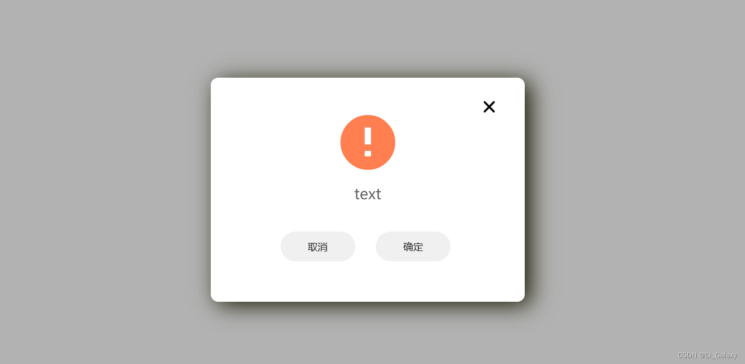
</html>第二种弹框样式,是带有取消和确定的按钮的提示。
<!DOCTYPE html>
<html lang="en">

<head>
    <meta charset="UTF-8">
    <meta http-equiv="X-UA-Compatible" content="IE=edge">
    <meta name="viewport" content="width=device-width, initial-scale=1.0">
    <title>Document</title>
    <link rel="stylesheet" href="path/to/font-awesome/css/font-awesome.min.css">
    <link rel="stylesheet" type="text/css" media="screen"
        href="https://cdn.staticfile.org/ionicons/2.0.1/css/ionicons.min.css">
    <style type="text/css">
        * {
            margin: 0;
            padding: 0;
        }

        body {
            width: 100%;
            height: 100%;
        }

        #shadowDiv {
            width: 100%;
            height: 100%;
            position: fixed;
            top: 0px;
            display: none;
            background-color: rgba(0, 0, 0, 0.3);
        }

        #alertDiv {
            width: 420px;
            height: 300px;
            background-color: white;
            border-radius: 10px;
            position: absolute;
            top: 150px;
            display: none;
            left: 50%;
            margin-left: -210px;
            box-shadow: 8px 5px 30px #191801;
        }

        .move {
            animation-name: MessageMoveOut;
            animation-duration: 0.5s;
        }

        @keyframes MessageMoveOut {
            0% {
                opacity: 0;
                top: -500px;
            }

            100% {
                opacity: 1;
                top: 150px;
            }
        }

        #btn {
            width: 100px;
            height: 30px;
            background-color: #2b9191;
        }

        #close {
            cursor: pointer;
            position: absolute;
            right: 40px;
            top: 25px;
            font-size: 20px;
            transition: all .3s;
        }

        #close:hover {
            transform: rotate(180deg);
            color: #d45050;
        }

        #alertDiv {
            display: flex;
            flex-wrap: nowrap;
            flex-direction: column;
        }

        #alertDiv_top {
            width: 100%;
            height: 40px;
        }

        #alertDiv_center {
            width: 100%;
            height: 90px;
            line-height: 90px;
            text-align: center;
        }

        #alertDiv_bot {
            width: 100%;
            text-align: center;
            height: 50px;
            font-size: 20px;
            line-height: 50px;
            color: #666;
        }

        #alertDiv_btn {
            width: 100%;
            height: 90px;
        }

        #btnDiv {
            width: 280px;
            margin: 0 auto;
            line-height: 90px;
        }

        #alertDiv_btn button {
            width: 100px;
            height: 40px;
            border-radius: 20px;
            outline-style: none;
            border-style: none;
            margin-left: 23px;
            transition: all .2s;
        }

        #alertDiv_btn button:hover {
            border: 1px solid orange;
            background-color: rgba(224, 147, 3, 0.5);
            color: aliceblue;
        }
    </style>
</head>

<body>
    <div id="btn" onclick="tan()">123</div>
    <div id="shadowDiv">
        <div id="alertDiv">
            <div id="alertDiv_top">
                <a id="close" onclick="closed()"><i class="icon ion-close-round"></i></a>
            </div>
            <div id="alertDiv_center">
                <a><i class="icon ion-android-alert" style="font-size: 90px;color:coral"></i></a>
            </div>
            <div id="alertDiv_bot">
                <a class="tipText"></a>
            </div>
            <div id="alertDiv_btn">
                <div id="btnDiv">
                    <button id="noBtn">取消</button>
                    <button id="yesBtn">确定</button>
                </div>
            </div>
        </div>
    </div>
    <script>
        var tipText = document.querySelector('.tipText');
        var alertDiv = document.getElementById("alertDiv")
        var shadowDiv = document.getElementById("shadowDiv")
        function tan(text) {
            tipText.innerHTML = 'text';
            console.log(text)
            alertDiv.classList.add('move');
            alertDiv.style.display = 'flex';
            shadowDiv.style.display = 'flex';
        }
        function closed() {
            alertDiv.classList.remove('move');
            alertDiv.style.display = 'none'
            shadowDiv.style.display = 'none';
        }
    </script>
</body>


</html>