本文讲解vue项目中使用ECharts快速绘制折线图,并将服务器传来的数据渲染上去,提供源代码,可以直接复制粘贴使用。
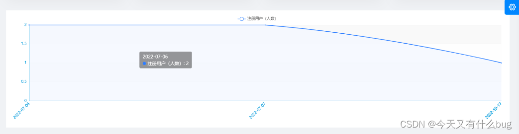
效果展示:
Vue 通常使用ECharts 生成图表,官网地址:
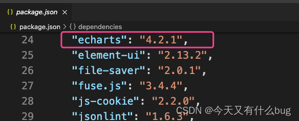
1.Vue中要使用EChart需要先安装:
npm install echarts --save更多安装方法请移步:
2.本例将折线图写在子组件LineChart中,父组件进行引入:

3.子组件LineChart.vue(绘制折线图)
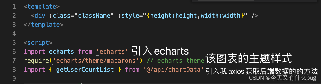
<template>
<div :class="className" :style="{height:height,width:width}" />
</template>
<script>
import echarts from 'echarts'
require('echarts/theme/macarons') // echarts theme
import { getUserCountList } from '@/api/chartData'
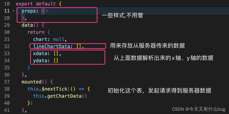
export default {
props: {
className: {
type: String,
default: 'chart'
},
width: {
type: String,
default: '100%'
},
height: {
type: String,
default: '350px'
},
autoResize: {
type: Boolean,
default: true
}
},
data() {
return {
chart: null,
lineChartData: [],
xdata: [],
ydata: []
}
},
mounted() {
this.$nextTick(() => {
this.getChartData()
})
},
beforeDestroy() {
if (!this.chart) {
return
}
this.chart.dispose()
this.chart = null
},
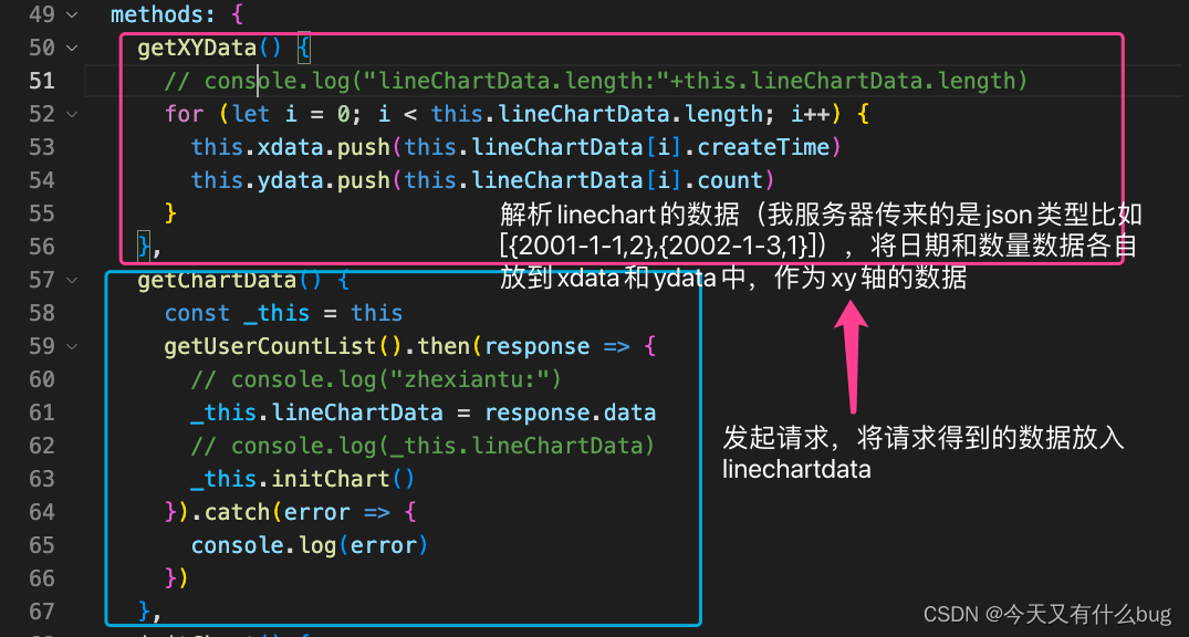
methods: {
getXYData() {
// console.log("lineChartData.length:"+this.lineChartData.length)
for (let i = 0; i < this.lineChartData.length; i++) {
this.xdata.push(this.lineChartData[i].createTime)
this.ydata.push(this.lineChartData[i].count)
}
},
getChartData() {
const _this = this
getUserCountList().then(response => {
// console.log("zhexiantu:")
_this.lineChartData = response.data
// console.log(_this.lineChartData)
_this.initChart()
}).catch(error => {
console.log(error)
})
},
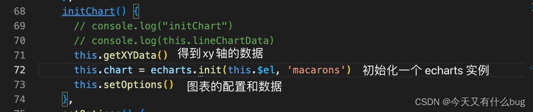
initChart() {
// console.log("initChart")
// console.log(this.lineChartData)
this.getXYData()
this.chart = echarts.init(this.$el, 'macarons')
this.setOptions()
},
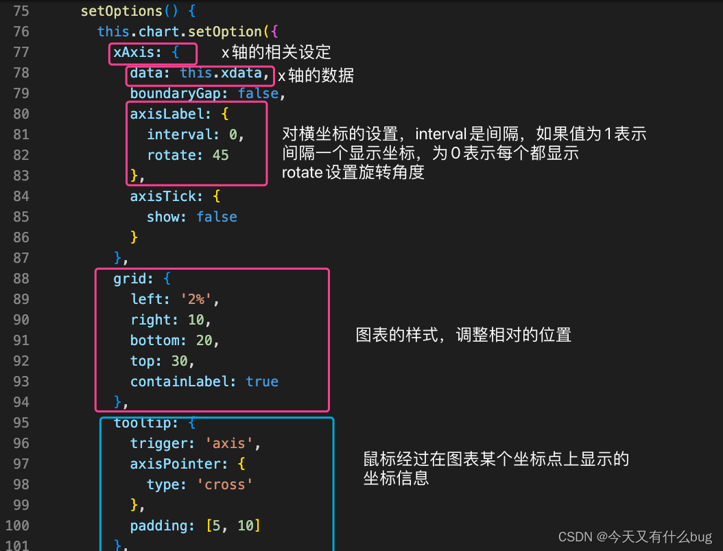
setOptions() {
this.chart.setOption({
xAxis: {
data: this.xdata,
boundaryGap: false,
axisLabel: {
interval: 0,
rotate: 45
},
axisTick: {
show: false
}
},
grid: {
left: '2%',
right: 10,
bottom: 20,
top: 30,
containLabel: true
},
tooltip: {
trigger: 'axis',
axisPointer: {
type: 'cross'
},
padding: [5, 10]
},
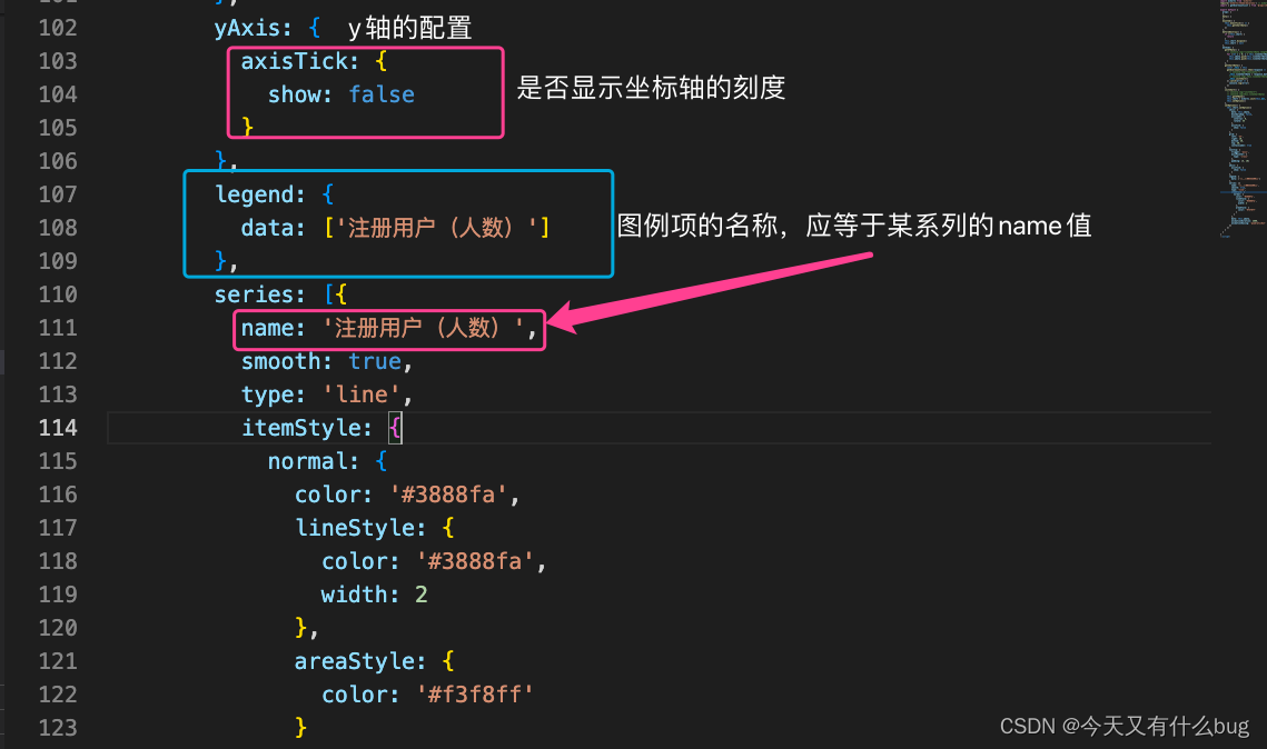
yAxis: {
axisTick: {
show: false
}
},
legend: {
data: ['注册用户(人数)']
},
series: [{
name: '注册用户(人数)',
smooth: true,
type: 'line',
itemStyle: {
normal: {
color: '#3888fa',
lineStyle: {
color: '#3888fa',
width: 2
},
areaStyle: {
color: '#f3f8ff'
}
}
},
data: this.ydata,
animationDuration: 2800,
animationEasing: 'quadraticOut'
}]
})
}
}
}
</script>
对以上代码的分析: