前言
参考:老孟Flutter
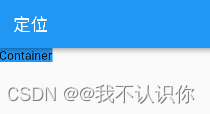
Container
Container 是最常用的组件之一,它是单容器类组件,即仅能包含一个子组件,用于装饰和定位子组件,例如设置背景颜色、形状等。
背景颜色
return Container(
   color: Colors.blue,
   child:  const Text("Container"),
);
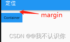
padding和margin
 return Container(
   color: Colors.blue,
   padding: const EdgeInsets.all(10), //上下左右都是10
   margin: const EdgeInsets.only(top: 10), //只有上面是10
   child: const Text("Container"),
 );
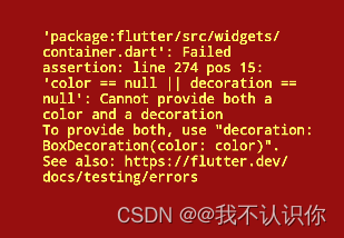
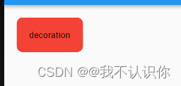
decoration
decoration 属性设置子组件的背景颜色、形状等。
//错误代码,不允许出现两个颜色
return Container(
  color: Colors.blue,
  decoration: const BoxDecoration(
      shape: BoxShape.circle, //形状,圆形
      color: Colors.red),
  child: const Text("decoration"),
);
}
return Container(
      decoration: const BoxDecoration(
          shape: BoxShape.circle, //形状,圆形
          color: Colors.red),
      child: const Text("decoration"),
    );
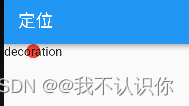
默认情况下,圆形的直径等于 Container 窄边长度,相当于在矩形内绘制内切圆。
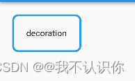
圆角矩形背景
return Container(
    padding: const EdgeInsets.all(20),
    margin: const EdgeInsets.only(left: 20, top: 20),
    decoration: const BoxDecoration(
        shape: BoxShape.rectangle,
        borderRadius: BorderRadius.all(Radius.circular(10)), //每一条边都是10的圆角
        color: Colors.red),
    child: const Text("decoration"),
  );
边框
return Container(
   padding: const EdgeInsets.all(20),
   margin: const EdgeInsets.only(left: 20, top: 20),
   decoration: BoxDecoration(
       shape: BoxShape.rectangle,
       borderRadius:
           const BorderRadius.all(Radius.circular(10)),
       border: Border.all(color: Colors.blue, width: 3)),
   child: const Text("decoration"),
 );
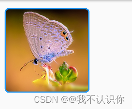
图片
 return Container(
      height: 200,
      width: 200,
      margin: const EdgeInsets.only(left: 20, top: 20),
      decoration: BoxDecoration(  //装饰
          shape: BoxShape.rectangle,  //外形,矩形
          image: const DecorationImage(  //图片
              fit: BoxFit.cover, //覆盖
              image: NetworkImage(
                'https://scpic.chinaz.net/files/default/imgs/2022-10-19/1fbf757ca93ccb1a.jpg',
              )),
          borderRadius: const BorderRadius.all(Radius.circular(10)),
          border: Border.all(color: Colors.blue, width: 3)),
    );
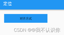
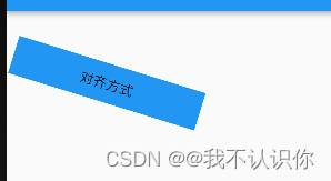
对齐方式
 return Container(
      height: 40,
      width: 200,
      color: Colors.blue,
      margin: const EdgeInsets.only(left: 20, top: 20),
      alignment: Alignment.center, //水平垂直居中
      child: const Text("对齐方式"),
    );
constraints
通过 constraints 属性设置最大/小宽、高来确定大小,如果不设置,默认最小宽高是0,最大宽高是无限大(double.infinity)
transform
通过transform可以旋转、平移、缩放Container
  return Container(
      height: 40,
      width: 200,
      color: Colors.blue,
      margin: const EdgeInsets.only(left: 20, top: 20),
      alignment: Alignment.center, //水平垂直居中
      transform: Matrix4.rotationZ(0.3),
      child: const Text("对齐方式"),
    );
SizedBox
SizedBox 是具有固定宽高的组件,直接指定具体的宽高
return const SizedBox(
   child: Text('SizeBox'),
 );
设置尺寸无限大
SizedBox(
  height: double.infinity,
  width: double.infinity,
)
虽然设置了无限大,但是子控件不会无限长,子控件依然会受到父组件的约束,会扩展到父组件的尺寸。
SizedBox 可以没有子组件,但仍然会占用空间,所以 SizedBox 非常适合控制2个组件之间的空隙
Column(
   children: <Widget>[
     Container(height: 30,color: Colors.blue,),
     SizedBox(height: 30,),
     Container(height: 30,color: Colors.red,),
   ],
 )
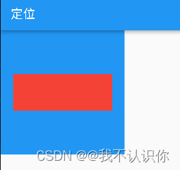
固定宽高比的组件
return Container(
   height: 200,
   width: 200,
   color: Colors.blue,
   child: AspectRatio(
     aspectRatio: 2 / 1, //宽高比2:1
     child: Container(
       color: Colors.red,
     ),
   ),
 );
aspectRatio 是宽高比,可以直接写成分数的形式,也可以写成小数的形式,但建议写成分数的形式,可读性更高。
但是如果不添加alignment: Alignment.center,,或者设置了 padding: const EdgeInsets.only(top: 10,bottom: 10), 都不会生效,因此这个组件好像没啥用处。
相对父组件尺寸的组件
FractionallySizedBox 是一个相对父组件尺寸的组件。
return Container(
    height: 200,
    width: 200,
    color: Colors.blue,
    child: FractionallySizedBox(
      widthFactor: 0.8, //宽度占父组件的0.8
      heightFactor: 0.3,  //占父组件的0.3
      child: Container(color: Colors.red,),
    ),
  );
权重组件
Flexible
Flexible 组件可以控制 Row、Column、Flex 的子控件占满父组件,比如,Row 中有3个子组件,两边的宽是100,中间的占满剩余的空间
return Row(
      children: [
        Container(
          width: 100,
          height: 50,
          color: Colors.red,
        ),
        Flexible(
            child: Container(
          color: Colors.yellow,
          height: 50,
        )),
        Container(
          width: 100,
          height: 50,
          color: Colors.blue,
        ),
      ],
    );
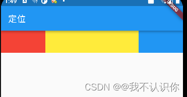
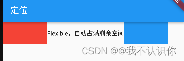
必须设置高度,不然纵向上也会被撑开。
const Flexible(child: Text("Flexible,自动占满剩余空间")),
文本类的好像无法撑开容器,原因是有一个fit参数,默认为FlexFit.loose,意为尽可能填满,可以不填满。就像下面的文字,宽度是有限的,是无法填满的。如果想填满的可以设置为FlexFit.tight,意为强制填满。
Expanded
Expanded 继承字 Flexible,fit 参数固定为 FlexFit.tight,也就是说 Expanded 必须(强制)填满剩余空间。相当于设置fit:FlexFit.tight 的Flexible
Spacer
pacer 的本质也是 Expanded 的实现的,但是可以通过flex属性来设置占几份剩余空间,默认占1份,一般用于撑开 Row、Column、Flex 的子控件的空隙