文章目录
xlrd操作excel文件
1.导入模块:
import xlrd
2.打开文件:
x1 = xlrd.open_workbook("data.xlsx")
3.获取sheet:
- 获取所有sheet名字:x1.sheet_names()
- 获取sheet数量:x1.nsheets
- 获取所有sheet对象:x1.sheets()
- 通过sheet名查找:x1.sheet_by_name("test”)
- 通过索引查找:x1.sheet_by_index(3)
例如:
print 'sheet_names:', x1.sheet_names()  # 获取所有sheet名字
print 'sheet_number:', x1.nsheets        # 获取sheet数量
print 'sheet_object:', x1.sheets()       # 获取所有sheet对象
print 'By_name:', x1.sheet_by_name("test")  # 通过sheet名查找
print 'By_index:', x1.sheet_by_index(3)  # 通过索引查找
结果:
sheet_names: [u' plan', u'team building', u'modile', u'test']
sheet_number: 4
sheet_object: [<xlrd.sheet.Sheet object at 0x10244c190>, <xlrd.sheet.Sheet object at 0x10244c150>, <xlrd.sheet.Sheet object at 0x10244c110>, <xlrd.sheet.Sheet object at 0x10244c290>]
By_name: <xlrd.sheet.Sheet object at 0x10244c290>
By_index: <xlrd.sheet.Sheet object at 0x10244c290>
4.获取sheet的汇总数据:
- 获取sheet名:sheet1.name
- 获取总行数:sheet1.nrows
- 获取总列数:sheet1.ncols
例子:
sheet1 = x1.sheet_by_name("plan")
print "sheet name:", sheet1.name   # get sheet name
print "row num:", sheet1.nrows  # get sheet all rows number
print "col num:", sheet1.ncols  # get sheet all columns number
结果:
sheet name: plan
row num: 31
col num: 11
5.单元格批量读取:
a)行操作:
- sheet1.row_values(0) # 获取第一行所有内容,合并单元格,首行显示值,其它为空。
- sheet1.row(0) # 获取单元格值类型和内容
- sheet1.row_types(0) # 获取单元格数据类型
sheet1 = x1.sheet_by_name("plan")

# 单元格批量读取
print sheet1.row_values(0)  # 获取第一行所有内容,合并单元格,首行显示值,其它为空。
print sheet1.row(0)         # 获取单元格值类型和内容
print sheet1.row_types(0)   # 获取单元格数据类型
[u'learning plan', u'', u'', u'', u'', u'', u'', u'', 123.0, 42916.0, 0]
[text:u'learning plan', empty:u'', empty:u'', empty:u'', empty:u'', empty:u'', empty:u'', empty:u'', number:123.0, xldate:42916.0, bool:0]
array('B', [1, 0, 0, 0, 0, 0, 0, 0, 2, 3, 4])
b) 表操作
- sheet1.row_values(0, 6, 10) # 取第1行,第6~10列(不含第10列)
- sheet1.col_values(0, 0, 5) # 取第1列,第0~5行(不含第5行)
- sheet1.row_slice(2, 0, 2) # 获取第3行0~1列的单位格值类型和内容
- sheet1.row_types(1, 0, 2) # 获取第2行0~1列的数据类型
sheet1 = x1.sheet_by_name("plan")

# 列操作
print sheet1.row_values(0, 6, 10)   # 取第1行,第6~10列(不含第10表)
print sheet1.col_values(0, 0, 5)    # 取第1列,第0~5行(不含第5行)
print sheet1.row_slice(2, 0, 2)     # 获取第3行0~1列的单位格值类型和内容
print sheet1.row_types(1, 0, 2)     # 获取第2行0~1列的数据类型
[u'', u'', 123.0, 42916.0]
[u'learning plan', u'\u7f16\u53f7', 1.0, 2.0, 3.0]
[number:1.0, text:u'\u7ba1\u7406\u5b66\u4e60']
array('B', [1, 1])
6.特定单元格读取:
a) 获取单元格值:
sheet1.cell_value(1,0).encode(‘utf-8’)
- sheet1.cell_value(1, 2)
- sheet1.cell(1, 2).value
- sheet1.row(1)[2].value
b) 获取单元格类型: - sheet1.cell(1, 2).ctype
- sheet1.cell_type(1, 2)
- sheet1.row(1)[2].ctype
7.(0,0)转换A1:
- xlrd.cellname(0, 0) # (0,0)转换成A1
- xlrd.cellnameabs(0, 0) # (0,0)转换成$A$1
- xlrd.colname(30) # 把列由数字转换为字母表示
# (0,0)转换成A1
print xlrd.cellname(0, 0)   # (0,0)转换成A1
print xlrd.cellnameabs(0, 0) # (0,0)转换成$A$1
print xlrd.colname(30)  # 把列由数字转换为字母表示
A1
$A$1
AE
8.数据类型:
- 空:0
- 字符串:1
- 数字:2
- 日期:3
- 布尔:4
- error:5
9.读取单元格中的日期
首先判断ctype是否等于3,如果为3,则用时间格式处理。先使用xlrd.xldate_as_tuple()方法来处理,将date类型的数据转换成元组。1991/11/11 -> (1991,11,11,0,0,0)。然后使用date的strftime()方法进行格式化。 (1991,11,11,0,0,0) -> 1991/11/11
if (sheet.cell(row,col).ctype == 3):
  date_value = xlrd.xldate_as_tuple(sheet.cell_value(rows,3),book.datemode)
  date_tmp = date(*date_value[:3]).strftime('%Y/%m/%d')
ndarray 与 list 互相转换
np.array(a) # list 转 numpy
a.tolist() # ndarray 转 list
两组点组算欧式距离
In [1]: from scipy.spatial.distance import cdist
   ...: import numpy as np
   ...: x1 =np.array([(1,3),(2,4),(5,6)])
   ...: x2 =[(3,7),(4,8),(6,9)]
   ...: cdist(x1,x2,metric='euclidean')
   ...:
Out[1]:
array([[ 4.47213595,  5.83095189,  7.81024968],
       [ 3.16227766,  4.47213595,  6.40312424],
       [ 2.23606798,  2.23606798,  3.16227766]])
openpyxl操作excel文件
1.新建工作表
from openpyxl import Workbook
wb = Workbook()
一个工作表至少有一个工作簿. 你可以通过 Workbook.active 来获取这个属性:
>>> ws = wb.active
给工作簿命名后,就可以将其作为工作簿的键:
ws3 = wb["New Title"]
2.新建工作簿
>>> ws1 = wb.create_sheet("Mysheet") # insert at the end (default)
# or
>>> ws2 = wb.create_sheet("Mysheet", 0) # insert at first position
# or
>>> ws3 = wb.create_sheet("Mysheet", -1) # insert at the penultimate position
3.修改工作簿名称,工作簿选项卡背景色
ws.title = "New Title"
ws.sheet_properties.tabColor = "1072BA"
4. 查看工作簿中所有工作表的名称
>>> print(wb.sheetnames)
['Sheet2', 'New Title', 'Sheet1']
>>> for sheet in wb:
	     print(sheet.title)
5.复制工作簿
在一个工作表中创建一个工作簿的复制:
>>> source = wb.active
>>> target = wb.copy_worksheet(source)
6.访问单元格
>>> c = ws['A4']
>>> ws['A4'] = 4
>>> d = ws.cell(row=4, column=2, value=10)
当工作薄在内存中被创建之后并没有单元格 cells ,单元格只有在被第一次访问(access)的时候才会创建.由于这个特性,即使你未对单元格赋值,滚动浏览而非直接访问时也会在内存中直接创建。
# 切片访问单元格
>>> cell_range = ws['A1':'C2']
>>> colC = ws['C']
>>> col_range = ws['C:D']
>>> row10 = ws[10]
>>> row_range = ws[5:10]
# 遍历访问单元格
# Worksheet.iter_rows 方法:
>>> for row in ws.iter_rows(min_row=1, max_col=3, max_row=2):
...    for cell in row:
...        print(cell)
<Cell Sheet1.A1>
<Cell Sheet1.B1>
<Cell Sheet1.C1>
<Cell Sheet1.A2>
<Cell Sheet1.B2>
<Cell Sheet1.C2>
# Worksheet.iter_cols 方法
>>> for col in ws.iter_cols(min_row=1, max_col=3, max_row=2):
...     for cell in col:
...         print(cell)
<Cell Sheet1.A1>
<Cell Sheet1.A2>
<Cell Sheet1.B1>
<Cell Sheet1.B2>
<Cell Sheet1.C1>
<Cell Sheet1.C2>
# Worksheet.rows 属性
>>> ws = wb.active
>>> ws['C9'] = 'hello world'
>>> tuple(ws.rows)
((<Cell Sheet.A1>, <Cell Sheet.B1>, <Cell Sheet.C1>),
(<Cell Sheet.A2>, <Cell Sheet.B2>, <Cell Sheet.C2>),
(<Cell Sheet.A3>, <Cell Sheet.B3>, <Cell Sheet.C3>),
(<Cell Sheet.A4>, <Cell Sheet.B4>, <Cell Sheet.C4>),
(<Cell Sheet.A5>, <Cell Sheet.B5>, <Cell Sheet.C5>),
(<Cell Sheet.A6>, <Cell Sheet.B6>, <Cell Sheet.C6>),
(<Cell Sheet.A7>, <Cell Sheet.B7>, <Cell Sheet.C7>),
(<Cell Sheet.A8>, <Cell Sheet.B8>, <Cell Sheet.C8>),
(<Cell Sheet.A9>, <Cell Sheet.B9>, <Cell Sheet.C9>))

# Worksheet.columns 属性
>>> tuple(ws.columns)
((<Cell Sheet.A1>,
<Cell Sheet.A2>,
<Cell Sheet.A3>,
<Cell Sheet.A4>,
<Cell Sheet.A5>,
<Cell Sheet.A6>,
...
<Cell Sheet.B7>,
<Cell Sheet.B8>,
<Cell Sheet.B9>),
(<Cell Sheet.C1>,
<Cell Sheet.C2>,
<Cell Sheet.C3>,
<Cell Sheet.C4>,
<Cell Sheet.C5>,
<Cell Sheet.C6>,
<Cell Sheet.C7>,
<Cell Sheet.C8>,
<Cell Sheet.C9>))
7.仅访问单元格值
如果你只想要工作薄的值,你可以使用 Worksheet.values 属性。
for row in ws.values:
   for value in row:
     print(value)
Worksheet.iter_rows 和 Worksheet.iter_cols 可以用 values_only 参数来返回单元格值:
>>> for row in ws.iter_rows(min_row=1, max_col=3, max_row=2, values_only=True):
...   print(row)

(None, None, None)
(None, None, None)
8.保存至文件
保存工作表最简单和安全的方法就是使用 Workbook 类的 Workbook.save() 方法:
>>> wb = Workbook()
>>> wb.save('balances.xlsx')
这个操作将会无警告直接覆盖已有文件
如果想把文件保存成流。例如当使用 Pyramid, Flask 或 Django 等 web 应用程序时
>>> from tempfile import NamedTemporaryFile
>>> from openpyxl import Workbook
>>> wb = Workbook()
>>> with NamedTemporaryFile() as tmp:
        wb.save(tmp.name)
        tmp.seek(0)
        stream = tmp.read()
9.从文件加载
可以使用 openpyxl.load_workbook() 方法来打开一个已存在的工作表:
>>> from openpyxl import load_workbook
>>> wb2 = load_workbook('test.xlsx')
>>> print wb2.sheetnames
['Sheet2', 'New Title', 'Sheet1']
10.写入工作表
>>> from openpyxl import Workbook
>>> from openpyxl.utils import get_column_letter
>>>
>>> wb = Workbook()
>>>
>>> dest_filename = 'empty_book.xlsx'
>>>
>>> ws1 = wb.active
>>> ws1.title = "range names"
>>>
>>> for row in range(1, 40):
...     ws1.append(range(600))
>>>
>>> ws2 = wb.create_sheet(title="Pi")
>>>
>>> ws2['F5'] = 3.14
>>>
>>> ws3 = wb.create_sheet(title="Data")
>>> for row in range(10, 20):
...     for col in range(27, 54):
...         _ = ws3.cell(column=col, row=row, value="{0}".format(get_column_letter(col)))
>>> print(ws3['AA10'].value)
AA
>>> wb.save(filename = dest_filename)
11.更改时间格式
>>> import datetime
>>> from openpyxl import Workbook
>>> wb = Workbook()
>>> ws = wb.active
>>> # set date using a Python datetime
>>> ws['A1'] = datetime.datetime(2010, 7, 21)
>>>
>>> ws['A1'].number_format
'yyyy-mm-dd h:mm:ss'
12.合并/拆分单元格
会保留左上角的单元格值
>>> from openpyxl.workbook import Workbook
>>>
>>> wb = Workbook()
>>> ws = wb.active
>>>
>>> ws.merge_cells('A2:D2')
>>> ws.unmerge_cells('A2:D2')
>>>
>>> # or equivalently
>>> ws.merge_cells(start_row=2, start_column=1, end_row=4, end_column=4)
>>> ws.unmerge_cells(start_row=2, start_column=1, end_row=4, end_column=4)
13.插入图像
>>> from openpyxl import Workbook
>>> from openpyxl.drawing.image import Image
>>>
>>> wb = Workbook()
>>> ws = wb.active
>>> ws['A1'] = 'You should see three logos below'
>>> # create an image
>>> img = Image('logo.png')
>>> # add to worksheet and anchor next to cells
>>> ws.add_image(img, 'A1')
>>> wb.save('logo.xlsx')
14.隐藏列号和行号
>>> import openpyxl
>>> wb = openpyxl.Workbook()
>>> ws = wb.create_sheet()
>>> ws.column_dimensions.group('A','D', hidden=True)
>>> ws.row_dimensions.group(1,10, hidden=True)
>>> wb.save('group.xlsx')
15.插入/删除行或列,移动范围单元格
openpyxl.worksheet.worksheet.Worksheet.insert_rows()
openpyxl.worksheet.worksheet.Worksheet.insert_cols()
openpyxl.worksheet.worksheet.Worksheet.delete_rows()
openpyxl.worksheet.worksheet.Worksheet.delete_cols()
# 默认是一行或一列。 例如在第七行插入一行 (存在第七行):
>>> ws.insert_rows(7)
# 删除 F:H 列:
>>> ws.delete_cols(6, 3)
# 在一个工作表内移动范围单元格:
>>> ws.move_range("D4:F10", rows=-1, cols=2)
# 这会将 D4:F10 单元格向上移动一行向右移动两列,已存在的单元格将会被覆盖
16.将Pandas Dataframes写入工作簿
from openpyxl.utils.dataframe import dataframe_to_rows
wb = Workbook()
ws = wb.active

for r in dataframe_to_rows(df, index=True, header=True):
    ws.append(r)
Python基础语法
1.enumerate() 函数
>>> seq = ['one', 'two', 'three']
>>> for i, element in enumerate(seq):
...     print i, element
...
0 one
1 two
2 three
2.List index()方法
list.index(x[, start[, end]])
- x-- 查找的对象。
- start-- 可选,查找的起始位置。
- end-- 可选,查找的结束位置。
#!/usr/bin/python
# -*- coding: UTF-8 -*-

aList = [123, 'xyz', 'runoob', 'abc']

print "xyz 索引位置: ", aList.index( 'xyz' )
print "runoob 索引位置 : ", aList.index( 'runoob', 1, 3 )
Python turtle库
1.移动和绘制
turtle.forward(distance) # 海龟前进 distance 指定的距离,方向为海龟的朝向。
turtle.back(distance) # 海龟后退 distance 指定的距离,方向与海龟的朝向相反。不改变海龟的朝向。
turtle.right(angle) # 海龟右转 angle 个单位。(单位默认为角度,但可通过 degrees() 和 radians() 函数改变设置。) 角度的正负由海龟模式确定
turtle.left(angle) # 海龟左转 angle 个单位。
turtle.setpos(x, y=None) # 如果 y 为 None,x 应为一个表示坐标的数值对或 Vec2D 类对象 (例如 pos() 返回的对象).海龟移动到一个绝对坐标。如果画笔已落下将会画线。不改变海龟的朝向。
# 例如:
tp = turtle.pos()
turtle.setpos(60,30)
turtle.setpos(tp)
#
turtle.setx(x) # 设置海龟的横坐标为 x,纵坐标保持不变。
turtle.sety(y) # 设置海龟的纵坐标为 y,横坐标保持不变。
turtle.setheading(to_angle) # 设置海龟的朝向为 to_angle。
# 标准模式 0 - 东 90 - 北 180 - 西 270 - 南
# logo 模式 0 - 北 90 - 东 180 - 南 270 - 西
turtle.home() # 海龟移至初始坐标 (0,0),并设置朝向为初始方向
turtle.circle(radius, extent=None, steps=None) # 绘制一个 radius 指定半径的圆。圆心在海龟左边 radius 个单位;extent 为一个夹角,用来决定绘制圆的一部分。如未指定 extent则绘制整个圆。如果 extent 不是完整圆周,则以当前画笔位置为一个端点绘制圆弧。如果 radius 为正值则朝逆时针方向绘制圆弧,否则朝顺时针方向。最终海龟的朝向会依据 extent 的值而改变。圆实际是以其内切正多边形来近似表示的,其边的数量由 steps 指定。如果未指定边数则会自动确定。此方法也可用来绘制正多边形。
turtle.dot(size=None, *color) # 绘制一个直径为 size,颜色为 color 的圆点。如果 size 未指定,则直径取 pensize+4 和 2*pensize 中的较大值。
turtle.undo() # 撤消 (或连续撤消) 最近的一个 (或多个) 海龟动作。可撤消的次数由撤消缓冲区的大小决定。
turtle.speed(speed=None) # 设置海龟移动的速度为 0..10 表示的整型数值。如未指定参数则返回当前速度。如果输入数值大于 10 或小于 0.5 则速度设为 0。速度字符串与速度值的对应关系如下:"fastest": 0 最快 "fast": 10 快 "normal": 6 正常 "slow": 3 慢 "slowest": 1 最慢 # speed = 0 表示 没有 动画效果。forward/back 将使海龟向前/向后跳跃,同样的 left/right 将使海龟立即改变朝向。
2.获取海龟的状态
turtle.position() # 返回海龟当前的坐标 (x,y) turtle.pos()
turtle.towards(x, y=None) # 返回从海龟位置到由 (x,y)、矢量或另一海龟所确定位置的连线的夹角。 此数值依赖于海龟的初始朝向,这又取决于 "standard"/"world" 或 "logo" 模式设置。
# 例
turtle.goto(10, 10)
turtle.towards(0,0)
#
turtle.xcor() # 返回海龟的 x 坐标。
turtle.ycor() # 返回海龟的 y 坐标。
turtle.heading() # 返回海龟当前的朝向
turtle.distance(x, y=None) # 返回从海龟位置到由 (x,y),适量或另一海龟对应位置的单位距离
3.度量单位设置
turtle.degrees(fullcircle=360.0) # 设置角度的度量单位,即设置一个圆周为多少 "度"。默认值为 360 度。
turtle.radians() # 设置角度的度量单位为弧度。其值等于 degrees(2*math.pi)。
4.画笔控制——绘图状态
turtle.pendown()
turtle.pd()
turtle.down()
# 画笔落下 -- 移动时将画线。
turtle.penup()
turtle.pu()
turtle.up()
# 画笔抬起 -- 移动时不画线。
turtle.pensize(width=None)
turtle.width(width=None)
# 设置线条的粗细为 width 或返回该值。如未指定参数,则返回当前的 pensize。
# 例
>>> turtle.pensize()
1
>>> turtle.pensize(10)
#
turtle.pen(pen=None, **pendict)
# 返回或设置画笔的属性,以一个包含以下键值对的 "画笔字典" 表示:
turtle.isdown() # 如果画笔落下返回 True,如果画笔抬起返回 False。
5.画笔控制——颜色控制
turtle.pencolor(*args) # 返回或设置画笔颜色。
turtle.fillcolor(*args) # 返回或设置填充颜色。
turtle.color(*args) # 返回以一对颜色描述字符串或元组表示的当前画笔颜色和填充颜色,两者可分别由 pencolor() 和 fillcolor() 返回。
6.画笔控制——填充
turtle.filling() # 返回填充状态 (填充为 True,否则为 False)。
turtle.begin_fill() # 在绘制要填充的形状之前调用。
turtle.end_fill() # 填充上次调用 begin_fill() 之后绘制的形状。

>>> turtle.color("black", "red")
>>> turtle.begin_fill()
>>> turtle.circle(80)
>>> turtle.end_fill()
7.画笔控制——更多绘图控制
turtle.reset() # 从屏幕中删除海龟的绘图,海龟回到原点并设置所有变量为默认值。
turtle.clear() # 从屏幕中删除指定海龟的绘图。不移动海龟。海龟的状态和位置以及其他海龟的绘图不受影响。
turtle.write(arg, move=False, align='left', font=('Arial', 8, 'normal')) # 基于 align ("left", "center" 或 "right") 并使用给定的字体将文本 —— arg 的字符串表示形式 —— 写到当前海龟位置。 如果 move 为真值,画笔会移至文本的右下角。 默认情况下 move 为 False。
8.海龟状态
turtle.hideturtle()
turtle.ht()
# 使海龟不可见。当你绘制复杂图形时这是个好主意,因为隐藏海龟可显著加快绘制速度。
turtle.showturtle()
turtle.st()
# 使海龟可见。
turtle.isvisible()
# 如果海龟显示返回 True,如果海龟隐藏返回 False。
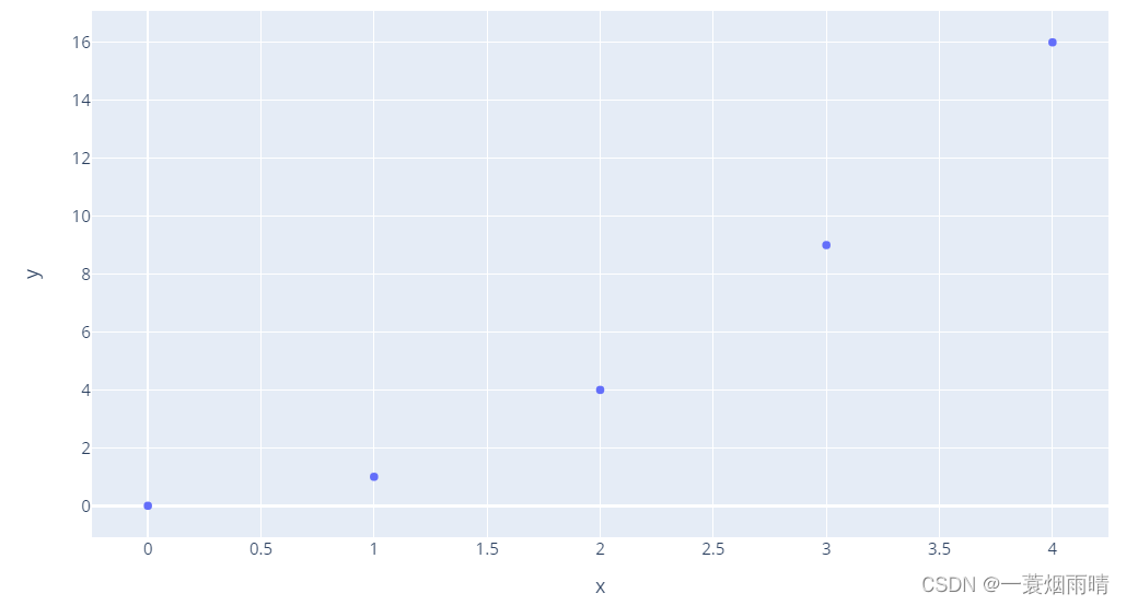
Python plotly_express库
1.散点图
# x and y given as array_like objects
import plotly.express as px
fig = px.scatter(x=[0, 1, 2, 3, 4], y=[0, 1, 4, 9, 16])
fig.show()
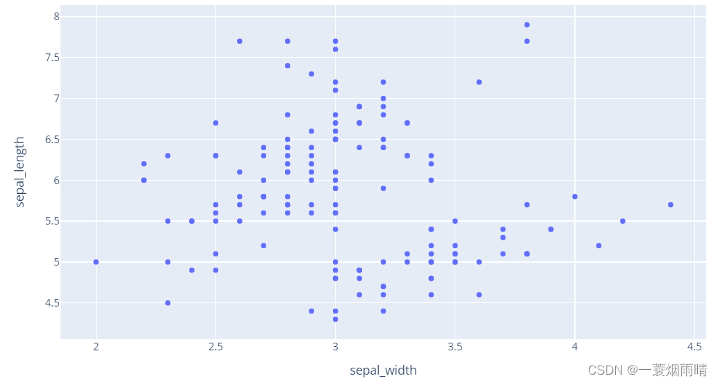
# x and y given as DataFrame columns
import plotly.express as px
df = px.data.iris() # iris is a pandas DataFrame
fig = px.scatter(df, x="sepal_width", y="sepal_length")
fig.show()
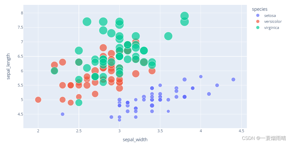
import plotly.express as px
df = px.data.iris()
fig = px.scatter(df, x="sepal_width", y="sepal_length", color="species",
                 size='petal_length', hover_data=['petal_width'])
fig.show()
import plotly.express as px
df = px.data.iris()
fig = px.scatter(df, x="sepal_width", y="sepal_length", color='petal_length')
fig.show()

import plotly.express as px
df = px.data.iris()
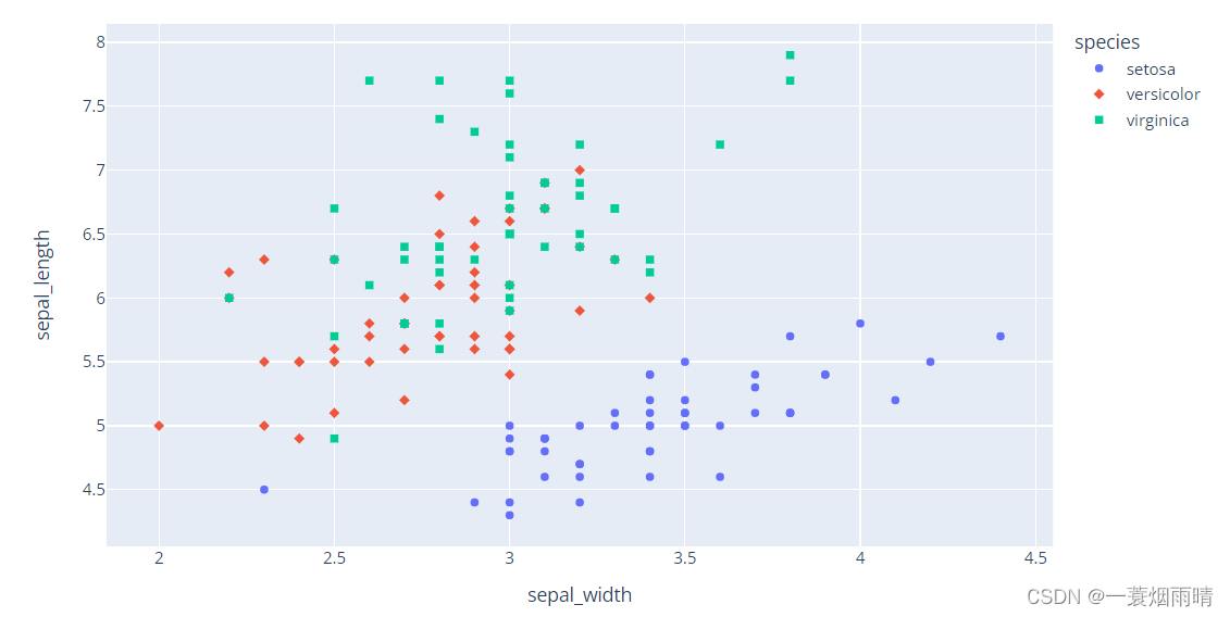
fig = px.scatter(df, x="sepal_width", y="sepal_length", color="species", symbol="species")
fig.show()
import plotly.express as px
df = px.data.iris()
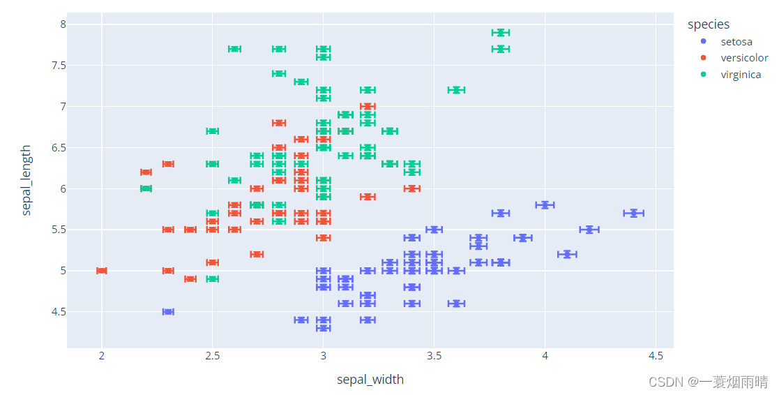
df["e"] = df["sepal_width"]/100
fig = px.scatter(df, x="sepal_width", y="sepal_length", color="species",
error_x="e", error_y="e")
fig.show()
import plotly.express as px
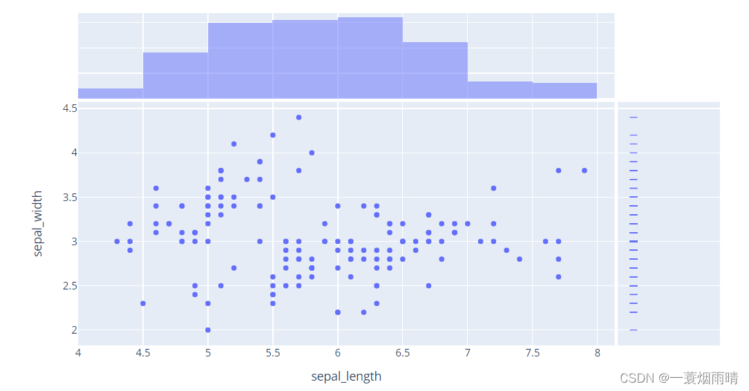
df = px.data.iris()
fig = px.scatter(df, x="sepal_length", y="sepal_width", marginal_x="histogram", marginal_y="rug")
fig.show()
import plotly.express as px
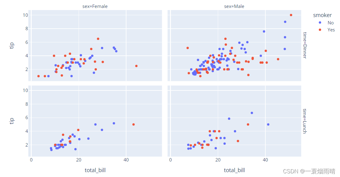
df = px.data.tips()
fig = px.scatter(df, x="total_bill", y="tip", color="smoker", facet_col="sex", facet_row="time")
fig.show()
import plotly.express as px
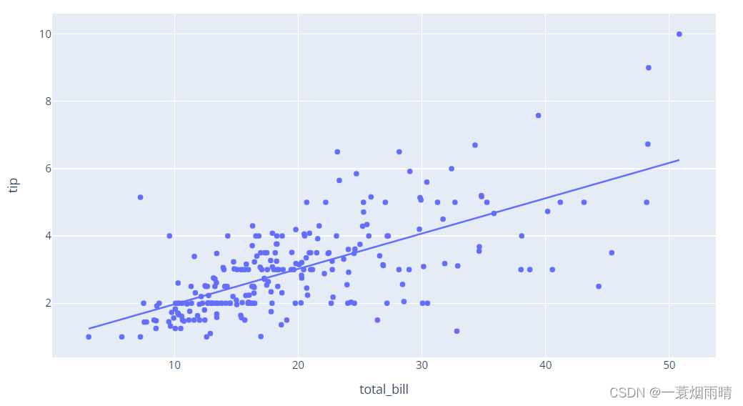
df = px.data.tips()
fig = px.scatter(df, x="total_bill", y="tip", trendline="ols")
fig.show()
2.折线图
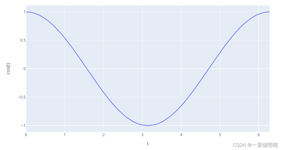
import plotly.express as px
import numpy as np

t = np.linspace(0, 2*np.pi, 100)

fig = px.line(x=t, y=np.cos(t), labels={

    'x':'t', 'y':'cos(t)'})
fig.show()
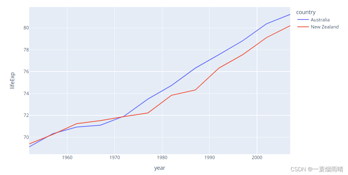
import plotly.express as px
df = px.data.gapminder().query("continent == 'Oceania'")
fig = px.line(df, x='year', y='lifeExp', color='country')
fig.show()
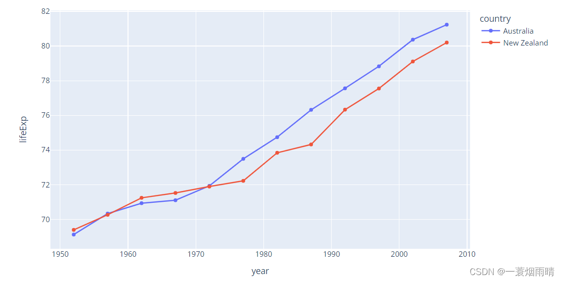
import plotly.express as px
df = px.data.gapminder().query("continent == 'Oceania'")
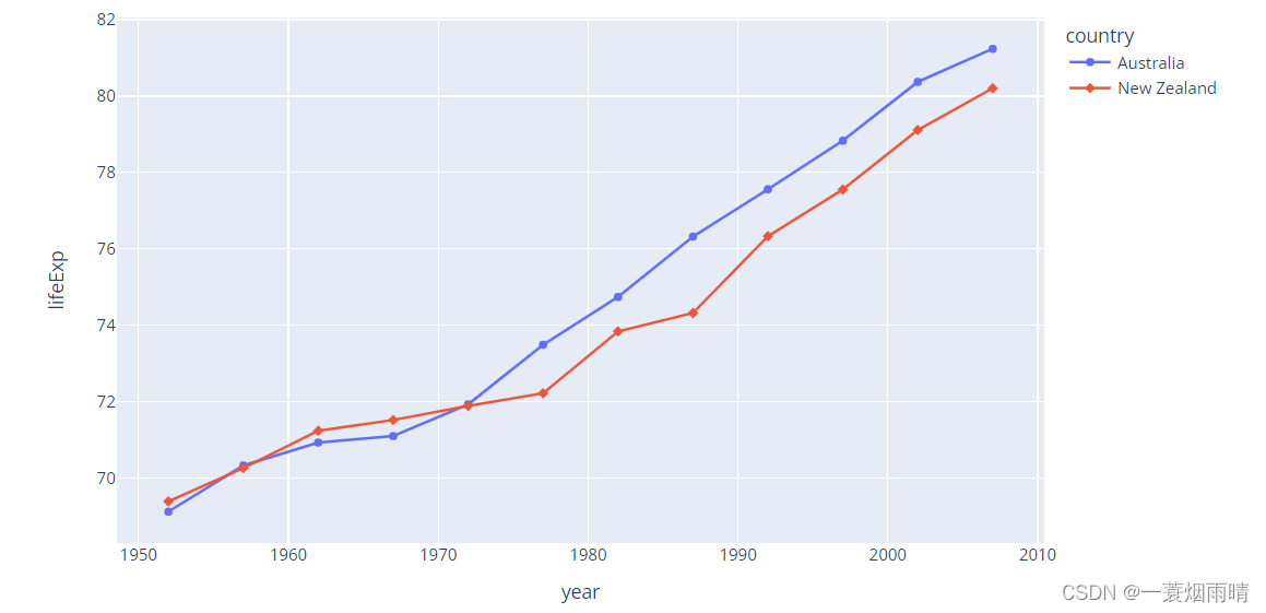
fig = px.line(df, x='year', y='lifeExp', color='country', markers=True)
fig.show()
import plotly.express as px
df = px.data.gapminder().query("continent == 'Oceania'")
fig = px.line(df, x='year', y='lifeExp', color='country', symbol="country")
fig.show()
import plotly.express as px
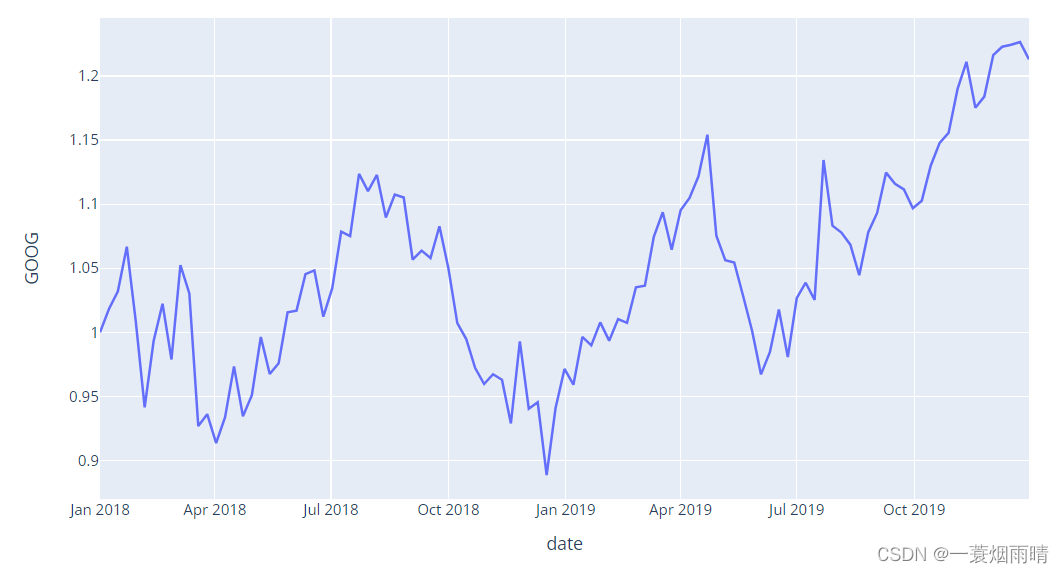
df = px.data.stocks()
fig = px.line(df, x='date', y="GOOG")
fig.show()
import plotly.express as px
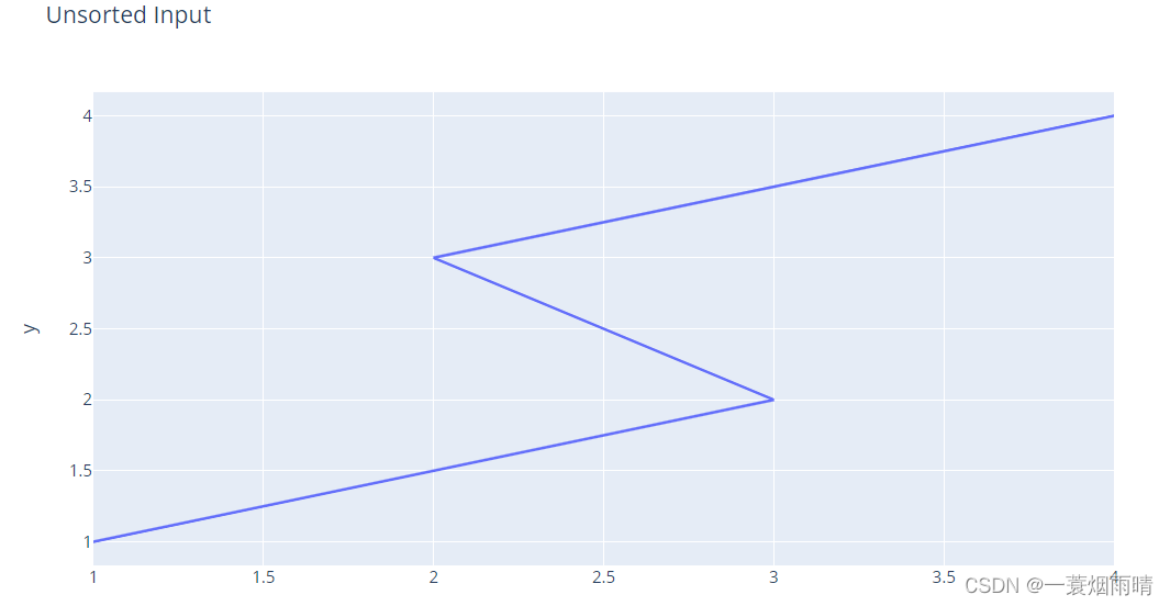
import pandas as pd
df = pd.DataFrame(dict(
x = [1, 3, 2, 4],
y = [1, 2, 3, 4]
))
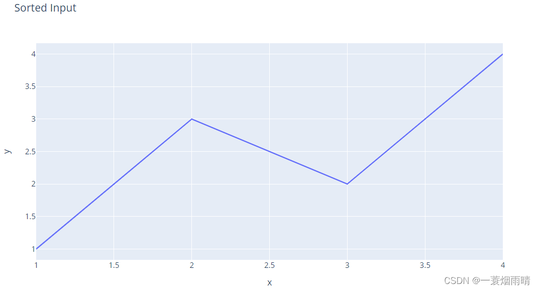
fig = px.line(df, x="x", y="y", title="Unsorted Input")
fig.show()
df = df.sort_values(by="x")
fig = px.line(df, x="x", y="y", title="Sorted Input")
fig.show()
import plotly.express as px
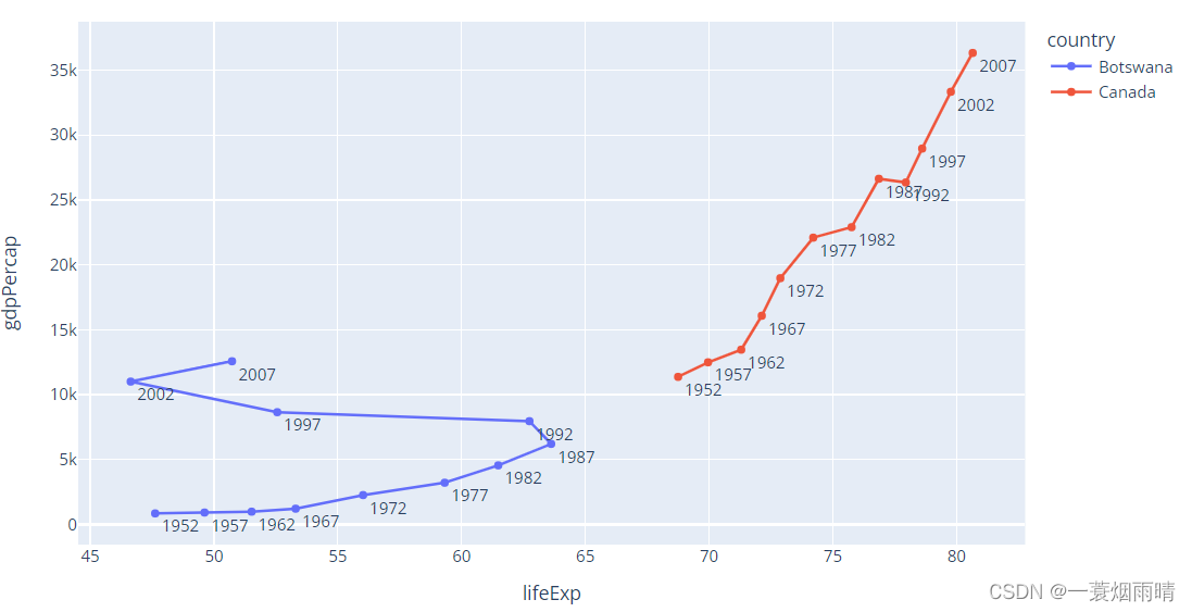
df = px.data.gapminder().query("country in ['Canada', 'Botswana']")
fig = px.line(df, x="lifeExp", y="gdpPercap", color="country", text="year")
fig.update_traces(textposition="bottom right")
fig.show()
3.import plotly.graph_objects as go
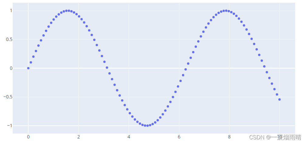
import plotly.graph_objects as go
import numpy as np

N = 1000
t = np.linspace(0, 10, 100)
y = np.sin(t)

fig = go.Figure(data=go.Scatter(x=t, y=y, mode='markers'))

fig.show()
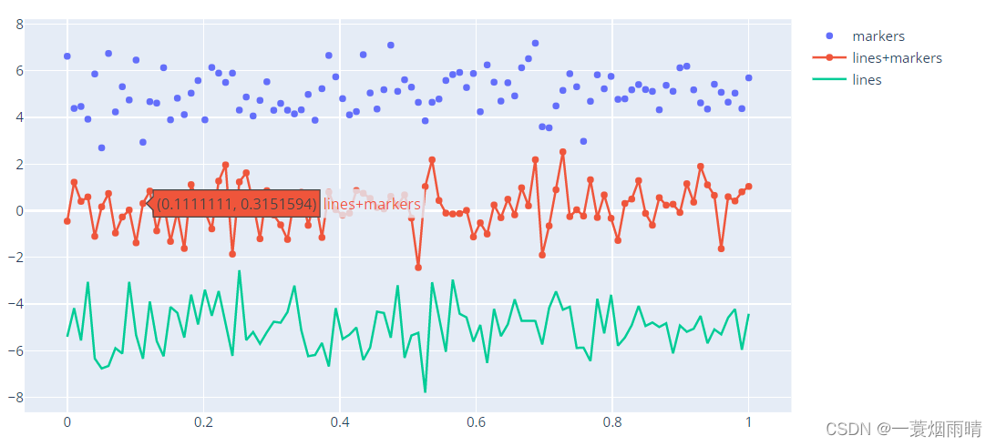
import plotly.graph_objects as go

# Create random data with numpy
import numpy as np
np.random.seed(1)

N = 100
random_x = np.linspace(0, 1, N)
random_y0 = np.random.randn(N) + 5
random_y1 = np.random.randn(N)
random_y2 = np.random.randn(N) - 5

fig = go.Figure()

# Add traces
fig.add_trace(go.Scatter(x=random_x, y=random_y0,
                    mode='markers',
                    name='markers'))
fig.add_trace(go.Scatter(x=random_x, y=random_y1,
                    mode='lines+markers',
                    name='lines+markers'))
fig.add_trace(go.Scatter(x=random_x, y=random_y2,
                    mode='lines',
                    name='lines'))

fig.show()
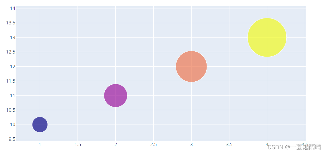
import plotly.graph_objects as go

fig = go.Figure(data=go.Scatter(
    x=[1, 2, 3, 4],
    y=[10, 11, 12, 13],
    mode='markers',
    marker=dict(size=[40, 60, 80, 100],
                color=[0, 1, 2, 3])
))

fig.show()
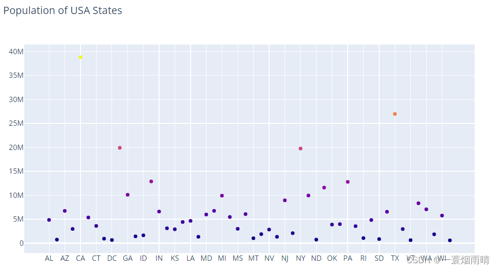
import plotly.graph_objects as go
import pandas as pd

data= pd.read_csv("https://raw.githubusercontent.com/plotly/datasets/master/2014_usa_states.csv")

fig = go.Figure(data=go.Scatter(x=data['Postal'],
                                y=data['Population'],
                                mode='markers',
                                marker_color=data['Population'],
                                text=data['State'])) # hover text goes here

fig.update_layout(title='Population of USA States')
fig.show()
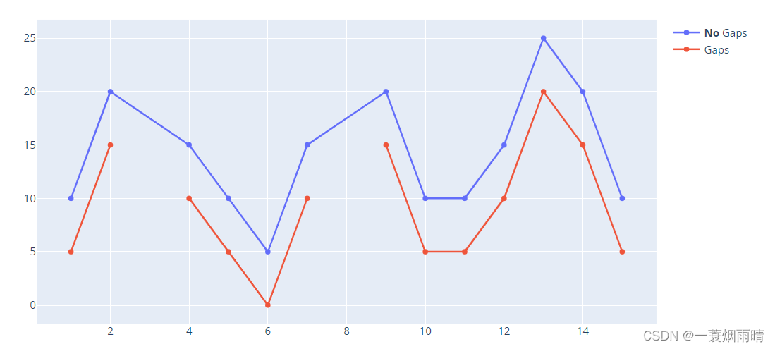
import plotly.graph_objects as go

x = [1, 2, 3, 4, 5, 6, 7, 8, 9, 10, 11, 12, 13, 14, 15]

fig = go.Figure()

fig.add_trace(go.Scatter(
    x=x,
    y=[10, 20, None, 15, 10, 5, 15, None, 20, 10, 10, 15, 25, 20, 10],
    name = '<b>No</b> Gaps', # Style name/legend entry with html tags
    connectgaps=True # override default to connect the gaps
))
fig.add_trace(go.Scatter(
    x=x,
    y=[5, 15, None, 10, 5, 0, 10, None, 15, 5, 5, 10, 20, 15, 5],
    name='Gaps',
))

fig.show()
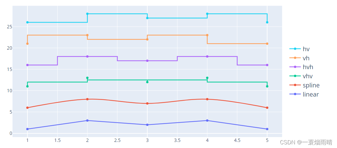
import plotly.graph_objects as go
import numpy as np

x = np.array([1, 2, 3, 4, 5])
y = np.array([1, 3, 2, 3, 1])

fig = go.Figure()
fig.add_trace(go.Scatter(x=x, y=y, name="linear",
                    line_shape='linear'))
fig.add_trace(go.Scatter(x=x, y=y + 5, name="spline",
                    text=["tweak line smoothness<br>with 'smoothing' in line object"],
                    hoverinfo='text+name',
                    line_shape='spline'))
fig.add_trace(go.Scatter(x=x, y=y + 10, name="vhv",
                    line_shape='vhv'))
fig.add_trace(go.Scatter(x=x, y=y + 15, name="hvh",
                    line_shape='hvh'))
fig.add_trace(go.Scatter(x=x, y=y + 20, name="vh",
                    line_shape='vh'))
fig.add_trace(go.Scatter(x=x, y=y + 25, name="hv",
                    line_shape='hv'))

fig.update_traces(hoverinfo='text+name', mode='lines+markers')
fig.update_layout(legend=dict(y=0.5, traceorder='reversed', font_size=16))

fig.show()
import plotly.graph_objects as go
import numpy as np
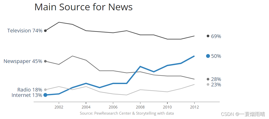
title = 'Main Source for News'
labels = ['Television', 'Newspaper', 'Internet', 'Radio']
colors = ['rgb(67,67,67)', 'rgb(115,115,115)', 'rgb(49,130,189)', 'rgb(189,189,189)']
mode_size = [8, 8, 12, 8]
line_size = [2, 2, 4, 2]
x_data = np.vstack((np.arange(2001, 2014),)*4)
y_data = np.array([
[74, 82, 80, 74, 73, 72, 74, 70, 70, 66, 66, 69],
[45, 42, 50, 46, 36, 36, 34, 35, 32, 31, 31, 28],
[13, 14, 20, 24, 20, 24, 24, 40, 35, 41, 43, 50],
[18, 21, 18, 21, 16, 14, 13, 18, 17, 16, 19, 23],
])
fig = go.Figure()
for i in range(0, 4):
fig.add_trace(go.Scatter(x=x_data[i], y=y_data[i], mode='lines',
name=labels[i],
line=dict(color=colors[i], width=line_size[i]),
connectgaps=True,
))
# endpoints
fig.add_trace(go.Scatter(
x=[x_data[i][0], x_data[i][-1]],
y=[y_data[i][0], y_data[i][-1]],
mode='markers',
marker=dict(color=colors[i], size=mode_size[i])
))
fig.update_layout(
xaxis=dict(
showline=True,
showgrid=False,
showticklabels=True,
linecolor='rgb(204, 204, 204)',
linewidth=2,
ticks='outside',
tickfont=dict(
family='Arial',
size=12,
color='rgb(82, 82, 82)',
),
),
yaxis=dict(
showgrid=False,
zeroline=False,
showline=False,
showticklabels=False,
),
autosize=False,
margin=dict(
autoexpand=False,
l=100,
r=20,
t=110,
),
showlegend=False,
plot_bgcolor='white'
)
annotations = []
# Adding labels
for y_trace, label, color in zip(y_data, labels, colors):
# labeling the left_side of the plot
annotations.append(dict(xref='paper', x=0.05, y=y_trace[0],
xanchor='right', yanchor='middle',
text=label + ' {}%'.format(y_trace[0]),
font=dict(family='Arial',
size=16),
showarrow=False))
# labeling the right_side of the plot
annotations.append(dict(xref='paper', x=0.95, y=y_trace[11],
xanchor='left', yanchor='middle',
text='{}%'.format(y_trace[11]),
font=dict(family='Arial',
size=16),
showarrow=False))
# Title
annotations.append(dict(xref='paper', yref='paper', x=0.0, y=1.05,
xanchor='left', yanchor='bottom',
text='Main Source for News',
font=dict(family='Arial',
size=30,
color='rgb(37,37,37)'),
showarrow=False))
# Source
annotations.append(dict(xref='paper', yref='paper', x=0.5, y=-0.1,
xanchor='center', yanchor='top',
text='Source: PewResearch Center & ' +
'Storytelling with data',
font=dict(family='Arial',
size=12,
color='rgb(150,150,150)'),
showarrow=False))
fig.update_layout(annotations=annotations)
fig.show()
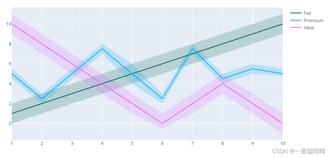
import plotly.graph_objects as go
import numpy as np


x = [1, 2, 3, 4, 5, 6, 7, 8, 9, 10]
x_rev = x[::-1]

# Line 1
y1 = [1, 2, 3, 4, 5, 6, 7, 8, 9, 10]
y1_upper = [2, 3, 4, 5, 6, 7, 8, 9, 10, 11]
y1_lower = [0, 1, 2, 3, 4, 5, 6, 7, 8, 9]
y1_lower = y1_lower[::-1]

# Line 2
y2 = [5, 2.5, 5, 7.5, 5, 2.5, 7.5, 4.5, 5.5, 5]
y2_upper = [5.5, 3, 5.5, 8, 6, 3, 8, 5, 6, 5.5]
y2_lower = [4.5, 2, 4.4, 7, 4, 2, 7, 4, 5, 4.75]
y2_lower = y2_lower[::-1]

# Line 3
y3 = [10, 8, 6, 4, 2, 0, 2, 4, 2, 0]
y3_upper = [11, 9, 7, 5, 3, 1, 3, 5, 3, 1]
y3_lower = [9, 7, 5, 3, 1, -.5, 1, 3, 1, -1]
y3_lower = y3_lower[::-1]


fig = go.Figure()

fig.add_trace(go.Scatter(
    x=x+x_rev,
    y=y1_upper+y1_lower,
    fill='toself',
    fillcolor='rgba(0,100,80,0.2)',
    line_color='rgba(255,255,255,0)',
    showlegend=False,
    name='Fair',
))
fig.add_trace(go.Scatter(
    x=x+x_rev,
    y=y2_upper+y2_lower,
    fill='toself',
    fillcolor='rgba(0,176,246,0.2)',
    line_color='rgba(255,255,255,0)',
    name='Premium',
    showlegend=False,
))
fig.add_trace(go.Scatter(
    x=x+x_rev,
    y=y3_upper+y3_lower,
    fill='toself',
    fillcolor='rgba(231,107,243,0.2)',
    line_color='rgba(255,255,255,0)',
    showlegend=False,
    name='Ideal',
))
fig.add_trace(go.Scatter(
    x=x, y=y1,
    line_color='rgb(0,100,80)',
    name='Fair',
))
fig.add_trace(go.Scatter(
    x=x, y=y2,
    line_color='rgb(0,176,246)',
    name='Premium',
))
fig.add_trace(go.Scatter(
    x=x, y=y3,
    line_color='rgb(231,107,243)',
    name='Ideal',
))

fig.update_traces(mode='lines')
fig.show()