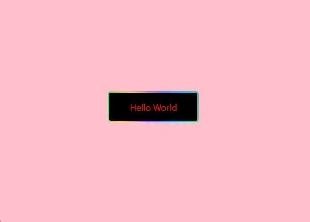
效果图
JS
import styles from './style.less'
const index = () =>
{


    return (
        <div className={

    styles.container}>
            <a href="#" className={

    styles.SidebarCreate}>
                <span>Hello World</span>
            </a>
        </div>
    );
};
export default index
CSS
.container {


  display: flex;
  justify-content: center;
  align-items: center;
  height: 100vh;
  background: pink;

  a {


    text-decoration: none;
  }

  .SidebarCreate {


    width: 180px;
    text-align: center;
    position: relative;
    border-radius: 6px;
    box-sizing: border-box;
    color: red;
    display: block;
    z-index: 2;
    overflow: hidden;
    padding: 3px;
  }

  .SidebarCreate::before {


    content: "";
    position: absolute;
    top: 0;
    left: 0;
    width: 200%;
    height: 100%;
    background: linear-gradient(115deg, #4fcf70, #fad648, #a767e5, #12bcfe, #44ce7b);
    background-size: 50% 100%;
    animation: animated 1.5s ease alternate infinite;
  }

  .SidebarCreate span {


    position: relative;
    z-index: 2;
    padding: 0.875rem 0;
    font-size: 1.1rem;
    align-items: center;
    background: #000;
    border-radius: 3px;
    display: block;
    justify-content: center;
    box-sizing: border-box;
    height: 100%;
  }

  @keyframes animated {


    0% {


      background-position: 0% 0%;
    }

    100% {


      background-position: 100% 100%;
    }
  }
}