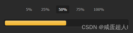
效果图
HTML
<div class="container">
    <input type="radio" class="radio" name="progress" value="five" id="five">
    <label for="five" class="label">5%</label>

    <input type="radio" class="radio" name="progress" value="twentyfive" id="twentyfive" checked>
    <label for="twentyfive" class="label">25%</label>

    <input type="radio" class="radio" name="progress" value="fifty" id="fifty">
    <label for="fifty" class="label">50%</label>

    <input type="radio" class="radio" name="progress" value="seventyfive" id="seventyfive">
    <label for="seventyfive" class="label">75%</label>

    <input type="radio" class="radio" name="progress" value="onehundred" id="onehundred">
    <label for="onehundred" class="label">100%</label>

    <div class="progress">
        <div class="progress-bar"></div>
    </div>
</div>
css部分
<style>
        body {


            font: 13px/20px "Lucida Grande", Tahoma, Verdana, sans-serif;
            color: #404040;
            background: #2a2a2a;
        }

        .container {


            margin: 60px auto;
            width: 400px;
            text-align: center;
        }

        .container .progress {


            margin: 0 auto;
            width: 400px;
        }

        .progress {


            padding: 4px;
            background: rgba(0, 0, 0, 0.25);
            border-radius: 6px;
            -webkit-box-shadow: inset 0 1px 2px rgba(0, 0, 0, 0.25), 0 1px rgba(255, 255, 255, 0.08);
            box-shadow: inset 0 1px 2px rgba(0, 0, 0, 0.25), 0 1px rgba(255, 255, 255, 0.08);
        }

        .progress-bar {


            height: 16px;
            border-radius: 4px;
            background-image: -webkit-linear-gradient(top, rgba(255, 255, 255, 0.3), rgba(255, 255, 255, 0.05));
            background-image: -moz-linear-gradient(top, rgba(255, 255, 255, 0.3), rgba(255, 255, 255, 0.05));
            background-image: -o-linear-gradient(top, rgba(255, 255, 255, 0.3), rgba(255, 255, 255, 0.05));
            background-image: linear-gradient(to bottom, rgba(255, 255, 255, 0.3), rgba(255, 255, 255, 0.05));
            -webkit-transition: 0.4s linear;
            -moz-transition: 0.4s linear;
            -o-transition: 0.4s linear;
            transition: 0.4s linear;
            -webkit-transition-property: width, background-color;
            -moz-transition-property: width, background-color;
            -o-transition-property: width, background-color;
            transition-property: width, background-color;
            -webkit-box-shadow: 0 0 1px 1px rgba(0, 0, 0, 0.25), inset 0 1px rgba(255, 255, 255, 0.1);
            box-shadow: 0 0 1px 1px rgba(0, 0, 0, 0.25), inset 0 1px rgba(255, 255, 255, 0.1);
        }
        #five:checked ~ .progress > .progress-bar {


            width: 5%;
            background-color: #f63a0f;
        }

        #twentyfive:checked ~ .progress > .progress-bar {


            width: 25%;
            background-color: #f27011;
        }

        #fifty:checked ~ .progress > .progress-bar {


            width: 50%;
            background-color: #f2b01e;
        }

        #seventyfive:checked ~ .progress > .progress-bar {


            width: 75%;
            background-color: #f2d31b;
        }

        #onehundred:checked ~ .progress > .progress-bar {


            width: 100%;
            background-color: #86e01e;
        }

        .radio {


            display: none;
        }

        .label {


            display: inline-block;
            margin: 0 5px 20px;
            padding: 3px 8px;
            color: #aaa;
            text-shadow: 0 1px black;
            border-radius: 3px;
            cursor: pointer;
        }

        .radio:checked + .label {


            color: white;
            background: rgba(0, 0, 0, 0.25);
        }

    </style>