使用CSS3制作幽灵按钮
1、什么是幽灵按钮
    透明按钮,顾名思义,就是在设计网页按钮时,不再设计复杂色彩、样式和纹理,
    而是外仅以线框示意轮廓,内只用文字示意功能,背景透出,与整个页面/背景合而为一的设计方式。
    国外的设计师称之为“幽灵按钮”(Ghost Buttons),盛赞这种按钮通透简约,
    贴合整体风格又不失神韵,别具魅力。这种按钮的设计早已有之,但是在iOS和安卓双双风格转向之后,
    它携了扁平之风雷,成了网页设计的新趋势。
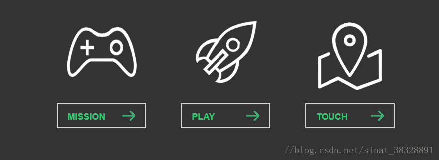
幽灵按钮设计相关案例
2、幽灵按钮基础DEMO(基础html样式)
<!DOCTYPE html>
<html>
<head lang="en">
    <meta charset="UTF-8">
    <title>幽灵按钮html基础样式制作</title>
    <style type="text/css">
        *{
            margin:0;
            padding:0;
        }
        body{
            background:#313031;
        }
        .container{
            width:800px;
            height:300px;
            margin:100px auto;
        }
        .link{
            display:inline-block;
            width:180px;
            height:300px;
            margin-left:60px;
        }
        .img{
            width:100%;
            height:200px;
        }
        .link_one .img{
            background:url("images/mission.png") no-repeat center center;
        }
        .link_two .img{
            background:url("images/play.png") no-repeat center center;
        }
        .link_three .img{
            background:url("images/touch.png") no-repeat center center;
        }
        .btn{
            display:block;
            width:180px;
            height:50px;
            border:2px solid rgba(255,255,255,0.7);
            margin:10px auto;
            line-height:50px;
            text-decoration:none;
            color:#2DCB70;
            padding-left:20px;
            box-sizing:border-box;
            -webkit-box-sizing:border-box;
            -o-box-sizing:border-box;
            -moz-box-sizing:border-box;
            font-weight:bold;
            font-size:18px;
            text-transform:uppercase;
            font-family:Arial;
            background:url('images/allow.png') no-repeat 130px center;
        }
    </style>
</head>
<body>
    <div class="container">
        <div class="link link_one">
            <p class="img"></p>
            <a href="javascript:void(0)" class="btn">
                MISSION
            </a>
        </div>
        <div class="link link_two">
            <p class="img"></p>
            <a href="javascript:void(0)" class="btn">
                PLAY
            </a>
        </div>
        <div class="link link_three">
            <p class="img"></p>
            <a href="javascript:void(0)" class="btn">
                TOUCH
            </a>
        </div>
    </div>
</body>
</html>
3、幽灵按钮基础DEMO(基础html样式+CSS3动画)
<!DOCTYPE html>
<html>
<head lang="en">
<meta charset="UTF-8">
<title>幽灵按钮动画添加</title>
<style type="text/css">
*{
margin:0;
padding:0;
}
body{
background:#313031;
}
.container{
width:800px;
height:300px;
margin:100px auto;
}
.link{
display:inline-block;
width:180px;
height:300px;
margin-left:60px;
}
.img{
width:100%;
height:200px;
transition:all 0.3s ease-out;
-moz-transition:all 0.3s ease-out;
-o-transition:all 0.3s ease-out;
-webkit-transition:all 0.3s ease-out;
}
.link_one .img{
background:url("images/mission.png") no-repeat center center;
}
.link_two .img{
background:url("images/play.png") no-repeat center center;
}
.link_three .img{
background:url("images/touch.png") no-repeat center center;
}
.btn{
display:block;
width:180px;
height:50px;
border:2px solid rgba(255,255,255,0.7);
margin:10px auto;
line-height:50px;
text-decoration:none;
color:#2DCB70;
padding-left:20px;
box-sizing:border-box;
-webkit-box-sizing:border-box;
-o-box-sizing:border-box;
-moz-box-sizing:border-box;
font-weight:bold;
font-size:18px;
text-transform:uppercase;
font-family:Arial;
background:url('images/allow.png') no-repeat 130px center;
transition:all 0.3s ease-out;
-moz-transition:all 0.3s ease-out;
-o-transition:all 0.3s ease-out;
-webkit-transition:all 0.3s ease-out;
position:relative;
}
.link:hover .img{
transform:rotate(360deg) scale(1.2);
-ms-transform:rotate(360deg) scale(1.2);
-moz-transform:rotate(360deg) scale(1.2);
-o-transform:rotate(360deg) scale(1.2);
-webkit-transform:rotate(360deg) scale(1.2);
}
.btn:hover{
border:2px solid rgba(255,255,255,1);
background-position:140px center;
}
.line{
display:block;
background:#fff;
position:absolute;
-moz-transition:ease 0.4s;
-o-transition:ease 0.4s;
-webkit-transition:ease 0.4s;
transition:ease 0.4s;
}
.line_top{
width:0px;
height:2px;
top:-2px;
left:-110%;
}
.btn:hover .line_top{
width:100%;
left:-2px;
}
.line_left{
width:2px;
height:0px;
bottom:-110%;
left:-2px;
}
.btn:hover .line_left{
height:100%;
bottom:-2px;
}
.line_bottom{
width:0px;
height:2px;
right:-110%;
bottom:-2px;
}
.btn:hover .line_bottom{
width:100%;
right:-2px;
}
.line_right{
width:2px;
height:0px;
top:-110%;
right:-2px;
}
.btn:hover .line_right{
height:100%;
top:-2px;
}
</style>
</head>
<body>
<div class="container">
<div class="link link_one">
<p class="img"></p>
<a href="javascript:void(0)" class="btn">
MISSION
<span class="line line_top"></span>
<span class="line line_left"></span>
<span class="line line_bottom"></span>
<span class="line line_right"></span>
</a>
</div>
<div class="link link_two">
<p class="img"></p>
<a href="javascript:void(0)" class="btn">
PLAY
<span class="line line_top"></span>
<span class="line line_left"></span>
<span class="line line_bottom"></span>
<span class="line line_right"></span>
</a>
</div>
<div class="link link_three">
<p class="img"></p>
<a href="javascript:void(0)" class="btn">
TOUCH
<span class="line line_top"></span>
<span class="line line_left"></span>
<span class="line line_bottom"></span>
<span class="line line_right"></span>
</a>
</div>
</div>
</body>
</html>
4、幽灵按钮基础DEMO(基础html样式+CSS3动画+jq制作提示)
<!DOCTYPE html>
<html>
<head lang="en">
<meta charset="UTF-8">
<title>幽灵按钮提示信息制作</title>
<style type="text/css">
*{
margin:0;
padding:0;
}
body{
background:#313031;
}
.container{
width:800px;
height:300px;
margin:100px auto;
}
.link{
display:inline-block;
width:180px;
height:300px;
margin-left:60px;
}
.img{
width:100%;
height:200px;
transition:all 0.3s ease-out;
-moz-transition:all 0.3s ease-out;
-o-transition:all 0.3s ease-out;
-webkit-transition:all 0.3s ease-out;
}
.link_one .img{
background:url("images/mission.png") no-repeat center center;
}
.link_two .img{
background:url("images/play.png") no-repeat center center;
}
.link_three .img{
background:url("images/touch.png") no-repeat center center;
}
.btn{
display:block;
width:180px;
height:50px;
border:2px solid rgba(255,255,255,0.7);
margin:10px auto;
line-height:50px;
text-decoration:none;
color:#2DCB70;
padding-left:20px;
box-sizing:border-box;
-webkit-box-sizing:border-box;
-o-box-sizing:border-box;
-moz-box-sizing:border-box;
font-weight:bold;
font-size:18px;
text-transform:uppercase;
font-family:Arial;
background:url('images/allow.png') no-repeat 130px center;
transition:all 0.3s ease-out;
-moz-transition:all 0.3s ease-out;
-o-transition:all 0.3s ease-out;
-webkit-transition:all 0.3s ease-out;
position:relative;
}
.link:hover .img{
transform:rotate(360deg) scale(1.2);
-ms-transform:rotate(360deg) scale(1.2);
-moz-transform:rotate(360deg) scale(1.2);
-o-transform:rotate(360deg) scale(1.2);
-webkit-transform:rotate(360deg) scale(1.2);
}
.btn:hover{
border:2px solid rgba(255,255,255,1);
background-position:140px center;
}
.line{
display:block;
background:#fff;
position:absolute;
-moz-transition:ease 0.4s;
-o-transition:ease 0.4s;
-webkit-transition:ease 0.4s;
transition:ease 0.4s;
}
.line_top{
width:0px;
height:2px;
top:-2px;
left:-110%;
}
.btn:hover .line_top{
width:100%;
left:-2px;
}
.line_left{
width:2px;
height:0px;
bottom:-110%;
left:-2px;
}
.btn:hover .line_left{
height:100%;
bottom:-2px;
}
.line_bottom{
width:0px;
height:2px;
right:-110%;
bottom:-2px;
}
.btn:hover .line_bottom{
width:100%;
right:-2px;
}
.line_right{
width:2px;
height:0px;
top:-110%;
right:-2px;
}
.btn:hover .line_right{
height:100%;
top:-2px;
}
.tips{
position:absolute;
padding:10px 14px;
background:#2DCB70;
color:#fff;
top:160px;
font-size:16px;
font-weight:normal;
text-transform:none;
margin:0 auto;
opacity:0;
border-radius:3px;
-moz-border-radius:3px;
-ms-border-radius:3px;
-o-border-radius:3px;
-webkit-border-radius:3px;
}
.tips em{
font-style:normal;
}
.tips span{
position:absolute;
width:0;
height:0;
overflow:hidden;
border:7px solid transparent;
border-top-color:#2DCB70;
left:50%;
margin-left:-3px;
bottom:-14px;
}
</style>
</head>
<body>
<div class="container">
<div class="link link_one">
<p class="img"></p>
<a href="javascript:void(0)" class="btn" data="My mission is clear">
MISSION
<span class="line line_top"></span>
<span class="line line_left"></span>
<span class="line line_bottom"></span>
<span class="line line_right"></span>
</a>
</div>
<div class="link link_two">
<p class="img"></p>
<a href="javascript:void(0)" class="btn" data="My play is clear">
PLAY
<span class="line line_top"></span>
<span class="line line_left"></span>
<span class="line line_bottom"></span>
<span class="line line_right"></span>
</a>
</div>
<div class="link link_three">
<p class="img"></p>
<a href="javascript:void(0)" class="btn" data="My touch is clear">
TOUCH
<span class="line line_top"></span>
<span class="line line_left"></span>
<span class="line line_bottom"></span>
<span class="line line_right"></span>
</a>
</div>
<div class="tips">
<em></em>
<span></span>
</div>
</div>
<script src="js/jquery-1.8.3.min.js"></script>
<script type="text/javascript">
$(function(){
$('.link .btn').hover(function(){
var title=$(this).attr('data');
$('.tips em').text(title);
var pos=$(this).offset().left;
var dis=($('.tips').outerWidth()-$(this).outerWidth())/2;
var l=pos-dis;
$('.tips').css({'left':l+'px'}).animate({'top':255,'opacity':1},500);
},function(){
if(!$('.tips').is(':animated')){
$('.tips').animate({'top':230,'opacity':0},500);
}
})
})
</script>
</body>
</html>